When you're shopping online, you've probably clicked on a product image, zoomed in, then zoomed out, and still had no idea if it would fit on your shelf, in your bag, or on your desk. That’s not a glitch - it’s a common failure in product photography. Without a clear sense of scale, even the most beautifully lit product can feel alien, confusing, or just plain wrong. And that confusion costs sales.
Why Your Product Looks Wrong (Even When It’s Perfectly Shot)
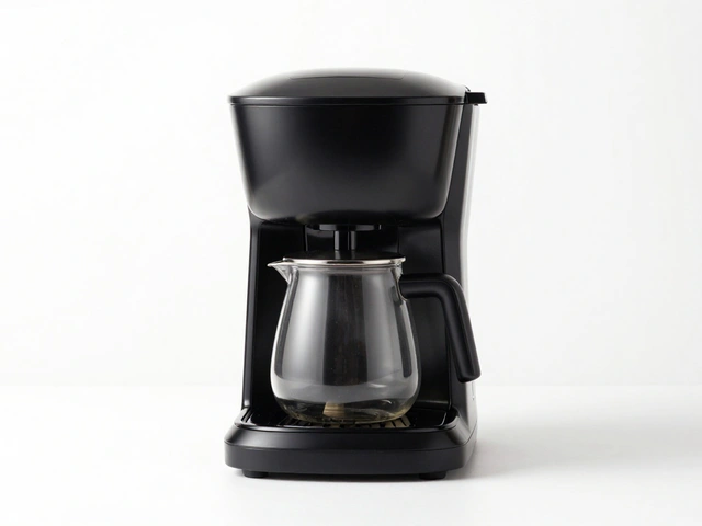
Most product photos are shot on a pure white background. Clean. Simple. Professional. But here’s the problem: a white background tells you nothing about size. A coffee maker might look like a toaster. A backpack might look like a suitcase. A phone charger might look like a brick. Without context, your brain fills in the gaps - and it’s often wrong. Research from Baymard Institute found that shoppers spent time clicking through five different images of a Weber grill just to guess its size. They didn’t buy. They left. Why? Because they couldn’t tell if it would fit on their patio. That’s not a marketing issue. It’s a visual communication failure. The truth is, product photography isn’t just about lighting and sharpness. It’s about scale. And if your images don’t answer the question, "How big is this really?" - you’re losing customers before they even read the description.The Three Ways to Show Size (And Which One Works Best)
There are three proven methods to fix this. Not one. Not two. All three, used together, create the clearest picture for your customers.1. The Cut Out Shot - The Baseline
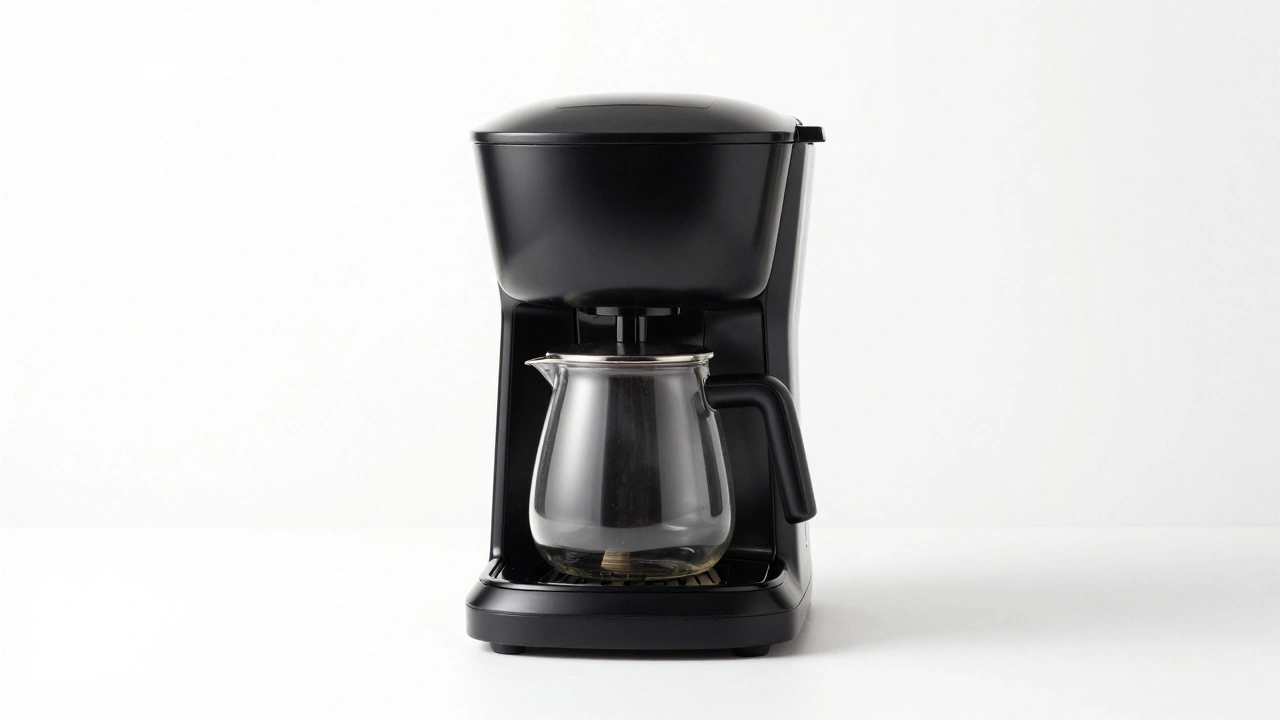
This is the standard white-background image. It’s necessary. It shows details. It’s clean. But it’s not enough. Use it as your primary shot, but never as your only one. It’s the foundation, not the full story.2. The In Scale Shot - The Game Changer
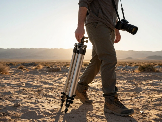
This is where you show the product in context. A blender on a kitchen counter next to a coffee mug. A suitcase next to a doorframe. A pair of headphones on a desk with a laptop and a water bottle. Suddenly, size clicks. Your customer doesn’t need to read the specs. They see it. They feel it. They imagine it in their own space. This isn’t just a nice-to-have. Baymard’s usability tests showed customers responded 62% more positively to product pages that included at least one In Scale image. Why? Because it triggers mental simulation. Your brain says, "Oh, that’s about the size of my coffee maker. I know how much space that takes. I can fit this."3. The Scale Shot - The Quick Reference
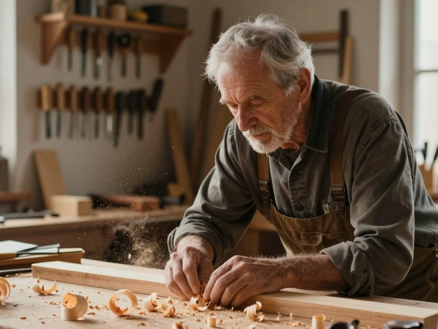
Sometimes, context isn’t enough. Sometimes, you need a direct comparison. That’s where scale shots come in. Place the product next to a common object: a coin, a ruler, a hand, a standard A4 sheet of paper. These are universal size anchors. A smart way to do this: use a human hand. Not a model’s hand. A real, slightly imperfect hand - the kind your customer has. The difference between a 1.5-inch and a 2-inch device becomes obvious when you see it next to a thumb. A 20-inch monitor? Place a standard coffee mug beside it. Instantly clear. Don’t overdo it. One scale shot per product is enough. Too many reference objects create visual noise. Keep it simple. Keep it real.The Margin Adjustment Trick - For Size Variants Without Extra Shoots
If you sell a product in three sizes - small, medium, large - you don’t need three photo shoots. You need one great shot and a smart editing trick. Here’s how it works: Take your clean product image. Adjust the margins - the empty space around the product - to make it look bigger or smaller. Increase the bottom margin? The product looks smaller. Reduce the margin? It looks larger. Pixelz, a leading product imaging company, tested this method with retailers and found it reduced studio costs by 70% while maintaining visual consistency. The rule? Always align the bottom edge of the product at the same vertical position across all variants. Add 7-10% white space below it. That gives the eye breathing room and makes the size difference feel natural, not forced. This works for apparel, kitchenware, electronics - anything with clear size tiers. No need to shoot the same item 4 times. Just resize, reposition, and repeat.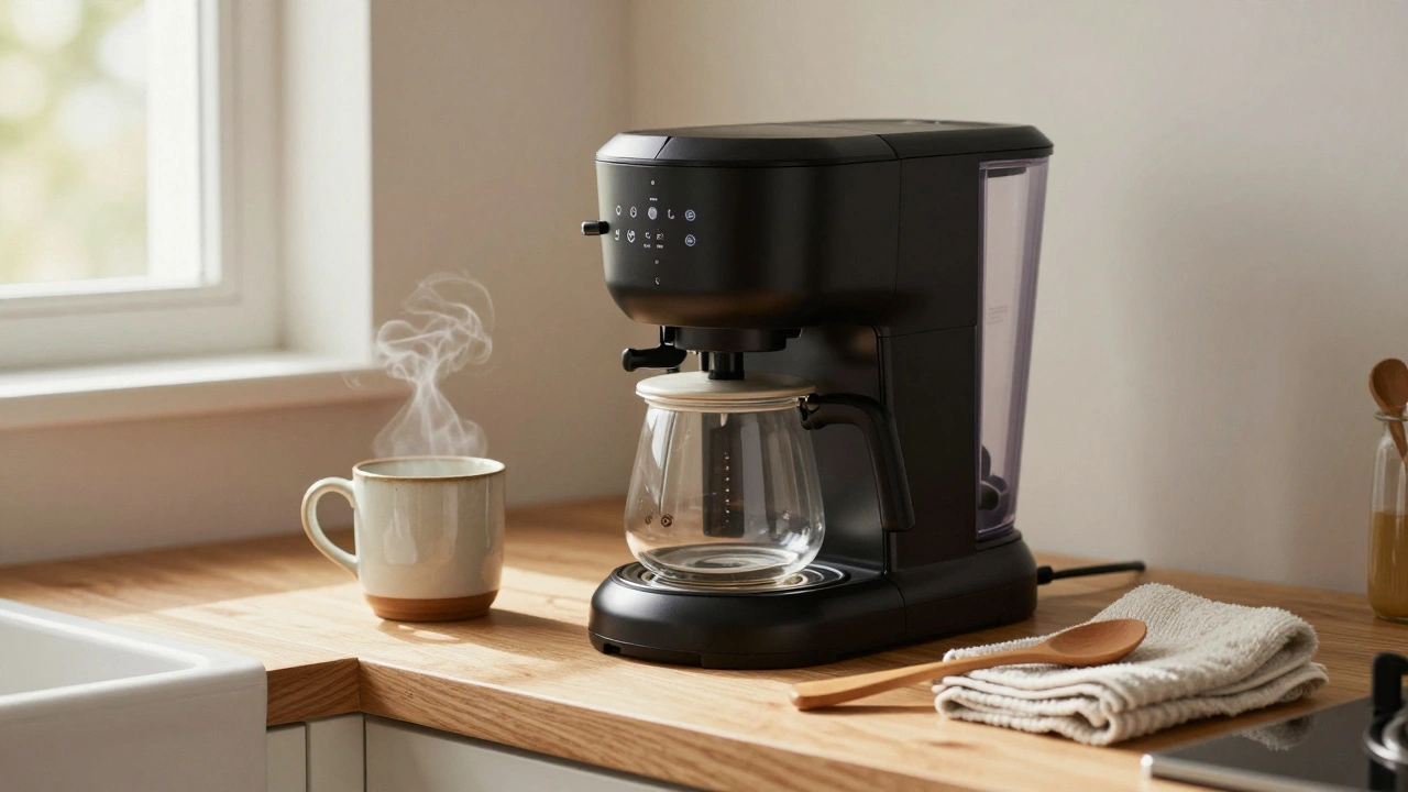
What Resolution Should You Use?
Resolution matters. A blurry image kills trust. But too large a file slows down your site. Here’s what top platforms recommend:- Faire: Minimum 600 x 600 pixels. They’ll warn you if you go lower.
- Warrior Forum: 1200 x 1200 pixels - a sweet spot for quality and speed.
- Shopify: 2048 x 2048 pixels - ideal for zooming in on textures, stitching, or fine details.
Who Can Do This? And Who Can’t?
Big brands like Nike or Apple? They shoot In Scale images for every product. They control the inventory. They have studios. They can afford it. But what if you sell 500 products from 10 different suppliers? You can’t shoot them all. That’s where automation steps in. Companies like Pixelz and Vistaprint now use AI-generated scale images. You input the product dimensions - length, width, height - and the system generates a realistic In Scale image showing the product next to a human hand or a standard object. It’s not perfect. But it’s 100x better than a white background with no context. For small businesses, start with one In Scale image per product category. For example: one image showing your phone stands next to a smartphone. One image showing your wall shelves next to a standard book. Then, use margin adjustment for size variants. You don’t need to do it all at once. Just start with the top 10% of your best-selling items.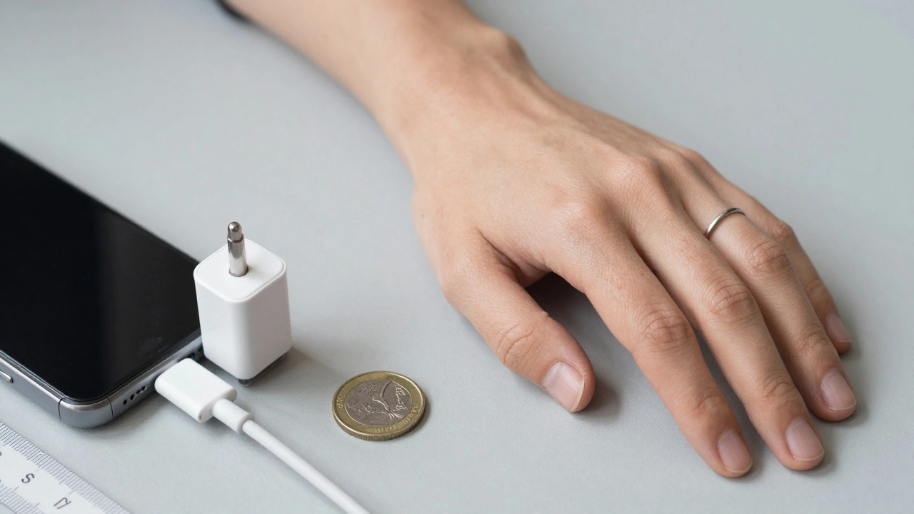
What Happens When You Ignore Scale?
You get returns. You get negative reviews. You get abandoned carts. A customer buys a lamp because it "looks cozy" in the photo. When it arrives, it’s half the size they imagined. They return it. You lose the sale. You lose the trust. And now, they’re on a competitor’s site. Or worse - they don’t return it. They keep it. But they never buy from you again. Scale isn’t just about measurements. It’s about expectation. When your images match reality, customers feel confident. When they don’t, they feel tricked.Putting It All Together - The Checklist
Here’s what every product page should have:- One clean Cut Out shot (white background, sharp focus).
- One In Scale shot (product in a realistic environment - kitchen, desk, bedroom).
- One Scale shot (product next to a coin, hand, or ruler).
- For size variants: use margin adjustment, not new photos.
- All images at 2048 x 2048 pixels or higher.
- Always align product bottoms at the same height across all size variants.
Final Thought: It’s Not About the Camera. It’s About the Customer.
You don’t need expensive gear to fix this. You need empathy. Ask yourself: "If I were buying this blind, what would I need to see?" The answer is never just a product. It’s a product in a world - a world they recognize, a world they live in. Start small. Add one In Scale image this week. Test it. Watch the conversion rates. You’ll see the difference before the month ends.Why do white background product photos fail to show size?
White background photos remove all context. Without a human, object, or environment nearby, your brain has no reference to judge how big or small something really is. This leads to misjudgments - like thinking a small lamp is a large one - which causes returns and abandoned carts.
What’s the difference between In Scale and Scale shots?
An In Scale shot shows the product in a realistic environment - like a blender on a kitchen counter - so viewers can imagine it in their own space. A Scale shot adds a known object - like a coin or hand - next to the product to give an exact size reference. Both help, but they serve different purposes: one builds context, the other gives precision.
Can I use AI to generate scale images for my products?
Yes. Services like Pixelz and Vistaprint now use AI to generate realistic In Scale images based on product dimensions. You input the length, width, and height, and the system creates a photo showing the product next to a human hand or standard object. It’s not perfect, but it’s far better than no context - and it’s scalable for large catalogs.
How do I handle size variants without shooting multiple photos?
Use margin adjustment. Start with one high-quality photo. Then, in editing software, resize the image while keeping the product’s bottom edge aligned at the same height. Increase the white space below for smaller sizes, reduce it for larger ones. This creates the visual illusion of different sizes without needing new shoots.
What’s the best image resolution for product photos?
Shoot at 2048 x 2048 pixels if you can. That’s the standard recommended by Shopify for high-quality zooming. If that’s too heavy for your site, 1200 x 1200 pixels is a solid fallback. Never go below 600 x 600 - most platforms will reject it.