When you’re scrolling through an online store, what makes one product image stop you mid-swipe? It’s not the price. It’s not the description. It’s the negative space. That quiet, empty area around your product? It’s doing more work than you think.
Most e-commerce photos feel cluttered. There’s a background pattern, a prop, a shadow, a second item in the frame-something trying to tell a story. But in a world where shoppers spend less than a second deciding whether to click, clutter doesn’t help. It confuses. Negative space fixes that. It gives your product room to breathe. And when it breathes, customers notice.
Why Negative Space Works (It’s Not Just Aesthetics)
Human brains process images in under 150 milliseconds. That’s faster than a blink. In that tiny window, your eyes decide: Is this clear? Is this trustworthy? Is this worth my time? Negative space makes that decision easier. When a product sits alone against a clean background, your brain instantly separates it from the rest of the image. That’s called figure-ground separation. And according to research from the National Institutes of Health, this happens automatically. No thinking required.
Think about Amazon. You’re looking at 20 similar Bluetooth speakers. One has a busy studio setup with wood shelves, plants, and a coffee mug. The other is on pure white, with just the speaker centered, shadows soft, edges crisp. Which one do you trust more? The clean one. Why? Because it looks intentional. Premium. Like someone cared enough to remove the noise.
It’s not just about looks. UX studies from MDPI show that negative space reduces accidental clicks on mobile. If your product image is too packed, shoppers might tap the wrong button. Too much visual competition = more mistakes. Less clutter = fewer errors = better conversions.
How Different Products Use Negative Space
Not every product needs the same amount of space. The rule changes based on what you’re selling.
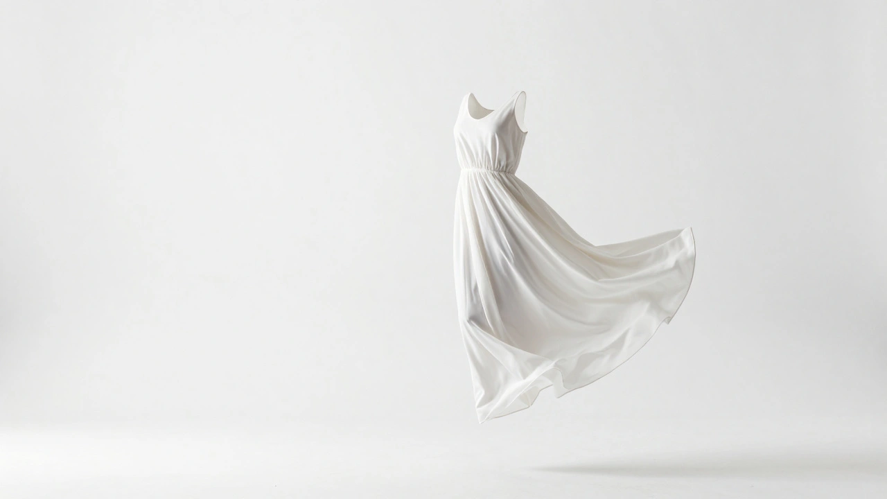
- Fashion: A dress on a white background with 30% empty space around it? That’s not empty-it’s showing shape, drape, and movement. Negative space here highlights the silhouette. No distractions. No models. Just the garment, in its purest form.
- Beauty & Skincare: A serum bottle on a matte black surface. No bottles in the background. No droppers. No towels. Just the product and a single soft shadow. That tells customers: This is pure. This is refined. This isn’t mixed with chemicals or clutter.
- Home Decor: A ceramic vase with 40% negative space around it doesn’t just show the object-it shows how it fits in a room. People imagine it on their mantel, their bookshelf. The emptiness becomes a blank canvas for their own space.
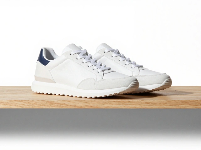
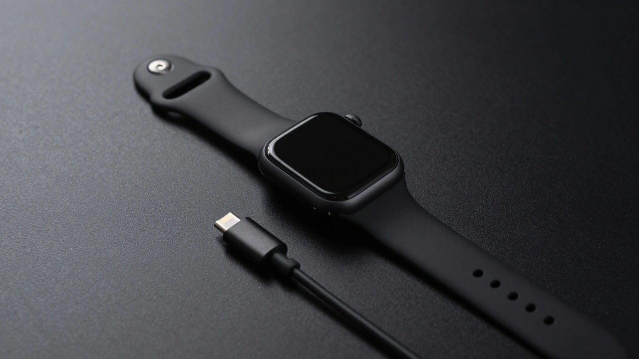
- Tech & Gadgets: A smartwatch on a gray surface with a single charging cable slightly off to the side? Perfect. The negative space separates the device from its accessory. No confusion. No visual overload. Just clarity.
Each category uses negative space differently, but the goal is the same: make the product the hero. Nothing else.
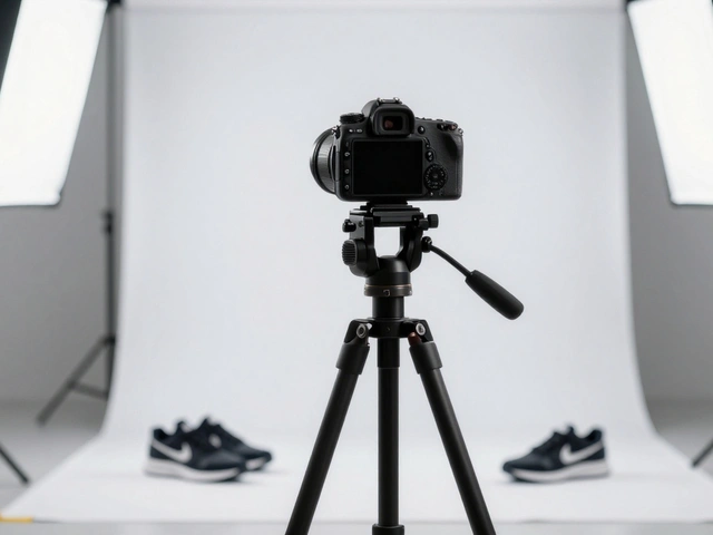
How to Shoot It Right
You can’t just take a photo and crop out the background. That’s not negative space-that’s a mistake. Real negative space is intentional. Here’s how to build it.
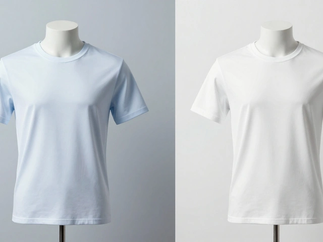
- Use a uniform background. White, black, or soft gray. No textures. No patterns. No gradients unless you’re a high-end brand like Apple. Consistency matters more than creativity when you’re managing 50+ SKUs.
- Follow the rule of thirds. Don’t center your product. Place it slightly left or right. That leaves more space on one side-creating balance, not symmetry. It feels more dynamic. More editorial.
- Control your lighting. Use soft, diffused light from one side. This creates gentle shadows that define shape without adding clutter. Hard light? It creates harsh edges and competing shadows. Avoid it.
- Use props sparingly. One prop max. A single book beside a notebook. One plant near a lamp. If it doesn’t add context, remove it. If it competes for attention, remove it.
- Shoot with shallow depth of field. Blur the background slightly. It turns clutter into soft, undefined space. It’s not empty-it’s intentionally out of focus. That’s negative space with a purpose.
What Not to Do
Even experienced photographers mess this up. Here are the three biggest mistakes:
- Too much space. If your product is the size of a postage stamp in a sea of white, it looks cheap. Like you didn’t know what to do. There’s a sweet spot. For most products, 20-40% negative space is ideal.
- Inconsistent backgrounds. One product on white, the next on gray, the third on a wood table? Your catalog looks like a garage sale. Stick to one or two tones across your entire line.
- Bad contrast. A dark product on a dark background? You’ve erased the figure-ground separation. The product disappears. Always ensure enough contrast. Dark item? Use light background. Light item? Use dark or neutral.
Amazon’s rule? The product must fill 85% of the frame. That’s not arbitrary. It’s a guideline for clarity. Too much empty space? You lose detail. Too little? You lose focus. Find the balance.
Post-Production: Creating Space After the Shot
You didn’t shoot it perfectly? No problem. You can build negative space in editing.
Tools like Photoshop or Affinity Photo let you expand your canvas. Extend the background. Fill it with a solid color. Then, gently adjust the product’s position. You can even blur a busy background to turn it into soft negative space. This is how big brands clean up thousands of product images without reshooting.
Pro tip: Always shoot slightly wider than you think you need. That gives you room to crop later. If you’re tight, you can’t add space-you can only cut into the product.
Real Brands Doing It Right
Look at Apple. Their product photos aren’t flashy. They’re quiet. A MacBook on a white surface. A single AirPod in the center. No text. No logos. No context. Just the product-and enough space around it to feel luxurious.
Nike does the same. A running shoe on a black background. One shadow. One reflection. The shoe isn’t just shown-it’s celebrated. The emptiness makes you feel the weight, the texture, the design.
These aren’t lucky shots. They’re calculated. Every pixel has a reason. That’s the power of negative space. It’s not decoration. It’s strategy.
Final Rule: Less Is More
In 2026, e-commerce isn’t about showing everything. It’s about showing the right thing. The right way.
Stop filling every corner. Stop adding props just because you think they’re "helpful." Your product doesn’t need an audience. It needs focus.
When you remove the noise, you give your customer a moment of clarity. And in a world of endless scrolling, that moment is worth more than any discount or slogan.
How much negative space should I leave around my product?
Aim for 20-40% empty space around your product. For small items like jewelry or electronics, 30-40% works best. For larger items like furniture or appliances, 20-25% is enough. Always check how it looks on mobile-your product should still be clearly visible at thumbnail size.
Can I use color for negative space, not just white or black?
Yes-but only if it matches your brand. Bold colors like deep navy or muted sage can work if they’re consistent across your catalog. Avoid patterns or gradients. The space should feel calm, not busy. If in doubt, stick with white, black, or neutral gray. They’re safe, clean, and universally compatible with e-commerce platforms.
Do I need to shoot every product the same way?
Yes, for consistency. If you shoot one shirt on white and another on a wood table, your catalog looks unprofessional. Pick one background tone and stick with it across your entire collection. Use standardized lighting, camera height, and framing. This helps shoppers compare products easily and builds brand trust.
Is negative space only for high-end brands?
No. In fact, budget brands benefit the most. When your competitors use cluttered shots with multiple products and props, your clean image stands out immediately. Clean composition doesn’t mean expensive-it means intentional. Even a $10 product looks more valuable when it’s framed with care.
Can I use negative space in product videos?
Absolutely. Keep the background simple. Let the product move slowly into frame. Avoid quick cuts or background motion. A 5-second video of a watch rotating on a black background with soft lighting is more effective than a 15-second video with music, text, and flashing lights. Less motion in the background = more focus on the product.