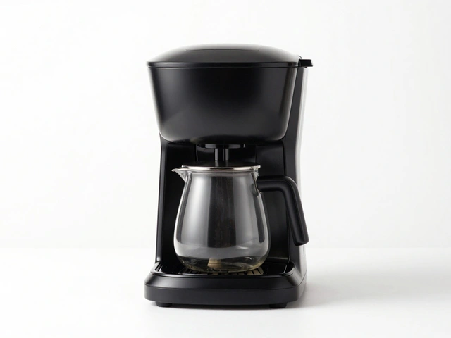
Getting white balance right is the difference between a photo that looks like a snapshot and one that looks like a professional asset. It is the process of removing unrealistic color casts so that objects appear as they do under natural light. While our brains automatically adjust to the yellow glow of a lamp or the blue tint of a cloudy day, your camera sensor doesn't have that intuition. You have to tell it what "true white" looks like so it can calculate every other color in the frame accurately.
The Science of Color Temperature
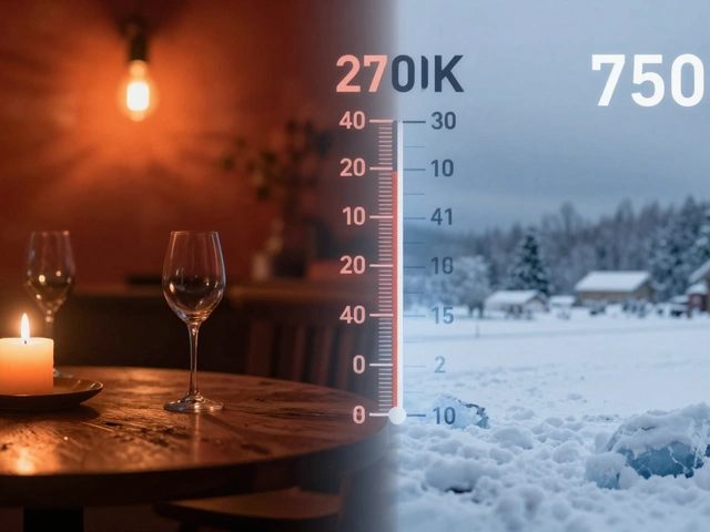
To master color, you first need to understand the Kelvin scale is a unit of measurement for the color temperature of light, ranging from warm (yellow/orange) to cool (blue) . This scale is the foundation of how cameras interpret light. If you set your camera to the wrong Kelvin value, you'll end up with a "color cast"-a pervasive tint that makes your product look unnatural.
Most standard light sources fall into a few predictable buckets. Natural daylight is generally the neutral baseline, sitting around 5500K. If you're shooting under tungsten bulbs (common incandescent lights), the temperature drops to about 3200K, creating a warm, golden hue. On the other end, an overcast sky or a shaded area pushes the temperature higher, resulting in a cool, bluish cast. The goal of white balance is to counteract these shifts. For instance, if your light is too yellow, the camera adds blue to neutralize it.
Choosing the Right Camera Settings
Depending on how much control you want, you have a few different ways to handle white balance. For some, the built-in shortcuts are enough; for others, manual precision is the only way to go.
- Auto White Balance (AWB): The camera guesses the color temperature. It's great for street photography, but dangerous for products. AWB can shift between shots, meaning your product looks different in every photo of the same set.
- Presets: These are fixed settings like "Daylight," "Cloudy," or "Tungsten." They work well if your lighting is consistent and matches the preset exactly, but they are often just approximations.
- Custom White Balance: This is the gold standard for studio work. You provide the camera with a reference of a neutral object (like a grey card), and the camera calculates the exact offset needed for that specific light source.
| Setting | Best For | Pros | Cons |
|---|---|---|---|
| AWB | Quick snapshots | Fast, zero effort | Inconsistent color shifts |
| Presets | Standard lighting | Faster than manual | Not perfectly accurate |
| Custom | Professional products | Highest accuracy | Requires extra gear/time |
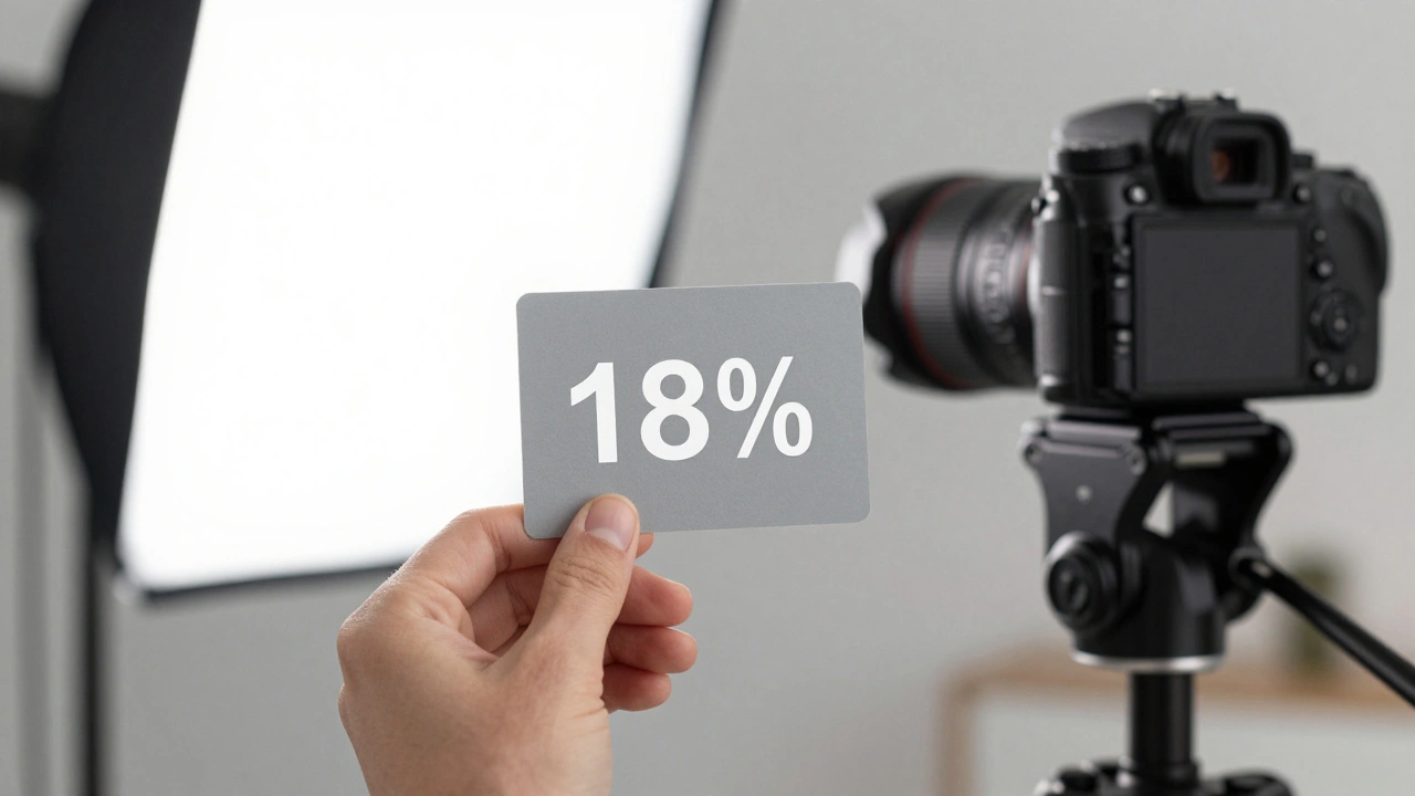
Using a Grey Card for Perfect Neutrality
If you want colors that are 100% true to life, you need a Grey Card is a photographic tool used to set a neutral reference point for exposure and white balance by reflecting all colors of light evenly . You might wonder why you wouldn't just use a piece of white paper. The problem is that pure white is easy to overexpose (blow out), which tricks the camera into thinking the scene is brighter than it is. An 18% grey card provides a mid-tone reference that is much more stable.
Here is the professional workflow for using one:
- Place the grey card directly in front of your product, ensuring it is hit by the exact same light sources as the product.
- Take a photo where the card fills most of the frame.
- Go into your camera's "Custom White Balance" menu.
- Select that reference photo as the baseline.
- Remove the card and shoot your product. Your camera now knows exactly how to neutralize the specific lighting in your room.
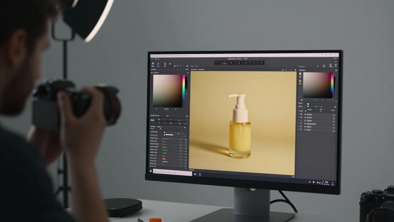
The RAW Advantage in Post-Processing
Even the best photographers make mistakes during the shoot. This is why shooting in RAW format is a file format that captures all uncompressed data from the image sensor, allowing for non-destructive editing of white balance and exposure absolutely essential. When you shoot in JPEG, the camera "bakes in" the white balance. If the photo comes out too yellow, trying to fix it in editing often leads to weird color artifacts and loss of quality.
RAW files treat white balance as a metadata tag rather than a permanent change to the pixels. Using software like Adobe Lightroom is a professional photo editing software used for color grading and batch processing RAW images , you can change the white balance temperature and tint after the fact without degrading the image. If you have a series of 20 photos, you can fix one image and then "synchronize" those settings across the entire set, ensuring that every product in your catalog has a consistent look.
Controlling the Environment to Prevent Color Casts
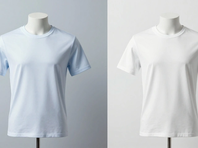
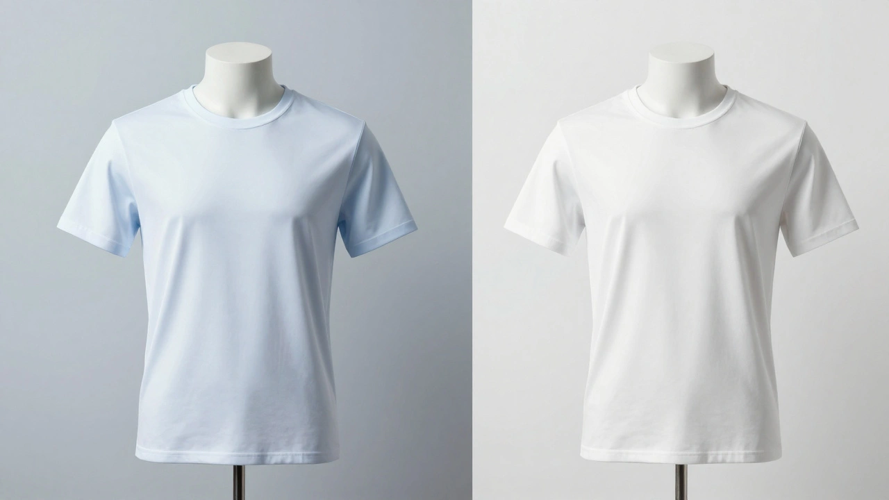
White balance settings can't fix everything. If your environment is poorly managed, you'll deal with "color bleed." This happens when light bounces off a colored surface and lands on your product. If you place a white product on a bright red table, the shadows will inevitably turn pinkish, regardless of your Kelvin settings.
To avoid this, use neutral backdrops. A clean white or soft grey background doesn't compete with the product's colors and prevents unwanted hues from reflecting onto your subject. Think of your studio as a clean slate. The more neutral your surroundings, the easier it is for your white balance settings to do their job. Controlling your light is the first step to controlling your color.
Common Pitfalls and How to Avoid Them
One of the biggest mistakes is relying on Auto White Balance when using mixed lighting. If you have a window with blue daylight on one side and a warm desk lamp on the other, AWB will get confused. It will either make the whole image too blue or too yellow, and you'll end up with a photo that looks "muddy." The only real solution here is to stick to one light source or use a custom white balance for the dominant light.
Another error is neglecting the histogram. While the screen on your camera is helpful, it can lie to you depending on its own brightness settings. Checking the histogram ensures you aren't clipping your highlights, which can distort how colors are rendered in the brightest areas of your product.
Does the brand of camera affect color accuracy?
Yes, different sensors and internal processing engines interpret color differently. However, this is exactly why using a grey card and shooting in RAW is critical. It removes the camera's "opinion' on color and gives you the raw data to set a true neutral baseline regardless of the brand.
Can I use a white piece of paper instead of a grey card?
You can, but it's risky. Pure white is very easy to overexpose. If the white paper "blows out" (becomes pure white with no detail), the camera can't accurately calculate the color temperature. A grey card is specifically designed to avoid this by reflecting a neutral 18% of light.
What is the best Kelvin setting for daylight?
Generally, 5500K is the standard for direct sunlight. However, this changes based on the time of day. Early morning or late evening light is warmer, while overcast days are cooler. This is why using a custom setting is always better than a fixed number.
Why do my colors look different on my phone vs. my monitor?
This is due to display calibration. Every screen has a different color profile. To ensure your product colors are truly accurate, you should use a calibrated monitor and export your photos using the sRGB color space, which is the standard for web browsers and mobile devices.
Is shooting in RAW really necessary for every product?
If color accuracy is a priority for your brand, then yes. JPEG compression throws away a massive amount of color data. If you realize after a shoot that your white balance was slightly off, RAW allows you to fix it perfectly; JPEG only allows you to "approximate" a fix, which often degrades the image quality.
Final Steps for Consistent Results
If you're just starting out, try a simple test. Take a photo of your product using AWB, then try a preset, and finally use a grey card. Compare the three. You'll likely notice that the custom setting makes the product look more like what you see with your own eyes. To keep your workflow efficient, always take a reference shot with your grey card at the beginning of every session, even if the lighting feels the same as yesterday. Small shifts in sunlight or a flickering bulb can change your colors enough to make a professional shoot look amateur.