We’ve been trained to fear the dark. For years, camera manufacturers and early digital tutorials told us that a "good" photo is one where every corner is lit, every shadow filled with detail, and nothing left to the imagination. But here’s the truth: shadows are not mistakes waiting to be fixed. They are powerful tools that define shape, create mood, and guide the viewer’s eye exactly where you want it.
When you stop fighting darkness and start using it, your images transform. You move from documenting a scene to interpreting it. This shift-from technical perfection to artistic intent-is what separates snapshotting from true photography. Let’s look at how to harness the power of dark areas to make your subjects pop.
The Psychology of Darkness
Why do we instinctively brighten our photos? It comes down to human nature. We equate light with safety and information. In a well-lit room, we see everything. In the dark, we feel uncertainty. Photography taps into this same psychological trigger. When you leave parts of an image in deep shadow, you force the viewer’s brain to work harder. The mind fills in the gaps, creating engagement and mystery.
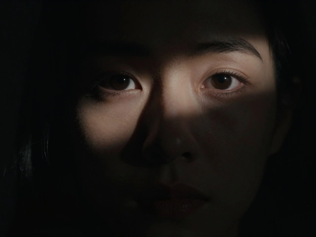
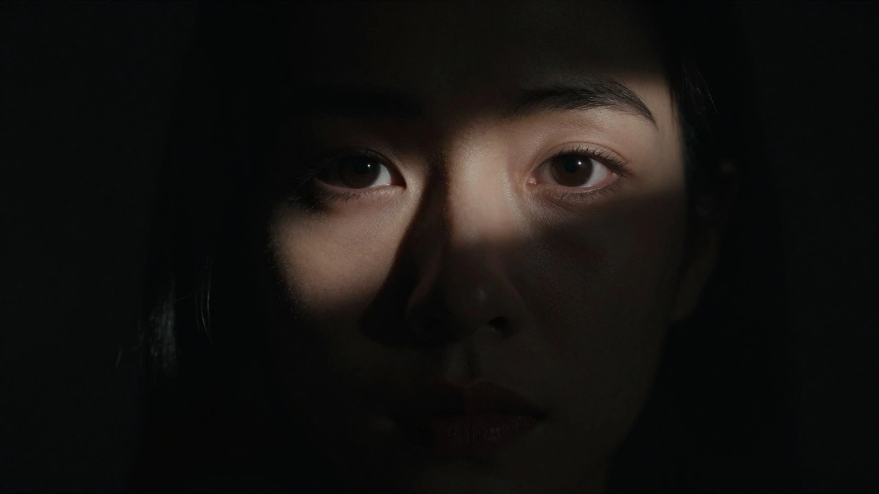
Consider a portrait taken in broad daylight versus one taken in low-key lighting. The former shows every pore, every wrinkle, and every distraction in the background. The latter isolates the subject’s eyes or expression against a void. As photographer David duChemin noted, the most powerful element in photography is often what you choose not to show. By removing visual clutter through shadows, you amplify the emotional weight of what remains visible.
This isn’t just about making things look "moody." It’s about control. Shadows act as negative space, but unlike white space, they carry weight. They anchor the composition. A subject emerging from darkness feels more significant than one floating in uniform brightness. You are literally shaping the narrative by deciding what stays hidden.
Understanding Tonal Contrast
To use shadows effectively, you need to understand tonal contrast. This refers to the difference between the brightest highlights and the darkest shadows in your image. High-contrast images have a wide gap between these extremes-bright whites and deep blacks-with fewer mid-tones. Low-contrast images sit mostly in the middle grays.
High contrast creates drama. It makes textures stand out and edges sharper. Think of black-and-white street photography or dramatic landscape shots where the sun cuts sharply across a cliff face. Low contrast feels softer, dreamier, and less urgent. It works for ethereal portraits or foggy mornings, but it rarely demands immediate attention.
There are three types of contrast to consider:
- Tonal Contrast: The difference in brightness levels (light vs. dark).
- Color Contrast: Using complementary colors (like blue and orange) to create separation.
- Conceptual Contrast: Juxtaposing opposing ideas, such as old vs. new or rough vs. smooth.
While color and conceptual contrast are valuable, tonal contrast is the foundation. If your image lacks dynamic range between light and dark, no amount of color correction will save it. Mastering tonal contrast means learning to expose for the highlights while letting the shadows fall away naturally.
The Technical Reality: Dynamic Range Limits
Here is where many photographers get stuck. They want the dynamic range of their eyes, but they’re limited by their camera’s sensor. Human vision can handle roughly 20 stops of dynamic range-we can see details in both bright sunlight and deep shade simultaneously. Camera sensors, even high-end ones like the Sony A7R V, typically capture between 14 and 15 stops. Smartphone sensors often manage only 8 to 10 stops.
This limitation is actually your friend. Because you cannot capture everything, you must choose. Do you preserve the detail in the clouds, or do you let the foreground go dark? In high-contrast photography, the answer is usually the former. You expose for the highlights to prevent them from blowing out (becoming pure white with no detail), and you accept that the shadows will become pure black.
This is why shooting in Raw format is non-negotiable for this style. JPEGs compress data aggressively, losing shadow information permanently if underexposed. Raw files retain 4 to 6 additional stops of recoverable shadow detail compared to JPEGs. This doesn’t mean you should always recover them, but it gives you the flexibility to decide later whether a shadow should remain pitch black or reveal some texture.
Exposure Strategy: Protect the Highlights
The single most important technical rule in high-contrast photography is: expose for the highlights. This sounds counterintuitive if you’re used to center-weighted metering, which tries to make the average brightness neutral gray. Instead, you need to underexpose slightly to ensure your brightest areas retain detail.
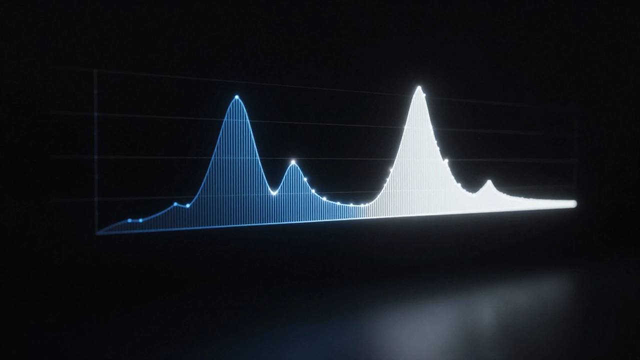
Use your camera’s histogram as your guide. The histogram is a graph showing the distribution of tones in your image. The right side represents highlights; the left side represents shadows. When exposing for highlights, you want the data on the right side to touch the edge but not clip over it. If the graph hits the right wall, you’ve lost highlight detail. If there’s a huge gap on the right, you’re likely underexposing too much and introducing noise.
Many modern cameras offer a "blinkies" or highlight alert feature. Turn it on. When you take a photo, any area that is blown out will flash red on the LCD screen. Adjust your exposure compensation until those red flashes disappear. Yes, the image will look dark on the camera’s preview screen. That’s fine. You’re capturing the data correctly; you’ll adjust the overall brightness in post-processing if needed.
Composition: Letting Shadows Breathe
Technique is useless without composition. You can’t just darken an image in post-processing and call it high-contrast art. You need to compose with shadows in mind from the moment you raise the camera.
Aim for shadows to occupy between 30% and 70% of your frame. If shadows cover less than 30%, they might just look like underexposed patches. If they cover more than 70%, the image may lack enough subject matter to hold interest. The sweet spot is where the shadow acts as a framing device or a background that pushes the subject forward.
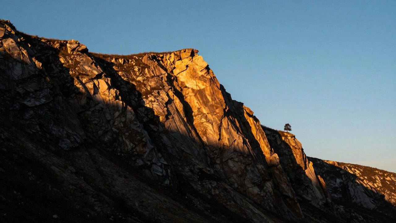
Look for directional light. Flat, overhead light (like noon sun) minimizes shadows and reduces contrast. The best light for defining shape comes at angles of 30 to 45 degrees. This creates long, defined shadows that sculpt the subject. In portraiture, this is often called Rembrandt lighting or split lighting. In landscapes, it’s the golden hour when the sun is low on the horizon.
Try placing a darker subject against a lighter background. This reverses the typical expectation and creates immediate visual separation. A silhouette against a bright sky is the classic example, but it works indoors too-a dark chair against a sunlit window, for instance. The contrast between the two tones forces the eye to focus on the boundary line, emphasizing the shape of the subject.
Post-Processing: Enhancing Without Cheating
Editing is where you refine your intent. The goal is not to "fix" the shadows, but to deepen them intentionally. In software like Adobe Lightroom Classic, you have precise controls.
Start with the Shadows slider. Moving it to the left (-100) darkens the shadow areas. Be careful not to crush the blacks entirely unless you want pure black. Then, use the Blacks slider to set the absolute deepest tone in the image. This ensures your darkest points have weight.
The Clarity slider is your secret weapon for texture. It increases local contrast in the mid-tones, making rocks look rockier and skin look more textured. However, use it sparingly on portraits, as it can emphasize imperfections. For landscapes and architectural shots, a slight increase in clarity (+10 to +20) can make the interplay of light and shadow feel more three-dimensional.
If you convert to black and white, remember that color translates to different shades of gray. Blue skies often become dark gray, while yellow flowers become light gray. Black and white conversion inherently increases perceived contrast by about 25-30% because it removes the distraction of color. This allows the tonal relationships to speak louder.
Common Pitfalls to Avoid
Even experienced photographers stumble when working with high contrast. Here are the most common traps:
- Fighting the Shadow: Trying to lift every shadow to see what’s inside. This kills the mood. Ask yourself: "Does this shadow add mystery or structure?" If yes, leave it alone.
- Noise Creep: Underexposing too much brings up digital noise in the shadows. While some grain adds character, excessive colored noise looks amateurish. Stick to ISO settings your camera handles well.
- Losing the Subject: If the entire image is dark, the viewer doesn’t know where to look. Ensure there is a clear focal point with sufficient light or contrast to draw the eye.
- Over-Processing: Cranking the contrast slider to +100 often results in unnatural, posterized images. Subtle adjustments yield better results. Aim for a natural-looking depth rather than a graphic design effect.
Practical Exercises to Build Skill
Mastery comes from repetition. Try these three exercises to train your eye:
- The Silhouette Hunt: Go outside during sunset. Find subjects with distinct shapes (trees, people, buildings). Expose for the sky, turning the subjects into black cutouts. Focus on the beauty of the outline.
- The Single Light Source: Indoors, turn off all lights except one lamp or window. Place your subject near the light. Observe how the shadows stretch and define the form. Move the light around to change the mood.
- The Histogram Challenge: Take ten photos of the same scene. Adjust your exposure compensation from -2 to +2. Review the histograms. Identify which exposure preserves the most highlight detail while maintaining a strong shadow presence.
Expect a learning curve. Most beginners struggle for 2 to 3 weeks before they overcome the urge to brighten everything. During this time, trust your histogram more than your eyes. Your eyes adapt to darkness quickly; your camera does not lie.
Should I always shoot in Raw for high-contrast photography?
Yes, shooting in Raw is highly recommended. Raw files contain significantly more data than JPEGs, allowing you to recover shadow details if needed or deepen blacks without introducing artifacts. This flexibility is crucial when balancing extreme highlights and shadows.
How do I know if my shadows are too dark?
If the shadows obscure the main subject or create confusion about what is in the frame, they may be too dark. Use the histogram to check for clipping on the left side. Pure black is acceptable for artistic effect, but ensure the subject remains distinguishable.
Can I achieve high contrast with a smartphone?
Yes, but it requires more deliberate composition. Smartphone sensors have limited dynamic range (8-10 stops), so you must rely heavily on strong directional light and compositional separation. Tap to focus on the brightest part of the scene and drag down the exposure slider manually.
What is the difference between tonal and color contrast?
Tonal contrast is the difference between light and dark values. Color contrast involves using opposing colors on the color wheel, such as blue and orange. Tonal contrast is generally more impactful for creating drama and defining shape, while color contrast adds vibrancy and energy.
Is the Zone System still relevant for digital photographers?
The principles of the Zone System, developed by Ansel Adams, remain highly relevant. While you don't need to memorize the zones, understanding that luminance falls into distinct steps helps you predict how exposure changes will affect highlights and shadows. Modern histograms serve the same purpose as zone visualization.