Have you ever taken a photo of a shiny bottle or a metallic gadget and felt defeated by the lighting? You expose for the bright reflections, and suddenly the label is a dark, muddy void. You expose for the label text, and the glass turns into a blown-out white blob with zero detail. This is the classic dynamic range problem in product compositing is a technique that combines multiple exposures to preserve detail in both highlights and shadows. It’s not just about fixing mistakes; it’s about creating an image that looks better than what your camera sensor could capture in a single click.
In professional product photography, perfection isn’t optional. Clients want crisp text on labels, deep blacks in shadows, and sparkling, defined highlights on glossy surfaces. Achieving all three in one shot is often physically impossible due to the limited dynamic range of even high-end cameras. The solution lies in capturing separate exposures for different parts of the scene and blending them together seamlessly. This process, known as exposure blending or multi-exposure compositing, allows you to reconstruct the full tonal range of a product, from the deepest shadows to the brightest specular highlights.
Why Single Exposures Fail in Product Photography
Let’s talk about why your camera struggles here. Every digital sensor has a limit to how much light information it can record simultaneously. This limit is called dynamic range. When you point a lens at a reflective product-like a perfume bottle, a soda can, or a smartphone-the contrast between the ambient light hitting the matte label and the direct flash bouncing off the glass is often too extreme.
If you meter for the highlights (the shiny parts), the shadows (the label) become underexposed. Noise creeps in, colors lose saturation, and fine details disappear into blackness. If you meter for the shadows, the highlights clip. "Clipping" means the data is gone. The pixels are pure white (255, 255, 255). No amount of editing software can bring back detail that was never recorded. You get a flat, overexposed mess where the shape of the product should be.
This is where the concept of High Dynamic Range (HDR) imaging comes in, but with a twist. Traditional HDR often results in an unnatural, "glowing" look that feels fake. In product photography, we don’t want a ghostly glow. We want realism. We want the product to look tangible, premium, and true to life. That’s why we use targeted compositing rather than automated HDR merging. We manually select the best parts of each exposure to build a final image that retains natural contrast while recovering lost details.
The Core Workflow: Capturing the Right Exposures
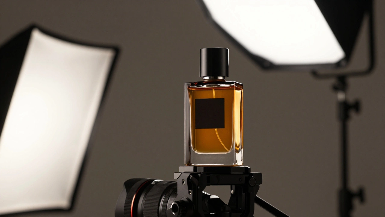
Before you even open Photoshop or Lightroom, you need to shoot correctly. Compositing fails if the source images aren’t aligned or if the lighting changes between shots. Here is the practical approach to capturing the necessary layers:
- The Highlight Exposure: Underexpose the image significantly (by 1 to 2 stops) to protect the brightest reflections. This ensures that the glossy curves on a bottle or the edge of a metal lid retain texture and gradient instead of turning into solid white blobs.
- The Shadow/Label Exposure: Overexpose slightly (or use additional fill lighting) to lift the dark areas. This brings out the color vibrancy and legibility of text on labels, which are often matte and absorb light.
- The Midtone Exposure: Take a standard, well-balanced shot. This serves as your base layer, providing accurate color representation for the majority of the product surface.
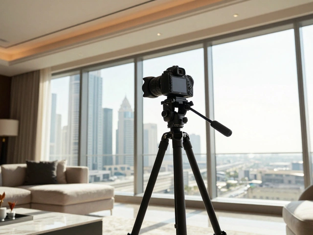
Critical rule: Keep the camera locked down on a sturdy tripod. Any movement between shots will make alignment a nightmare. Use a remote shutter release to avoid camera shake. Also, ensure your lighting setup remains identical. If you move a reflector between the shadow shot and the highlight shot, the direction of the shadows will change, making the composite look disjointed and unrealistic.
Blending Techniques: Beyond Simple Masking
Once you have your files, the real work begins. Many beginners think compositing is just placing one layer over another and painting away the bad parts. While masking is involved, successful blending requires understanding how light interacts with surfaces.
Start by aligning the layers precisely. Most editing software has an auto-align feature, but manual adjustment using the Move tool at 100% zoom is often safer for products with repetitive patterns. Once aligned, you’ll typically keep the midtone exposure as the bottom layer. Add the highlight exposure above it. Your goal is to reveal the clean highlights from the top layer while keeping the rich colors from the bottom layer.
Use layer masks to hide the blown-out areas of the lower layer and reveal the detailed highlights from the upper layer. But don’t stop there. Simply cutting and pasting bright spots creates hard edges that look artificial. You need to blend the transition zones. Use soft brushes with low opacity to feather the mask edges. Pay special attention to the "midtones"-the areas between pure black and pure white. If the midtones don’t match in brightness and color temperature across layers, the composite will look patchy.
For more advanced blending, utilize blend modes. The "Screen" mode can help lighten dark areas without blowing them out, while "Multiply" can deepen shadows. However, for product work, "Normal" mode with careful masking is usually the most controlled method. It gives you pixel-perfect control over exactly which part of which exposure is visible.
Handling Glossy Surfaces and Reflections
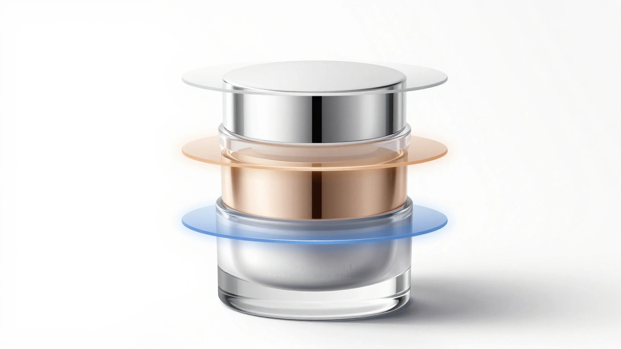
Glossy products pose the biggest challenge. A wine bottle or a cosmetic jar reflects its environment. If you expose for the reflection, you might lose the liquid inside. If you expose for the liquid, the reflection disappears.
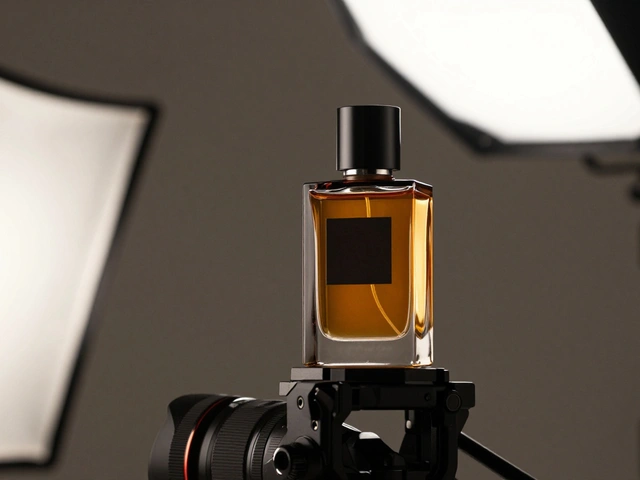
The pro trick here is to shoot the reflections separately. Set up a specific light source-a strip box or a softbox-to create a beautiful, elongated highlight on the curve of the bottle. Capture this with an exposure that makes the highlight pop but doesn’t clip. Then, take another shot with neutral lighting to capture the body of the product and the label.
In post-production, you composite these two elements. You might even take it further by adding a third exposure specifically for the cap or rim, which often catches harsh light. By isolating these high-contrast elements, you can adjust their intensity independently. Want the highlight brighter? Boost it only on that layer. Want the label clearer? Adjust the exposure on the label layer without affecting the shine. This independent control is the holy grail of commercial photography.
Lighting Consistency: The Secret to Believability
A composite can fail instantly if the lighting doesn’t tell a consistent story. Human eyes are incredibly good at detecting when light sources don’t match. If the shadow on the left side of the bottle points south in one layer and west in another, the brain rejects the image as fake.
To maintain consistency, document your lighting setup. Note the position, angle, and color temperature of every light. When you bring the images into your editor, check the white balance. Even if you shot in RAW, slight variations can occur. Use adjustment layers like Curves or Color Balance to harmonize the color temperature across all layers. Ensure that the warmth or coolness of the light matches everywhere.
Also, consider the quality of light. Is it hard and directional, or soft and diffused? The shadows cast by the product must match the hardness of the highlights. If you’re compositing a sharp, bright highlight onto a layer with soft, fuzzy shadows, it will look wrong. You may need to soften the highlight or sharpen the shadows to create cohesion.
Advanced Tips for Label and Text Clarity
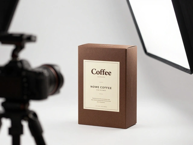
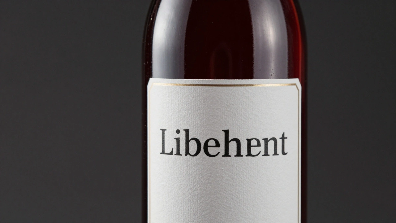
Labels are often the most critical part of a product shot, especially for e-commerce. Customers need to read ingredients, brand names, and warnings. Blurry or underexposed text leads to cart abandonment.
If your primary exposure leaves the label dark, don’t just brighten it globally. Brightening the whole image will wash out the colors and blow out the highlights elsewhere. Instead, isolate the label area using a selection tool. Create a new layer, paste the overexposed label shot into it, and mask it carefully around the edges of the label.
Be meticulous with the edges. Labels often wrap around curved surfaces. A simple rectangular selection won’t work. Use the Pen Tool for precise paths or the Select Subject feature followed by manual refinement. Once the clean label is composited, you might notice a slight mismatch in brightness at the boundaries. Use a soft brush on the layer mask to blend the edges smoothly. This technique, often called "label salvaging," ensures that every word is crisp and readable while maintaining the overall aesthetic of the product.
Common Pitfalls to Avoid
Even experienced photographers make mistakes in compositing. Here are the most common traps:
- Over-processing: Trying to fix everything in post. If your composite looks like it took 20 hours to edit, you’ve probably gone too far. Aim for a natural look. Subtle enhancements are more convincing than dramatic fixes.
- Halo Effects: These appear as bright or dark fringes around objects when blending layers. They happen when you mask incorrectly or use heavy smoothing. Zoom in to 100% and check edges. Use "Select and Mask" tools to refine hair-like details or complex borders.
- Ignoring Perspective: If you’re compositing elements from different angles, the perspective must match. A bottle viewed from slightly above cannot be combined with a label shot taken straight on. Always shoot from the same vantage point.
- Color Mismatch: Different exposures can shift color casts. Shadows often lean blue, while highlights lean yellow. Neutralize these shifts using White Balance adjustments before blending.
Tools of the Trade
You don’t need the most expensive software to achieve great results, but having the right tools helps. Adobe Photoshop remains the industry standard for pixel-level compositing due to its robust layer management and masking capabilities. Lightroom Classic can handle basic exposure blending using the Photo Merge > HDR feature, but it lacks the precision for complex product edits.
For alignment, tools like Auto-Align Layers in Photoshop save time. For selections, the Pen Tool offers the highest accuracy for hard edges like bottles and boxes. The Quick Selection Brush and Object Selection Tool are faster for organic shapes but require cleanup. Always work non-destructively. Use adjustment layers and smart objects so you can tweak decisions later without degrading image quality.
What is the difference between HDR and product compositing?
HDR (High Dynamic Range) automatically merges multiple exposures to maximize detail, often resulting in an unnatural, glowing look. Product compositing is a manual, selective process where you choose specific parts of different exposures (like highlights or labels) to blend together, aiming for a realistic, premium appearance suitable for commercial use.
Do I need a tripod for exposure blending?
Yes, absolutely. Any camera movement between shots makes alignment difficult and can cause ghosting artifacts. A sturdy tripod ensures that the product stays in the exact same position, allowing for seamless blending of layers in post-production.
How do I fix blown-out highlights on a glossy product?
Shoot an additional exposure that is underexposed by 1-2 stops to capture detail in the highlights. In editing, mask this darker layer over the blown-out areas of your main image. Blend the edges softly to maintain a natural transition between the bright reflection and the rest of the product.
Can I composite images taken at different times?
It’s possible but risky. Lighting conditions, including direction, intensity, and color temperature, must be identical. If you change lights or move the product, the shadows and reflections will not match, making the composite look fake. It’s best to shoot all exposures in one session with a fixed setup.
What is "label salvaging" in product photography?
Label salvaging is the technique of extracting a clear, well-exposed version of a product’s label from a separate exposure and compositing it onto the main image. This ensures that text is legible and colors are vibrant, even if the main exposure prioritized other elements like highlights or background.