Ever notice how someone looks stunning in a coral dress in Miami but the same dress looks off in Oslo? It’s not about the dress-it’s about how color interacts with light, climate, and culture. Fashion color theory isn’t just about what looks pretty on a mannequin. It’s about making your clothes work with where you live, work, and move through the world.
Colors Don’t Stay the Same
The same shade of blue can look icy in northern Europe and warm in Southeast Asia. Why? Light changes everything. In places with long winters and low sun angles-like Helsinki or Montreal-natural light is softer, grayer, and more diffused. Cool tones like navy, charcoal, and icy lavender pop here because they reflect what’s already around you. But in places like Sydney or Los Angeles, where sunlight is harsh and direct, those same cool tones can look flat. Here, you need warmer neutrals: camel, olive, or even soft peach to catch the light and keep your skin from looking washed out.Think about it: if you’re wearing a bright red blouse in Tokyo on a rainy April day, it’ll look muddy under gray skies. But in Rome under spring sunshine, that same red sings. Color isn’t static. It’s responsive. Your wardrobe should be too.
The Three-Color Rule, Location Edition
Most style guides tell you to stick to three colors per outfit. That’s solid advice-but it doesn’t account for environment. In cities with strong seasonal fashion identities, like Paris or Seoul, people often use color differently. Parisians might wear a navy coat, white shirt, and black boots-three colors, all muted, because the city’s architecture and street lighting favor subtlety. In contrast, in Lagos or São Paulo, where color is part of cultural expression, you’ll see outfits with five or more colors, but they’re carefully balanced. The key isn’t the number of colors-it’s whether they resonate with the place.Here’s how to adapt the three-color rule to location:
- Neutral base (60%): Choose based on local light. In sunny climates, go for warm neutrals-beige, cream, stone. In overcast zones, lean into cool neutrals-charcoal, slate, navy.
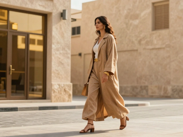
- Secondary color (30%): Pick a tone that complements your surroundings. In coastal towns, blues and greens echo the sea and sky. In desert cities like Phoenix or Dubai, terracotta, sand, and rust feel natural.
- Accent color (10%): Use this to reflect local energy. In Tokyo, a single pop of electric yellow or deep magenta stands out. In Barcelona, a burnt orange or cobalt blue adds local flair.
Climate Dictates Color Temperature
Warm colors-reds, oranges, yellows-feel energizing. Cool colors-blues, greens, purples-feel calming. But your body reacts differently depending on where you are.In hot, humid climates like Bangkok or Jakarta, wearing too many warm tones can feel overwhelming. The heat amplifies their intensity. Instead, opt for cool-toned fabrics: linen in pale blue, cotton in seafoam green. These colors don’t just look fresh-they help you feel cooler.
Conversely, in cold climates like Reykjavik or Winnipeg, cool tones can make you look drained. The lack of natural light means your skin already lacks warmth. Here, a touch of warm brown, rust, or even a muted coral near your face can make all the difference. It’s not about matching the snow-it’s about countering the gray.
Cultural Color Meanings Matter
Color doesn’t just affect how you look-it affects how you’re perceived. In Japan, white is associated with purity and often worn for weddings. In parts of India, white is worn for mourning. Wearing white in a wedding context in India might be fine, but in a funeral setting, it could send the wrong message.Even in Western cities, color norms vary. In New York, black is a default-it’s sleek, powerful, and works everywhere. In Los Angeles, black can feel too heavy. People here lean into white linen, light denim, and soft pastels. Why? Because the lifestyle is more relaxed, the light is brighter, and the culture values ease over formality.
When you travel, don’t just pack clothes. Pack color intentions. If you’re going to Milan for fashion week, bring structured pieces in rich jewel tones-emerald, burgundy, sapphire. If you’re heading to Bali, pack flowy silhouettes in earthy dyes-indigo, turmeric, ochre. The same outfit can look out of place in one city and perfectly at home in another.
Use Your Environment as a Palette
The best way to harmonize your wardrobe with location is to look around. What colors do you see everywhere?In Portland, Oregon? You’ll notice moss green, burnt orange, and deep brown in the trees, sidewalks, and coffee shops. A wardrobe built around those tones feels native. In Dubai? Gold, white, and sand dominate. A camel coat with gold accessories doesn’t just look expensive-it looks like it belongs.
Try this: next time you walk through your city, take a photo of five things you see. A brick wall, a parked car, a café awning, a tree, a street sign. Those are your natural color palette. Now, compare them to what’s in your closet. If your clothes don’t echo at least two of those colors, you’re fighting your environment.
Prints, Textures, and Local Patterns
Solid colors are easy. But what about patterns? A floral dress might look romantic in Paris but chaotic in a minimalist Tokyo office. The trick is to match the pattern’s color story to your location.When you’re shopping for prints, ask: Do the colors in this pattern match the colors I see outside? A print with navy, cream, and sage green works in coastal towns. A print with red, gold, and emerald fits urban centers with rich architectural detail, like Prague or Istanbul.
Texture helps too. In dry, dusty places like Arizona or Marrakech, matte fabrics like linen and cotton absorb light naturally. In rainy cities like London or Seattle, shiny textures-satin, metallics, glossy leather-catch what little light there is and add depth. A matte black coat in Seattle looks dull. A satin black coat? It glows.

Build a Location-Adaptive Capsule
You don’t need two wardrobes. You need one smart one.Start with three neutral bases that work in most climates: navy, beige, and charcoal. These are your anchors. Then, build your color story around two seasonal accent colors that reflect your location. For example:
- Coastal city (San Diego, Barcelona): Accent with seafoam green and coral.
- Mountain town (Denver, Innsbruck): Accent with forest green and rust.
- Metropolitan hub (Tokyo, Berlin): Accent with deep plum and metallic silver.
Now, every top, dress, or jacket you buy should work with at least two of these five colors. That means your navy coat pairs with your coral scarf. Your charcoal pants work with your seafoam top. You’re not matching-you’re layering context.
Test Colors Like a Pro
Hold a garment up to your face. Not in a store. Not under fluorescent lights. Do it in natural light, right where you live. Does it brighten your skin? Make your eyes pop? Or does it drain you?Here’s a quick test: wear a white shirt and a black shirt in your backyard or by a window. Which one makes your skin look more alive? That’s your temperature. If white wins, you’re cool-toned. If black wins, you’re warm-toned. This isn’t magic-it’s science. Your skin reflects light differently based on undertones, and your wardrobe should reflect that.
Save a photo of your best-looking outfit from last season. Now compare it to your current wardrobe. What colors are missing? What’s still working? That’s your personal location palette.
Final Thought: Color Is Context
Fashion color theory isn’t about rules. It’s about awareness. The best-dressed people aren’t following trends-they’re reading their environment. They know that a color that looks bold in one place can look boring in another. They know that a neutral in one city is an accent in another.Your wardrobe doesn’t need more clothes. It needs more intention. Start by asking: What colors does this place wear? Then, make sure yours speak the same language.
How do I find my location’s natural color palette?
Take a walk outside and photograph five things you see-like a brick wall, a parked car, a café awning, a tree, or a street sign. Those colors are your local palette. Now check your closet. If your clothes don’t echo at least two of them, you’re not harmonizing with your environment.
Can I wear warm colors in a cold climate?
Yes-but strategically. In cold, overcast places, warm colors like rust, camel, or terracotta near your face can counteract the gray and make your skin look healthier. Avoid large blocks of warm tones; use them as accents. A warm scarf or blouse over a cool base works better than a full warm outfit.
Why does my outfit look different in another city?
Light, humidity, and cultural norms change how color behaves. Harsh sunlight can bleach cool tones, while soft light makes warm tones look muddy. Also, local fashion culture influences what’s considered stylish. What looks bold in Tokyo might look out of place in Oslo.
Should I buy clothes based on where I live or where I travel?
Build your core wardrobe around where you live most of the time. Then, add one or two travel-specific pieces that reflect your destination’s color language. A coral blazer for Miami? A charcoal trench for London? Those are investments-not distractions.
Is denim a universal neutral?
Yes, but not all denim is equal. Dark indigo works almost everywhere. Light or bleached denim works best in sunny, casual climates. In formal or overcast cities, stick to dark washes. Denim’s strength is its ability to bridge warm and cool tones, making it the most flexible neutral you own.