Imagine scrolling through an online store where every product looks like it belongs to the same brand, even if they are completely different items. One shoe sits perfectly centered with crisp lighting; the next jacket matches that exact brightness and angle. This isn’t magic-it’s batch consistency, a systematic approach to maintaining visual uniformity across large volumes of product images. For e-commerce businesses, this consistency builds trust. When customers see predictable visuals, they feel more confident in their purchase decisions. Without it, your catalog looks messy, unprofessional, and hard to navigate.
Achieving this level of uniformity requires more than just good taste. It demands a rigorous workflow covering camera settings, lighting control, angle standardization, and post-processing protocols. Let’s break down how you can match angles and color with precision, ensuring your product photos look cohesive whether viewed on a desktop or a mobile screen.
The Technical Foundation: Locking Down Camera Settings
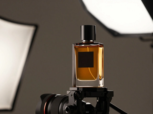
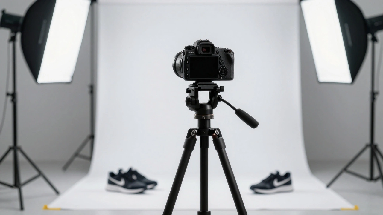
Consistency starts before you even press the shutter button. If your camera settings change from one shot to the next, no amount of editing will fully fix the discrepancies. Professional photographers rely on manual control to eliminate variables.
First, switch your camera to Manual (M) mode or Aperture Priority (A/Av) mode with exposure compensation locked. Auto-exposure is the enemy of batch consistency because it adjusts brightness based on the subject’s reflectivity. A white box might trigger underexposure, while a black bag causes overexposure. By locking these settings, you ensure that every product receives the same amount of light data.
ISO sensitivity is another critical factor. Always shoot at your camera’s lowest native ISO, typically ISO 100. Higher ISO values introduce noise and reduce dynamic range, which becomes visible as grain in fabric textures or smooth gradients on packaging. Instead of raising ISO to brighten a scene, add more light or slow down the shutter speed. Since products don’t move, there’s no risk of motion blur.
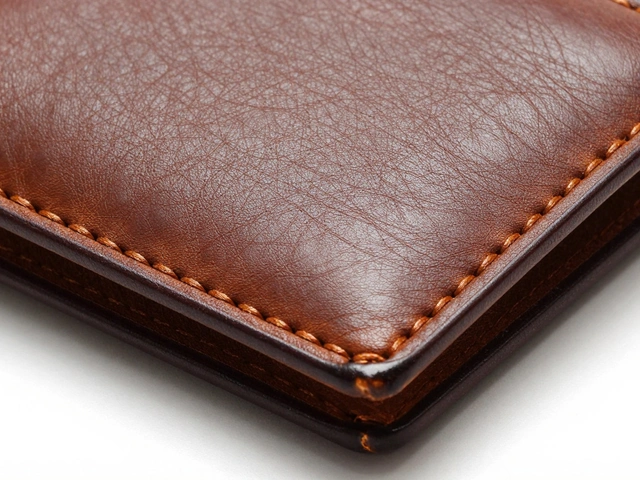
File format matters too. Shoot in RAW format rather than compressed JPEG. RAW files retain all sensor data, giving you extensive latitude for white balance adjustment and highlight recovery during batch processing. In-camera sharpening and contrast should be kept modest to prevent edge halos that misrepresent texture details.
Standardizing Angles for Visual Coherence
Angle choice dictates how a product is perceived. Changing angles randomly creates a disjointed shopping experience. You need to decide on default angles upfront and stick to them religiously. There are three primary angles that serve most product categories effectively.
- Straight-On Angle: Position the camera directly in front of the product at identical height and plane. This view eliminates distortion and provides an unobstructed look. It works best for upright packaging, layered food items like cakes, and small accessories where apparent size magnification is beneficial.
- 45-Degree Angle: Often described as universally flattering, this elevated position captures the side profile, height, depth, and surrounding context simultaneously. It’s versatile enough for lifestyle shots, electronics, and general product photography.
- Top-Down Flat Lay: Position the camera directly overhead. This angle is ideal for kits, bundles, flat objects, and small parts. However, be cautious with cylindrical packaging, as lighting reflections can become problematic from this perspective.
To maintain repeatability, use a tripod. Mark the floor or table with tape to indicate exactly where the camera feet go. Note the distance between the lens and the product. If you’re shooting a series of shoes, mark the spot for the heel and the toe. This physical reference ensures that when you swap out one product for another, the framing remains identical.
Color Science and Lighting Control
Lighting is the greatest technical challenge in batch photography, yet it has the most significant impact on final image quality. Inconsistent lighting leads to color shifts that confuse customers about what they are buying. Is the shirt red or orange? The answer depends on the light source.
Start with equipment calibration. Use a monitor calibrated to standards like DCI-P3 or sRGB to ensure you’re seeing accurate colors. Next, establish a custom white balance in-camera using a color reference chart or an 18% grey card. Place this chart in the same lighting environment as your product. Taking a photo of the chart allows you to set a precise white balance profile that neutralizes any color cast from your lights.
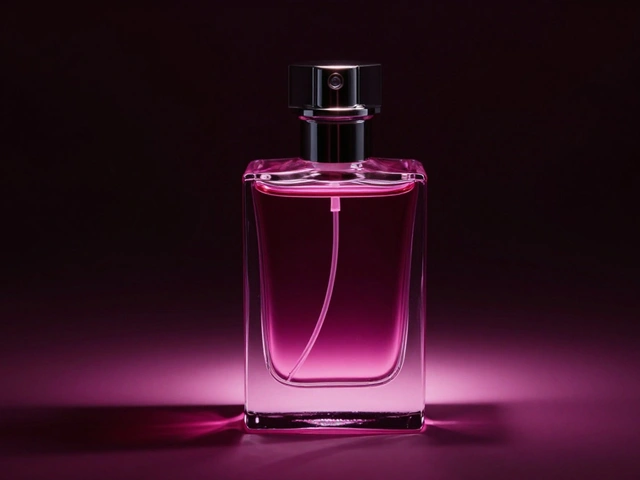
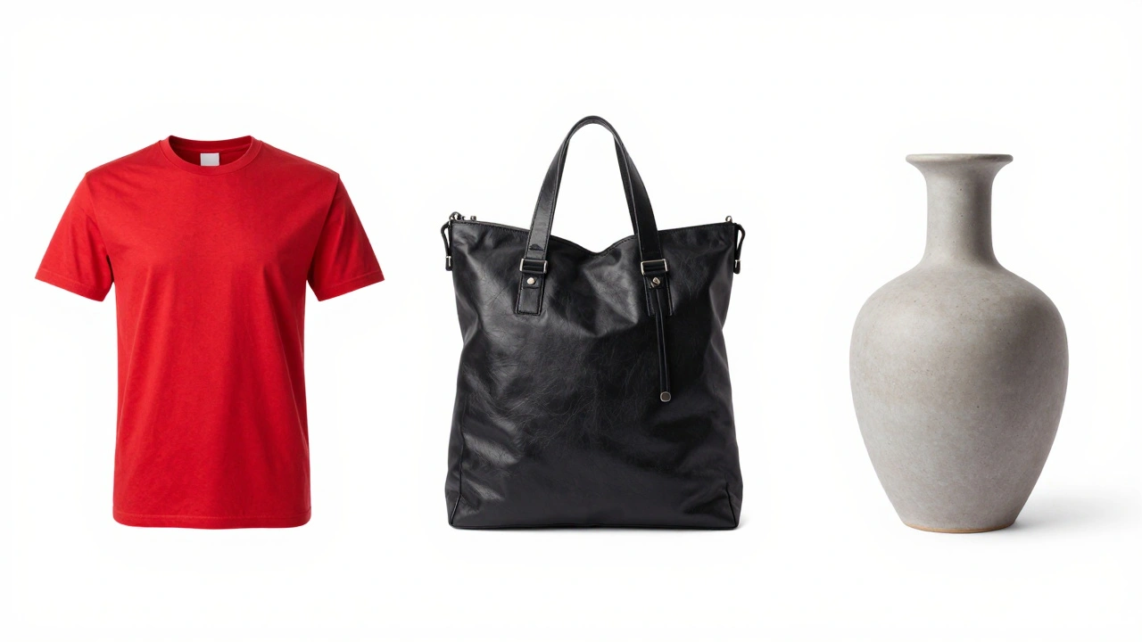
Background selection also plays a role in color consistency. White is the industry standard for e-commerce platforms like Amazon, which mandates pure white backgrounds (#FFFFFF) to keep focus on the product. Black backgrounds work well for premium items, creating a sense of luxury. Light grey (#5F5F5F) is a practical alternative when pure white appears too harsh or blows out highlights. Whichever background you choose, apply it uniformly across the entire batch.
Document your lighting setup meticulously. Create diagrams noting the position, power level, and modifiers (softboxes, reflectors, diffusers) for each light. This documentation allows you to replicate the exact conditions months later when new products arrive late in the season.
Negative Space and Composition Rules
Negative space-the blank area surrounding the product-must be standardized per category. A/B testing can help determine the optimal margin. Does the product occupy 80% or 85% of the frame? Once you decide, apply that rule to every item in that category. Shoes, dresses, and jewelry may require different negative space standards due to their shapes and sizes.
Composition principles emphasize symmetry and alignment. Small misalignments register as sloppy to viewers, even subconsciously. Symmetry conveys quality and control. If your brand aesthetic favors asymmetry, apply it deliberately and repeatedly so it appears intentional rather than accidental. Use props and backgrounds that support the product without distracting from it. Highly saturated props can steal focus, so manage their intensity carefully.

Efficient Batch Editing Workflows
Post-processing is where consistency is finalized. Manual editing of hundreds of images is inefficient and prone to human error. Instead, leverage batch processing tools in software like Adobe Lightroom Classic or Capture One.
The workflow involves selecting a "hero image"-the best shot in the batch-and editing it to perfection. Adjust exposure, contrast, white balance, and tone until it meets your quality standards. Then, use the Sync or Auto Sync feature to apply these settings to the entire batch. This achieves approximately 90% consistency instantly.
Create reusable presets for specific product categories or lighting conditions. Applying a preset on import jumps you 90% of the way toward final consistency. However, automation isn’t perfect. You must manually scan for outliers-images with reflective packaging, mixed lighting, or unique anomalies. These require targeted local adjustments to match the rest of the batch.
| Feature | Adobe Lightroom Classic | Capture One |
|---|---|---|
| Sync Capability | High (Auto-Sync available) | High (Session-based syncing) |
| Color Grading Precision | Good | Excellent (Professional favorite) |
| Preset Reusability | Cloud-synced presets | Local and shared profiles |
| Tethering Support | Basic | Advanced (Industry standard) |
Documentation and File Management
Organizing your files correctly supports future consistency. Standardize file naming conventions, dimensions, and metadata from the start. A consistent naming structure allows you to quickly identify images belonging to specific categories or lighting setups. Store setup metadata alongside images in digital asset management systems. This enables you to retrieve exact specifications years later, ensuring that new additions to your catalog match existing imagery perfectly.
Why is ISO 100 recommended for product photography?
ISO 100 is the camera's lowest native sensitivity, providing the cleanest image with minimal noise. Higher ISOs introduce grain and reduce dynamic range, which compromises detail in textures and gradients. Keeping ISO low ensures maximum color fidelity and sharpness.
How do I ensure consistent lighting across multiple shooting sessions?
Document your lighting setup thoroughly. Record the position, power levels, and modifiers for each light source. Use a tripod and mark camera positions. Take reference photos of a color chart to lock in white balance settings. This documentation allows you to replicate conditions exactly in future sessions.
What is the best angle for most products?
The 45-degree angle is often considered universally flattering as it shows depth, height, and context. However, straight-on angles are better for packaging and flat items, while top-down views work well for kits and flat lays. Choose one style per category and maintain it consistently.
Can I edit product photos automatically without checking each one?
No. While batch processing applies settings to 90% of images successfully, outliers with reflective surfaces or unique lighting issues require manual adjustment. Always review batches after syncing to catch anomalies that automated tools miss.
Why is RAW format preferred over JPEG for batch consistency?
RAW files contain uncompressed sensor data, allowing for extensive adjustments to white balance, exposure, and highlights without degrading image quality. JPEGs are compressed and lose data, limiting your ability to correct color mismatches during post-processing.