When you’re scrolling through an online store, what makes one product image feel real-and the other feel like a cheap cutout? It’s not the lighting, not the background, and definitely not the product itself. It’s the shadow.
Most people don’t think about shadows when they shop online. But if a shoe looks like it’s floating above the white background, or a chair seems to hover without touching the floor, your brain doesn’t trust it. That’s not just a design choice. That’s a conversion killer.
Studies show that products with realistic shadows can boost engagement by up to 30%. That’s not a guess. It’s from real data collected across e-commerce platforms. The difference between a flat, floating product and one that looks grounded is the difference between a customer clicking "Add to Cart" and closing the tab forever.
Why Shadows Matter More Than You Think
Online shopping is built on trust. You can’t touch it. You can’t turn it around. You can’t see how it sits on your desk or fits on your foot. All you have is a photo. And if that photo looks fake, you assume the product is fake.
Shadows are the invisible glue that holds that image together. They tell your brain: "This thing exists in space. It has weight. It’s on a surface. It’s real."
Without shadows, products look like they were pasted in from a stock photo library. Even if the product is high-end, the image makes it feel cheap. Customers don’t consciously think, "This shadow is wrong." But they feel it. And that feeling makes them leave.
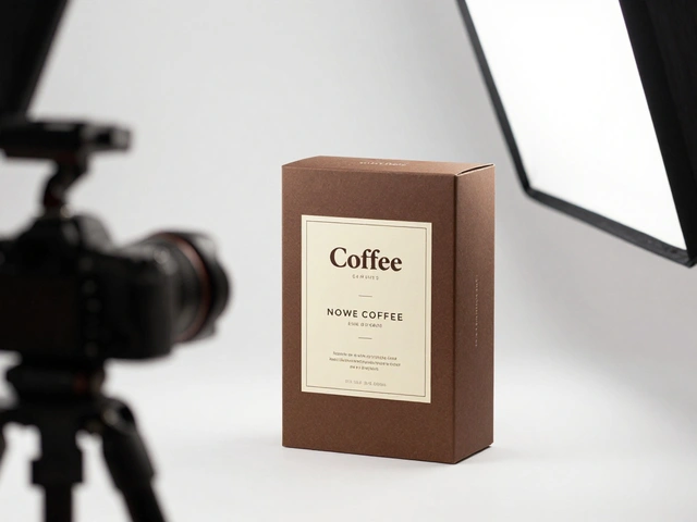
Realistic Drop Shadows: The Grounded Look
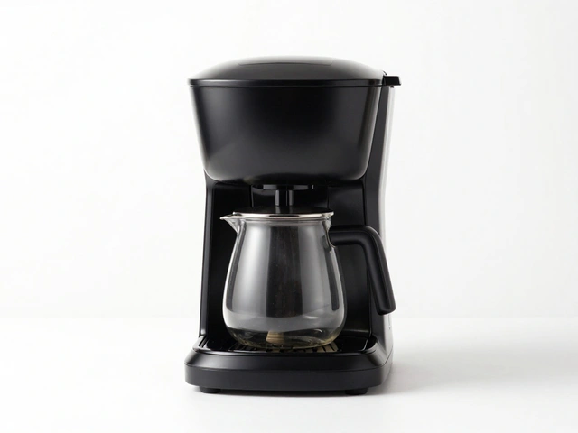
Drop shadows are the most common, most effective shadow type for e-commerce. They’re simple: a soft, dark shape beneath the product, mimicking how light from above casts a shadow on a surface.
Think of a pair of sneakers on a wooden shelf in a store. The shadow underneath isn’t black. It’s gray. It’s slightly blurred. It’s longer on one side if the light comes from the left. It doesn’t extend too far-just enough to feel natural.
For furniture, electronics, kitchenware, and footwear, drop shadows are non-negotiable. They replicate the retail environment. When a customer sees a couch with a realistic shadow, they instantly imagine it in their living room. That mental image is what closes the sale.
Here’s how to get it right:
- Never use pure black. Start with dark gray (50-70% opacity).
- Blur the edges. A sharp shadow looks painted on. A soft edge looks natural.
- Match the shadow length and angle to your product’s lighting. If the product is lit from the top-left, the shadow should fall bottom-right.
- Keep shadows consistent across your entire catalog. If one product has a long shadow and another has a short one, the whole store looks sloppy.
Realistic drop shadows don’t scream "I’m edited." They whisper, "I belong here."
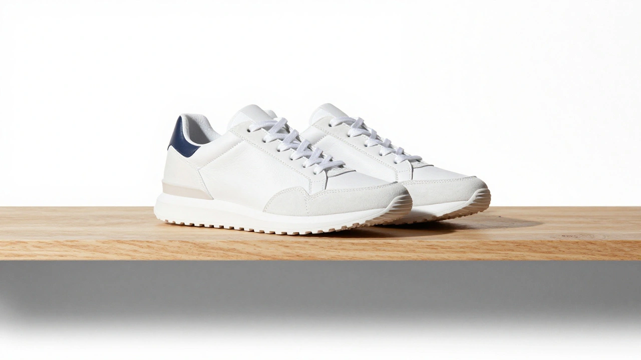
Floating Shadows: The Creative Escape
Floating shadows are the opposite. They make products look like they’re hovering in midair. No surface. No ground. Just the product, suspended.
This isn’t a mistake. It’s a style.
You see this in ads for sneakers, fitness gear, or tech gadgets. The shoe floats above a gradient background. The wireless earbuds hang in space. It’s energetic. It’s modern. It says, "This isn’t just a product-it’s a lifestyle."
Floating shadows work best for:
- Footwear (especially athletic brands)
- Wearable tech (smartwatches, headphones)
- Products with strong branding or motion-based marketing
But here’s the catch: floating shadows only work if they’re intentional. If you use them because you don’t know how to make a drop shadow, customers notice. They sense the laziness. The fake vibe.
A floating shadow should feel like a design choice-not a workaround. Use soft gradients, subtle glows, or motion blur to reinforce the sense of movement. Don’t just remove the shadow and call it a day.

Natural Shadows: The Silent Winner
Here’s a secret: the best shadows aren’t added in Photoshop. They’re captured in the studio.
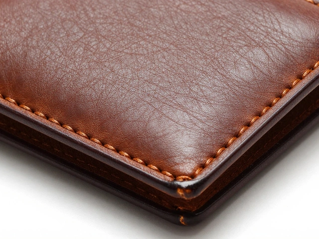
Natural shadows happen when you shoot with a single light source-like a window or a softbox-and let the shadow form naturally. No editing. No layers. Just light, object, and surface.
This method is perfect for textured products: woven baskets, ceramic mugs, leather wallets. The shadow wraps around curves and follows contours. It shows depth without looking artificial.
For jewelry or watches, natural shadows can fall off to the side, not just underneath. That’s how light behaves in real life. A shadow that’s too centered looks staged.
Pro tip: Natural shadows save time. You don’t need to mask, blur, or adjust opacity. You just need to control your lighting. One light. One surface. One shot.
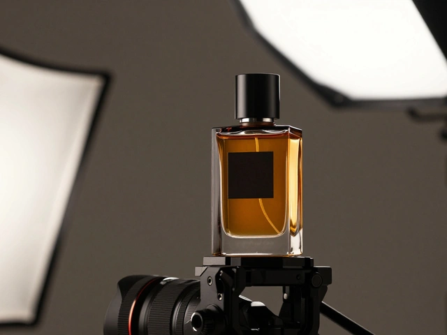
Reflection Shadows: The Luxury Touch
Reflection shadows are what you see in high-end jewelry ads. The watch sits on a glossy black surface, and its reflection stretches beneath it like a mirror image.
This isn’t a shadow. It’s a reflection. And it’s not for every product.
Use reflection shadows for:
- Jewelry
- Sunglasses
- Watches
- High-end electronics
- Luxury packaging
The rules are strict:
- The reflection must be faint-no more than 10-20% opacity.
- It should be slightly blurred and fade out toward the bottom.
- Only reflect parts that would actually touch the surface. A ring’s band reflects, but its stones shouldn’t.
- Use gradient masks to make the reflection disappear naturally, not cut off abruptly.
Get this wrong, and it looks like a Photoshop glitch. Get it right, and it screams "premium."
What Not to Do
Here are the three most common mistakes-and why they cost sales:
- Pure black shadows - They look like cut-and-paste errors. Real shadows have tone. They’re influenced by ambient light. Use dark gray, not black.
- Hard edges - Shadows in nature don’t have razor-sharp lines. Soften them. Blur them. Let them fade.
- Inconsistent direction - If one product’s shadow falls left and another’s falls right, your catalog looks like it was shot in five different studios. Pick one light direction and stick to it.
These aren’t "nice-to-haves." They’re trust-breakers.

How to Choose: Realistic or Floating?
There’s no universal answer. It depends on your product and your brand.
Use realistic shadows (drop or natural) if:
- Your product is functional, not decorative
- You sell in bulk (furniture, kitchen tools, electronics)
- Your customers care about accuracy, not flair
- You want to minimize returns by setting clear expectations
Use floating shadows if:
- You’re selling a lifestyle, not just a product
- Your brand is bold, youthful, or trend-driven
- Your product is meant to be dynamic (running shoes, fitness bands)
- You’re doing ads, not product catalogs
And never use reflection shadows unless you’re selling something expensive. A $20 phone case doesn’t need a mirror underneath it. It just looks silly.
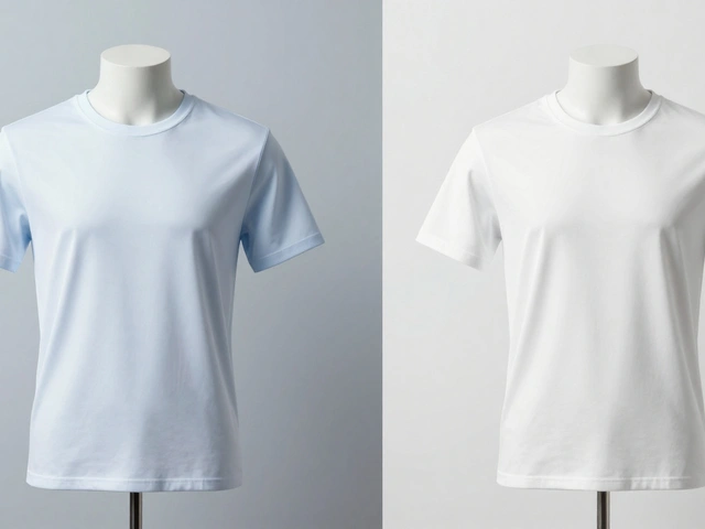
Consistency Is Everything
Imagine walking into a store where every shelf is lit differently. Some products have bright overhead lights. Others are in shadow. The floor is shiny in one aisle, matte in another. You’d feel confused. Uncomfortable.
That’s what inconsistent shadows do online.
If you have 100 products, they all need the same shadow style. Same angle. Same blur. Same opacity. Same background. No exceptions.
Why? Because your customers don’t see one product. They see your entire catalog. If one image looks amateurish, they assume they all are.
Build a shadow template. Save your settings in Photoshop. Use the same lighting setup for every shoot. Train your team. Document the rules. Shadow consistency isn’t a design preference-it’s a brand standard.
The Bottom Line
Shadows aren’t decoration. They’re communication.
A realistic shadow says: "This product is real. It’s been photographed properly. You can trust it."
A floating shadow says: "This product is cool. It’s not just a thing-it’s an idea."
A bad shadow says: "We didn’t care enough to get this right."
In e-commerce, you don’t get a second chance to make a first impression. And shadows? They’re the first thing your customers notice-even if they don’t know why.
Get them right, and you’re not just showing a product. You’re building trust. One shadow at a time.