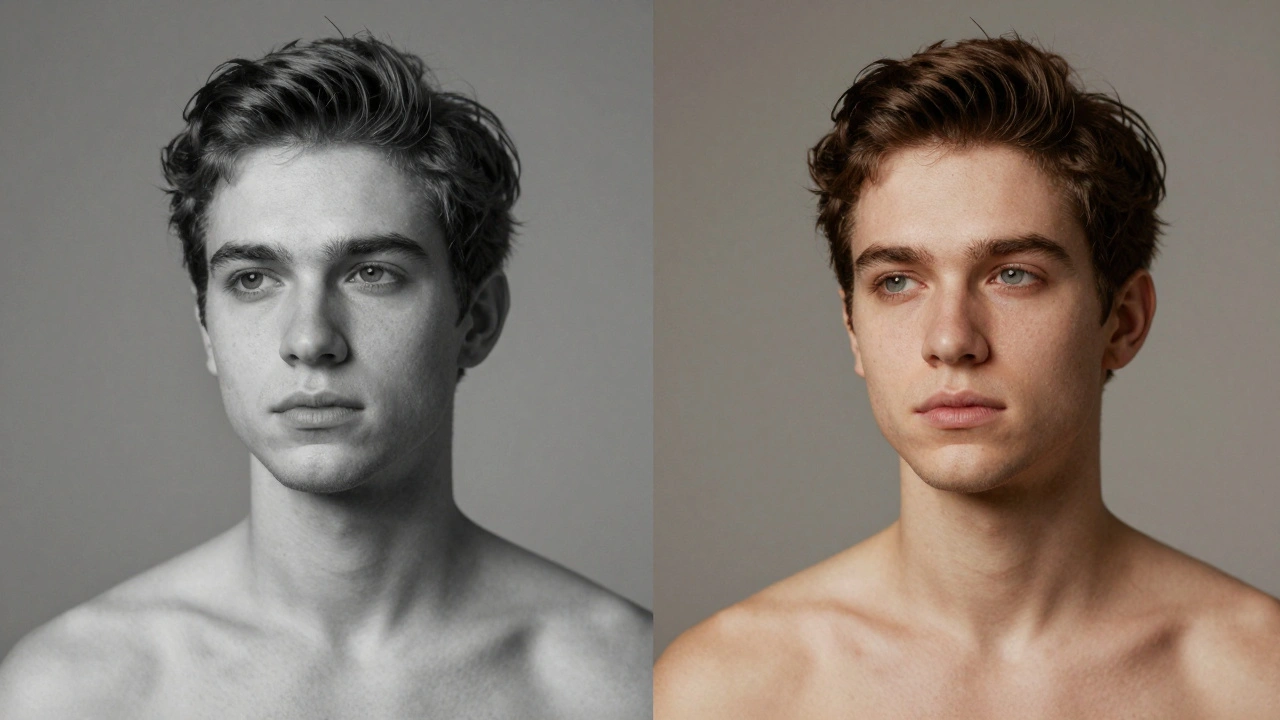
Getting skin tones right in portrait photography isn’t just about making someone look good-it’s about making them look true. Too often, photos of people with darker skin come out with a blueish or gray cast, while lighter skin can turn orange or too yellow. This isn’t a styling choice. It’s a technical failure. And it happens because white balance was ignored, mishandled, or assumed to be "good enough" in auto mode.
Why White Balance Matters More Than You Think
White balance is your camera’s way of figuring out what "white" looks like under different lights. Sunlight? Cool. Incandescent bulb? Warm. Fluorescent? Greenish. Your camera doesn’t know the difference unless you tell it. And when it guesses wrong, skin tones pay the price.Most cameras have an Auto White Balance (AWB) setting. It works fine in daylight, but in mixed lighting-like a room with windows and overhead lamps-it often fails. The result? A person’s complexion looks off. Not because the skin changed, but because the camera misread the light.
Studies show that darker skin tones are far more vulnerable to white balance errors. Why? Because skin isn’t just "dark" or "light." It has undertones-red, yellow, olive, violet-and when the camera adds too much blue, those undertones disappear. A rich brown skin tone can look ashen. A deep olive tone can turn muddy. And once that’s captured, fixing it in post isn’t just hard-it’s often impossible without losing detail.
How to Get It Right at the Source
There are four reliable ways to set white balance correctly, and one of them works every time: custom white balance.- Auto (AWB): Acceptable in even lighting. Don’t rely on it indoors or under mixed light.
- Presets: Use "Cloudy" for soft daylight, "Shade" for cooler shadows, "Tungsten" for incandescent bulbs. Still a guess, but better than auto.
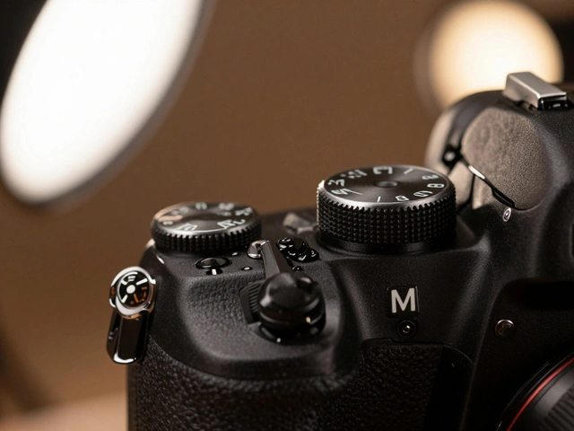
- Kelvin (K) Manual: Set it yourself. Daylight is around 5500K. Overcast? Try 6500K. Candlelight? 2000K. This gives you direct control.
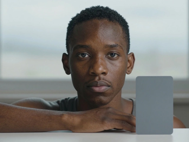
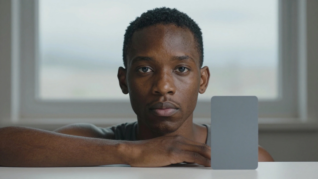
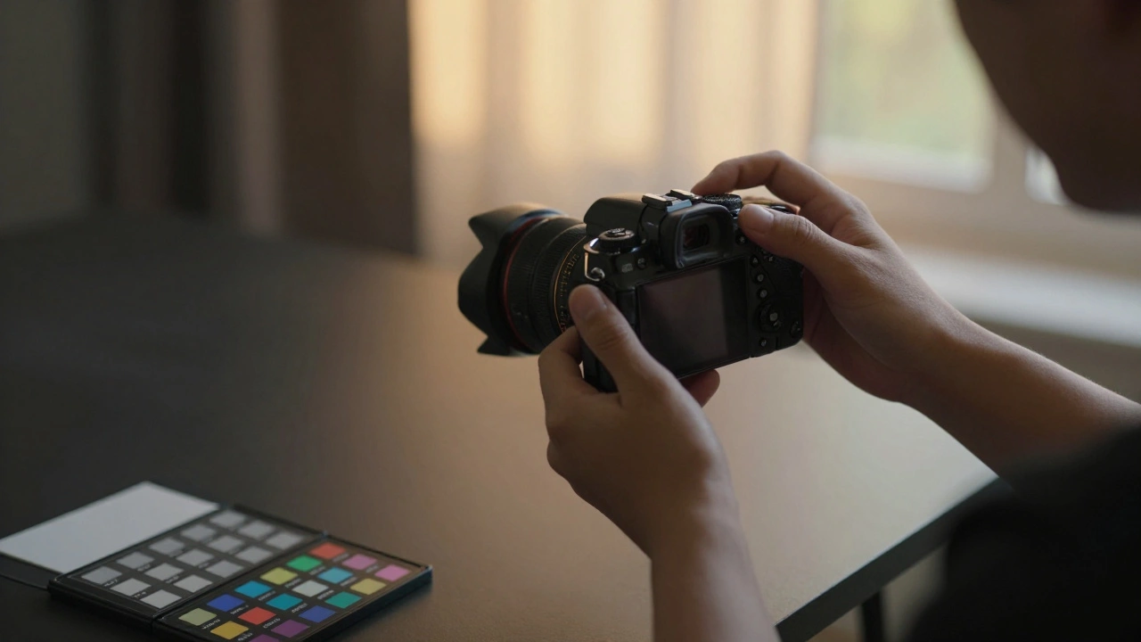
- Custom White Balance: The gold standard. Place an 18% gray card or a ColorChecker passport in the same light as your subject. Take a photo. Then use that image in your camera’s menu to set a custom white balance. Now every shot you take under that light will have accurate color.
Yes, it takes 30 seconds. But that 30 seconds saves you hours of editing later. And it ensures the person you’re photographing looks like themselves-not a washed-out version of themselves.
Lighting Is the Foundation
No amount of white balance correction can fix bad light. Harsh midday sun? It bleaches skin and throws shadows that make texture look rough. A single bare bulb overhead? It creates unflattering contrast.Soft, diffused light is your friend. Shoot near a window on a cloudy day. Use a softbox. Hang a white sheet to bounce light. The golden hour-just after sunrise or before sunset-is ideal. The light is warm, low, and wraps around the face naturally. If you’re shooting indoors, try bouncing flash off a ceiling or wall instead of pointing it directly.
Reflectors help too. A silver one adds punch. A white one softens. A gold one adds warmth-perfect for cooling down a too-blue image before you even press the shutter.
Post-Production: Fixing What You Can
Even with perfect in-camera settings, you’ll still tweak. That’s normal. But here’s the rule: never fix white balance in post if you can avoid it. The best correction is the one you did before the shot.When editing in Lightroom or Capture One:
- Start with the white balance eyedropper. Click on something that should be neutral-a white shirt, a gray card, even the whites of the eyes if they’re clean.
- Adjust the temperature slider. Too blue? Move right toward yellow. Too yellow? Move left toward blue.
- Check the tint. Skin tones often need a tiny push toward magenta (away from green) to look natural.
Then use the HSL panel. Focus on the Orange and Red sliders. Darker skin tones live in the orange range. If skin looks too red, reduce saturation slightly. If it looks dull, lift luminance. Lighter skin? Adjust reds more than oranges. Never touch yellows unless the skin looks unnaturally sallow.
Use the adjustment brush to fine-tune. Maybe one cheek is cooler than the other. Paint a small area, nudge the temperature +2, and blend. This level of control is why RAW files matter. JPEGs don’t give you enough room to breathe.
Camera Brand Differences Matter
Not all cameras render skin the same. Canon tends to lean warm and smooth-great for portraits. Nikon can be slightly cooler. Sony often has more detail but can flatten tones if not calibrated. Fuji’s film simulations? Some are beautiful for skin, others turn people into cartoonish versions of themselves.Shoot in RAW. Test your camera. Take the same subject under the same light with different brands. Look at the skin tones side by side. You’ll see differences. Then choose the profile that matches the look you want-or better yet, create your own custom profile in software.
Tonal Range and Skin Depth
Editing skin isn’t one-size-fits-all. Darker skin tones have less room for error in the shadows and mid-tones. Pull up the shadows too much, and you’ll crush the color. Too much contrast? Skin loses its richness.With darker skin:
- You can lift highlights freely-there’s usually plenty of detail there.
- But be gentle with shadows. A +10 increase might turn a deep brown into gray.
- Keep clarity at 0 or +5. Higher values add harshness.
With lighter skin:
- You can push mid-tones and shadows more aggressively.
- But overexpose even slightly, and skin turns chalky.
- Watch highlights like a hawk.
This isn’t about race. It’s about tonal distribution. Skin reflects light differently based on melanin levels. Your editing should reflect that.
Clarity, Sharpening, and Texture
Don’t sharpen skin. Ever. Sharpening makes pores, lines, and acne look like defects. Instead, sharpen only the eyes and hair. Keep skin soft.Clarity is the sneaky culprit. It adds contrast to mid-tones. On skin? It creates a plastic sheen. Use it at +10 or less. Some editors go with +3. That’s enough to make skin look alive without looking airbrushed.
Exposure matters too. Underexpose? Skin looks muddy. Overexpose? It looks bleached. Aim for the histogram to hug the right side-but never clip. Highlight recovery in RAW can save you, but it’s not magic.
Creative vs. Corrective White Balance
Sometimes, you want a cool, moody portrait. Or a warm, nostalgic one. That’s creative white balance. But here’s the line: know when you’re correcting and when you’re creating.If the subject’s skin looks unnatural, fix it first. Then, if you want to warm the whole image for mood, do it after. Don’t confuse a correction with a style choice. Your subject deserves to look like themselves first. Then you can make them look cinematic.
And if you’re shooting a wedding, family session, or editorial portrait? Accuracy isn’t optional. It’s respect.