Imagine you’ve designed a stunning box for your new coffee blend. The typography is crisp, the colors are rich, and the structural design feels premium in your hands. Now, imagine that same box looks flat, dull, or washed out in the online store listing. That disconnect costs sales. Packaging photography isn’t just about taking a picture of a box; it’s about translating physical texture, color accuracy, and brand promise into pixels that convert viewers into buyers.
Whether you are shooting a single hero image for a website or creating an entire sequence for a subscription box launch, the technical demands are higher than standard catalog work. You need deep focus, precise color matching, and lighting that makes labels pop without blinding glare. Here is how to master boxes, labels, and those crucial unboxing moments.
The Foundation: Depth of Field and Color Accuracy
The first rule of packaging photography is depth. When a customer views a package online, they want to see every detail-from the fine print on the back to the texture of the cardboard. To achieve this, you cannot shoot wide open. You need a small aperture.
- Aperture Settings: Aim for f/18 to f/22. This maximizes depth of field, ensuring the front and back of the box are equally sharp. Be aware that going beyond f/22 can introduce diffraction, which softens the image slightly, so test your specific lens to find its sweet spot.
- ISO Sensitivity: Keep it low. Use ISO 100 or 200. High ISO introduces noise, which ruins the clean look required for high-end packaging graphics.
- Shutter Speed: Because you are using small apertures and low ISOs, you will need a lot of light. If you don’t have massive strobes, slow down your shutter speed. Use a sturdy tripod, mirror lock-up, and a remote shutter release to prevent any camera shake during long exposures.
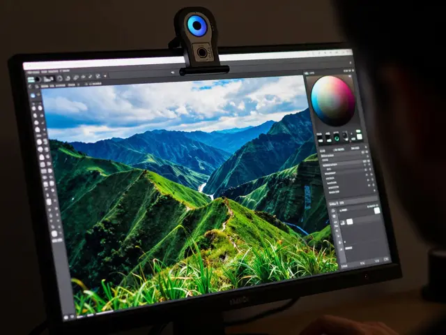
Color accuracy is non-negotiable. If the red on your screen doesn’t match the red on the printed box, customers will feel misled. Calibrate your monitor before starting. In-camera, set your white balance manually rather than relying on auto settings, especially if you are mixing different light sources. Consistency across a whole product line (dozens of SKUs) requires locking these settings down and not changing them between shots.
Lighting Strategies for Boxes and Cartons
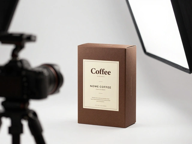
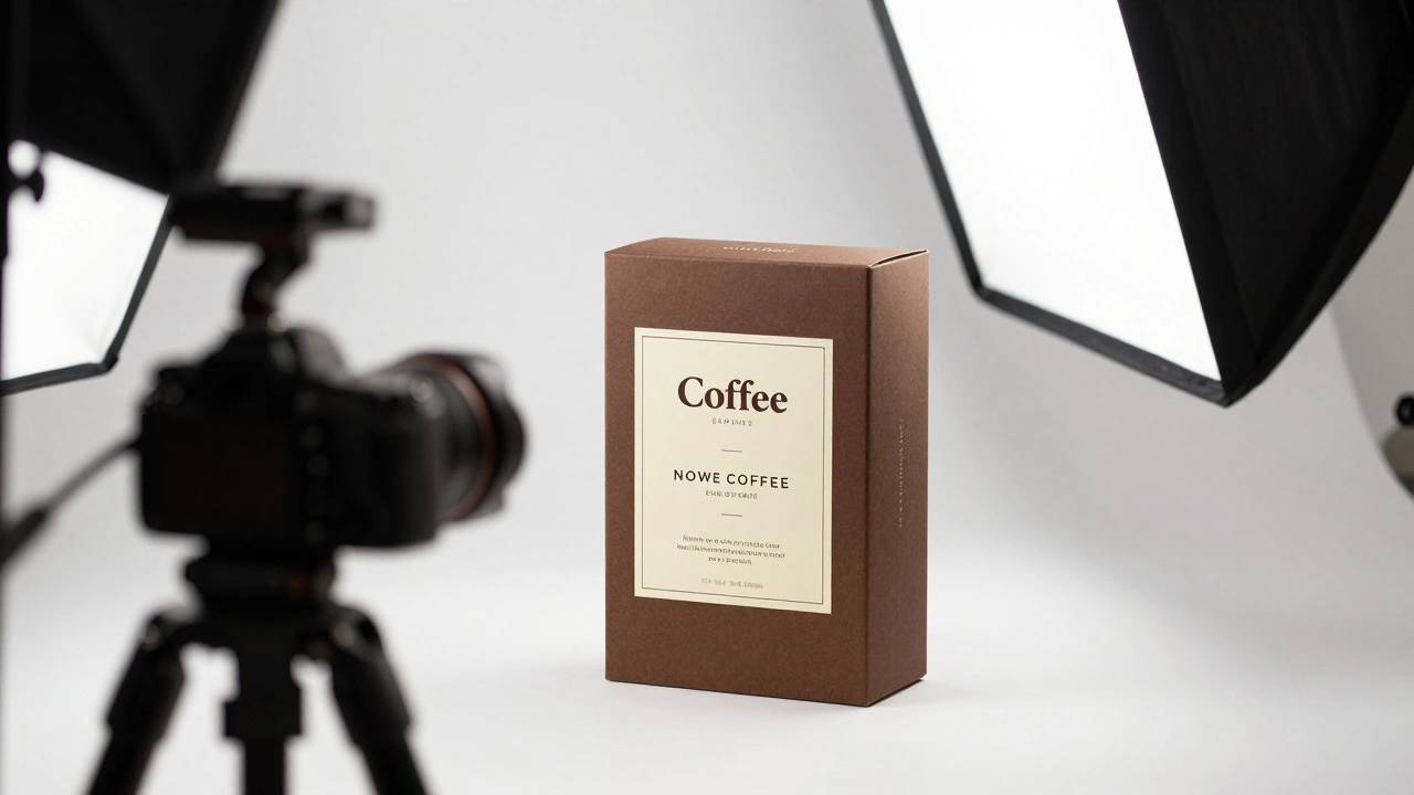
Boxes are essentially three-dimensional canvases. The challenge is lighting them evenly so there are no harsh shadows hiding text or blown-out highlights washing out logos. Think of your setup as a giant light tent.
To get that professional, shadow-free look, surround your subject with large, diffused light sources. A dedicated shooting box works well, but you can also construct a setup using large softboxes and white foam core reflectors. The key is control.
| Background Type | Lighting Strategy | Goal |
|---|---|---|
| White Background | Ensure background is at least 2 stops brighter than the object | Clean cutouts for e-commerce; natural edge definition |
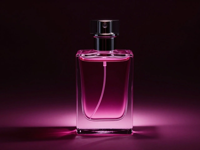
| Dark Background | Keep background significantly darker than the object | Dramatic contrast; ensures edges remain visible against black |
| Lifestyle Surface | Use directional light to mimic natural environment | Contextual appeal; shows scale and usage |
If you are shooting against a white background for web use, make sure the backdrop is bright enough. A good rule of thumb is that the background should be at least two stops brighter than the product. This creates a clean separation that makes masking easy later. Conversely, if you are shooting on black, ensure the product is lit sufficiently so it doesn’t blend into the void. Dark edges can make a product look like it has a halo or glow, which looks unnatural in print.
Taming Glare: How to Light Labels and Glass
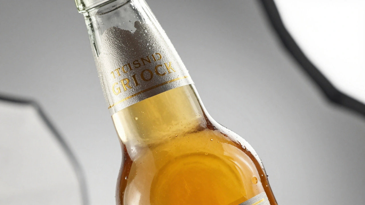
Labels, especially on glass bottles or glossy cartons, are the bane of many photographers. Specular highlights can obscure text, making ingredients unreadable. This is where advanced lighting techniques come into play.
For reflective surfaces like glass, you need to control what reflects onto the bottle. Place large white diffusion screens around the product to create broad, soft reflections that outline the shape without creating hot spots. If you are shooting a beverage, you might want the liquid inside to glow. Achieve this by placing a diffuser sheet between the light source and the bottle, allowing light to pass through the glass and illuminate the contents from within.
When the label itself is the problem-appearing patchy or dull-you can use a few pro tricks:
- The Diffusion Pipe: Roll a piece of white tracing paper or diffusion material into a cylinder and place it around the label. Shine your flash into the tube. The light bounces off the inner walls and wraps evenly around the curved surface of the label, eliminating harsh angles.
- The Camera Flag: Cut a hole in a large sheet of thick white paper. Mount this paper directly in front of your camera lens so you shoot through the hole. The paper acts as a massive, close-range reflector that floods the label with even light while blocking direct flash spill.
- Cross-Polarization: For metallic foils or high-gloss varnishes, mount a circular polarizing filter on your lens. Rotate it until reflections disappear. For ultimate control, add polarizing gels to your flash heads as well. By rotating the lens filter relative to the flash filters, you can eliminate almost all unwanted glare, revealing intricate details in gold foil or embossed text.
Styling Food and Ingredients for Packaging
If your packaging features food imagery-like a box of frozen berries or a bag of pasta-the styling must be flawless. Consumers judge the quality of the contents by the photo on the outside.
Start by sourcing premium specimens. Buy multiple versions of each ingredient. Visit upscale grocery stores or farmers' markets to find produce with perfect shapes and vibrant colors. Keep everything refrigerated until the moment of prep. Wilting or dehydration becomes obvious when images are enlarged for packaging print runs.
Prep timing matters. Some vegetables hold up well overnight, but others wilt quickly. It is often safer to prep on the day of the shoot. Start with your "hero" composition-the most appealing arrangement. Once you nail the lighting and focus, rotate the plate or change angles systematically to capture variations. Review these early images on a computer connected to your camera. Check for color accuracy, sharpness, and composition before moving on to the next SKU. This workflow saves hours of retouching later.
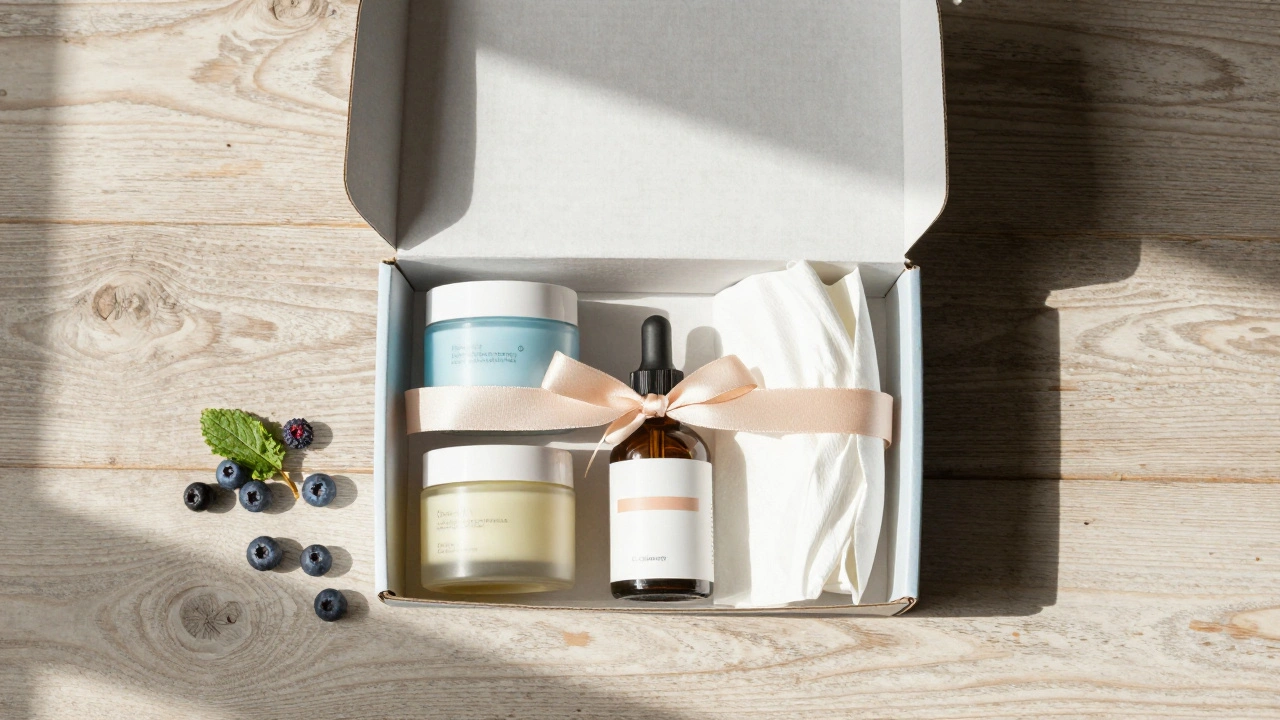
Capturing the Experience: Unboxing Shots
In the era of subscription boxes and direct-to-consumer brands, the unboxing experience is a major marketing asset. Research suggests that nearly half of consumers engage positively with content that shows what’s inside the box, not just the exterior. Unboxing shots tell a story: anticipation, discovery, and satisfaction.
To create compelling unboxing imagery, think sequentially. Do not just shoot the closed box. Create a narrative arc:
- The Exterior: A clean shot of the sealed box on a neutral or lifestyle background. Show the branding clearly.
- The Reveal: Images of the seal being broken, the lid lifting, or the tissue paper being pulled back. Capture the tactile details-the texture of the ribbon, the sound implied by the snap of a magnetic closure.
- The Contents: An overhead "flat lay" showing all items arranged neatly. This answers the immediate question: "What do I get?"
- The Lifestyle: Final shots showing the products in use. If it’s skincare, show the cream applied. If it’s tea, show the cup steaming.
If you are filming unboxing videos, treat it like a production. Create a chronological shot list. Vary your angles and focal lengths to keep the viewer engaged. Good lighting is more important than expensive gear. Ensure your audio is clean if you are including voiceover, and add sound design in post-production to enhance the tactile sounds of opening packages.
Workflow and Post-Production Essentials
Shooting is only half the battle. Packaging photography requires rigorous post-production to meet print standards.
Begin with basic corrections: adjust black levels, reduce hot spots, and sharpen details. Color correction is critical here. Match the digital image to the physical packaging as closely as possible. If you are working with a client, ask for Pantone references or physical samples to compare against your screen.
For e-commerce listings, you will likely need precise cutouts. Save your files as layered PSDs and send them to a specialized masking service if you don’t have the time to do it yourself. Clean edges are essential for products placed on colored backgrounds in ads.
Remember consistency. If you are shooting a line of ten products, the lighting angle, color temperature, and exposure must be identical across all images. Any variation will look amateurish on a shelf or a website grid. Plan your shoot order to minimize setup changes, and review your work continuously to catch drift in lighting or styling.
What aperture should I use for packaging photography?
Use a small aperture, typically between f/18 and f/22, to ensure deep depth of field. This keeps the entire product, from front to back, in sharp focus. However, test your lens to avoid diffraction, which can soften details at extremely small apertures.
How do I remove glare from glossy labels?
Use cross-polarization. Mount a circular polarizing filter on your lens and polarizing gels on your lights. Rotate the lens filter to cancel out reflections. Alternatively, use a diffusion pipe or a camera flag with a hole cut out to wrap soft, even light around the label.
Is unboxing photography necessary for all products?
It is highly effective for subscription boxes, gift sets, and direct-to-consumer brands where the experience of opening the package is part of the value proposition. Studies show significant consumer engagement with unboxing content, as it builds trust by showing exactly what is inside.
How important is color accuracy in packaging photos?
It is critical. Customers expect the digital image to match the physical product. Inaccurate colors can lead to returns and loss of trust. Always calibrate your monitor, set manual white balance, and compare your shots to the physical packaging under consistent lighting.
Do I need a dark room for packaging photography?
While not strictly mandatory, controlling ambient light helps. A dark room allows you to fully control the color temperature and intensity of your studio lights, ensuring consistent results across multiple products and preventing unwanted reflections from windows or other light sources.