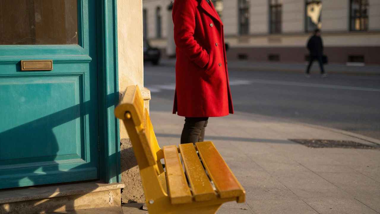
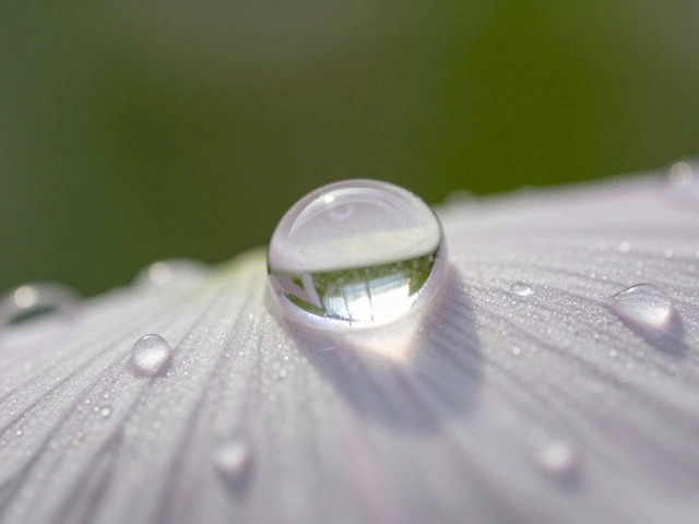
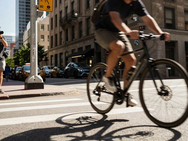
When you see a photo that stops you mid-scroll-bright red boots against a yellow wall, a teal dress in front of a coral door-you’re not just looking at colors. You’re seeing color blocking at work. It’s not about being colorful. It’s about using color like architecture: to hold the frame together, to lead the eye, and to make the image feel intentional, not accidental.
What Color Blocking Really Means
Color blocking isn’t just using bright colors. It’s about grouping two or three bold hues together in a way that creates structure. Think of it like painting with color instead of lines. Instead of relying on leading lines or the rule of thirds, you use color itself as the framework. A red jacket, a blue door, and a green bench aren’t just elements in the scene-they become three solid blocks that divide the frame and give it rhythm. This isn’t random. It’s calculated. The Canadian Photography School calls it a "structural compositional element," meaning the colors aren’t decoration-they’re the bones of the image. A well-placed orange bag on a gray sidewalk doesn’t just stand out. It anchors the whole shot.How Color Relationships Drive the Effect
Not all color combinations work. Some clash. Some feel dull. The best color blocking uses relationships defined by color theory:- Complementary colors (opposites on the wheel)-like purple and yellow-create maximum contrast. This is the most powerful combo for grabbing attention.
- Analogous colors (neighbors on the wheel)-like blue, teal, and green-give a calm, harmonious feel. Great for moody, quiet scenes.
- Triadic colors (three evenly spaced)-like red, blue, and yellow-add energy without chaos. Used often in fashion and product shots.
- Split-complementary-one base color plus the two next to its opposite-offers balance with a punch. Think navy with mustard and coral.
Where Color Blocking Shines: Real-World Applications
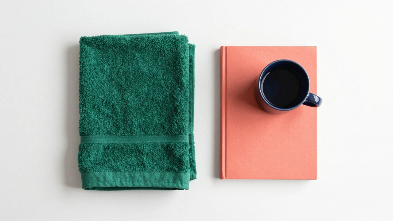
This technique isn’t just for studio shoots. It works across genres-but each one uses it differently.Flat lay photography is the easiest place to start. You control everything: the background, the props, the lighting. A white surface with a single bright pink towel and a mustard-yellow book? Instant structure. No clutter. Just three bold shapes.
Food photography uses color blocking to make dishes pop. A white plate on a dark wood table with a splash of green herbs and a red sauce drizzle? The food doesn’t just look tasty-it looks intentional. The color contrast separates the subject from the background without needing blur or lighting tricks.
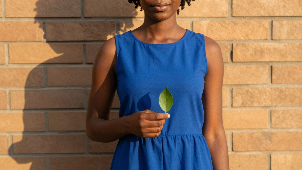
Fashion and portrait photography rely on matching subject and environment. If your subject has warm brown skin and dark hair, placing them in front of a cyan wall or wearing an emerald dress creates a striking contrast. You’re not just photographing a person-you’re composing a color relationship. Hair color, eye color, skin tone-all factor in. A photographer might avoid placing a redhead in front of a brick wall if it’s too close in hue. Too much similarity? The subject disappears.
Street photography is harder. You can’t control the scene. But you can wait. Look for existing blocks: a yellow taxi beside a blue bus, a woman in a red coat walking past a green doorway. It’s about noticing, not creating. The best street shots using color blocking feel lucky-but they’re really the result of trained observation.
Color Blocking vs. Other Composition Techniques
The rule of thirds is about placement. The golden ratio is about proportion. Color blocking is about relationship.- Rule of Thirds: Places the subject at intersection points. Works, but doesn’t explain why the subject stands out.
- Dynamic Symmetry: Uses diagonal lines to guide the eye. Great for movement, but silent on color.
- Figure-Ground: Separates subject from background using contrast in light or focus. Color blocking does this too-but with hue, not brightness.
Lighting and Color Temperature: The Hidden Layer
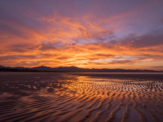
Color isn’t just about paint. It’s about light. A sunset shot isn’t just orange. It’s warm light hitting a blue building, turning the wall into a soft violet. That’s color blocking with temperature. Golden hour warms skin tones and makes reds glow. Blue hour cools shadows, turning asphalt into slate and skin into cool gray. Photographers who master this layer don’t just wait for good light-they plan for it. A portrait session might be scheduled for late afternoon not just for soft light, but because the warm glow will make a navy dress look richer and a white dress look ethereal. Post-processing can enhance this. A slight shift in white balance can turn a muddy green into a vibrant emerald. A subtle color grade can unify a scene that felt disjointed. But here’s the catch: color grading for composition is powerful, but it’s not magic. You can’t fix a weak color relationship in editing. You can only sharpen what’s already there.When Color Blocking Fails
This technique isn’t a cure-all. It can backfire.- Overdoing it: Three neon colors in one frame? It looks like a kids’ toy store, not a photograph.
- Forced color: Adding a single red object into a black-and-white photo just because it’s "poppy"? That’s cliché. Format.com calls it a trap. It feels like a gimmick, not a choice.
- Wrong context: A documentary photo of a protest doesn’t need a perfectly balanced triadic palette. Sometimes truth is messy. Color blocking can feel dishonest if it sanitizes reality.
- Ignoring tone: A bright red dress on a bright red wall? You lose the subject. Color blocking needs contrast-not repetition.
How to Practice It
You don’t need expensive gear. You need awareness.- Start with black and white. Shoot in monochrome mode. Look for shapes and tones. Notice where the lightest and darkest areas sit. Then, switch to color. The contrast you saw in grayscale becomes a color relationship.
- Use a color wheel app. Before you shoot, pick two or three colors you want to use. Look for them in your environment. Don’t force it-wait for them to appear.
- Shoot in controlled spaces. A studio, your kitchen, a bookstore. These places let you arrange color. Try a plain white backdrop with one colored prop. Then two. Then three. See how the balance shifts.
- Study photographers who use it. Look at the work of Erik Madigan Heck, Viviane Sassen, or even fashion campaigns from Gucci or Balenciaga. Notice how the colors don’t just look good-they hold the frame.
- Limit yourself. For a week, only shoot using two colors. Make every image work with just that pair. You’ll learn restraint.
Why It Works Now
Social media feeds are noisy. Algorithms reward contrast. Color blocking cuts through. A photo with two bold, clashing colors gets more attention than one with muted tones-even if the subject is identical. It’s also accessible. You don’t need to master aperture or shutter speed to use it. You just need to notice color. And that’s something anyone can learn. The technique has moved from experimental to essential. It’s taught in professional courses. It’s used in commercial shoots. It’s in Instagram feeds and magazine covers. It’s not a trend. It’s a tool.Final Thought
Color blocking isn’t about being loud. It’s about being clear. It’s about using the most powerful visual tool we have-color-not as decoration, but as structure. The next time you walk past a blue door, a red bench, and a yellow car, don’t just see them. See how they could hold a photograph together.Can color blocking work in black and white photography?
Not directly. Black and white removes color, so you lose the core element of color blocking. But you can use the concept: think in terms of tonal blocks. A dark shadow next to a bright highlight can create the same visual tension. Some photographers even add selective color back in post-like one red shoe in a grayscale scene-but this is risky. Done poorly, it looks staged. Done well, it’s powerful.
Do I need special equipment to use color blocking?
No. You need your eyes and a camera-any camera. A smartphone works fine. What matters is your ability to see color relationships. A wide-angle lens (28mm or 35mm) helps you capture more context, but it’s not required. The technique is about composition, not gear.
Is color blocking the same as using a color palette in design?
It’s similar, but not the same. Design palettes are often chosen for branding or mood. Color blocking in photography is about structure. It’s not just about looking good-it’s about organizing the visual space. A designer might pick pastels for calm. A photographer might pick red and green to make a subject leap off the frame.
Can I use color blocking in portrait photography if my subject has dark skin?
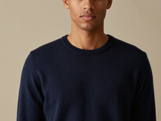
Absolutely. In fact, dark skin tones often make color blocking more effective. A deep burgundy dress against a teal wall, or a cobalt shirt next to a warm ochre background, creates stunning contrast. The key is to avoid colors too close in value. A dark skin tone next to a dark blue wall might disappear. But a bright yellow or lime green? That pops. Use color theory to find complementary tones that enhance-not clash with-your subject’s natural coloring.
How do I avoid making color blocking look amateurish?
Three things: restraint, contrast, and context. Use no more than three dominant colors. Make sure they’re distinct in value (light/dark) and saturation (bright/muted). And don’t force it into genres where subtlety matters-like documentary or journalism. Color blocking should feel intentional, not decorative. When in doubt, simplify. One bold color block is better than three messy ones.
