Ever looked at a photo or a movie frame and felt something shift in your chest before you even understood why? That’s not magic. It’s composition doing its job. Most people think arrangement is just about making things look pretty, but true visual storytelling uses placement to guide emotion, direct attention, and build a story that unfolds over time.
You don’t need to be a filmmaker or a high-end photographer to master this. Whether you’re designing a social media post, taking a portrait, or planning a product launch, the principles of arranging elements for narrative are the same. The goal isn’t just clarity; it’s connection. You want the viewer to feel like they are part of the scene, not just observing it from the outside.
The Core Principle: Guiding the Eye
Before you place a single object or subject, you need to understand how humans process visual information. We don’t scan images randomly. Our eyes follow paths based on weight, contrast, and direction. This is where Visual Hierarchy comes in. It is the system that tells the brain what to look at first, second, and third. If your hierarchy is broken, the story gets lost in the noise.
Think of visual hierarchy as the roadmap of your image. The strongest element-the one with the highest contrast, largest size, or most interesting detail-becomes the starting point. From there, the eye moves naturally toward secondary elements. If you want the viewer to notice the background texture after focusing on the face, you need to create a subtle bridge between those two areas. Without that bridge, the viewer might get stuck on the main subject and miss the context entirely.
- Size: Larger objects usually command more attention than smaller ones.
- Contrast: High contrast areas (light vs. dark) pull the eye faster than low contrast zones.
- Color: Saturated colors stand out against muted backgrounds, creating immediate focal points.
- Direction: Arrows, lines, or the gaze of a person lead the eye toward specific areas.
Using Space to Build Tension
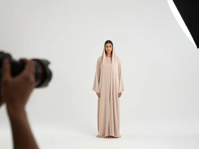
Negative space is often misunderstood as empty space. In reality, it’s active space. It’s the breathing room that gives your subject meaning. When you crowd an image, you create chaos. When you leave room, you create focus. But here’s the trick: where you place the subject within that space changes the emotional tone completely.
This relates directly to the Rule of Thirds, a foundational guideline in photography and design. Instead of centering your subject, you imagine a grid dividing the frame into nine equal parts. Placing key elements along these lines or at their intersections creates dynamic balance. Why does this work? Because centered compositions often feel static and formal, while off-center placements suggest movement, uncertainty, or anticipation.
If you place a character looking into the empty space on the right side of the frame, the viewer subconsciously wonders what they see. This is called "leading room" or "looking room." It invites curiosity. Conversely, if you place them near the edge with no space ahead, it can feel claustrophobic or trapped. You aren’t just arranging pixels; you’re managing psychological expectations.
Lines and Direction: The Invisible Strings
Every image contains lines, whether they are physical objects like roads and fences or implied lines created by shadows and gazes. These lines act as invisible strings that tug the viewer’s eye across the frame. Mastering Leading Lines allows you to control the pace of the narrative.
Consider a photograph of a winding road disappearing into the distance. The road itself is a leading line. It starts at the bottom of the frame and pulls the eye deep into the scene, suggesting a journey. Now, imagine the same road cutting straight across the middle of the frame horizontally. The effect is different. It feels stable, perhaps even stagnant. The direction of the line dictates the energy of the story.
- Diagonal Lines: Create dynamism and action. They are the most energetic lines in composition.
- Horizontal Lines: Suggest calm, stability, and rest. Think of a horizon line.
- Vertical Lines: Convey strength, dignity, and height. Often used in architecture shots.
- Curved Lines: Feel organic and natural. They guide the eye smoothly without sharp stops.
When composing, ask yourself: Where do I want the eye to go next? Use lines to answer that question. If the story requires a sudden stop, use a strong vertical barrier. If it needs a smooth transition, use a curve.

Depth and Layering: Creating a World
A flat image tells a snapshot. A layered image tells a story. To make your composition feel immersive, you need depth. This doesn’t mean you need a 3D printer; it means you need to arrange elements in distinct planes: foreground, midground, and background.
Let’s look at a practical example. Imagine you’re shooting a portrait in a forest. If you only have the person against a blurred tree trunk, the image feels isolated. But if you add a branch in the foreground, slightly out of focus, and keep the detailed trees in the midground, you’ve created three layers. The viewer now feels like they are standing behind that branch, peeking into the scene. This technique is known as Frame Within a Frame. It adds intimacy and context simultaneously.
| Technique | Primary Function | Emotional Impact | Best Used For |
|---|---|---|---|
| Rule of Thirds | Balancing asymmetry | Dynamism, interest | Portraits, landscapes |
| Leading Lines | Directing eye movement | Journey, flow | Architecture, travel |
| Negative Space | Isolating subjects | Calm, loneliness, focus | Minimalist design, portraits |
| Layering | Creating depth | Immersion, complexity | Documentary, environmental shots |
Color as a Narrative Tool
We often talk about shape and line, but color is the fastest way to trigger an emotional response. Warm colors like reds and oranges feel urgent and close. Cool colors like blues and greens feel distant and calm. By controlling the palette, you control the mood of the narrative.
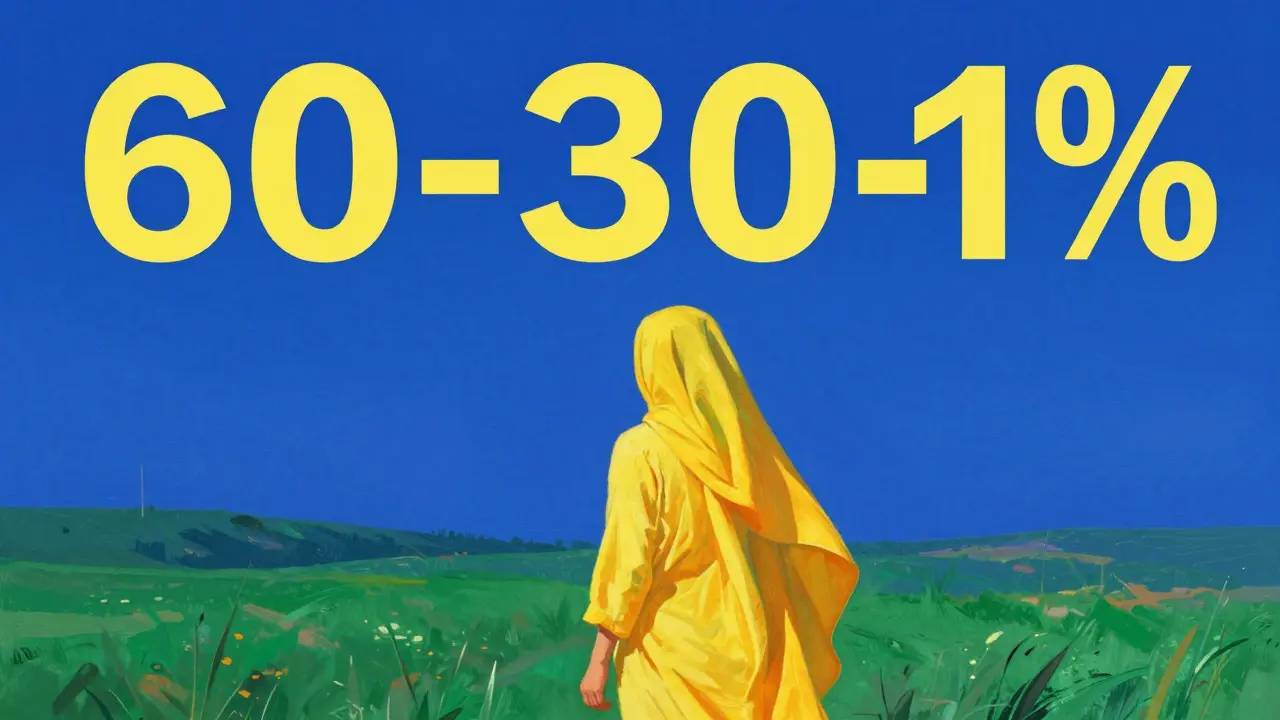
In film, this is standard practice. A scene set in winter might use desaturated blues to convey isolation. A romantic scene might use warm, soft lighting to suggest intimacy. In still photography, you can achieve similar results by balancing complementary colors. If your subject wears a bright yellow shirt, placing them against a blue sky creates a vibrant pop that demands attention. This contrast isn’t just aesthetic; it signals importance.
However, don’t ignore harmony. If every element competes for attention, the viewer becomes fatigued. Use a dominant color scheme (60-30-10 rule) to maintain coherence. Let 60% of the image be one neutral tone, 30% a secondary tone, and 10% an accent color that carries the narrative weight.
Common Mistakes That Break the Story
Even experienced creators fall into traps that dilute their message. One common error is clutter. Adding too many elements because they are "interesting" individually ignores how they interact collectively. If an element doesn’t support the main story, cut it. Simplicity is not a lack of content; it’s precision.
Another mistake is ignoring the edges. Viewers rarely look at the very corners of an image unless something dramatic happens there. If you place a critical detail in the corner, you risk losing it. Keep essential narrative elements closer to the center or along the primary sight lines. Finally, watch out for distracting intrusions. A random pole sticking up through someone’s head or a bright sign in the background can break immersion instantly. Always check your framing from multiple angles.
Applying These Principles in Practice
You don’t need to memorize every rule to start using them. Pick one principle per project. If you’re working on a series of photos, try focusing solely on leading lines. Notice how the viewer’s path changes. In the next series, experiment with negative space. See how much less you need to say when you give the subject room to breathe.
Composition is a language. Like any language, fluency comes from practice and feedback. Look at images that move you. Ask yourself: Where did my eye go first? What pulled me there? Was it the light, the line, or the color? Reverse-engineering great work is the fastest way to internalize these concepts. Over time, these arrangements will become intuitive, allowing you to tell richer stories with fewer words.
What is the most important element in visual composition?
The focal point is generally considered the most important element. It is the area where the viewer's eye lands first. Without a clear focal point, the image lacks direction, and the narrative becomes confusing. Everything else in the composition should support or lead to this focal point.
How does negative space affect the mood of an image?
Negative space isolates the subject, which can evoke feelings of solitude, peace, or elegance depending on the context. Large amounts of negative space often slow down the viewing experience, encouraging contemplation. Conversely, filling the frame creates urgency and intensity.
Can I break the Rule of Thirds?
Absolutely. Rules are guidelines, not laws. Breaking the Rule of Thirds can be powerful if done intentionally. Centering a subject can create symmetry and formality, while extreme off-center placement can create tension or imbalance. The key is to know why you are breaking the rule.
What role does color play in storytelling?
Color sets the emotional tone instantly. Warm tones suggest energy and closeness, while cool tones suggest distance and calm. Color contrast helps identify focal points, and color harmony ensures the image feels cohesive. Using color strategically guides the viewer's emotional journey through the narrative.
How do I avoid clutter in my compositions?
Edit ruthlessly. Remove any element that does not serve the main story or guide the eye. Simplify backgrounds to reduce visual noise. Use depth of field to blur distractions. Remember that white space is a tool, not a waste. Clutter occurs when too many elements compete for equal importance.