You’ve probably felt it before. You shoot a scene that looks amazing to your eye, but when you open the file in Lightroom or Photoshop, something feels… off. The colors clash, the mood is flat, or the subject doesn’t pop. It’s rarely about bad lighting or a missed focus point. Usually, it’s because you’re ignoring Color Theory, which is the science and art of using color to create visually pleasing and meaningful compositions. It sounds academic, like something you’d study in a design school lecture hall, but for photographers, it’s a practical tool. Think of it less as a rulebook and more as a cheat code for making your images work harder.
If you want your photos to stop just "documenting" moments and start telling stories, you need to understand how colors interact. This isn’t about memorizing every shade of cyan. It’s about knowing why a red jacket stands out against green foliage, or why blue hour feels melancholic while golden hour feels nostalgic. Let’s break down the basics so you can actually use them on set, not just in post-production.
The Color Wheel Is Your Map
Before you can apply anything, you need to know where you are. The Color Wheel is a circular diagram representing the relationships between primary, secondary, and tertiary colors. Most photographers ignore this until they’re trying to fix a white balance issue, but it should be your first stop during planning. The wheel is divided into three main groups:
- Primary Colors: Red, Blue, Yellow. These cannot be created by mixing other colors.
- Secondary Colors: Green, Orange, Purple. Created by mixing two primaries (e.g., Blue + Yellow = Green).
- Tertiary Colors: Red-Orange, Blue-Green, etc. Created by mixing a primary with a neighboring secondary.
Hue, Saturation, and Value: The Three Knobs
People often say "color," but they usually mean just hue. In reality, every color has three attributes. Understanding these gives you control over the emotional weight of an image.
| Attribute | Definition | Photographic Application |
|---|---|---|
| Hue | The name of the color (Red, Blue, etc.). | Determines the basic mood. Warm hues (reds, yellows) feel energetic; cool hues (blues, greens) feel calm. |
| Saturation | The intensity or purity of the color. | High saturation feels vibrant and commercial; low saturation feels muted, cinematic, or vintage. |
| Value | The lightness or darkness of the color. | Controls contrast and depth. High-value differences create drama; low-value differences create subtlety. |
Harmonious Combinations That Actually Work
You don’t need to reinvent the wheel. Certain combinations have been proven to please the human eye for centuries. Use these as starting points, then tweak them to fit your style.
Complementary Colors
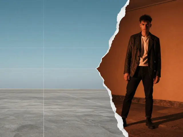
This is the classic "pop." Complementary colors sit directly opposite each other on the wheel. Think Blue and Orange, Red and Green, Yellow and Purple. Why do they work? Because they provide maximum contrast. When you see a sunset (orange/yellow) against a deep blue sky, your brain registers high impact. Pro Tip: Don’t use 100% saturated complements side-by-side unless you want a vibrating, psychedelic effect. Instead, desaturate one slightly. A muted teal background with a sharp coral subject is easier on the eyes than electric blue next to fire engine red.
Analogous Colors
These are neighbors on the wheel, like Blue, Blue-Green, and Green. Analogous schemes are naturally harmonious because they share common hues. They create a sense of unity and calm. This is perfect for landscapes or minimalist portraits. If you’re shooting a forest, sticking to greens and earthy browns keeps the image cohesive. To avoid it looking boring, introduce a small accent of a contrasting color-a yellow flower in a sea of green-to create a focal point.
Triadic Colors
Three colors evenly spaced around the wheel, like Red, Yellow, and Blue. This scheme is vibrant and balanced. It’s harder to pull off because three strong colors can compete for attention. The trick is to let one color dominate (60%), support it with a second (30%), and use the third as an accent (10%). For example, in a food photo, maybe the plate is white (neutral), the food is green (dominant), the garnish is red (accent), and the background has hints of yellow. It feels lively but organized.
Warm vs. Cool: Setting the Emotional Tone
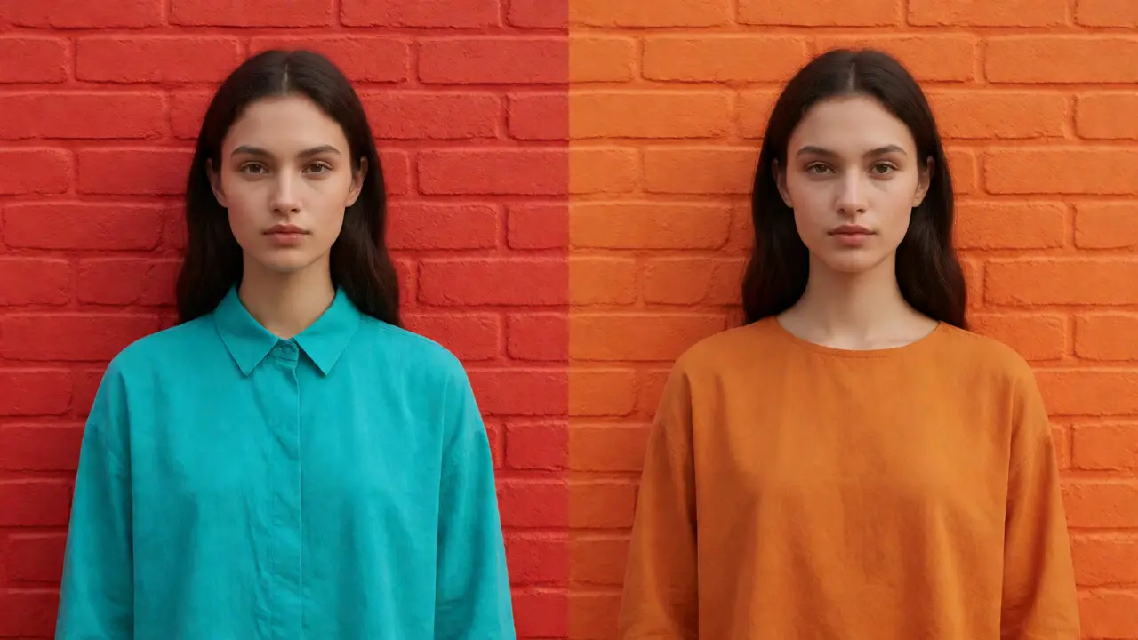
Temperature isn’t just about Kelvin settings on your camera. It’s about feeling. Warm Colors (reds, oranges, yellows) advance toward the viewer and evoke energy, warmth, happiness, or anger. Cool Colors (blues, greens, purples) recede into the distance and evoke calm, sadness, trust, or mystery. You can manipulate this in-camera or in post. If you want a romantic vibe, lean into warm tones. Golden hour naturally provides this. But what if you’re shooting indoors under fluorescent lights that cast a sickly green tint? You can shift the white balance warmer to neutralize the green and add intimacy. Conversely, if you want a corporate headshot to feel trustworthy and professional, cooler tones often read as more serious and stable. Don’t forget mixed lighting. Mixing warm tungsten bulbs with cool daylight from a window creates complex, realistic scenes. It mimics how our eyes perceive real life. Our brains automatically separate the sources, so don’t be afraid to leave some mixed temperature in your final edit. It adds dimension.
Using Color to Guide the Eye
Composition isn’t just about lines and shapes. Color is a directional cue. Humans are wired to notice contrast. If your entire frame is monochromatic except for one bright red object, the viewer will look at the red object first. Always. Use this to control the narrative order. Do you want people to see the face first, or the environment? If the face is in shadow and the background is brightly lit with a vibrant color, the eye goes to the background. If you want the face to be the hero, ensure it has the highest contrast in value or saturation compared to its surroundings. Consider leading lines, too. A path painted in a distinct color can lead the eye to the subject. Or, use color blocking. Place your subject against a solid color block to isolate them. This is huge in fashion and product photography. It removes distraction and forces engagement with the subject.
Practical Workflow: From Pre-Production to Post
How do you actually implement this? Here’s a simple workflow I use when planning shoots.
- Pre-Visualization: Before picking a location, ask yourself: What emotion do I want? Calm? Energetic? Choose a dominant color family that supports that. If you want energy, scout locations with reds, oranges, or high-contrast black and white.
- Wardrobe Coordination: Check the location’s palette. If the location is busy with many colors, dress the subject in neutrals or a single solid color that contrasts with the background. If the location is minimal, give the subject bold colors.
- Shoot with Intent: Frame your shot to minimize competing colors. Move left or right to eliminate a distracting blue sign behind a red-shirted subject.
- Edit with Restraint: In Lightroom or Capture One, don’t just crank saturation. Use the HSL (Hue, Saturation, Luminance) panel. Shift specific hues closer together to unify the image. Desaturate skin tones slightly if they look too orange. Boost the luminance of the subject’s color to make them glow.
Common Pitfalls to Avoid
Even experienced photographers mess up color. Here are the big ones:
- Oversaturation: Making colors so intense they look radioactive. Skin tones should never be fully saturated. Keep them natural.
- Ignoring Background Clutter: A random neon sign or a bright yellow car can ruin an otherwise perfect composition. Watch the edges of your frame.
- Chasing Trends: Teal and orange is popular because it’s complementary. But if every photo looks like a Marvel movie poster, it loses authenticity. Use trends as inspiration, not rules.
- Screen Calibration: If your monitor isn’t calibrated, you’re editing blind. Invest in a cheap calibrator. Your prints will thank you.
Do I need to learn color theory if I only shoot black and white?
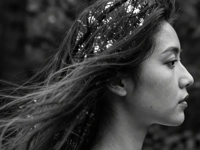
Yes, absolutely. Black and white photography relies entirely on tonal contrast, which is derived from color values. A red apple and a green leaf might look similar in brightness, but converting them to grayscale requires understanding their relative luminance. Knowing how colors translate to gray levels helps you choose filters or adjust channels in post-production to maximize separation between elements.
What is the most important color combination for beginners?
Start with analogous colors. They are forgiving and naturally pleasing. Shooting a landscape with various shades of green and brown, or a portrait with blues and teals, reduces the risk of clashing colors. Once you master harmony, experiment with complementary colors for more dramatic impact.
How does lighting affect color perception?
Lighting changes both the hue and the saturation of objects. Warm light enhances reds and yellows while muting blues. Cool light does the opposite. Hard light increases contrast and can make colors appear deeper, while soft light diffuses colors, making them appear softer and less saturated. Always consider the light source's color temperature when predicting how colors will render.
Should I match my subject's clothing to the background?
Not necessarily. Matching creates camouflage, which can be good for environmental portraits where the subject blends into the scene. Contrasting creates isolation, which is better for highlighting the subject. Decide whether you want the subject to merge with or stand out from the environment before choosing wardrobe.
Is there a standard color profile for printing?
Most printers prefer sRGB for web and general sharing, but Adobe RGB offers a wider gamut for professional printing. However, always check with your specific lab or printer. Some require CMYK conversion for offset printing, though most digital labs accept high-quality JPEGs or TIFFs in sRGB or Adobe RGB. Soft-proofing in your editing software helps predict print results.