You’ve picked the date. You’ve booked the venue. Now comes the part that makes half of couples panic at 2 AM: choosing a wedding color scheme. It’s not just about picking your favorite shade of blue or pink. It’s about creating a visual harmony between what you wear, what the tables look like, and how the photos turn out. If you get this wrong, your dreamy lavender bridesmaid dresses might clash with the rustic wood tables, or your bold red napkins might make the white tablecloths look dingy in pictures.
Color coordination is the glue that holds your wedding aesthetic together. But it doesn’t have to be complicated. Whether you’re planning an intimate backyard ceremony or a grand ballroom reception, understanding a few basic rules can save you thousands of dollars in mismatched rentals and regrettable floral choices. Let’s break down how to build a palette that works, from the bride’s gown to the last boutonniere.
The Foundation: Start With What Can’t Change
Most people start by picking a color they love, then trying to force everything else to match. That’s backwards. In Portland, where I plan most of my events, we see a lot of natural venues-think exposed brick, greenery, and wooden beams. These elements are fixed. They don’t change because you want "Millennial Pink." So, before you buy a single ribbon, look at your venue.
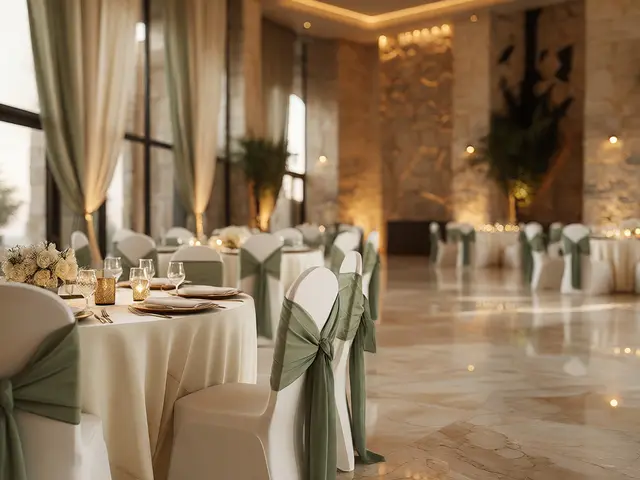
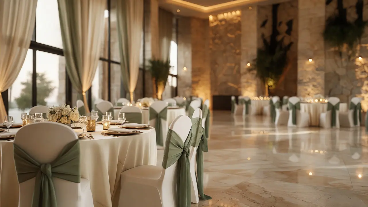
If your venue has dark wood floors and warm lighting, cool tones like icy blues or stark whites might feel disconnected. Warm neutrals like beige, terracotta, or sage green will blend seamlessly. If you’re in a modern glass building with gray concrete, cooler tones work beautifully. The rule of thumb? Your palette should complement the permanent features of the space, not fight them.
Building a Balanced Palette: The 60-30-10 Rule
You don’t need ten different colors. You need three. Interior designers use a simple formula called the 60-30-10 rule, and it works perfectly for weddings too. Here’s how it breaks down:
- 60% Dominant Color: This is your background. Usually, this is white, ivory, cream, or soft gray. It covers table linens, chair sashes, and large floral arrangements. It sets the tone without overwhelming the eye.
- 30% Secondary Color: This is your main accent. Think bridesmaid dresses, major floral focal points, or signage. This color adds personality and depth. For example, if your dominant is ivory, your secondary could be deep navy or dusty rose.
- 10% Accent Color: This is the pop. Small details like napkins, candle holders, place cards, or boutonnieres. This is where you can go bold. A touch of metallic gold, bright coral, or emerald green keeps things interesting without being chaotic.
Using this structure prevents the "clown car" effect where every element screams for attention. It creates a hierarchy so guests know where to look.
Coordinating Dresses and Attire
The biggest headache for many couples is coordinating the bridal party. Should the groom’s tie match the bridesmaids’ dresses exactly? No. Please, no. Matching exactly looks dated and stiff. Instead, aim for complementary tones.
If your bridesmaids are wearing sage green, the groom’s suit could be charcoal gray (neutral) with a tie that hints at the green but isn’t identical-maybe a patterned tie with flecks of sage and cream. This shows intentionality without looking like a uniform.
| Element | Common Mistake | Better Approach |
|---|---|---|
| Bridesmaid Dresses | All identical shades | Ombre effect or mix-and-match within same family |
| Groom’s Tie | Exact match to dress fabric | Complementary texture or pattern incorporating accent color |
| Boutonnieres | Same flower as bouquet | Smaller version or complementary greenery with tiny accent bloom |
| Mother of Bride/Groom | Wearing the exact dress color | Choosing a neutral or distinct shade outside the bridal party palette |
Also, consider skin tones. Not every color flatters every person. If you have a diverse bridal party, avoid sticking to one rigid shade. Allow each bridesmaid to pick a dress in the same color family but a different hue or length. A plum dress on one friend and a mauve dress on another still reads as cohesive because they belong to the same purple spectrum.
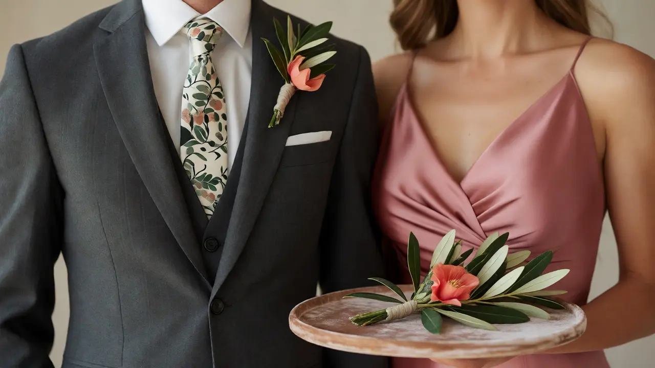
Floral Design: Where Color Lives and Dies
Flowers are expensive. If you ask for a specific Pantone shade of coral, your florist might charge extra for importing blooms that aren’t in season. To keep costs down, choose flowers that naturally occur in your chosen palette.
For example, if you want yellow, sunflowers and roses are abundant and affordable in late summer. If you want deep burgundy, dahlias and garden roses are great fall options. Trying to force a spring tulip into a winter wedding usually means paying premium prices for lower-quality imports.
Here’s a quick guide to seasonal availability for popular palettes:
- Spring: Pastels like blush, lilac, and mint. Use peonies, ranunculus, and sweet peas.
- Summer: Brights like coral, turquoise, and lemon. Use zinnias, hydrangeas, and dahlias.
- Fall: Earth tones like rust, olive, and mustard. Use chrysanthemums, marigolds, and dried grasses.
- Winter: Jewel tones like emerald, ruby, and navy. Use amaryllis, hellebores, and evergreens.
Don’t forget foliage. Greenery isn’t just filler; it’s a color tool. Eucalyptus brings a silvery-green tone that pairs well with almost anything. Ferns add deep forest green. Olive branches offer a muted, Mediterranean vibe. Mixing textures of greenery can replace the need for more expensive colorful blooms.
Lighting Changes Everything
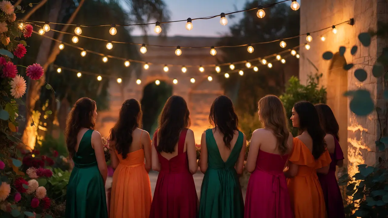
A color that looks perfect under daylight might look muddy under candlelight. This is crucial for evening receptions. Warm lighting (around 2700K-3000K) enhances yellows, oranges, and reds but can mute blues and purples, making them look grayish or black.
If you’re planning a night wedding with lots of candles or string lights, avoid pale pastels if you want them to stand out. They’ll disappear into the ambient glow. Instead, opt for richer, saturated colors that hold up against low light. Conversely, if you have bright white LED uplighting, pastel pinks might look washed out. Always check the venue’s lighting capabilities before finalizing your palette.
Photography Considerations
Your photographer sees your wedding differently than you do. They care about contrast and how colors render on camera. Highly saturated colors can sometimes cause "color cast," where nearby objects pick up a tint from the strong color source. For instance, sitting near a wall of bright orange flowers might give everyone’s skin a slight orange hue in close-up shots.
To help your photos pop, ensure there’s enough contrast between the foreground (people) and background (venue). If everyone is wearing light colors in a light room, the image can look flat. Adding darker accents through suits, shoes, or dark floral stems helps anchor the image.
Also, consider the time of day. Golden hour photography loves warm tones. If your palette is heavily cool-toned (blues, grays), the golden sunlight will actually warm them up nicely, creating a soft, romantic look. If your palette is already warm, golden hour might make everything look overly yellow. Talk to your photographer early. They can tell you which palettes work best with their editing style and the specific lighting conditions of your venue.
Common Pitfalls to Avoid
Even with good intentions, mistakes happen. Here are the big ones I see regularly:
- Ignoring Texture: Two fabrics of the same color can look completely different. Satin reflects light; matte cotton absorbs it. Mixing textures adds depth even when using monochromatic colors.
- Too Many Colors: Stick to three main colors plus neutrals. If you have five distinct hues, it becomes noise.
- Clashing Patterns: Floral prints, stripes, and polka dots rarely play nice together unless carefully curated. Stick to solid colors for major elements and use patterns sparingly in accessories.
- Forgetting the Men: Often, the focus is entirely on the women. Ensure the men’s attire complements the palette too. Gray suits are versatile, but tan or navy can also fit certain themes.
Final Checklist Before You Buy
Before you sign contracts or order online, run through this list:
- Have I visited the venue at the same time of day as my wedding?
- Do I have physical swatches of all materials (fabric, paper, paint)?
- Did I check how these colors look under artificial light?
- Are the flowers available during my month?
- Does the palette reflect our personal style, or just what’s trending on Instagram?
Remember, trends fade. A color scheme that feels authentic to you two will always look better than one copied from a magazine cover. Trust your instincts, keep it simple, and let the venue’s natural beauty shine through.
How many colors should be in a wedding palette?
Aim for three main colors plus neutral tones. Use the 60-30-10 rule: 60% dominant neutral (like white or ivory), 30% secondary accent (like navy or sage), and 10% bold accent (like gold or coral). This creates balance without overwhelming the eye.
Do bridesmaid dresses need to match the flowers exactly?
No. Exact matches can look staged and unnatural. Instead, choose flowers that complement the dress color. For example, if dresses are blush pink, use flowers with deeper pinks, creams, and greens. This adds depth and sophistication.
What are the best wedding colors for fall?
Fall palettes often feature earth tones like rust, burnt orange, olive green, mustard yellow, and deep burgundy. These colors pair well with natural elements like pumpkins, dried leaves, and wooden venues. Jewel tones like emerald and ruby also work well for evening fall weddings.
Can I wear black to a wedding?
Yes, especially for evening or formal weddings. Black is elegant and slimming. However, check the couple's preferences, as some traditional families may prefer guests to avoid black. For the bridal party, black suits or dresses can provide a sharp, modern contrast to lighter florals.
How does lighting affect wedding colors?
Warm lighting enhances reds, oranges, and yellows but can dull blues and purples. Cool lighting does the opposite. Always test your color samples under the specific lighting conditions of your venue, especially if you plan to use candles or colored uplights.