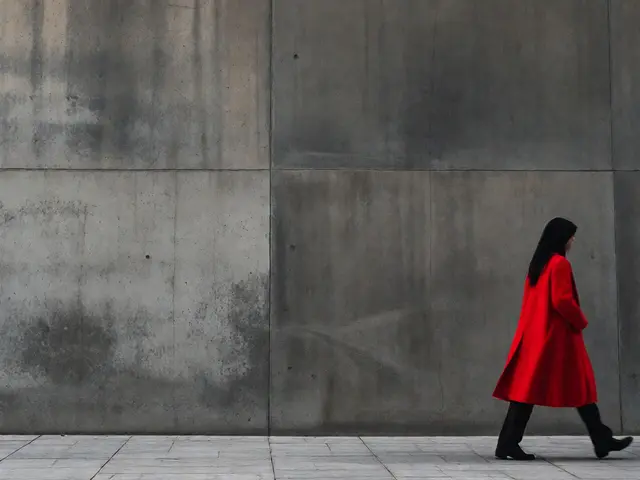
You walk down a busy sidewalk. Most people see chaos. You see a red umbrella against a grey concrete wall. That contrast? That is the hook. Color is not just decoration in street photography. It is a language. It guides the eye, sets the mood, and tells a story before you even read the caption. Yet many photographers treat it as an afterthought. They shoot for composition first, then hope the colors work out. This approach leaves money on the table. You can control the narrative by choosing your palette intentionally.
The Psychology of Urban Palettes
Why do certain images stop us scrolling? Color psychology plays a huge role. Warm tones like reds and oranges evoke energy, urgency, or warmth. Cool tones like blues and greens feel calm, distant, or melancholic. In a city environment, these emotions clash with the built environment. A bright yellow taxi in a monochrome rainy street creates tension. That tension keeps the viewer looking. You are not just capturing a moment; you are curating an emotional response. Consider how brands use color. Fast food chains use red to stimulate appetite. Tech companies use blue for trust. Street photography borrows this subconscious coding. When you spot a neon sign glowing pink at dusk, you are tapping into nostalgia and vibrancy simultaneously.
But here is the trap: saturation does not equal impact. Over-saturated photos look fake. They scream "I edited this too much." The best street photos often use subtle shifts. Think about the difference between a harsh midday sun and the golden hour. The light changes the color temperature naturally. Your job is to recognize these shifts and wait for them. Patience pays off when you are hunting for specific hues. You might stand on a corner for twenty minutes waiting for someone wearing a green jacket to walk through a patch of shadow. That specific combination creates a visual rhyme that feels accidental but is actually engineered.
Bold Colors: Making Statements
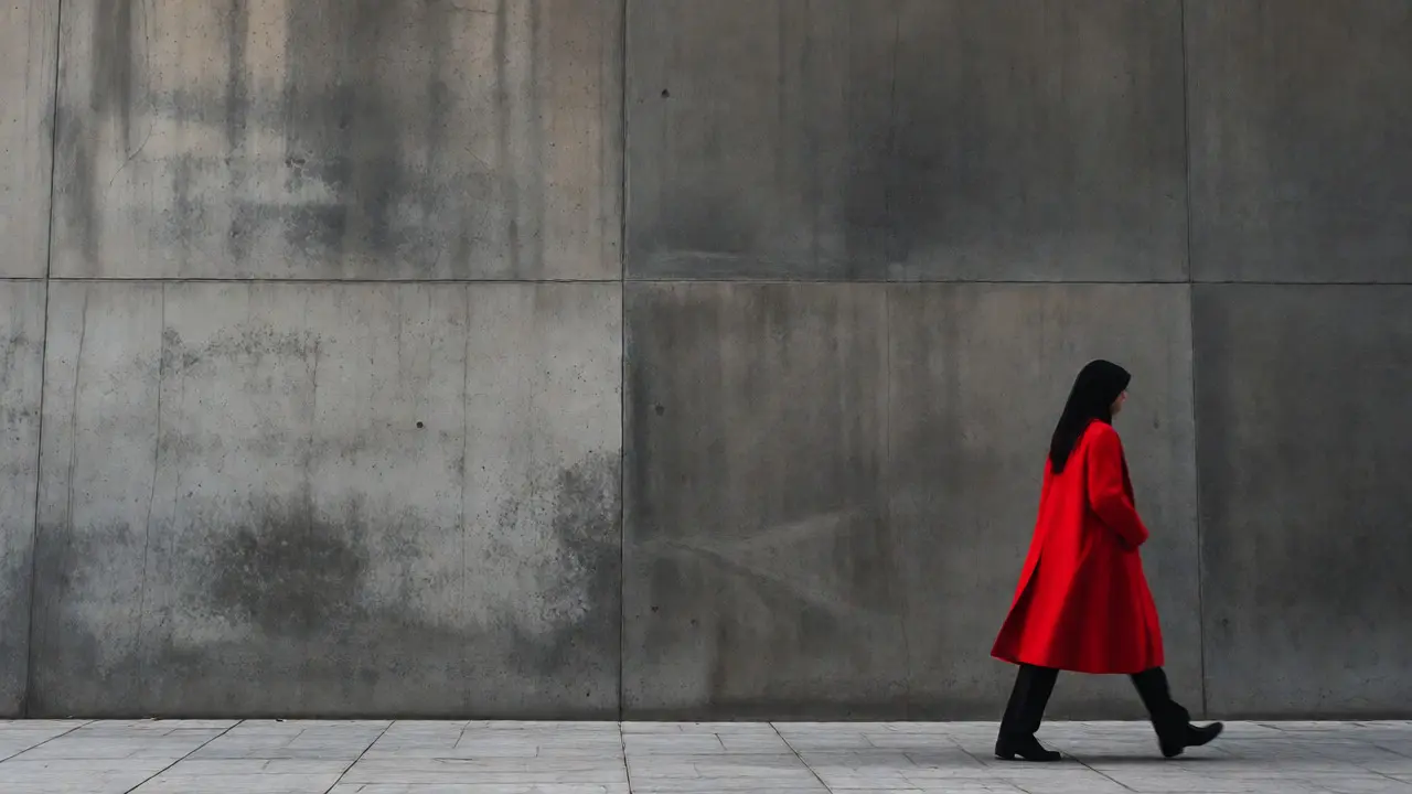
Sometimes subtlety fails. You need a shout. Bold colors demand attention. This works best when the rest of the frame is neutral. Imagine a black-and-white world with one splash of color. This technique, often called selective color, isolates the subject instantly. But you do not need post-processing tricks to achieve this. Nature provides high-contrast scenarios daily. Construction sites offer safety vests in fluorescent orange against dusty beige backgrounds. Markets provide piles of red tomatoes next to white tiles. These natural contrasts are gold mines for candid shots.
| Strategy | Visual Impact | Best For | Risk |
|---|---|---|---|
| Bold Contrast | High immediate attention | Isolating subjects, dynamic scenes | Can look artificial if over-edited |
| Subtle Harmony | Lingering appreciation | Mood pieces, environmental portraits | May blend into background if lighting is flat |
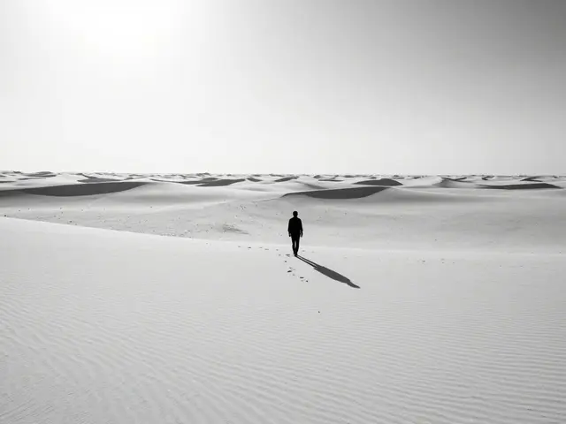
| Monochromatic | Unified, clean aesthetic | Minimalist compositions, texture focus | Can feel boring without strong shape |
When using bold colors, keep the composition simple. If the color is loud, the shapes must be quiet. Clashing patterns plus clashing colors create noise. Noise confuses the brain. Look for solid blocks of color. A large blue door is more powerful than a small blue sticker. Scale matters. The larger the area of saturated color, the stronger its pull. Use this power to lead the eye toward the face or hands of your subject. The color acts as an arrow pointing to the human element.
Subtle Hues: The Quiet Narrative
Not every photo needs to yell. Some stories whisper. Subtle hues rely on analogous colors-neighbors on the color wheel. Think of various shades of brown, tan, and beige in an old library or a coffee shop. These palettes feel cohesive and calming. They invite the viewer to step into the scene rather than observe it from afar. This approach requires a sharper eye for detail. You are looking for tonal relationships, not just hue differences.
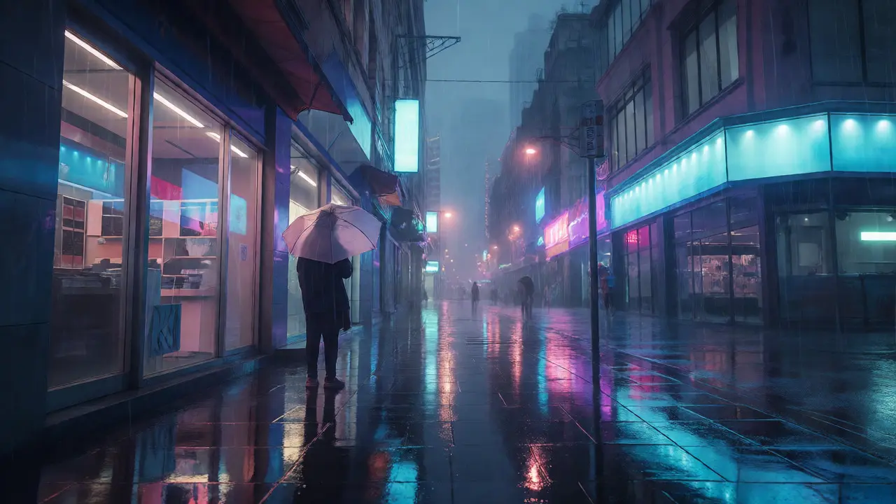
Weather plays a massive role here. Fog desaturates colors, creating soft pastels. Rain reflects ambient light, mixing city lights with wet pavement reflections. These conditions flatten contrast but deepen mood. A photograph taken in heavy rain might lack vibrant pops but gain atmospheric depth. Do not fear dull days. Dull light is a blank canvas. It allows you to introduce color through clothing or props without competing with harsh sunlight. A person holding a purple umbrella in a grey foggy morning stands out precisely because the surroundings are muted.
Finding Color in the Concrete Jungle
Where do you find these palettes? Cities are messy, which means they are colorful. Start by scanning for repetition. Repeated colors create rhythm. A row of identical mailboxes painted red creates a pattern. Break that pattern with a single different color. Maybe one mailbox is green. Or maybe a person walks past wearing a green hat. This break in pattern draws the eye immediately. It is a visual joke. Viewers enjoy finding the anomaly.
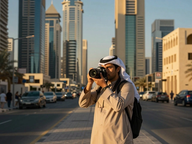
Look up. Buildings have facades. Windows reflect sky. Billboards change. Architecture provides static color anchors. People provide moving color accents. Combine these elements. Wait for a pedestrian to enter the frame near a colorful wall. Time your shutter release so their clothing complements or contrasts with the background. This requires anticipation. You cannot react fast enough to catch perfect color alignment. You must predict where the color will appear. Study the flow of traffic. Notice which paths pedestrians take. Position yourself where the color interaction is most likely to happen.

Post-Processing: Enhancing Without Destroying
Capturing the right color is half the battle. Editing is the other half. Many beginners ruin good captures with aggressive sliders. Remember, your goal is to enhance reality, not replace it. Start with white balance. Correcting white balance ensures skin tones look natural. If your whites look blue, everything looks cold. If they look yellow, everything looks sickly. Get this right first. Then adjust saturation globally. If the image feels flat, increase vibrance slightly. Vibrance protects skin tones while boosting less saturated colors. This is safer than saturation, which boosts everything equally.
Use local adjustments sparingly. Dodge and burn can emphasize colored areas. Brighten the subject’s red shirt slightly to make it pop against a dark coat. Darken the edges to draw focus inward. Avoid changing hues unless necessary. Shifting a blue sky to teal might look artistic, but it breaks realism. Unless you are going for a stylized look, stick to what the eye saw. Authenticity builds trust. Viewers connect with genuine moments. Artificial colors feel distant. Let the camera capture the truth, then refine it gently.
Practical Tips for Better Color Hunting
- Learn the map: Know where the colorful spots are. Markets, graffiti alleys, and tourist districts offer variety. Residential areas offer uniformity.
- Shoot during shoulder hours: Midday sun blows out highlights. Early morning and late afternoon provide softer light and richer shadows.
- Dress neutrally: Wear black, grey, or navy. Bright clothes distract you and might reflect onto subjects. Stay invisible.
- Review in B&W: Sometimes checking composition in black and white helps you see shapes better. Then switch back to color to add emotion.
- Limit your palette: Try shooting only one color per outing. Hunt for reds all day. This trains your eye to spot specific hues quickly.
Consistency beats intensity. You do not need a masterpiece every time you go out. You need to train your eye to see color as a structural element. Over time, you will start seeing potential frames everywhere. A puddle reflecting a neon sign becomes a portal. A child’s toy left on a bench becomes a focal point. The city offers endless combinations. Your job is to notice them before they disappear.
Does street photography require color?
No, black and white is a valid choice. However, understanding color theory helps even in monochrome work because it teaches you about contrast and tone. Color adds an emotional layer that black and white lacks, making it a powerful tool for storytelling.
How do I handle mixed lighting sources?
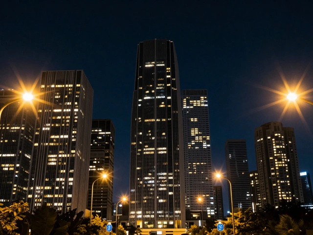
Mixed lighting (e.g., daylight and tungsten) creates interesting color casts. Embrace it rather than fighting it. Adjust your white balance to favor one source, allowing the other to create a complementary tint. This adds depth and realism to night scenes.
What camera settings help with color accuracy?
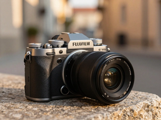
Shoot in RAW format to retain maximum color data. Use manual white balance or custom presets for consistent results. Keep ISO low to reduce noise, which can distort color fidelity. Proper exposure prevents clipping highlights, preserving color detail in bright areas.
Should I use filters for color enhancement?
Polarizing filters reduce glare and deepen blues, enhancing sky and water colors. Graduated ND filters help balance exposure in high-contrast scenes, preserving color detail in both shadows and highlights. Digital filters in post-processing offer more flexibility but cannot recover blown-out details.
How do I avoid cluttered color compositions?
Simplify the frame. Remove distracting elements by moving closer or changing angles. Stick to two or three dominant colors. If there are too many competing hues, the image loses focus. Use negative space to let the colors breathe.