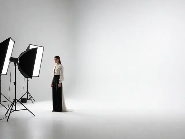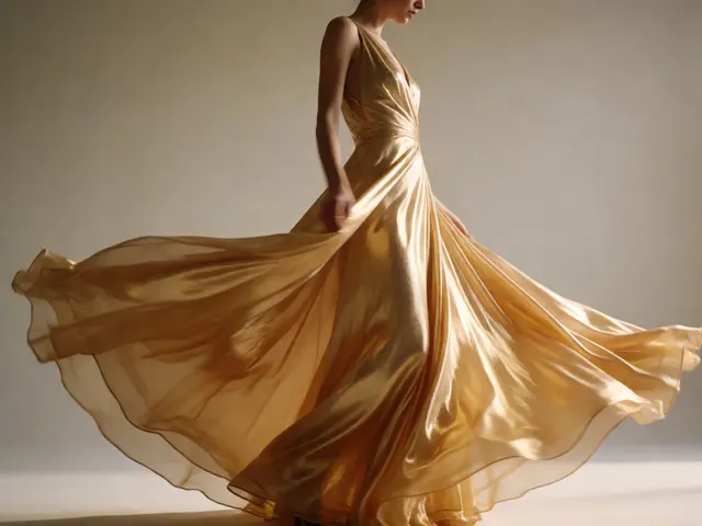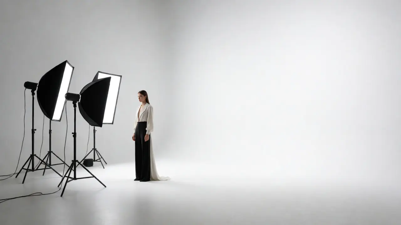
You know that feeling when you’re staring at a raw file, zoomed in at 100%, and you see the faint, ugly curve where the wall meets the floor? It kills the illusion. In studio fashion photography, the goal is often to create an infinite space or a controlled environment that isolates the subject. If your background has a visible horizon line, you’ve failed the first test of professionalism. Whether you are shooting high-end editorial work or clean e-commerce catalogs, the separation between model and background must be invisible or intentional.
Most beginners think buying a white sheet solves this. It doesn’t. A wrinkled sheet looks like a bedsheet, not a void. To get that crisp, floating look, you need to understand how light interacts with physical space. This isn’t just about gear; it’s about geometry and physics. Let’s break down how to build sets that don’t distract from the clothes, but elevate them.
The Physics of the Invisible Horizon
The secret to a seamless background isn’t Photoshop; it’s distance. When you place a subject too close to a backdrop, shadows form in the corner where the vertical paper meets the horizontal floor. This creates a "V" shape that draws the eye downward. To fix this, you need to pull the subject forward. But pulling them forward introduces another problem: falloff. The further they are from the background, the darker the background becomes unless you light it separately.
This is where the concept of inverse square law comes into play. Light intensity drops off rapidly as distance increases. If your main light is on the model, the background gets exponentially less light. For a pure white background, you need to blast it with dedicated strobes until it clips slightly. For a gray or colored background, you need to control the spill so it doesn’t wash out the subject’s edges. You aren’t just taking a picture; you are balancing two separate exposures within one frame.
| Background Color | Desired RGB Value (Approx) | Lighting Strategy | Common Pitfall |
|---|---|---|---|
| Pure White | 255, 255, 255 | Overexpose by 1.5-2 stops relative to subject | Subject rim light disappears if backlight is too strong |
| Mid-Gray | 128, 128, 128 | Match subject exposure; use flags to block spill | Background looks muddy due to shadow gradients |
| Deep Black | 0, 0, 0 | No light on background; keep subject far away | Black velvet absorbs light, making focus difficult |
| Sky Blue | Varies | Even coverage required to avoid color banding | Uneven lighting causes visible hotspots |
Choosing Your Canvas: Paper vs. Fabric vs. Paint
Once you understand the lighting, you have to pick your material. There are three main contenders, and each has distinct behaviors under studio lights.
- Seamless Paper is the industry standard for good reason. Brands like Savage Universal produce rolls up to 107 inches wide. It’s cheap, disposable, and comes in every color imaginable. However, paper tears easily and wrinkles if left rolled too long. It also reflects light differently depending on the finish-matte reduces glare, while satin adds sheen.
- Muslin Backdrops offer texture. If you want a gritty, organic feel for a denim campaign, muslin works. But it requires steaming before every shoot. One wrinkle ruins the shot. Muslin also absorbs light, meaning you need more power to get a bright background compared to paper.
- Permanent Painted Walls are the luxury option. If you own a studio, painting a cove (a curved transition from wall to floor) with flat matte paint gives you a permanent, wrinkle-free surface. It costs thousands upfront but saves money on consumables. The catch? You can’t change colors quickly without repainting or using gel filters.
I once worked with a client who insisted on using a green screen because they wanted to "fix it in post." They didn’t realize that green spill bounces onto the model’s skin, turning their highlights sickly yellow. Unless you have a chroma-key expert in post-production, stick to real backgrounds. Real light on real surfaces beats digital fakery every time.
Set Design That Doesn’t Clutter the Frame
A seamless background provides the canvas, but set design provides the story. In fashion, less is almost always more. Your job is to remove distractions, not add decoration. Think about negative space. If the model is looking left, leave room on the right for text placement or visual breathing room.
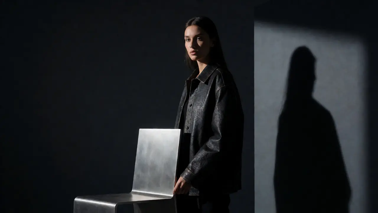
Props should serve the garment. If you’re shooting a leather jacket, a sleek metal chair might complement the texture. A rustic wooden bench might clash. Consider the scale. A tiny prop next to a full-body shot looks insignificant. A massive architectural element can dwarf the model, emphasizing vulnerability or dominance.
Here is a quick heuristic for prop selection:
- Texture Match: Does the prop’s texture contrast or harmonize with the fabric? Silk needs smooth surroundings; wool can handle rougher textures.
- Color Theory: Use complementary colors for pop (blue dress, orange chair) or analogous colors for mood (green dress, teal wall).
- Functionality: Can the model interact with it naturally? If they look stiff holding a vase, move the vase.
Remember, the camera flattens depth. A prop that looks fine to the naked eye might overlap awkwardly with the model’s head in the lens. Always check through the viewfinder before committing to a setup. Adjust the angle by even two inches to clear a collision.
Lighting Techniques for Flawless Separation
To make the model pop off the background, you need separation. This is usually achieved with rim light or hair light. Place a strobe behind the subject, aimed at their back or hair, and flag it so it doesn’t hit the lens directly. This creates a glowing edge that visually separates the silhouette from the backdrop.
For a dramatic noir look, use hard light from the side. This casts deep shadows across the face and body, adding dimension. For beauty shots, use softboxes or octaboxes placed close to the model. The larger the light source relative to the subject, the softer the shadows. Soft light wraps around curves, hiding imperfections in the skin and fabric.
Don’t forget the fill. If your key light is harsh, the shadow side of the model will crush to black. Use a reflector or a low-power strobe on the opposite side to lift those shadows. But be careful-too much fill flattens the image. Aim for a ratio of 3:1 or 4:1 between key and fill for most fashion work. This keeps drama while retaining detail.

Post-Production: Cleaning Up the Seam
Even with perfect lighting, you’ll likely need some cleanup. Start by cropping out any visible stand legs or clamps. Then, check for unevenness in the background. Sometimes, a subtle gradient appears because the light wasn’t perfectly centered. Use a radial mask in Lightroom or Capture One to even out the brightness.
If you shot against a dark background, watch out for noise in the shadows. High ISO settings amplify grain in dark areas. Keep your ISO low (100-200) and rely on strobe power instead. If you must raise the ISO, apply luminance noise reduction specifically to the background layer, keeping the model sharp.
For white backgrounds, ensure they are truly white. Select the background area and adjust the levels until the histogram touches the right edge without clipping important details in the model’s whites (like a wedding dress). If the background is off-white, it looks dated. Pure white signals modernity and cleanliness.
Troubleshooting Common Studio Nightmares
Things go wrong. Here is how to fix the most frequent issues without panicking.
- Shadows on the background: Move the model further away. If you can’t, use a boom arm to position the light higher and closer to the model, reducing the angle of incidence on the wall.
- Wrinkles in paper: Don’t try to iron them. Unroll the paper fully and let it hang for 24 hours before the shoot. Gravity does the work for you. If you’re in a rush, use a handheld steamer, but keep it moving to avoid water spots.
- Color cast on the model: Check your white balance. If you’re mixing tungsten practicals with daylight strobes, you’ll get weird tints. Gel your practicals to match your strobes, or turn them off entirely.
- Focus hunting: Dark backgrounds confuse autofocus systems. Switch to manual focus or use single-point AF locked on the model’s eye. Use a flashlight to help the camera find contrast if necessary.
Building a great studio setup is iterative. Start simple. Master the seamless paper roll before investing in custom builds. Learn how light falls off. Understand why a gray card matters. Once you control the environment, you control the narrative. And in fashion photography, the narrative is everything.
How wide should my seamless background be?
For full-body fashion shots, a 9-foot (107-inch) wide roll is ideal. This allows you to shoot horizontally without seeing the edges of the paper. For portrait-only work, a 5-foot (60-inch) width is sufficient and cheaper. Always buy wider than you think you need; you can crop later, but you can't add width.
Do I need a special stand for seamless paper?
Yes. A sturdy support system with crossbars and clamps is essential. Cheap stands wobble, causing the paper to sway and creating inconsistent lighting. Look for stands rated for at least 10 pounds of weight to hold heavy rolls securely. Sandbags on the base prevent tipping during active shoots.
Why does my white background look gray?
This is usually a lighting issue, not a camera setting. Your background is receiving insufficient light compared to the subject. Add dedicated strobes aimed solely at the background. Overexpose the background by 1.5 to 2 stops relative to your subject's exposure. Also, ensure the model is not casting a shadow on the wall by moving them forward.
Can I use a bedsheet as a seamless background?
You can, but it rarely looks professional. Bedsheets have seams, patterns, and wrinkles that absorb light unevenly. They also tend to yellow over time. If you must use fabric, choose solid-colored muslin or cotton twill, steam it thoroughly, and hang it high enough to drape smoothly without touching the floor.
What is the best way to store seamless paper?
Store rolls vertically in a dry, cool place. Humidity causes paper to curl and mold. Keep them capped with plastic ends to protect the edges from dents. Never lay rolls flat on top of each other, as the weight of the top rolls can crush the bottom ones, creating permanent creases.