Ever scroll through Instagram and instantly know whose photo it is before you even see the handle? That’s not magic. It’s consistency. In a feed saturated with noise, a recognizable aesthetic acts like a fingerprint for your work. It tells viewers, “This is me,” without saying a word.
Building this kind of visual identity isn’t about copying trends or sticking to one rigid rulebook forever. It’s about finding the intersection between what you love, what you’re good at, and what resonates with your audience. Let’s break down how to move from random snapshots to a cohesive body of work that people actually remember.
The Core Pillars of Visual Identity
Before you start shooting differently, you need to understand what makes an image feel “yours.” Most consistent aesthetics rely on three non-negotiable pillars: color, light, and composition. If you change one drastically while keeping the others static, the vibe shifts immediately.
- Color Palette: This is your strongest signal. Do you gravitate toward warm, golden-hour tones? Or do you prefer cool, desaturated blues and greys? Pick a dominant hue range and stick to it. For example, if you shoot street photography, muted earth tones might ground your images, while high-contrast black and white could emphasize texture and mood.
- Lighting Style: Hard shadows create drama; soft diffused light creates calm. Decide if you want your photos to feel energetic and punchy or serene and airy. Natural light enthusiasts often lean into overcast days for even lighting, while studio shooters might control every ray to match their specific look.
- Composition Rules: Do you favor negative space? Symmetry? Rule of thirds? Consistent framing helps the eye process your work faster. If you always place subjects off-center, that becomes part of your signature.
Finding Your Niche Through Repetition
It sounds counterintuitive, but variety is the enemy of consistency when you’re trying to build recognition. You don’t need to photograph only one subject. A wedding photographer can have a consistent aesthetic whether they’re capturing a quiet first look or a chaotic dance floor, provided the color grade and lighting treatment remain uniform.
Try this exercise: pick five recent photos you’re proud of. Lay them out side by side. What do they share? Maybe they all have a slight green tint in the shadows. Maybe they all use wide-angle lenses. That shared DNA is your starting point. Now, ask yourself: is this accidental luck, or intentional choice? If it’s lucky, make it a rule. If it’s intentional, document it.

The Role of Post-Processing in Branding
Many photographers think consistency happens in-camera. While gear matters, the real glue of an aesthetic is post-processing. Tools like Adobe Lightroom allow you to save presets that enforce your color choices automatically. But beware of one-size-fits-all presets. They can flatten dynamic ranges or wash out skin tones if applied blindly.
Instead, develop a base edit workflow. Start with exposure and contrast adjustments, then apply your signature color tweaks. Save this as a custom preset. When you review new shots, adjust only the variables that differ (like white balance) rather than rebuilding the look from scratch. This ensures that a portrait taken in a bright park feels tonally similar to a landscape shot at dusk.
| Style | Color Profile | Lighting Preference | Best For |
|---|---|---|---|
| Moody & Dark | Low saturation, deep blacks | Hard light, high contrast | Portraits, Street |
| Air & Light | Pastels, lifted blacks | Soft, diffused natural light | Weddings, Lifestyle |
| High Contrast B&W | No color, strong greys | Directional, dramatic | Architecture, Editorial |
| Vibrant Pop | Saturated, warm highlights | Bright, direct sunlight | Travel, Product |
Curating Your Portfolio for Cohesion
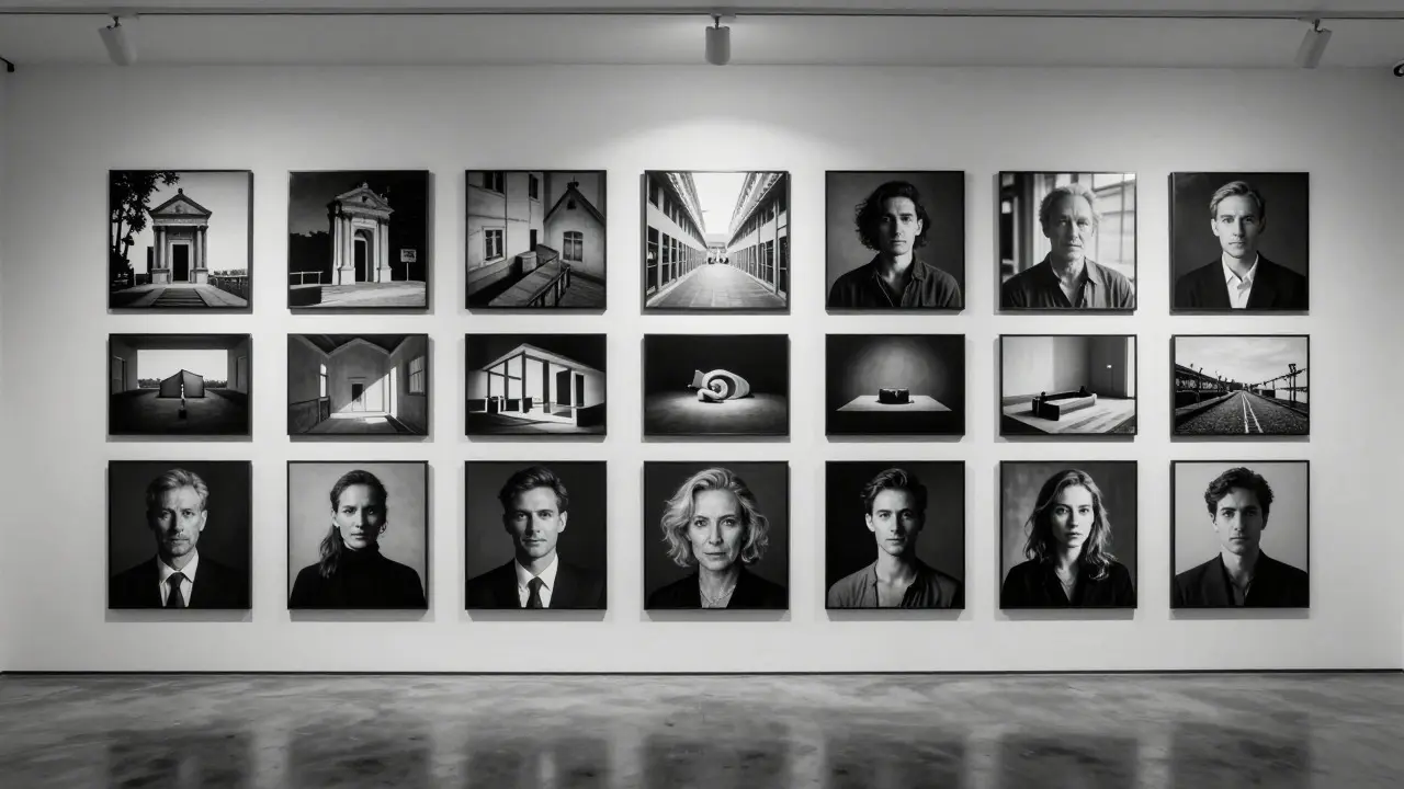
Your portfolio is where consistency pays off. Clients and followers judge your brand by the collection, not the single best image. If your gallery jumps from neon cyberpunk vibes to soft pastel florals without explanation, it feels disjointed.
Curate ruthlessly. Remove images that don’t fit the current narrative. It’s okay to hide your favorite shot if it clashes with your established palette. Consistency doesn’t mean monotony; it means harmony. Think of your portfolio like a playlist. Every song should flow into the next. If you’re switching genres, consider creating separate albums or collections so each theme stands alone.
Maintaining Consistency Across Platforms
Instagram, Behance, and personal websites all display images differently. Compression artifacts, aspect ratios, and screen calibrations can alter how your colors appear. To maintain your aesthetic across these platforms, test your exports regularly.
Use standard sRGB color profiles for web sharing to ensure broad compatibility. Check how your images look on mobile devices, which are the primary viewing platform for most audiences. If your darks crush too much on a phone screen, lighten your shadow settings slightly. Adaptation is part of consistency-your look should survive the technical constraints of different displays.
When to Evolve Your Style
Staying consistent doesn’t mean staying stagnant. Artists evolve. The key is to transition gradually. Introduce new elements slowly. Perhaps you’ve always shot in color, but you want to experiment with black and white. Don’t switch your entire feed overnight. Mix in a few B&W shots alongside your colored ones. Let your audience adjust. Over time, the new element becomes part of your signature rather than a jarring interruption.
Remember, a recognizable aesthetic is a promise to your viewer. Keep that promise, and they’ll keep coming back.
How long does it take to build a recognizable photography aesthetic?
There is no fixed timeline, but most photographers begin to see a clear pattern after 50 to 100 curated images. Consistency comes from repetition and refinement. Focus on quality over quantity during this phase, ensuring each new photo aligns with your defined color and lighting rules.
Do I need expensive camera gear to have a consistent style?
No. Gear affects resolution and low-light performance, but aesthetic consistency is primarily driven by creative choices like composition, lighting, and post-processing. A smartphone photographer can have a highly recognizable style if they maintain strict color and framing guidelines.
What is the biggest mistake beginners make when trying to be consistent?
The biggest mistake is changing the style too frequently based on fleeting trends. Chasing viral filters leads to a fragmented portfolio. Instead, identify core preferences that you genuinely enjoy and commit to them for at least six months before making significant changes.
Can I have multiple consistent aesthetics for different clients?
Yes, but manage them carefully. Many commercial photographers have distinct looks for corporate headshots versus lifestyle branding. Clearly label these services on your website so clients know what to expect. Avoid mixing these styles in a single social media feed unless you use dedicated hashtags or stories to separate them.
How important is lighting compared to color grading?
Lighting is foundational. You can fix color issues in post, but bad lighting often requires heavy manipulation that degrades image quality. Consistent lighting setups or shooting conditions ensure that your color grading has a stable base to work with, resulting in a more authentic and professional look.