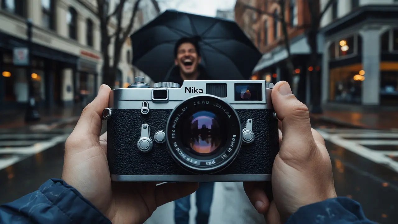
You shoot the raw moment. The rain slicks the pavement in Portland, a stranger laughs under an umbrella, and you click. But when you open that file in your editor, it looks flat. Boring. Like a snapshot from a phone camera, not the cinematic frame you saw with your eyes. This is where street photography editing separates the amateurs from the pros. It isn’t about slapping on a filter; it’s about translating emotion into pixels.
Most beginners mess this up by trying to make everything "pop." They crank saturation until faces look orange and shadows crush into black blobs. Real street editing is subtle. It’s about guiding the viewer’s eye to the subject while keeping the background believable. You need to master three specific tools: tone curves, the backbone of contrast and dynamic range adjustment, grain, a texture element that adds depth and authenticity, and color grading, the art of harmonizing hues for mood. If you get these right, your images will feel timeless. If you ignore them, they’ll feel digital and cold.
Why Your Street Photos Look Flat (And How to Fix It)
Before you touch a slider, understand why your RAW files look dull. Digital sensors capture light linearly, but human vision works logarithmically. We see details in bright skies and dark alleys simultaneously. A camera often clips highlights or crushes shadows because it can’t handle that dynamic range. When you import a RAW file into software like Adobe Lightroom or Capture One, it applies a basic profile that flattens contrast to preserve data. This is safe, but it’s not artistic.
Your job is to reintroduce contrast without losing detail. In street photography, context matters. You can’t just boost global contrast because that might blow out a neon sign or hide a pedestrian in the shadows. You need targeted adjustments. Think of your histogram as a roadmap. If it’s bunched in the middle, your image lacks punch. If it’s spread edge-to-edge, you have good dynamic range. Most street shots live in the mid-tones. That’s where the story happens. Your editing goal is to lift those mid-tones slightly while anchoring the blacks and whites.
Mastering Tone Curves for Depth
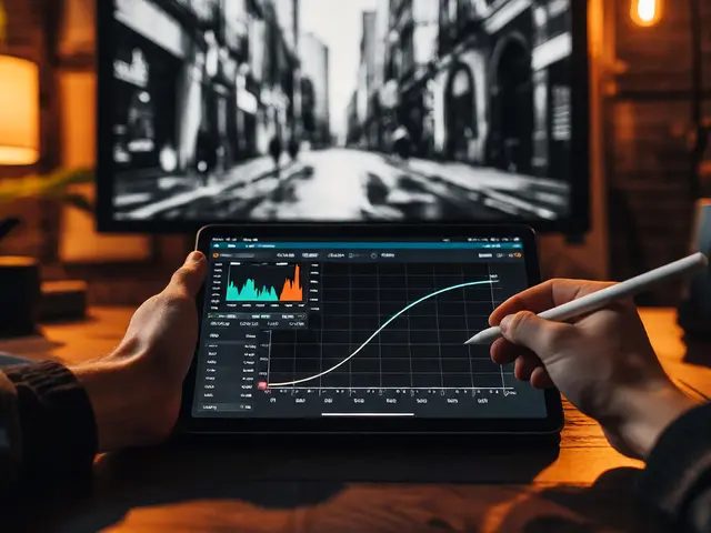
The tone curve is the most powerful tool in your editing arsenal. Unlike sliders that adjust broad ranges, the curve lets you manipulate specific luminance levels independently. For street photography, I usually start with a gentle "S" shape. This lifts highlights and deepens shadows, adding perceived sharpness and depth. But don’t overdo it. A steep S-curve creates a high-contrast, gritty look that can distract from the subject.
Here’s a practical workflow for adjusting curves:
- Anchor the Blacks: Drag the bottom-left point of the curve slightly upward. This prevents pure black clipping, ensuring shadow details remain visible. In urban environments, shadows often contain crucial narrative elements, like a cat hiding under a bench.
- Lift the Whites: Drag the top-right point slightly down if your sky is blown out. This recovers highlight detail without making the image look gray.
- Adjust Midtones: Add two points in the middle of the curve. Pull one down slightly to deepen shadows around the subject, and push one up to brighten the subject’s face or key action area. This creates a local contrast effect.
A common mistake is using the RGB channel curves separately too early. Start with the composite (RGB) curve to set overall exposure. Only then should you tweak individual Red, Green, or Blue channels if there’s a color cast. For example, pulling down the Blue channel in the shadows can add warmth, which feels more inviting than cool blue shadows in a winter scene.
| Lighting Condition | Curve Shape | Goal | Pitfall to Avoid |
|---|---|---|---|
| Overcast / Flat Light | Stronger S-Curve | Add artificial contrast and drama | Crushing shadows loses texture in wet pavement |
| Harsh Midday Sun | Gentle S-Curve + Lifted Shadows | Retain detail in deep shadows under hats/collars | Blowing out highlights on skin tones |
| Night / Neon | Deep Blacks + Controlled Highlights | Preserve neon glow without clipping colors | Noise reduction smoothing away grain texture |
| Golden Hour | Soft Curve + Warm Tint | Enhance natural warmth without oversaturation | Making skin tones look overly orange |
Adding Grain for Authenticity
Digital noise is ugly. Film grain is beautiful. Why? Because film grain has structure. It clusters in patterns that our brains interpret as texture rather than error. Adding film grain to your digital street photos mimics the aesthetic of classic 35mm cameras like the Leica M6 or Nikon FM2. It also helps mask banding in gradients, like a foggy sky or a smooth wall.
When applying grain, less is more. In Lightroom, go to the Effects panel. Set Amount between 10 and 30 for most daylight shots. Size should be small (around 10-15) to mimic fine-grain films like Kodak Portra 400. Roughness controls how clumped the grain is; keep it low (10-20) for a smoother look. If you’re shooting at night, you might increase Amount to 40-50 and Size to 20-25 to emulate high-speed films like Ilford Delta 3200. This adds grittiness that fits the chaotic energy of nighttime streets.
Pro Tip: Don’t apply grain uniformly. Use masking to reduce grain in smooth areas like faces or clear skies, and emphasize it in textured areas like brick walls or asphalt. This selective application enhances realism. You can use the brush tool in Lightroom or Photoshop to paint grain intensity onto specific parts of the image.
Color Grading for Mood
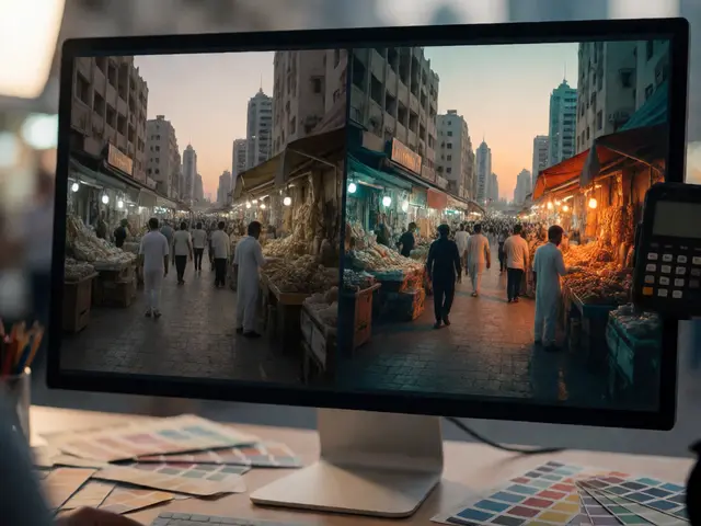
Color is emotion. In street photography, you rarely want perfectly neutral colors unless you’re documenting historical events. You want a vibe. Color grading involves shifting hues, saturation, and luminance to create a cohesive palette. The most popular technique is teal and orange, but don’t let that become a cliché. Instead, think about complementary colors that suit the scene.
Start with HSL (Hue, Saturation, Luminance) sliders. Reduce saturation in distracting colors. If a red car competes with your subject’s red shirt, desaturate the car’s red slightly. Boost saturation only in the subject’s clothing or key props. Then, move to the Color Grading panel. This allows you to tint shadows, midtones, and highlights independently.
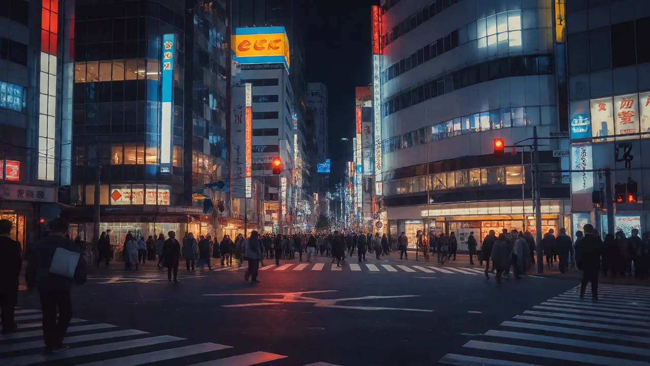
For a moody, cinematic look, try adding a slight blue or teal tint to the shadows and a warm yellow or orange tint to the highlights. This mimics the way light interacts with atmosphere-cool shadows, warm sun. But keep it subtle. If your shadows look purple, you’ve gone too far. Check your skin tones. They should remain natural. If faces look sickly, pull back on the green or magenta tints.
Workflow Integration: From Capture One to Final Export
Editing isn’t just about sliders; it’s about efficiency. You might shoot hundreds of frames in a day. You can’t spend twenty minutes on each. Create a baseline preset that handles the boring stuff: lens correction, basic white balance, and default sharpening. Then, manually adjust tone curves and color grading per image.
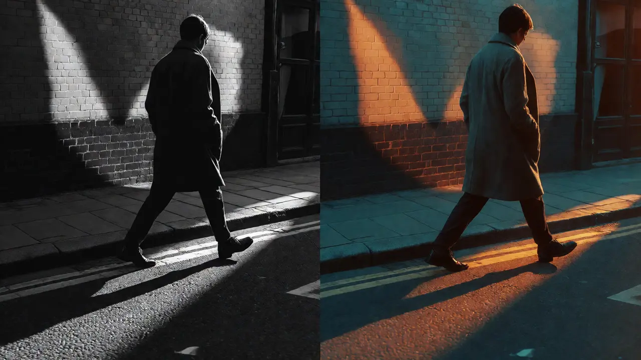
Use virtual copies in Lightroom to experiment. Take your best shot and create three versions: one high-contrast black and white, one muted color grade, and one vibrant color grade. Step away for ten minutes. Come back and pick the one that tells the story best. Often, black and white removes distractions and focuses on form and gesture, which are critical in candid street shots. However, if color is part of the narrative-a bright yellow taxi, a colorful mural-keep it.
Finally, export settings matter. For web, use sRGB color space. For print, use Adobe RGB or ProPhoto RGB depending on your printer’s capabilities. Always output at 300 DPI for print and 72-96 DPI for web. Sharpening should be applied last. Use "Screen" sharpening for web (Amount 50-70, Radius 0.8-1.0) and "Print" sharpening for physical media (Amount 25-40, Radius 1.0-1.5).
Common Pitfalls and How to Avoid Them
Even experienced editors fall into traps. Here are the big ones:
- Oversharpening: Cranking clarity or dehaze creates halos around subjects. Keep Clarity below +30 for portraits. Use Dehaze sparingly, as it introduces noise and unnatural contrast.
- Ignoring Skin Tones: Always check skin tones against a reference. If everyone looks tan or pale, your white balance is off. Use the eyedropper tool on a neutral gray object in the scene, like a concrete sidewalk.
- Cropping Too Aggressively: Street photography relies on context. Don’t crop so tight that you lose the environment. Leave enough room to show where the subject is interacting with their surroundings.
- Inconsistent Style: Pick a style and stick to it for a series. Mixing heavy vignettes with clean minimalism confuses the viewer. Consistency builds your brand.
Remember, editing is subjective. What works for a rainy Tokyo alley might not work for a sunny New York park. Experiment. Break rules. Sometimes, a broken white balance captures the heat haze better than a corrected one. Trust your eyes, not just the histogram.
Should I edit my street photos in black and white?
Not always. Black and white is excellent for removing distractions and emphasizing shapes, textures, and emotions. It’s ideal for scenes with strong lighting contrasts or when colors clash. However, if color plays a narrative role-like a bright red umbrella in a gray crowd-keep it in color. Edit both versions and choose the one that communicates the story more clearly.
How much grain is too much in street photography?
Grain should enhance texture, not dominate the image. For daytime shots, keep grain amount below 20% in most software. For night shots, up to 40-50% is acceptable to mimic high-speed film. If the grain looks like static TV noise rather than organic texture, reduce the size and roughness settings. Always zoom in to 100% to check grain quality before exporting.
What is the best software for street photography editing?
Adobe Lightroom Classic is the industry standard for its non-destructive editing and efficient library management. Capture One offers superior color rendering and tethering capabilities, favored by many professional street photographers. For advanced compositing or retouching, combine either with Adobe Photoshop. Free alternatives like Darktable provide similar power but have a steeper learning curve.
Do I need to correct lens distortion in street photos?
Yes, usually. Wide-angle lenses used in street photography often exhibit barrel distortion, curving straight lines like buildings or sidewalks. Enable profile corrections in your editing software to fix this automatically. However, if you’re intentionally using a fisheye lens for artistic effect, leave the distortion intact. Always check vertical lines to ensure the horizon doesn’t look tilted unintentionally.
How do I maintain consistency across a photo series?
Create a custom preset that includes your preferred tone curve, grain settings, and color grading basics. Apply this preset to all images from a specific shoot. Then, make minor adjustments to exposure and white balance for each individual photo. Review the entire series side-by-side to ensure the mood and tonal range feel unified. Adjust outliers until they fit the collective visual language.