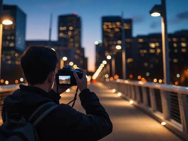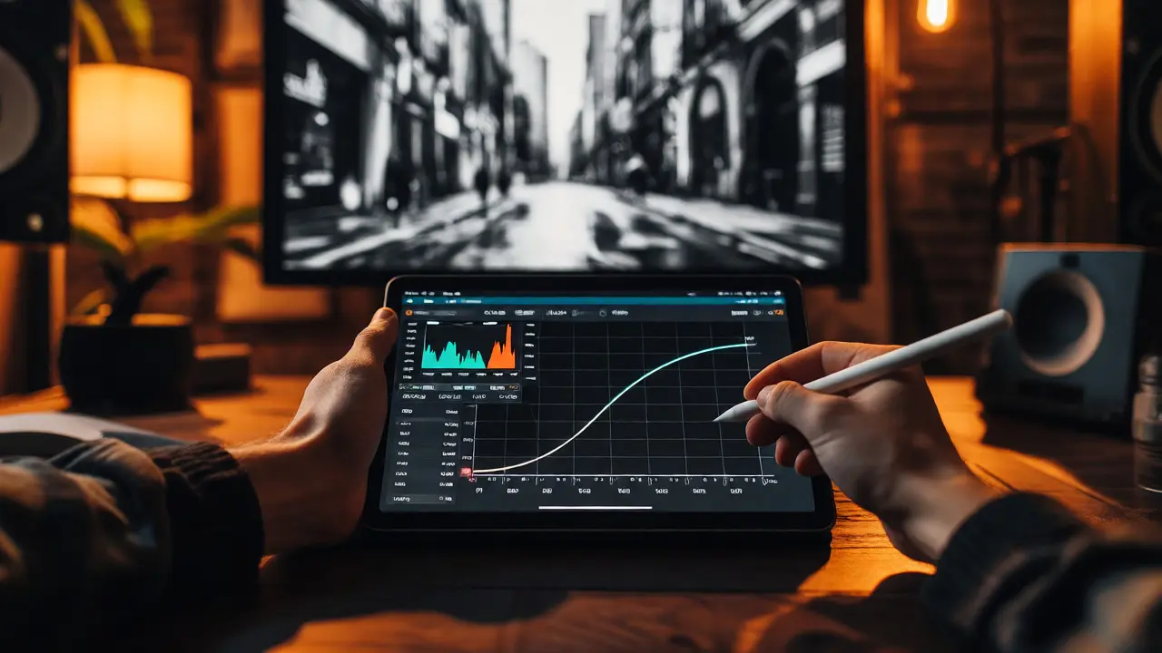
You shot a perfect candid moment on the busy streets of Portland last Tuesday. The light was fading, the subject’s expression was raw, and you nailed the composition. But when you open that RAW file in Lightroom or Capture One, it looks flat. It lacks the grit, the mood, and the punch that made the scene feel alive in your memory. This is where street photography editing becomes an art form rather than just technical cleanup. You aren’t trying to fix a broken photo; you’re translating a feeling. Most beginners mess this up by over-saturating colors or crushing blacks until details vanish. Let’s break down how to use tone curves, grain, and color to make your candids sing without looking like every other Instagram filter from 2015.
Why Your Street Photos Look Flat (And How to Fix Them)
Here is the hard truth: digital sensors capture too much information. They record shadows that are actually black and highlights that are actually white, but they often lack the dynamic range contrast our eyes perceive. In street photography, especially with candid shots, context is everything. If the background is muddy or the subject blends into the wall behind them, the story dies.
The goal isn't HDR perfection. It's separation and mood. Think about Henri Cartier-Bresson’s work. His images weren't perfectly exposed by modern standards; they were emotionally resonant. To achieve that today, you need to manipulate three specific pillars: tonal structure, texture, and hue. If you ignore any one of these, your image feels incomplete. A clean, sharp digital image with no grain can feel sterile on a gritty urban scene. Conversely, heavy grain with poor tonal balance looks like noise, not style.
Tone Curves: The Backbone of Contrast
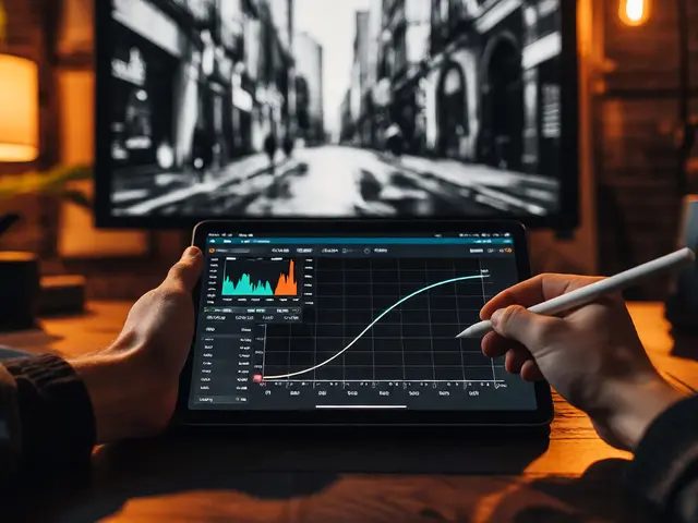
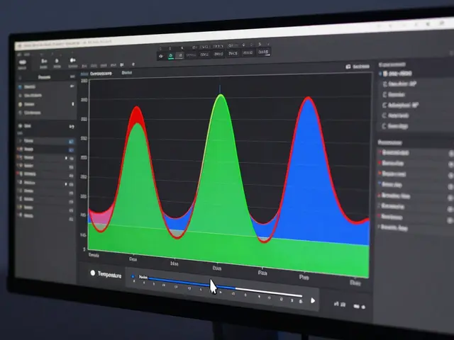
If you only learn one tool for editing street photos, make it the Tone Curve. Unlike sliders that adjust brightness globally, the curve lets you target specific luminance ranges. This precision is critical because street scenes rarely have uniform lighting.
Start with the classic "S-Curve." Drag the lower mid-tones down slightly and the upper mid-tones up. This increases contrast while preserving detail in the deepest shadows and brightest highlights. But here is the pro tip most people miss: don't just pull the corners. Adjust the points near the center of the curve. For a moody, noir look, lift the black point slightly so shadows become dark gray rather than pure black. This mimics the way film renders deep shadows, adding depth without losing readability.
Consider a shot of a commuter under a bridge. The area under the bridge is dark, but their face is lit by a stray beam of sunlight. If you crush the blacks globally, the face might get lost if it falls into the shadow range. Instead, use the RGB channels separately. Lift the blue channel slightly in the shadows to add a cool tint to the dark areas, while keeping the reds neutral in the highlights. This creates atmospheric perspective, making the subject pop against the environment.
| Mood | Curve Shape | Shadow Adjustment | Highlight Adjustment |
|---|---|---|---|
| Documentary/Realistic | Gentle S-Curve | Preserve detail, slight lift | Protect whites, avoid clipping |
| Noir/Dramatic | Steep S-Curve | Lift black point (matte effect) | Crush highlights for punch |
| Faded/Vintage | Inverted L-Shape | Raise black point significantly | Lower white point slightly |
| High Key/Clean | Upward Arc | Brighten shadows heavily | Keep highlights soft |
Grain: Texture That Tells a Story
Digital noise is bad. Film grain is good. Why? Because noise is random chromatic aberration that degrades image quality, while grain is a consistent textural overlay that adds tactile weight. When you shoot street photography, you are often capturing fleeting moments in imperfect light. Adding artificial grain helps unify the image, hiding minor sensor imperfections and giving the photo a timeless quality.
Don't just crank the grain slider to 100%. Start small. In Lightroom, set the Amount to around 20-40 for full-frame files. Set Size to 25 and Roughness to 50. These settings mimic ISO 400-800 Tri-X film, which has a noticeable but elegant texture. If you want a more contemporary, gritty look, increase the size to 50 and roughness to 70. This works well for high-contrast black and white conversions.
Crucially, apply grain selectively. Use a mask to protect skin tones if you are shooting portraits within the street scene. Heavy grain on a face can look like acne or dirt. Mask out the subject’s face and keep the grain on the clothing, walls, and pavement. This draws the eye to the clear, smooth subject while the surroundings retain their textured atmosphere. It’s a subtle trick, but it separates the human element from the urban chaos.
Color Grading: Less Is More
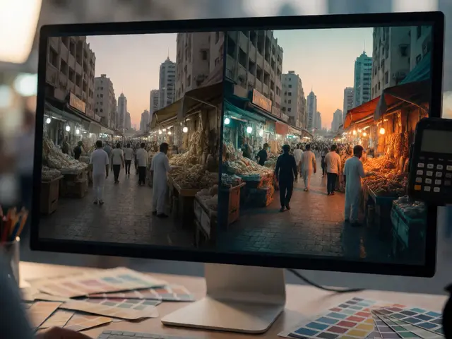
Street photography is notorious for chaotic colors. Neon signs, yellow taxis, red stoplights-it’s a visual cacophony. If you try to correct every color, you end up with a muddy mess. The key is to simplify the palette. Pick two dominant colors and mute everything else.
For example, if you have a shot with a strong yellow taxi and a blue sky, push the saturation of those hues slightly higher while desaturating greens and oranges. This doesn't mean removing color entirely. It means guiding the viewer’s eye. Use the HSL panel to shift similar colors toward your chosen palette. Turn orangey skin tones slightly more pink if your accent color is magenta. Shift green leaves toward teal if your accent is cyan.
Avoid the "teal and orange" cliché unless it fits the scene naturally. Many editors blindly apply split toning-blue shadows, orange highlights-without considering the actual light source. If you are shooting at night under sodium-vapor lamps, your highlights should be warm yellow, not orange. Match your color grade to the ambient light. If the scene is cold and rainy, lean into blues and grays. Don't force warmth where there is none.
Practical Workflow: From RAW to Final Edit
Editing shouldn't take hours per image. Street photography relies on volume and intuition. Here is a streamlined workflow that keeps you moving:
- Global Corrections: Fix lens profiles, remove chromatic aberration, and straighten horizons. Do this first so your subsequent adjustments are accurate.
- Tonal Balance: Apply your Tone Curve. Decide on your contrast strategy before touching color. Black and white conversion happens here if applicable.
- Local Adjustments: Use radial gradients or brush tools to dodge and burn. Brighten the subject’s face, darken distracting backgrounds. This is where the photo gains depth.
- Color Harmonization: Adjust HSL sliders to unify the palette. Remove competing colors.
- Texture and Finish: Add grain. Sharpen lightly (masking enabled to avoid sharpening noise). Vignette subtly to draw focus inward.
Remember, the edit supports the photograph; it doesn't replace it. If you spend more time editing than shooting, you might be compensating for weak compositions. Good street photography edits are invisible-they just make the moment feel real.
Common Pitfalls to Avoid
One major mistake is over-sharpening. Digital sharpening enhances edges, but in street scenes with complex textures (brick walls, foliage), it creates halos and artifacts. Always use masking. Hold the Alt/Option key while adjusting the Masking slider until only the main subject’s edges are highlighted. This ensures you sharpen faces and hands, not the noisy background.
Another trap is excessive vignetting. A heavy black border can make a photo look dated. Keep vignettes subtle-around -10 to -20 amount. The goal is to gently guide the eye, not frame the image like a painting.
Finally, resist the urge to clone out every distraction. Sometimes a blurred pedestrian in the foreground adds motion and context. If it doesn't block the subject, leave it. Perfection is the enemy of authenticity in street photography.
Do I need to shoot in black and white for street photography?
No, but it is a powerful stylistic choice. Black and white removes color distractions, forcing the viewer to focus on shape, light, and emotion. It is ideal for scenes with chaotic or unappealing colors. However, color can tell a different story, emphasizing cultural context or mood through hue. Experiment with both; some images simply demand color to convey their narrative.
How much grain is too much in street photography?
There is no fixed number, but a good rule of thumb is that grain should enhance texture, not obscure detail. If you cannot see fine details in hair or fabric due to grain, you have gone too far. Aim for a level that mimics ISO 400-800 film for a balanced look. For dramatic, high-contrast images, you can push it higher, akin to ISO 3200, but ensure the subject remains legible.
Should I use presets for street photography editing?
Presets are great starting points, but never rely on them exclusively. Every scene has unique lighting conditions. Apply a preset as a base, then manually adjust exposure, contrast, and color balance to suit the specific image. Blindly applying presets often results in inconsistent portfolios and unnatural-looking skies or skin tones.
What software is best for street photography editing?
Adobe Lightroom Classic and Capture One are industry standards for their robust tone curve and local adjustment tools. Darktable is an excellent free alternative with powerful non-destructive editing capabilities. Choose based on your budget and workflow preference, but ensure the software allows precise control over curves and masking.
How do I handle mixed lighting in street photos?
Mixed lighting (e.g., daylight and tungsten) can create color casts. Use the White Balance selector to pick a neutral gray area in the scene. Then, use the HSL panel to desaturate conflicting hues. For example, if a neon sign casts a green glow on a subject, shift the green hue toward teal and reduce its saturation to harmonize with the rest of the image.