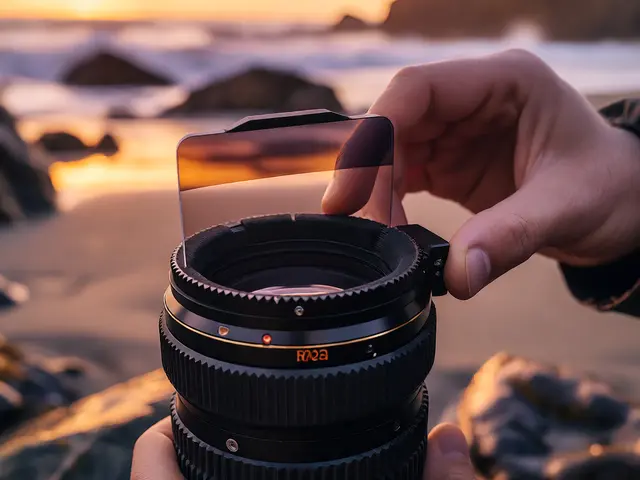
You’ve shot the perfect moment. The lighting is golden, the subject is sharp, and the composition sings. But when you open the file in your editor, it feels… flat. It doesn’t hit you in the gut the way it did through the viewfinder. That missing emotional punch? That’s usually a job for color grading. Unlike basic color correction, which aims to make things look "real," color grading is about making them feel real to the viewer.
Think of color grading as the soundtrack of your photo. You can have great dialogue (sharp focus) and a solid script (composition), but without the right music (color), the scene falls flat. Whether you’re shooting weddings, street portraits, or commercial products, mastering this skill transforms your images from snapshots into stories. It’s not just about slapping on a filter; it’s about understanding how hue, saturation, and luminance interact to trigger specific psychological responses.
The Psychology Behind Your Palette
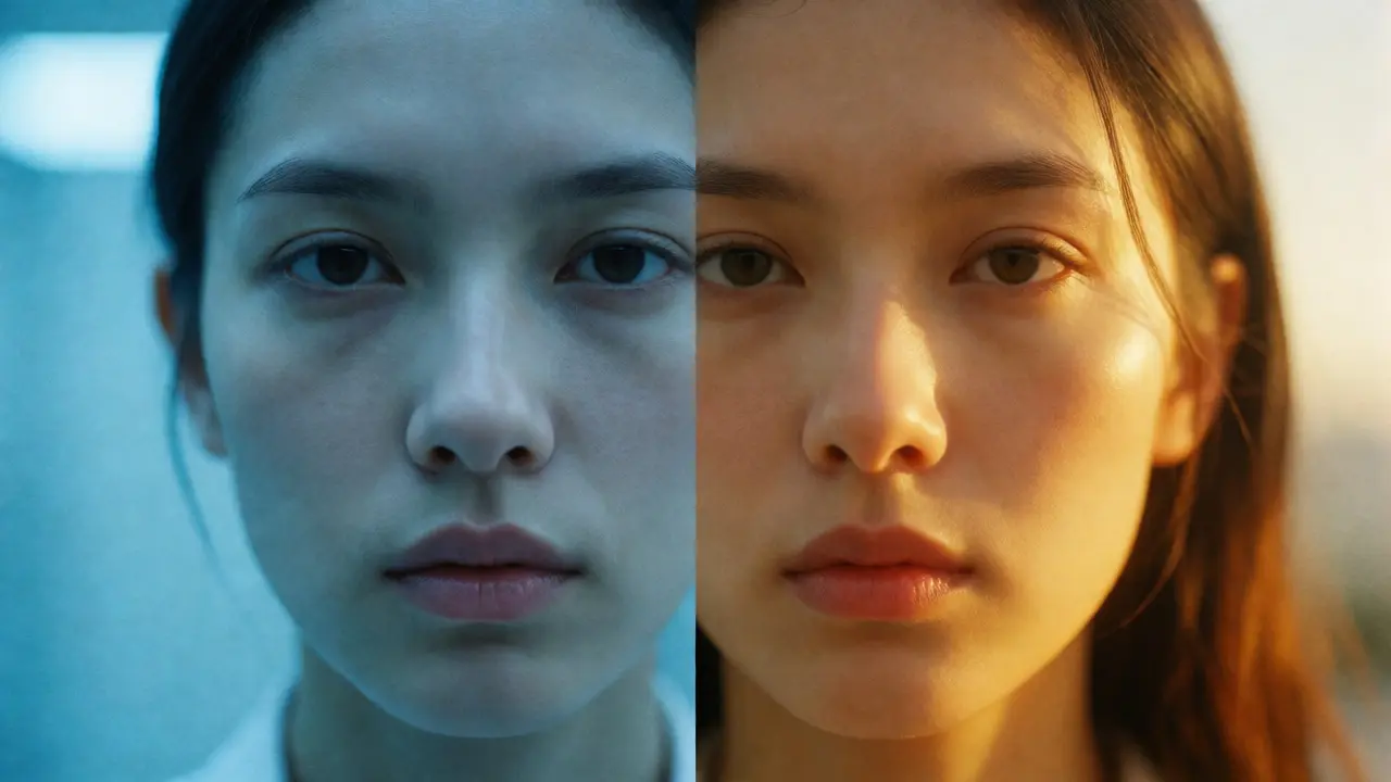
Before you touch a single slider, you need to know what you’re trying to say. Colors aren’t neutral; they carry cultural and biological weight. This is where color theory stops being an art school lecture and starts being a practical tool for photographers. Warm tones-reds, oranges, yellows-typically evoke energy, nostalgia, intimacy, or heat. Cool tones-blues, greens, cyans-suggest calm, isolation, technology, or coldness.
Consider a portrait taken at sunset versus one taken under fluorescent office lights. The raw data might be similar in exposure, but the emotional impact is worlds apart because of the white balance. When you grade, you are deliberately manipulating these associations. Do you want your client to feel the cozy warmth of a home-cooked meal? Push the shadows toward orange and the highlights toward yellow. Want to convey the sterile efficiency of a medical clinic? Desaturate the reds and lean into cool blues and teals.
It’s crucial to remember that context changes meaning. A deep red can signal danger in a thriller movie still but passion in a wedding photo. Your job is to align the color palette with the narrative intent of the image. If the story is joyful, high-key colors with lifted blacks often work better than heavy, crushed shadows. If the story is mysterious, increasing contrast and shifting midtones toward green or blue can create unease.
Correction vs. Grading: Know the Difference
A common mistake beginners make is confusing color correction with color grading. They are two distinct steps in the workflow, and skipping the first makes the second messy.
Color Correction is technical. Its goal is neutrality and accuracy. You fix white balance so whites are actually white. You adjust exposure so details aren’t blown out or crushed. You remove color casts caused by mixed lighting sources. Think of this as cleaning the lens before you paint the picture. If your skin tones look green because of a bad fluorescent bulb, no amount of artistic grading will save it unless you correct that cast first.
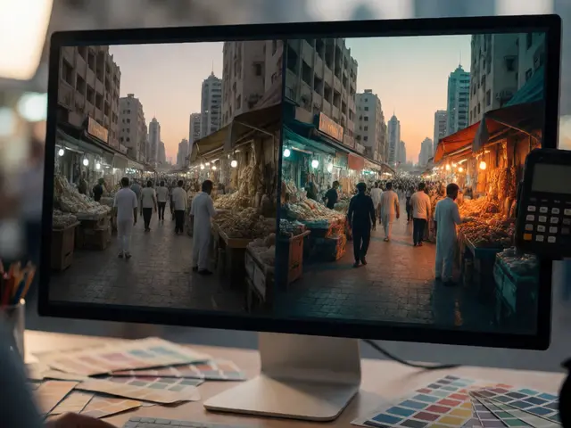
Color Grading is creative. Once the image is technically sound, you apply stylistic choices. This involves splitting tonal ranges-applying different colors to shadows, midtones, and highlights independently. For example, the popular "teal and orange" look isn’t just a preset; it’s a deliberate choice to push complementary colors (blue/orange) into opposing tonal zones to create depth and separation.
| Feature | Color Correction | Color Grading |
|---|---|---|
| Primary Goal | Accuracy and Neutrality | Mood and Style |
| Tools Used | White Balance, Exposure, HSL (Basic) | Split Toning, Curves, Color Wheels |
| Subjectivity | Low (Objective truth) | High (Artistic interpretation) |
| Timing | First step in editing | Final polish |
Building a Consistent Visual Identity
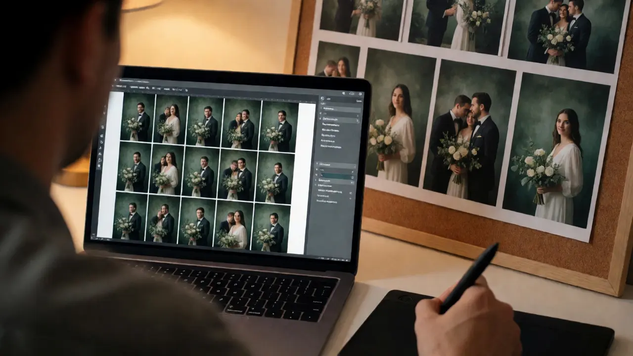
One of the biggest challenges for professional photographers is consistency. Clients hire you for your "look." If one portfolio piece looks like a moody film noir and the next looks like a bright Instagram influencer shot, you confuse the buyer. Developing a signature visual style requires discipline in your grading process.
Start by defining your brand’s core aesthetic. Are you minimalist? Then your grades should likely involve lower saturation, higher contrast, and cleaner whites. Are you documentary-style? You might prefer natural skin tones with subtle enhancements rather than heavy stylization. Once you define this, create a base profile or preset that serves as your starting point. This doesn’t mean every photo looks identical-that’s lazy-but they should share a DNA.
To achieve this, master the use of LUTs (Look-Up Tables). A LUT is essentially a mathematical formula that maps input colors to output colors. Many software programs like Lightroom or Capture One allow you to load custom LUTs. However, beware of the "one-click" trap. Applying a cinematic LUT to a brightly lit corporate headshot often results in muddy shadows and unnatural skin tones. Use LUTs as a foundation, then refine manually using HSL sliders to protect key elements like skin tones.
Another trick for consistency is creating a "style reference" board. Keep a folder of images whose grading you admire. Before editing a new set, compare your work against these references. Ask yourself: Does my black point match theirs? Is my color harmony similar? This external check prevents you from drifting into over-saturation or weird color casts when you’ve been staring at the same screen for hours.
Practical Techniques for Emotional Impact
Let’s get hands-on. How do you actually manipulate pixels to change feelings? Here are three concrete techniques you can use immediately in software like Adobe Lightroom, Photoshop, or DaVinci Resolve.
- Split Toning: This is the powerhouse of modern grading. By assigning a color to the shadows and a different color to the highlights, you create depth. For a nostalgic, vintage feel, try adding warm sepia or brown to the shadows and a slight teal to the highlights. This mimics the chemical imbalances found in old film stocks. Conversely, for a futuristic or tech vibe, push shadows toward blue and highlights toward cyan.
- Luminance Masking: Not all colors should be treated equally. Skin tones usually need protection. Use luminance masks to target only the brightest parts of the image (highlights) or the darkest (shadows). This allows you to add color to the sky without turning your subject’s face purple. In Lightroom, hold Alt/Option while dragging the masking slider to see exactly which areas are affected.
- Hue Shifts: Sometimes, simply rotating the hue of a specific color channel changes the entire vibe. Shifting greens slightly toward yellow can make foliage look sun-drenched and summery. Shifting it toward teal makes it look cooler and more autumnal. Be careful with skin tones here; small adjustments matter, large ones look artificial.
Remember the rule of restraint. New editors often overdo it, resulting in neon skies and plastic-looking skin. A good heuristic: if you notice the effect immediately when someone glances at the photo, it’s probably too strong. The best grading feels subconscious-the viewer shouldn’t think "wow, nice teal," they should just feel "this place looks inviting."
Pitfalls to Avoid
Even experienced shooters fall into traps. The most common is ignoring monitor calibration. If your screen is washed out or overly saturated, your grading will be wrong on everyone else’s device. Invest in a hardware calibrator or at least ensure your monitor settings are neutral. Another pitfall is relying solely on presets. Presets are shortcuts, not solutions. They assume a certain starting point. If your RAW file has a strong magenta cast, a generic "warm" preset will just make it worse.
Also, watch out for banding. Aggressive color grading, especially in gradients like skies, can cause visible steps in color transitions instead of smooth blends. This happens when you stretch the data too far beyond its original range. To mitigate this, shoot in RAW format whenever possible, as it retains more color information than JPEG. If you must edit JPEGs, keep your adjustments subtle.
Next Steps for Mastery
Color grading is a muscle that grows with practice. Start by picking five photos from your past archive that felt "off." Try re-grading them with three different moods in mind: happy/bright, melancholic/dark, and neutral/documentary. See how the same image tells three different stories.
Once you’re comfortable with manual adjustments, start building your own preset library. Name them after emotions, not camera models (e.g., "Golden Hour Glow" instead of "Sony A7III Default"). This forces you to think about the feeling you’re delivering, not just the technical specs. Over time, your unique voice will emerge naturally from these consistent choices.
What is the difference between color correction and color grading?
Color correction focuses on technical accuracy, such as fixing white balance and exposure to make the image look realistic. Color grading is the creative process of altering colors to establish a specific mood, atmosphere, or artistic style, often deviating from reality for emotional impact.
Do I need expensive software to do color grading?
No. While industry standards like Adobe Lightroom, Capture One, and DaVinci Resolve offer advanced tools, free alternatives like Darktable or even mobile apps like Snapseed provide sufficient control for effective color grading. The principles remain the same regardless of the tool.
How does color affect viewer emotion?
Colors trigger psychological associations. Warm colors (red, orange, yellow) often evoke energy, happiness, or nostalgia, while cool colors (blue, green, purple) tend to suggest calm, sadness, or professionalism. Photographers use these associations to guide the viewer's emotional response to the image.
Can I apply color grading to JPEG files?
Yes, but results may be less flexible than with RAW files. JPEGs have compressed color data, so aggressive grading can lead to artifacts like banding or loss of detail in shadows and highlights. It is best to keep adjustments moderate when working with JPEGs.
What is a LUT in photography?
A Look-Up Table (LUT) is a predefined set of color transformations that can be applied to an image to quickly achieve a specific look or style. LUTs map input colors to output colors, allowing photographers to simulate film stocks or cinematic palettes efficiently.