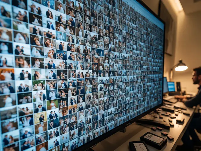
You just got back from a three-week trip through Southeast Asia. You have 4,000 photos on your hard drive, and you want to post the best ones to Instagram or your portfolio. But when you look at them side-by-side, something feels off. The shots from Bali are warm and saturated, while the images from Vietnam look cool and desaturated. The street food in Bangkok looks orange, but the mountains in Laos look green. It’s disjointed. It doesn’t feel like your work.
This is the classic trap of travel photography editing. We shoot in wildly different lighting conditions, cultures, and color palettes, yet we expect our final gallery to tell a cohesive story. If you’re struggling to make your feed look intentional rather than accidental, you’re not alone. Most photographers fail here because they edit each image in isolation, chasing perfection for every single frame instead of building a unified visual language.
The Myth of Perfect Color Accuracy
Let’s get one thing straight immediately: consistency does not mean accuracy. In fact, if you try to make every photo perfectly white-balanced and neutral, your travel series will look sterile and boring. A sunset in Santorini shouldn't look the same as a foggy morning in London, nor should it. Consistency means that when someone sees one of your photos, they can guess it came from your camera before they see the watermark.
Think about Steve McCurry or Michael Yamashita. Their bodies of work span decades and continents. Yet, there is an unmistakable signature-a specific way shadows fall, a particular warmth in skin tones, a distinct contrast curve. That signature isn’t about correcting the camera; it’s about imposing your vision onto the chaos of travel.
Build Your Foundation Before You Shoot
The biggest mistake travelers make is waiting until they get home to think about their style. By then, you’re drowning in raw files with inconsistent white balances. To fix this, you need a "Base Look" before you even pack your bag.
A Base Look is a set of global adjustments that apply to every single photo you take on the trip. This includes:
- Tone Curve: Do you like crushed blacks (cinematic) or lifted blacks (filmic)? Pick one and stick to it.
- Contrast: High contrast creates drama; low contrast creates softness. Don’t switch between them arbitrarily.
- Clarity/Texture: Decide if you want gritty detail or smooth gradients.
- HSL Defaults: Set your saturation and luminance sliders for key colors like Blue (sky), Orange (skin), and Green (foliage) to your preferred starting point.
When you import your photos into Lightroom or Capture One, apply this Base Look as a preset. Now, every photo starts from the same place. You’ve eliminated 50% of the inconsistency right off the bat.
Managing White Balance Chaos
Travel throws everything at you: tungsten bulbs in old hotels, neon signs in Tokyo, harsh midday sun in Egypt, blue hour in Iceland. If you let Auto White Balance (AWB) run wild, your images will jump around in temperature. AWB is smart, but it’s not consistent.
Here is the rule of thumb: Manual control beats automation for consistency. When shooting RAW, set your white balance manually based on the scene, or better yet, use a gray card if you have time. But what if you didn’t? What if you shot JPEGs or relied on AWB?
In post-production, don’t aim for "neutral." Aim for "intentional." If you decide your trip has a "warm, nostalgic" vibe, push the temperature slider toward yellow/orange for all images, even those that were originally too warm. Yes, some might look slightly over-warmed. That’s fine. Uniformity trumps technical perfection. If a shot looks too orange, lower the saturation of the orange channel slightly rather than cooling down the whole image. This keeps the hue consistent while managing intensity.
| Strategy | Pros | Cons | Best For |
|---|---|---|---|
| Auto White Balance (AWB) | Fast, handles extreme shifts | Inconsistent results, unpredictable | Snapshots, non-critical work |
| Manual Kelvin Setting | Precise, repeatable | Slow, requires attention | Studio, controlled environments |
| Gray Card Reference | Most accurate technical baseline | Requires extra step in field | Professional commercial shoots |
| Stylistic Shift | Highly consistent aesthetic | Less technically accurate | Social media, personal portfolios |
The Power of Batch Editing
Editing 300 photos one by one is a recipe for fatigue and inconsistency. Your eyes adjust after the first ten edits. The tenth photo gets more contrast than the first. The solution is batch processing.
Group your images by location or lighting condition. Did you shoot a market in Marrakech under bright sunlight? Select all 20 photos from that session. Apply your Base Look. Then, make one adjustment to the group-maybe lift the shadows slightly because the midday sun was harsh. Sync these settings across the selection.
Now, go through them individually only if necessary. Usually, 80% of the images in a homogeneous lighting scenario need zero additional tweaks. Only tweak the outliers-the one photo where someone stepped into shadow, or the one where the sky blew out. This method ensures that the majority of your series shares identical DNA.
Local Adjustments vs. Global Consistency
Once your global settings are locked, you might be tempted to dodge and burn every face or brighten every sky differently. Be careful. Over-editing local areas breaks the unified feel.
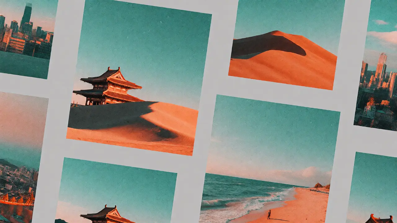
Use local adjustments sparingly and consistently. If you always brighten the subject’s face by +0.3 EV using a radial filter, do that for every portrait. If you always darken the edges with a vignette of -10, do it for every landscape. Create a mental checklist of your "signature moves." Are you a fan of split toning? Maybe you add teal to the shadows and orange to the highlights. If so, apply that split toning globally, not locally. Let the global grade carry the weight.
Consider using AI-powered masking tools in modern software like Adobe Lightroom Classic or Luminar Neo. These tools can automatically detect skies, people, or buildings. Instead of manually painting masks, use the auto-detection to apply a consistent adjustment layer to all detected skies in your batch. This saves time and ensures the sky treatment is uniform across different destinations.
Handling Different Cultures and Palettes
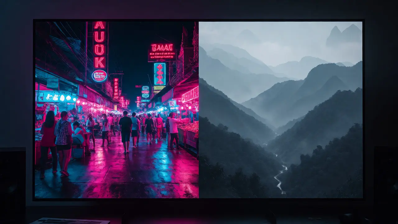
Some destinations fight your style. Japan is often pastel and clean. India is vibrant and chaotic. Morocco is earthy and red. If you force a heavy teal-and-orange grade on a pastel Kyoto temple, it might look muddy. If you force a desaturated, moody grade on a vibrant Holi festival, you kill the energy.
Here is the pro tip: Allow for "Sub-Series" consistency. If your trip covers vastly different aesthetics, break your portfolio into chapters. Chapter 1: Urban Neon (cool tones). Chapter 2: Desert Sands (warm tones). Within each chapter, maintain strict consistency. Viewers understand context. They won’t judge you for having a cooler look in Norway and a warmer look in Mexico, as long as the Norway photos match each other and the Mexico photos match each other.
However, keep your core contrast and grain settings identical across sub-series. Grain size and intensity are subtle cues that bind different color palettes together. A fine grain overlay applied uniformly across all images acts like a digital varnish, unifying the texture of the entire collection.
Your Post-Trip Workflow Checklist
To streamline this process, follow this exact sequence when you sit down to edit:
- Cull First: Delete the bad shots. Never edit a photo you aren’t sure about. Less clutter makes consistency easier to spot.
- Apply Base Preset: Hit the button. Instant unity.
- Group by Scene: Use flags or color labels to sort by location/time.
- Batch Adjust: Fix exposure and white balance for the group.
- Refine Outliers: Manually adjust only the 10-20% of photos that don’t fit the group average.
- Review as Grid: Switch to Loupe view? No. Switch to Grid view. Look at 12 photos at once. Does the rhythm flow? If one sticks out, fix it or delete it.
- Export Consistently: Use the same export settings (sRGB, same quality, same resizing) to ensure no compression artifacts vary.
Common Pitfalls to Avoid
Watch out for "Preset Fatigue." Downloading 50 free presets from Pinterest and trying them on every photo leads to a Frankenstein portfolio. Stick to one or two custom presets you built yourself. You know exactly what they do. You know how they react to shadows and highlights.
Also, beware of oversaturation. Travel photos are already colorful. Adding another 20 points of saturation to an already vivid Taj Mahal photo makes it look like a toy. Consistency often comes from restraint. If your style is muted, mute everything. If it’s punchy, punch everything. Just don’t mix them.
Frequently Asked Questions
Should I shoot in RAW or JPEG for consistent travel editing?
RAW is strongly recommended. It gives you much greater flexibility to correct white balance errors and recover shadows/highlights without degrading image quality. JPEG applies in-camera processing that locks in decisions early, making it harder to unify diverse lighting scenarios later. If you must shoot JPEG, be extremely disciplined with your in-camera picture profiles and white balance settings.
How many photos should I edit from a trip?
Quality over quantity. Edit 10-20 strong images per day of travel. Trying to edit 500 photos dilutes your focus and leads to inconsistent results. Culling ruthlessly is part of the editing process. A small, highly consistent series is far more impactful than a large, erratic one.
Can I use the same preset for night and day shots?
Not directly. Night shots usually require lifting shadows significantly and reducing noise, whereas day shots might need highlight recovery. However, you can create a "Night Variant" of your base preset that shares the same color grading (HSL curves) but adjusts exposure and contrast differently. This maintains color consistency while adapting to dynamic range limitations.
What if my phone photos look different from my camera photos?
Phones often have aggressive HDR and sharpening. To unify them, reduce the clarity/sharpness of phone photos in post. Match the white balance manually. Consider adding a subtle film grain to both sources to mask resolution differences and create a textural link. Treat phone shots as supplementary B-roll; don’t force them to compete with main camera shots in terms of dynamic range.
Is it okay to change my style during a trip?
Yes, if the environment changes drastically. As mentioned, creating sub-series (e.g., 'City Series' vs. 'Nature Series') is acceptable. However, avoid changing style daily or hourly. Sudden shifts confuse the viewer. Establish a clear boundary between styles, such as a title slide or a distinct caption theme, to signal the transition.