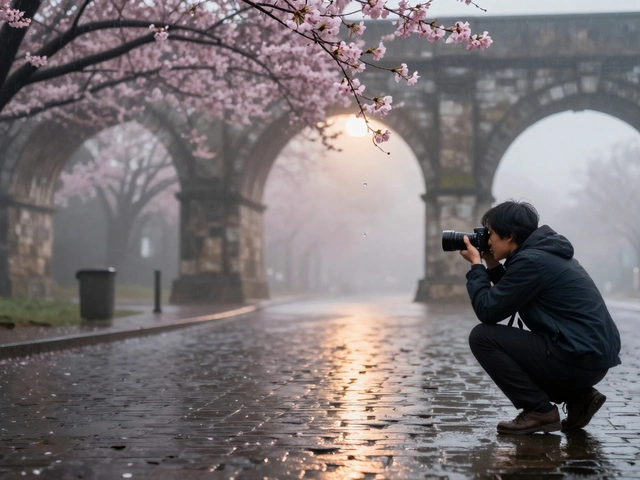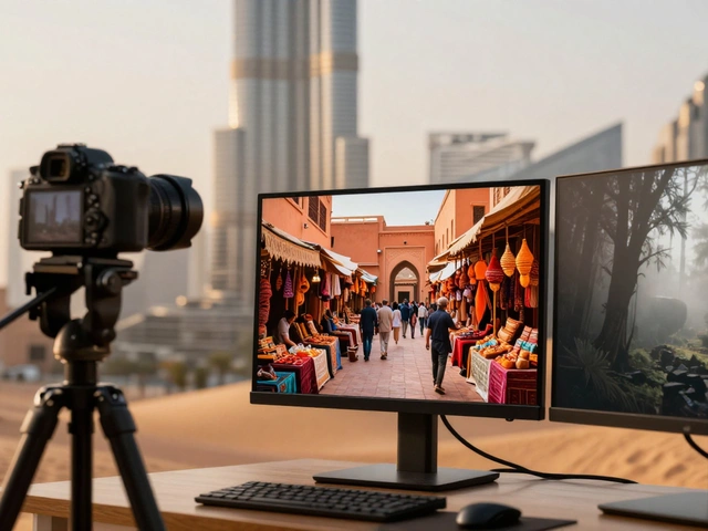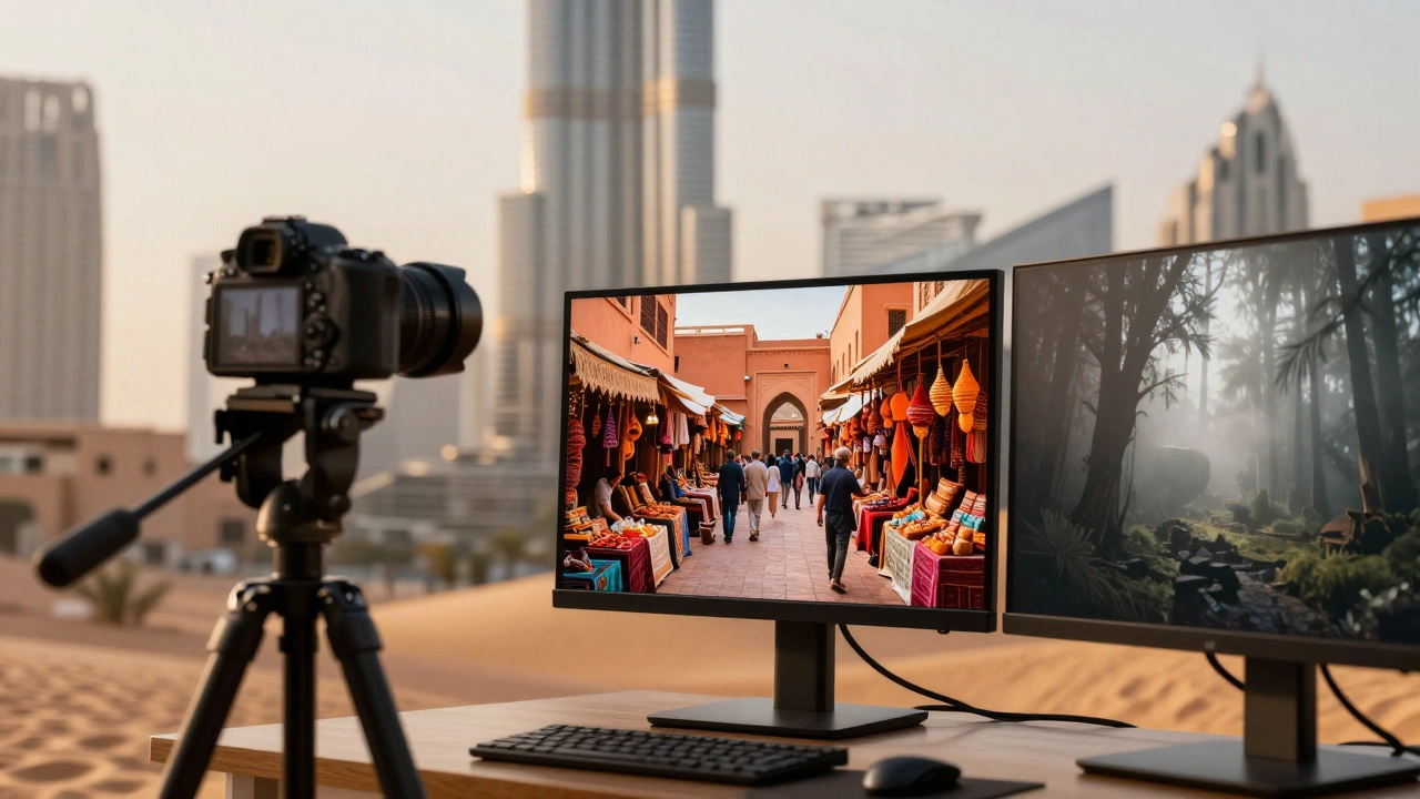
Imagine scrolling through a travel portfolio. One photo is a bright, high-contrast shot of a bustling market in Marrakech. The next is a moody, desaturated image of a misty forest in Oregon. Then comes a warm, golden-hour beach scene from Bali. Does it feel like one cohesive story? Or does it feel like three different photographers took those pictures?
That disjointed feeling happens when you skip color grading, which is the intentional adjustment of colors and tones to create emotional cohesion across a body of work. In travel photography, color grading isn't just about making skies bluer or grass greener. It’s the secret sauce that ties diverse destinations together into a unified visual narrative. Without it, your photos are just snapshots. With it, they become a signature style.
The Mood-First Approach to Color Grading
Most beginners make the mistake of starting with sliders. They tweak saturation until the sunset looks "better." But professional color grading starts with emotion, not mechanics. Before you touch a single control in Adobe Lightroom, a photo editing software used by professionals for organizing and processing digital images, ask yourself: what feeling should this destination evoke?
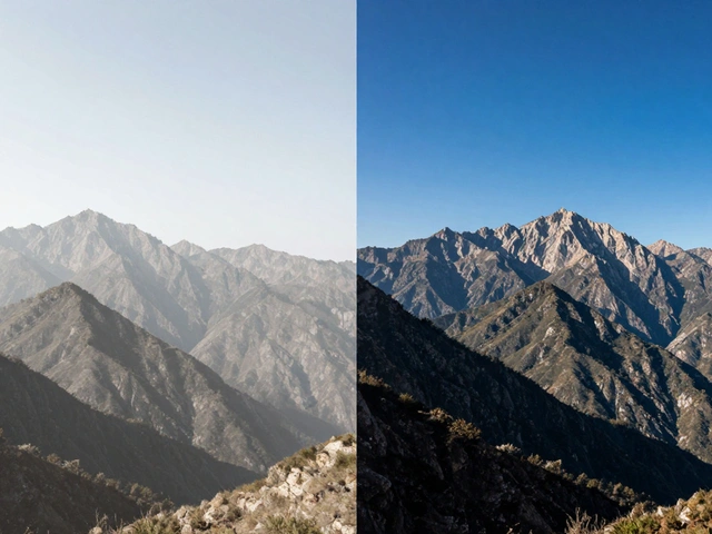
Is the Sahara Desert supposed to feel harsh and hot? Or warm and inviting? Is the rainforest mysterious and cool? Or vibrant and alive? This decision dictates your entire palette. If you want a moody, cinematic look, you’ll lean into darker, muted tones-think charcoal shadows and desaturated midtones. If you want an airy, dreamy vibe, you’ll opt for lighter, creamy pastels with lifted blacks.
This mood-first strategy prevents random adjustments. Instead of fixing "problems," you’re building an atmosphere. For example, if you’re shooting in Kyoto during cherry blossom season, a soft, slightly pinkish grade enhances the romance. A stark, high-contrast black-and-white grade might emphasize architectural geometry but lose the seasonal context. Your choice of mood defines the story before the technical execution begins.
Why Shooting RAW Is Non-Negotiable
You cannot effectively color grade JPEGs. When you shoot in JPEG, your camera makes decisions for you-it compresses data, locks in white balance, and clips highlights. You lose the flexibility needed to harmonize palettes later.
RAW files, which are unprocessed data captured by a camera sensor that retains maximum dynamic range and color information, contain all the tonal and color data the sensor recorded. This extra information gives you the latitude to shift white balance, recover blown-out skies, and pull detail from deep shadows without introducing artifacts. If you plan to apply heavy color grades, especially split-toning or dramatic contrast shifts, RAW is the only format that holds up.
Think of RAW as clay. JPEG is baked pottery. You can paint on pottery, but you can’t reshape it. Color grading often requires reshaping the fundamental color relationships in an image. Without RAW, you’re limited to surface-level tweaks.
The Technical Workflow for Consistent Grades
Consistency doesn’t happen by accident. It comes from a repeatable workflow. Here is the sequence most professional travel photographers follow:
- Set White Balance: Establish the foundational temperature. Are you leaning warm (orange/yellow) or cool (blue/green)? Get this right first, because every subsequent color adjustment builds on this base.
- Global Tonal Corrections: Adjust exposure, contrast, highlights, and shadows. Ensure you have detail in both the brightest and darkest parts of the image.
- HSL Adjustments: Use the Hue, Saturation, and Luminance panel to target specific colors. Want the green foliage to pop but keep the skin tones natural? Lower the saturation of greens while boosting their luminance.
- Color Grading Panel: Apply split-toning. Add color to the shadows, midtones, and highlights separately. This is where you create that cinematic teal-and-orange look or a subtle film-like warmth.
- Local Corrections: Use brushes or radial filters to adjust specific areas. Maybe the sky needs more blue, but the foreground shouldn’t change.
Note that precise slider values don’t matter. What matters is the relationship between controls. If you push saturation too high, noise becomes visible. If you crush shadows too much, you lose texture. Experimentation is key, but always within this logical order.
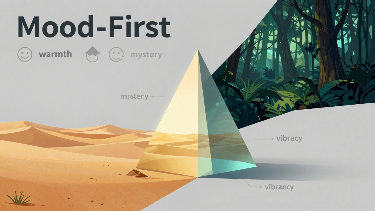
Harmonizing Different Destinations: Desert vs. Rainforest
Travel photography throws curveballs at you. Lighting changes drastically from location to location. How do you keep a consistent style when shooting a sun-baked desert one week and a humid jungle the next?
In desert landscapes, like the Sahara, you deal with intense warm oranges, deep reds, and sometimes purple shadows. The challenge is avoiding orange overload, especially in skin tones. Here, the HSL panel is critical. You might shift the hue of oranges slightly toward yellow to reduce intensity, then lower the saturation of reds to prevent distraction. In the Color Grading panel, you might add a cool blue tint to the shadows to create separation between the warm sand and the cooler shade areas.
Rainforests present the opposite problem: flat, green-heavy light with low contrast. To harmonize this with your desert shots, you need to introduce depth. Cool down the highlights to mimic overcast skies. Warm the midtones slightly to bring out earth tones. Use a custom tone curve to enhance contrast subtly, emulating film stock characteristics. This helps separate the layers of canopy and mist, revealing details hidden in the gloom.
The goal isn’t to make the rainforest look like the desert. It’s to make both images feel like they belong in the same book. By applying similar principles-cool shadows, warm midtones, controlled saturation-you create a visual thread that connects disparate environments.
| Environment | Primary Challenge | Recommended Grade Style | Key Adjustments |
|---|---|---|---|
| Sahara Desert | Orange dominance, harsh light | Warm, Golden, High Contrast | Cool shadows, desaturate reds, boost orange luminance |
| Tropical Rainforest | Flat light, green cast | Cool, Muted, Moody | Cool highlights, warm midtones, increase contrast curve |
| Urban Architecture | Mixed materials, clutter | Split-Toned, Cinematic | Teal shadows, orange highlights, selective saturation |
| Coastal Beach | Bright blues, white sand | Airy, Pastel, Soft | Lift blacks, desaturate blues slightly, warm midtones |
Creating Cohesive Palettes with External Tools
Sometimes, intuition isn’t enough. You might struggle to find the right combination of colors that feels "right." That’s where external tools come in.
A powerful technique involves using Photoshop, a raster graphics editor used for image manipulation and design’s color picker to extract hex codes from your image. Identify a dominant color-say, the red collar of a subject’s shirt (#b03a3a). Take that hex code to a palette generator like Paletton. The tool will suggest harmonious complementary, analogous, or triadic colors based on that seed value.
Now, you have a scientific basis for your grade. If the palette suggests a teal complement, you know exactly what color to put in the shadows. This method ensures your color choices aren’t arbitrary. They’re mathematically harmonized with the existing elements in the photo. It bridges the gap between artistic instinct and technical precision.
Software Choices: Lightroom vs. DaVinci Resolve
Which tool should you use? For most travel photographers, Lightroom Classic, Adobe's flagship photo editing application known for its non-destructive workflow and batch processing capabilities is the best fit. It integrates asset management, basic edits, and advanced color grading in one interface. The learning curve is manageable, and the documentation is extensive.
DaVinci Resolve, a professional video editing and color grading software originally designed for Hollywood post-production offers superior color science and node-based workflows. It’s incredibly powerful but overkill for stills unless you’re also producing video content. If you’re shooting travel vlogs alongside photos, Resolve’s ability to handle both media types seamlessly makes it a strong contender. However, for pure photography, Lightroom’s simplicity and speed usually win out.
Other alternatives like Capture One offer different color rendering engines, particularly for medium-format cameras, but they lack the ecosystem integration that Lightroom provides. Stick with what fits your workflow. Don’t chase tools; chase results.
Building Your Signature Style
Your color grade is your brand. Just as musicians have a distinct sound, photographers have a distinct look. This consistency builds recognition. When someone sees your photo, they should know it’s yours before checking the watermark.
To build this signature, develop presets. Once you’ve graded a few images successfully, save those settings as presets. Apply them to new shoots as a starting point. Then, fine-tune for each individual photo. This ensures baseline consistency while allowing for creative variation.
Remember, color grading is subjective. There’s no "correct" way to grade a photo. There’s only what works for your vision. Test your grades on different devices. Colors look different on calibrated monitors versus phone screens. What pops on your desktop might wash out on Instagram. Preview your work in the contexts where it will be viewed most.
Do I need to shoot in RAW to color grade effectively?
Yes. RAW files retain significantly more color and tonal data than JPEGs. This extra information allows you to make drastic adjustments to white balance, shadows, and highlights without losing quality or introducing artifacts. JPEGs are compressed and processed in-camera, limiting your ability to manipulate colors creatively.
What is the difference between color correction and color grading?
Color correction fixes technical issues like white balance errors, exposure problems, and color casts to make the image look natural. Color grading is an artistic process that applies a specific mood or style to the image, often altering colors intentionally to evoke emotion or create cohesion across a series.
How do I maintain consistency across different destinations?
Use a mood-first approach. Decide on the emotional tone you want for your portfolio. Then, apply similar principles-such as cool shadows and warm midtones-to every image, regardless of location. Use presets as a starting point and adjust locally for each photo. This creates a visual thread that ties diverse environments together.
Is DaVinci Resolve better than Lightroom for travel photography?
For pure photography, Lightroom is generally easier and faster due to its integrated asset management and simpler interface. DaVinci Resolve offers more advanced color grading tools but has a steeper learning curve. Choose Resolve if you also edit video or need node-based workflows. Otherwise, Lightroom is sufficient for most travel photographers.
Can I use AI tools for color grading?
AI tools can suggest initial adjustments or auto-grade images, but manual control remains essential for professional results. AI lacks the contextual understanding of mood and narrative intent. Use AI as a starting point or for batch processing simple tasks, but always refine grades manually to ensure they align with your creative vision.