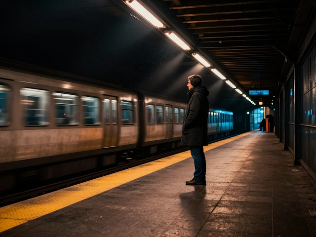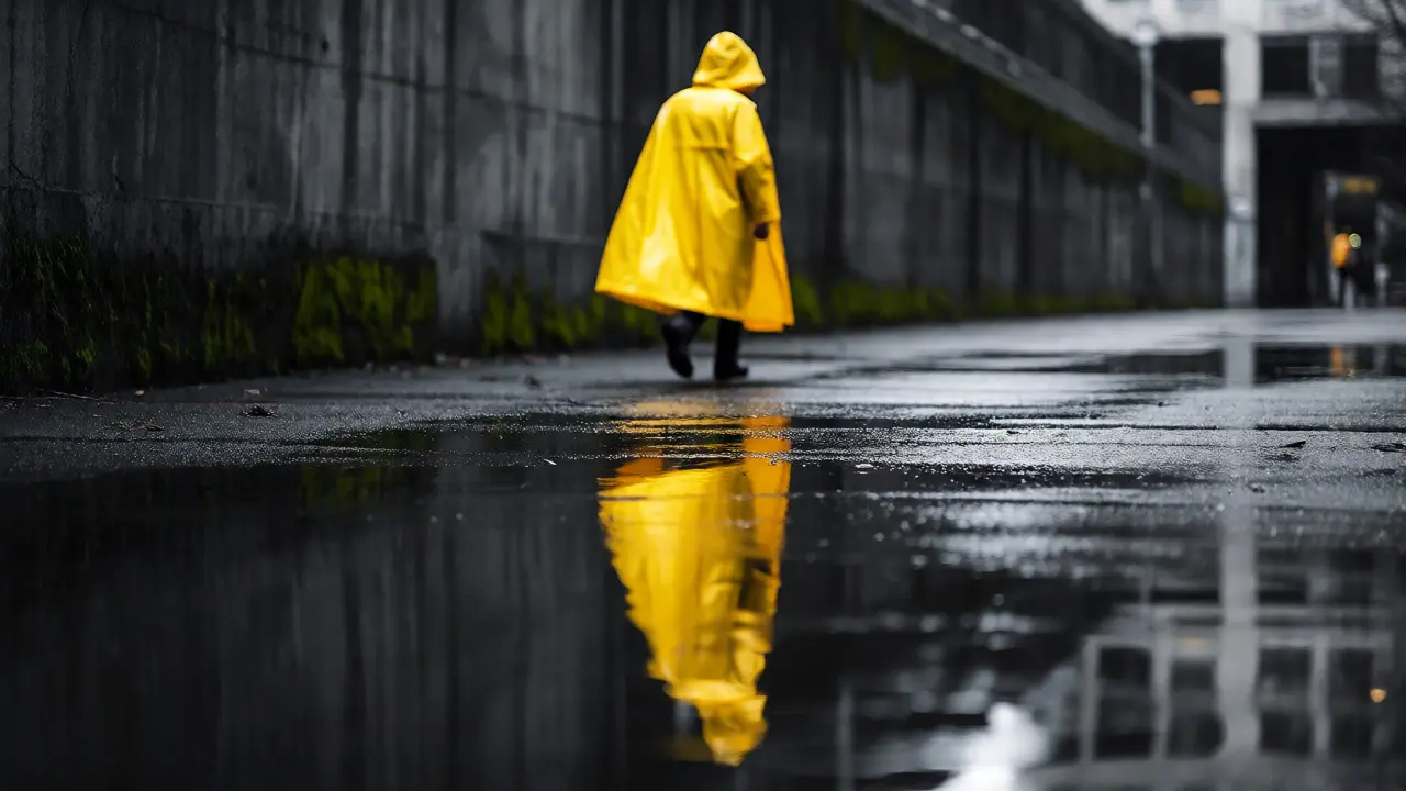
You’re standing on a busy corner in downtown Portland. The rain has just stopped, leaving the asphalt slick and reflective. A person walks by wearing a bright yellow raincoat against a backdrop of gray concrete and dark green moss. Your eye locks onto that contrast instantly. That’s not luck; that’s color theory at work. In street photography, understanding how colors interact is the difference between a snapshot and a striking image.
Most photographers talk about light, composition, or timing. But color is the silent director of your frame. It guides the viewer’s eye, sets the mood, and creates visual harmony-or deliberate tension. When you master complementary urban palettes, you stop waiting for perfect moments and start hunting for them. You begin to see the city not as a chaotic mess, but as a canvas where specific hues are designed to pop against others.
Why Complementary Colors Rule the Street
Let’s get technical for a second, but keep it simple. On the standard color wheel, complementary colors sit directly opposite each other. Think red and green, blue and orange, or purple and yellow. When these two meet, they create maximum contrast. This isn’t just an artistic preference; it’s rooted in human biology. Our eyes are wired to notice these clashes because they signal importance-think ripe fruit against leaves, or warning signs against traffic.
| Primary Hue | Complementary Counterpart | Typical Urban Source | Visual Effect |
|---|---|---|---|
| Blue | Orange | Sky/Shadow vs. Brick/Sunset | High energy, warm focal point |
| Green | Red | Foliage/Park vs. Traffic Lights/Signs | Natural vibrancy, urgent focus |
| Purple | Yellow | Taxis/Buses vs. Shadows/Night Neon | Playful, high visibility |
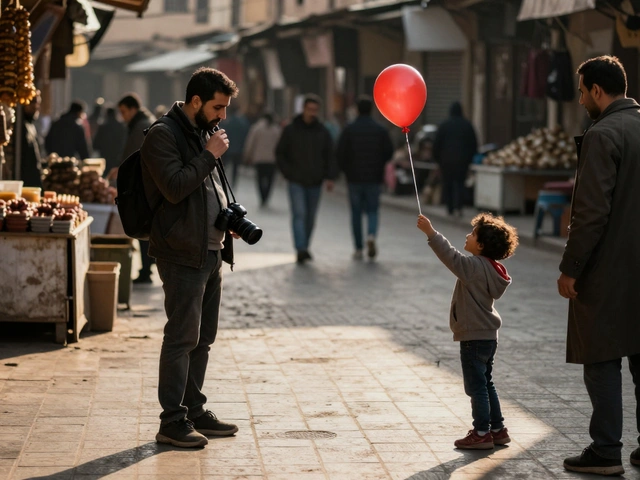
In a city environment, these pairs are everywhere if you know what to look for. A blue uniform walking past an orange construction barrier? That’s gold. A red umbrella in a park with deep green trees? Classic. The trick isn’t finding rare colors; it’s recognizing common ones when they align correctly. Many beginners miss this because they’re too focused on the subject’s face or action, ignoring the chromatic context surrounding them.
Spotting Opportunities Before You Shoot
You don’t need to carry a color wheel around your neck, but you do need to train your eye. Start by scanning scenes for large blocks of color. Are there walls painted in a single hue? Is there a sea of umbrellas? These areas act as natural backgrounds. Once you identify a dominant background color, wait for its complement to enter the frame.
Consider the "frame within a frame" technique using color. If you find a doorway painted teal, position yourself so that a person wearing an orange jacket passes through it. The door frames the subject, and the colors make them jump out. This works exceptionally well in dense urban areas like New York or Tokyo, where signage and architecture provide endless colored backdrops. In Portland, I often use the lush greenery of parks against the red brick of older buildings.
- Scan for saturation: Dull colors rarely create strong complements. Look for vivid hues.
- Watch the shadows: Blue-hour shadows often complement warm artificial lights.
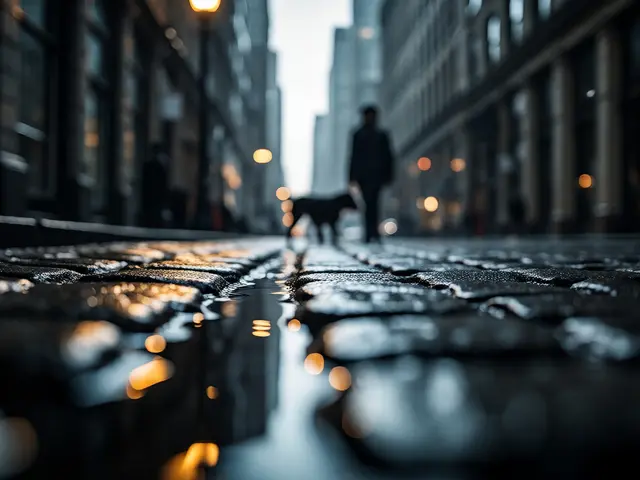
- Use reflections: Wet streets can double the impact of a complementary pair by mirroring the sky (blue) against streetlights (orange).
Managing Light and Saturation
Color doesn’t exist in a vacuum; it lives in light. Harsh midday sun blows out highlights, washing away the subtle differences between a pale pink shirt and a white wall. Overcast days, ironically, are often better for street color photography. The diffuse light acts like a giant softbox, keeping colors rich and saturated without harsh glare. This is why many pros prefer shooting during cloudy weather-it makes those complementary pops more consistent.
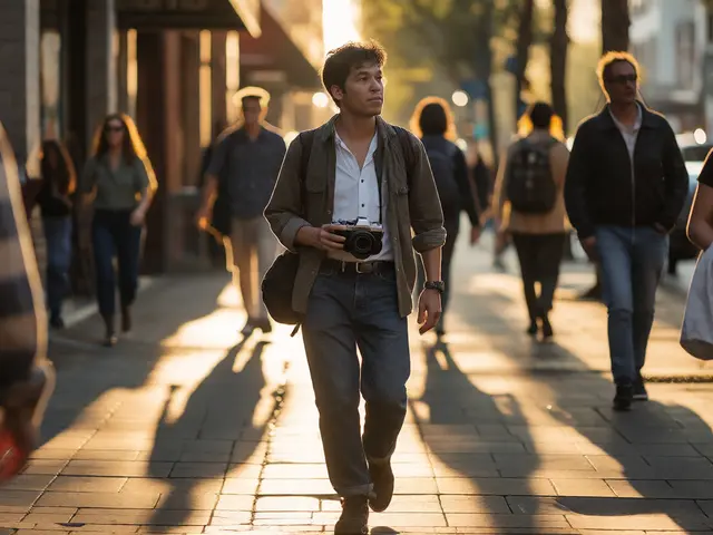
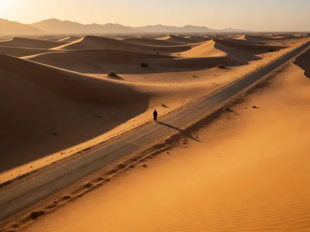
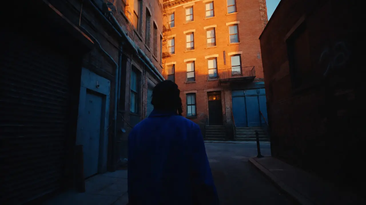
However, golden hour offers its own twist. As the sun drops, everything bathes in warm orange tones. To maintain a complementary balance here, you need cooler elements in the shadow areas. A blue jacket in a shadowed alleyway against a sunlit orange building creates a dynamic range of temperature that feels cinematic. If everything is orange, the image feels flat. Contrast in temperature is key.
Be careful with mixed lighting sources. Sodium vapor streetlights cast a sickly yellow-orange glow, while LED lights are often cool blue. Mixing these can create muddy colors unless you plan for it. Sometimes, embracing the clash is part of the aesthetic, capturing the gritty reality of night cities. But if you want clean complementary palettes, stick to one primary light source or correct for it in post-processing.
Composition Strategies for Color Balance
Once you’ve found your complementary pair, where do you put them? Placing both subjects dead center can feel static. Try the rule of thirds. Put the dominant background color on one side and the subject in the complementary color on the other intersection. This creates visual weight and movement.
Another powerful tactic is isolation. Use a wide aperture to blur the background into a wash of color. If the background is a blurred field of green foliage, a sharp subject in red becomes undeniable. This is easier with longer lenses (85mm or 100mm), which compress the scene and isolate subjects from clutter. For wider angles, rely on leading lines formed by colored objects-like a row of red mailboxes leading to a blue-clad pedestrian.
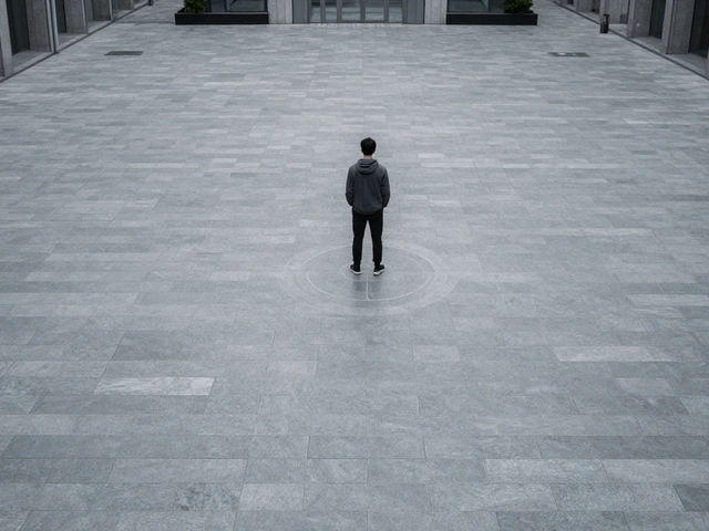
Don’t underestimate negative space. A vast expanse of neutral gray concrete allows a small splash of complementary color to dominate the frame. A tiny yellow taxi in a massive gray tunnel shot emphasizes the color’s brightness. Scale matters. A small dot of red in a sea of green feels different than a giant red truck blocking a green forest. Experiment with scale to control the emotional impact of the color relationship.

Post-Processing: Enhancing Without Cheating
Digital editing gives you control over color harmony. Tools like HSL (Hue, Saturation, Luminance) sliders allow you to tweak specific color channels. If your blue sky is competing with a blue sign, desaturate the sign slightly to let the sky breathe. Or, shift the hue of the sign toward cyan to separate it further from the deep blue sky.
Split toning is another secret weapon. Add a slight teal tint to the shadows and an orange tint to the highlights. This reinforces the blue/orange complementary scheme naturally used in cinema. Even if your original photo didn’t have strong complementary colors, split toning can introduce a cohesive palette that unifies disparate elements. Just be subtle. Heavy-handed filters look fake and dated. Aim for enhancement, not transformation.
Remember, the goal is authenticity. Street photography thrives on real moments. If you manipulate colors so much that the scene looks like a graphic design poster, you’ve lost the soul of the street. Keep skin tones natural. Adjust the environment colors to support the subject, not overshadow them.
Practical Exercises to Train Your Eye
Theory means nothing without practice. Here are three drills to sharpen your sense of urban palettes:
- The Monochrome Hunt: Go out with the intention to shoot only images containing blue and orange. Ignore everything else. This forces you to scan the environment specifically for these hues.
- The One-Hour Constraint: Stay in one location for an hour. Wait for complementary colors to walk into your pre-composed frame. Patience reveals patterns you’d miss while walking.
- Limit Your Palette: Edit a series of five photos so they all share the same two complementary colors. This teaches you to select and edit for consistency across a body of work.
These exercises build muscle memory. Soon, you won’t think about the color wheel; you’ll just see the potential for contrast. You’ll instinctively know that a purple hat needs a yellow bus behind it. That intuition is what separates casual shooters from deliberate artists.
What are complementary colors in photography?
Complementary colors are pairs of colors that are opposite each other on the color wheel, such as blue and orange, red and green, or yellow and purple. In photography, placing these colors next to each other creates high contrast and makes subjects stand out visually.
How do I find complementary colors in a city?
Look for contrasting elements in everyday urban features. Common examples include blue skies or shadows against orange brick buildings or sunset light, green foliage against red signs or clothing, and yellow taxis or buses against purple neon lights or twilight skies. Scanning for large blocks of color helps identify potential backgrounds before a subject enters the frame.
Does lighting affect color theory in street photography?
Yes, significantly. Light changes the perceived hue and saturation of colors. Golden hour adds warm orange tones, which can overwhelm other colors unless balanced with cool shadows. Overcast light provides even illumination, preserving true colors and making complementary contrasts clearer. Mixed artificial lighting can create complex color casts that may need correction in post-processing.
Should I shoot in RAW for better color control?
Shooting in RAW is highly recommended for street photography involving color theory. RAW files retain more color data and dynamic range than JPEGs, allowing you to adjust white balance, saturation, and hue in post-processing without degrading image quality. This flexibility is crucial for fine-tuning complementary palettes.
Can I use black and white instead of color theory?
Black and white photography relies on tonal contrast rather than color contrast. While color theory doesn't apply directly, the principles of contrast remain relevant. Dark subjects against light backgrounds serve a similar function to complementary colors in guiding the viewer's eye. However, mastering color first can enhance your understanding of visual weight and separation.