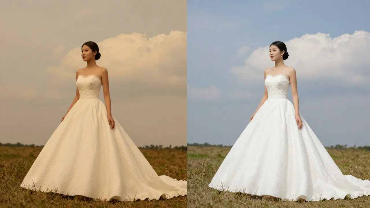
Ever opened your camera roll only to find a perfect sunset shot looking like it was taken through a yellow filter? Or maybe that crisp white wedding dress looks slightly cream-colored? This is the classic color cast. It happens more often than you think, even for experienced shooters. Usually, it’s caused by mixed lighting or an incorrect white balance setting on your camera. The good news is that fixing it in post-production is straightforward if you know where to look.
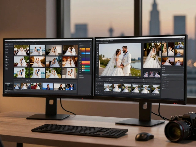
You don’t need expensive software to solve this. Whether you are using Lightroom, Capture One, or even free tools like Darktable, the core logic remains the same. You need to identify what is neutral in the image and force the software to treat it as such. Once you nail the neutrals, the whites follow suit, and the entire image feels natural again.
Understanding What a Color Cast Actually Is
A color cast is essentially a tint applied over the entire image. It shifts the hue of all pixels in one direction. For example, if your photo has a blue cast, every single pixel-whether it’s skin, grass, or sky-is pushed toward blue. This usually happens because the light source had a different color temperature than what your camera assumed.
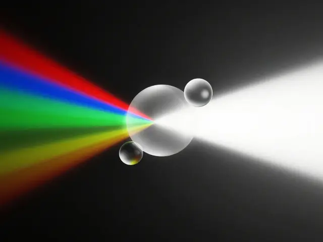
Color Temperature is a measure of the color spectrum of a light source, measured in Kelvin (K). Lower values (around 3000K) appear warm and orange, typical of candlelight or tungsten bulbs. Higher values (above 6500K) appear cool and blue, typical of overcast skies or shade. When your camera’s white balance doesn’t match the actual light source, you get a cast.Here is a quick way to diagnose the problem before you start dragging sliders:
- Warm Casts (Orange/Yellow): Usually from indoor lighting, sunsets, or shooting in shade without correction.
- Cool Casts (Blue/Cyan): Common in open shade, under fluorescent lights, or high-altitude daylight.
- Mixed Casts (Green/Magenta): Often result from mixing artificial light with daylight, or specific LED panels.
The Golden Rule: Find Your Neutrals
Most people try to fix color casts by guessing. They drag the temperature slider left until it “looks right.” This works sometimes, but it’s risky. A better approach is to find a part of the image that *should* be gray or black. This is called finding a neutral.
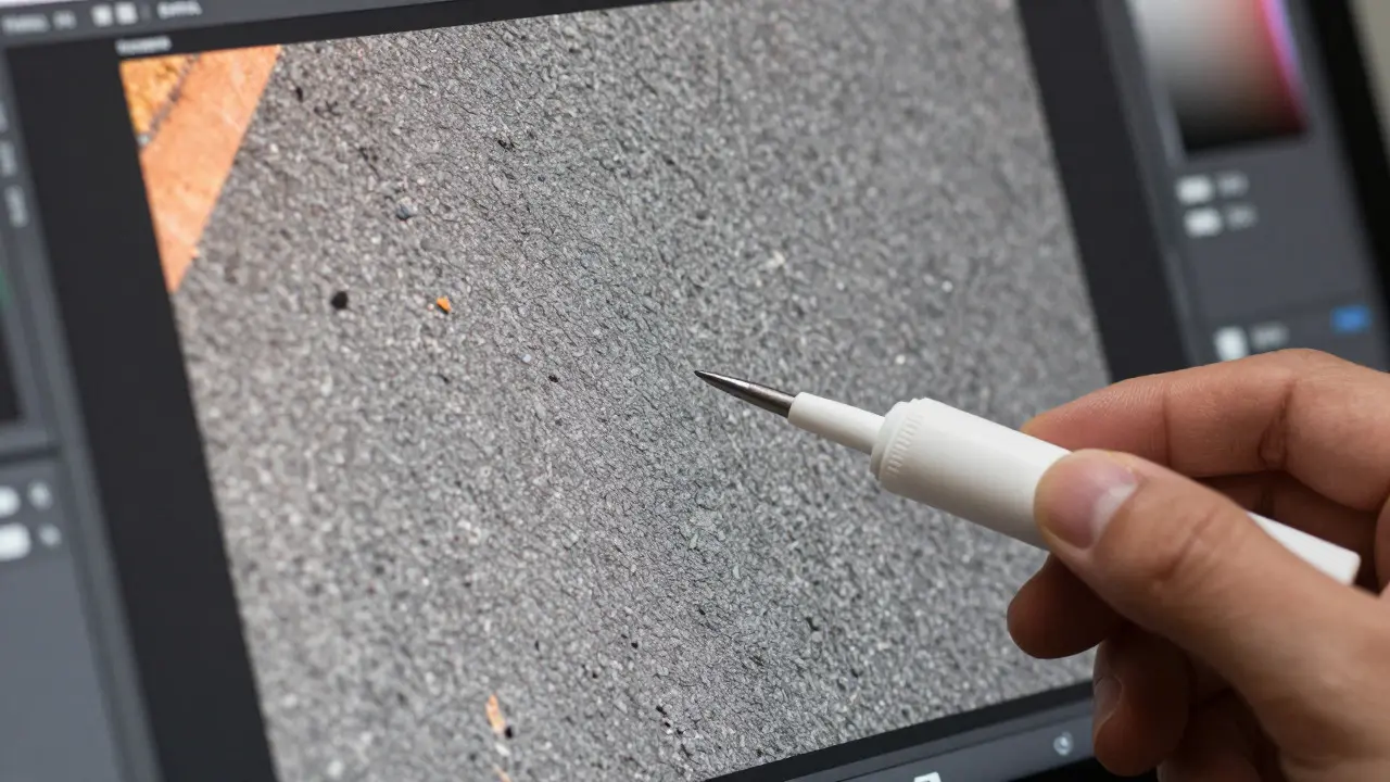
Think about what objects in your scene have no inherent color. Asphalt, concrete, shadows on a white wall, or a gray shirt are perfect candidates. If you can tell the software, “Hey, this patch of asphalt should be 50% gray,” the software will adjust the red, green, and blue channels accordingly to make it true gray. This process is known as neutralizing.
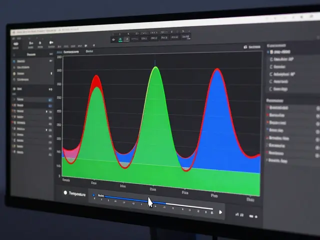
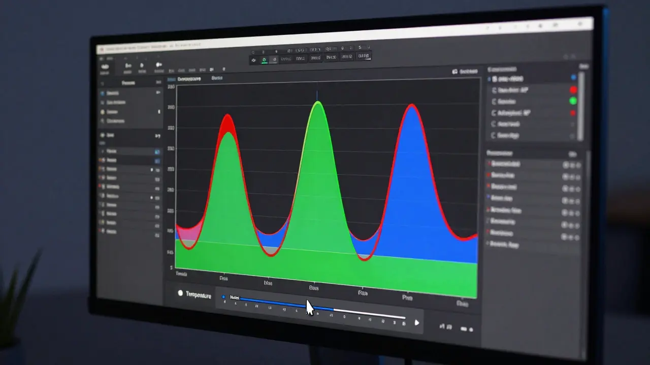
Neutral tones refer to colors that have equal amounts of red, green, and blue, resulting in shades of gray rather than a specific hue.In practice, this means using the White Balance Eyedropper tool found in most editing apps. Click on that neutral area, and watch the histogram. The peaks for red, green, and blue should align closely. If they don’t, keep clicking until they do. This step alone solves 80% of color cast issues.
Fixing Whites Without Losing Detail
Once your neutrals are correct, you still need to check your whites. Sometimes, even with correct neutrals, the brightest parts of the image might look too dark or too colored. This is where adjusting the “Whites” or “Highlights” slider comes in.
However, be careful. Pushing whites too far can cause clipping, where you lose detail in the brightest areas. To avoid this, zoom into 100% and look at your highlights. If you see pure white patches with no texture, you’ve gone too far. Aim for bright whites that still show some surface detail, like the weave of fabric or the texture of clouds.
Here is a simple workflow for handling whites:
- Select a white object in the image (like a paper sign, a cloud, or a white shirt).
- Use the eyedropper on the brightest part of that object, not the shadowed part.
- Check the histogram to ensure the white point isn’t cut off completely.
- Fine-tune the “Tint” slider if the whites still look slightly magenta or green.
Comparison of Correction Methods
Different tools offer different ways to handle these adjustments. Understanding which method fits your situation saves time. Below is a comparison of common approaches used in professional photo editing workflows.
| Method | Best For | Precision Level | Common Pitfall |
|---|---|---|---|
| Eyedropper Tool | Images with clear neutral or white references | High | Clicking on textured areas instead of flat colors |
| Manual Sliders | Subtle adjustments or creative tints | Medium | Over-correction due to lack of reference points |
| Histogram Analysis | Verifying channel balance | High | Misinterpreting clipped data as balanced |
| Split Toning | Adding mood after correction | Low | Applying tone before fixing base white balance |
Advanced Tips for Mixed Lighting Scenarios
What happens when your photo has both warm and cool areas? Maybe you shot a portrait indoors near a window. The face is lit by daylight (cool), while the background is lit by lamps (warm). In this case, global white balance won’t work perfectly.
This is where local adjustments come in. Use a brush or gradient tool to isolate the subject. Apply a cooler white balance to the face to match the window light, and leave the background warmer. This creates a natural look that respects the original lighting conditions. Pro editors often use masks to apply different white balance settings to different parts of the same image.
Another trick is using HSL sliders. If your neutrals are fixed but the greens still look weirdly yellow, go to the Hue slider for Green and shift it slightly toward teal. This doesn’t change the white balance globally but adjusts how that specific color renders. It’s a subtle fix that makes a big difference in landscape photography.
Common Mistakes to Avoid
Even with the right tools, it’s easy to mess things up. Here are the most frequent errors I see in edited photos:
- Correcting based on skin tones: Skin tones vary wildly between individuals. Using them as a neutral reference often leads to inaccurate results. Stick to actual gray or white objects.
- Ignoring the histogram: Your eyes can be fooled by screen brightness. The histogram shows the truth. If the left side is cut off, your blacks are crushed; if the right side is cut off, your whites are blown out.
- Over-correcting: Just because a cast is obvious doesn’t mean you need to swing the slider to the max. Small, incremental changes are usually enough.
- Forgetting the preview: Always toggle your before/after view. It helps you see exactly what changed and prevents accidental shifts in contrast or saturation.
Workflow Checklist for Clean Results
To streamline your editing process, follow this checklist every time you open a raw file:
- Inspect the image at 100% zoom for any obvious tints.
- Identify a neutral gray area in the scene.
- Apply the white balance eyedropper to that neutral area.
- Check the histogram for balanced channels.
- Adjust the Whites slider to restore highlight detail.
- Fine-tune the Tint slider for any remaining magenta/green shifts.
- Review skin tones and vibrant colors for unnatural shifts.
- Save a preset if the same lighting condition applies to multiple shots.
By following these steps, you ensure consistency across your portfolio. Consistency is key. If one photo looks blue and the next looks orange, viewers will notice. Standardizing your white balance process saves hours of back-and-forth tweaking later.
Frequently Asked Questions
What is the best tool for removing color casts?
The White Balance Eyedropper tool is the most effective for most users. It allows you to click on a neutral area and automatically adjust the temperature and tint. For complex scenes with mixed lighting, combine it with local adjustment brushes.
Why do my whites still look yellow after fixing the temperature?
This usually indicates a tint issue rather than a temperature issue. Yellow is a mix of red and green. If the temperature is correct but the image still looks yellow, adjust the Tint slider toward cyan (blue-green) to neutralize the excess warmth.
Can I fix color casts in JPEG files?
Yes, but with less flexibility. JPEGs have limited dynamic range compared to RAW files. Be gentle with adjustments to avoid banding or color noise. RAW files allow for much more aggressive correction without degrading image quality.
How do I know if my white balance is correct?
Look for objects that should be gray or white. If they appear truly neutral without a strong tint, your white balance is likely correct. Also, check the histogram to ensure the red, green, and blue channels are aligned at their peaks.
Does white balance affect exposure?
Indirectly, yes. Changing the white balance can alter the perceived brightness of certain colors. For example, making an image cooler (bluer) can make it look darker in some areas. Always re-check your exposure after adjusting white balance.