Ever stare at a landscape photo and feel like something’s off-even though everything looks beautiful? The sky’s blue, the trees are green, the sun’s glowing-but the image doesn’t pull you in. It’s not about sharpness or composition alone. More often than not, it’s about color. How colors relate to each other, how they balance, and how much life they have. Mastering this turns ordinary shots into unforgettable ones.
Why Color Harmony Matters More Than You Think
Color isn’t just decoration. It’s emotion. A cool blue stream under a warm orange sunset doesn’t just look pretty-it makes you feel calm, awed, even nostalgic. That’s because colors work together like musical notes. Some combinations feel natural. Others feel jarring. In landscape photography, harmony means your colors support the story, not fight it.
Think of it this way: if your photo has five different colors all screaming for attention, your viewer’s eye jumps around like a pinball. But if you guide them with a quiet, intentional palette, they stay longer. They feel the scene instead of just seeing it.
Most successful landscape photos use just two or three main colors. Not because you’re limited, but because less is more. Too many hues? You lose focus. Too much saturation? It feels fake. The trick is balance.
The Four Color Harmonies That Work Best for Landscapes
You don’t need to memorize every color scheme. Four are enough to transform your work:
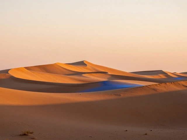
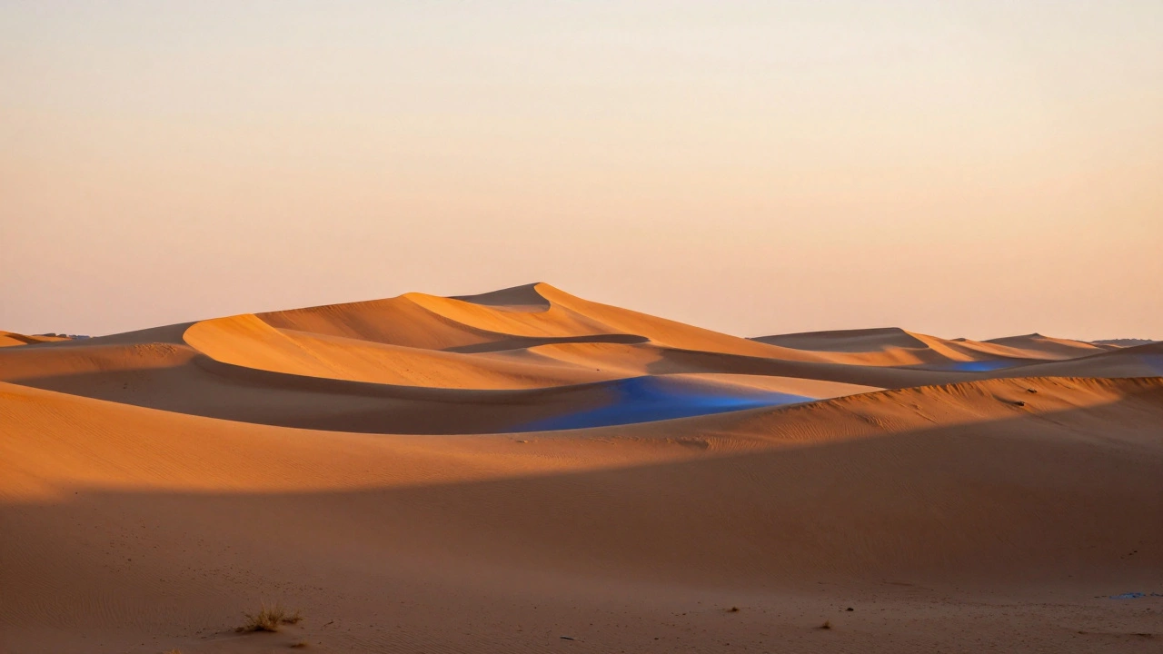
- Analogous: Colors next to each other on the wheel-like yellow, yellow-orange, and orange. Think desert sunsets with warm rocks and golden sand. These feel smooth and natural. They’re easy to use because nature already gives them to you.
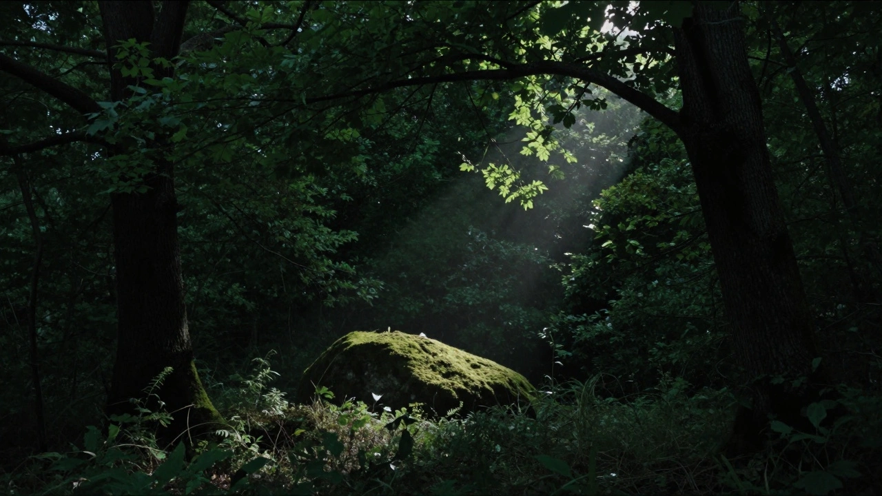
- Monochromatic: One base color with variations in brightness and saturation. A forest at twilight is perfect: deep greens, muted olive, almost-black shadows. It’s subtle, moody, and deeply calming.
- Complementary: Colors directly opposite each other-blue and orange, red and green. This is where landscapes pop. Blue water under a fiery sunset? That’s the classic. The contrast grabs attention, but only if one color dominates. Let the sunset be the star. Let the water support it.
- Split Complementary: One color plus the two on either side of its opposite. Say you have a green meadow. Instead of red (its direct opposite), use red-orange and red-violet in the sky. It’s less intense than pure complementaries but still has punch.
Triadic (three evenly spaced colors) and quadratic (four) schemes? They’re tempting, but rarely work in nature. You’ll almost never find a scene where purple, yellow, and green naturally balance without looking staged. Stick to the first four. They’re flexible. They’re real.
Saturation: Less Is More, Unless It’s Right
Here’s the myth: more saturation = more vibrant = better photo. Wrong.
Real saturation is selective. Think of it like spotlighting. The most powerful color in your image should be the one that tells the story-the sunrise, the wildflower, the glowing rock. Everything else should fade slightly.
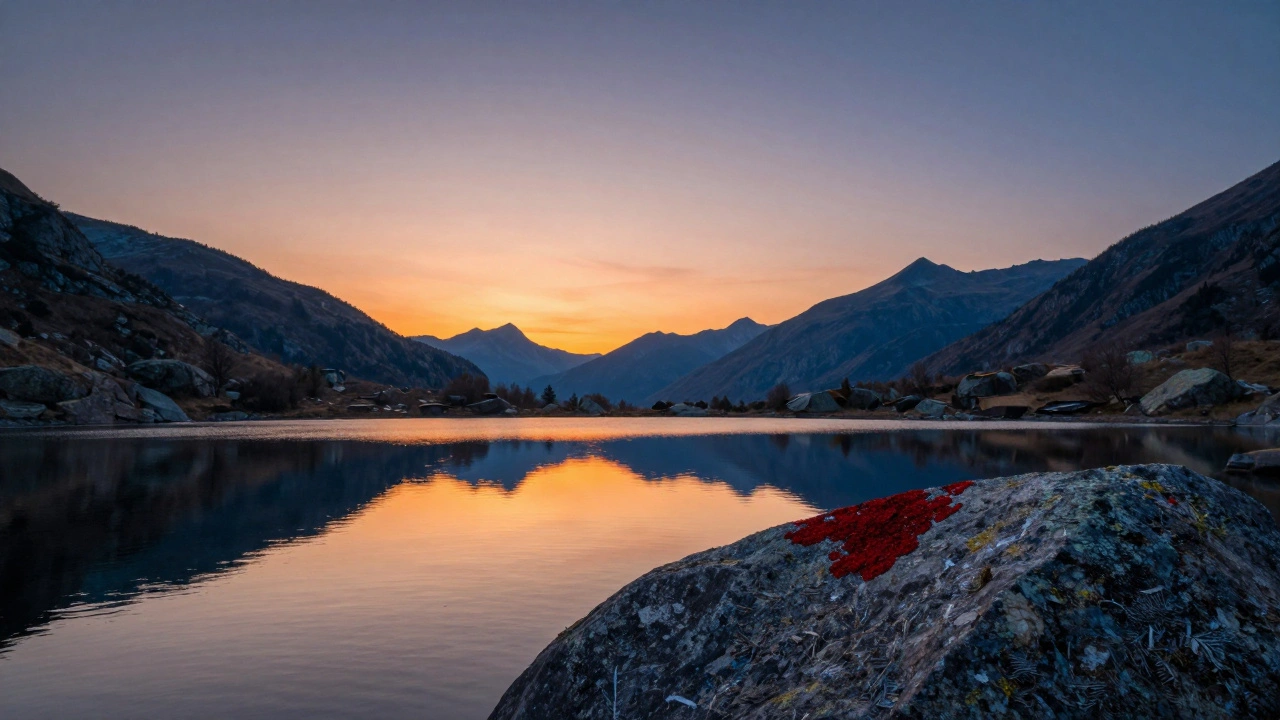
Look at Ted Gore’s work. His most vivid images don’t have saturated skies or glowing grass. They have one small patch of color-maybe a single red lichen on a gray boulder-that pulls your eye. The rest? Soft. Muted. Quiet.
Why? Because saturated colors have weight. They pull the eye. If you saturate the whole image, nothing stands out. If you saturate just the right part, everything else becomes a frame.
Rule of thumb: if a color covers more than 20% of your frame, keep its saturation low. Save the punch for the 5% areas-the highlight on water, the edge of a cloud, the tip of a leaf catching the last light.
Warm vs. Cool: How to Create Depth Without Editing
Nature already knows color depth. Sunlight is warm. Shadows are cool. That’s not a filter-it’s physics. And when you respect it, your photos gain dimension.
Here’s how to use it:
- Let sunlight warm your foreground rocks. Leave the shadows in the trees cool and blue.
- Don’t over-warm your entire sky. A touch of orange near the horizon is fine. But if the whole sky turns peach, it looks like a stock photo.
- Use cool tones to push elements back. A blue mountain range recedes. A warm rock in front jumps out.
Most photographers miss this. They edit everything to look “vibrant.” But real depth comes from contrast in temperature, not just brightness. Try this: in Lightroom, use the Split Toning panel. Add a tiny bit of blue to the shadows and a whisper of orange to the highlights. No sliders pushed to the edge. Just enough to make the light feel real.
And never forget: warm colors advance. Cool colors retreat. If you put a red flower against a red background? It disappears. Put it against a cool green? It sings.
Fixing Distracting Colors Without Ruining the Scene
You’re shooting a waterfall. The water’s perfect-smooth, blue-green. But then you see it: a dead branch, bright orange, right in the middle. It ruins the calm.
Don’t crop it out. Don’t delete it. Fix it.
Use HSL (Hue, Saturation, Luminance) in Lightroom. Find the orange slider. Lower the saturation just a little. Maybe drop it from 70 to 30. Then nudge the hue slightly toward red or yellow-whatever makes it blend with the rocks. Don’t try to turn it green. That looks fake. Just mute it. Make it quiet.
Same with unwanted reds in a forest scene. A few autumn leaves sticking out? Cool down their hue. Reduce saturation. You’re not erasing nature. You’re helping it speak.
And if you’re trying to make a complementary pair pop-say, blue water and orange sky-but the clouds have a hint of yellow? Use a selective color adjustment. In Photoshop, add a Hue/Saturation layer, target the yellows, and shift them toward orange. Then mask it so only the clouds change. You’re not forcing a color. You’re refining it.
Color Vignetting: The Silent Guide
Traditional vignettes darken the edges. Color vignettes do the same-just with hue.
Want to keep attention on a glowing sunrise? Add a cool blue or deep purple to the corners. It doesn’t need to be strong. Just enough to create a subtle visual frame. Your eye naturally moves away from cool tones, so the warm center pulls you in.
Try this in Lightroom: go to the Post-Crop Vignetting panel. Change the style to “Color.” Pick a cool tone. Set the amount to -10. That’s it. You’ve created a silent guide that says, “Look here.”
When to Break the Rules
Rules exist to teach. Not to trap.
There’s a photo I’ve seen a hundred times: a lone red canoe on a still, green lake under a gray sky. It breaks every harmony rule. Red and green are complementary, but here they’re not balanced. The red is tiny. The green is vast. The gray sky holds everything. It works because the contrast isn’t loud-it’s quiet. The red doesn’t shout. It whispers.
That’s the secret. Color harmony isn’t about following a wheel. It’s about intention. Is the color there to support the mood? To lead the eye? To echo the feeling of the place?
If you’re shooting a misty forest, go monochrome. If you’re capturing a desert storm, lean into analogous oranges and reds. If you’re at the ocean at dawn, let the blue and orange do their dance. But don’t force color where nature didn’t put it.
Final Thought: Color Is Feeling, Not Formula
You don’t need to be a color theorist to make great landscape photos. You just need to feel them. Look at the light. Notice how the shadows hold blue. How the rocks glow with warmth. How a single patch of wildflowers doesn’t just sit there-it sings.
When you shoot, ask: What emotion am I trying to hold? Calm? Wonder? Solitude? Then choose colors that carry that feeling-not ones that look pretty on a screen.
Harmony isn’t about matching. It’s about listening.
What’s the easiest color harmony to use in landscape photography?
Analogous color harmony is the easiest and most natural for landscapes. It uses colors next to each other on the wheel-like blues and greens in a forest, or oranges and yellows in a desert. Nature often presents these combinations naturally, so you don’t have to force them. They create calm, flowing images that feel balanced without any editing.
Should I always increase saturation to make my photos pop?
No. Increasing saturation everywhere makes photos look artificial and drains focus. Instead, boost saturation only in small areas that matter-like a sunlit rock, a glowing cloud, or a single flower. Keep the rest muted. This creates contrast and guides the viewer’s eye where you want it to go.
How do I fix a distracting color in my landscape photo?
Use the HSL panel in Lightroom or a selective color adjustment in Photoshop. Lower the saturation of the distracting color, or slightly shift its hue to blend with nearby tones. Don’t try to completely change it-just soften it. A small tweak, like reducing orange saturation from 70 to 40, can make a huge difference without looking unnatural.
Why do warm colors seem to come forward in a photo?
Warm colors like red, orange, and yellow have longer wavelengths, which our eyes perceive as closer. Cool colors like blue and green have shorter wavelengths and feel farther away. This is why placing a warm subject in front of a cool background creates instant depth-it mimics how we see the world naturally.
Can I use complementary colors in a landscape without making it look too busy?
Yes, if one color dominates. Use a small area of contrast-like a warm sunset against cool water-to create impact, not chaos. Let the majority of the image stay in one color family. The contrast should be a highlight, not a distraction. For example, orange sky (10% of the frame) over blue water (90%) works. Orange water with orange sky? It overwhelms.