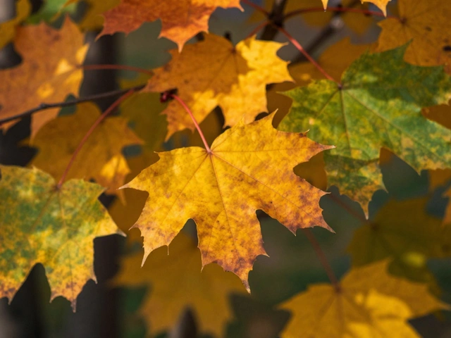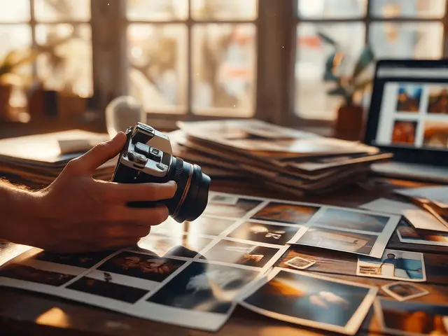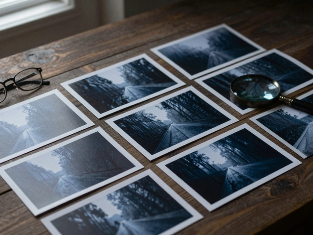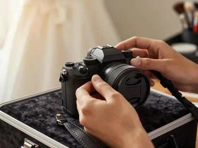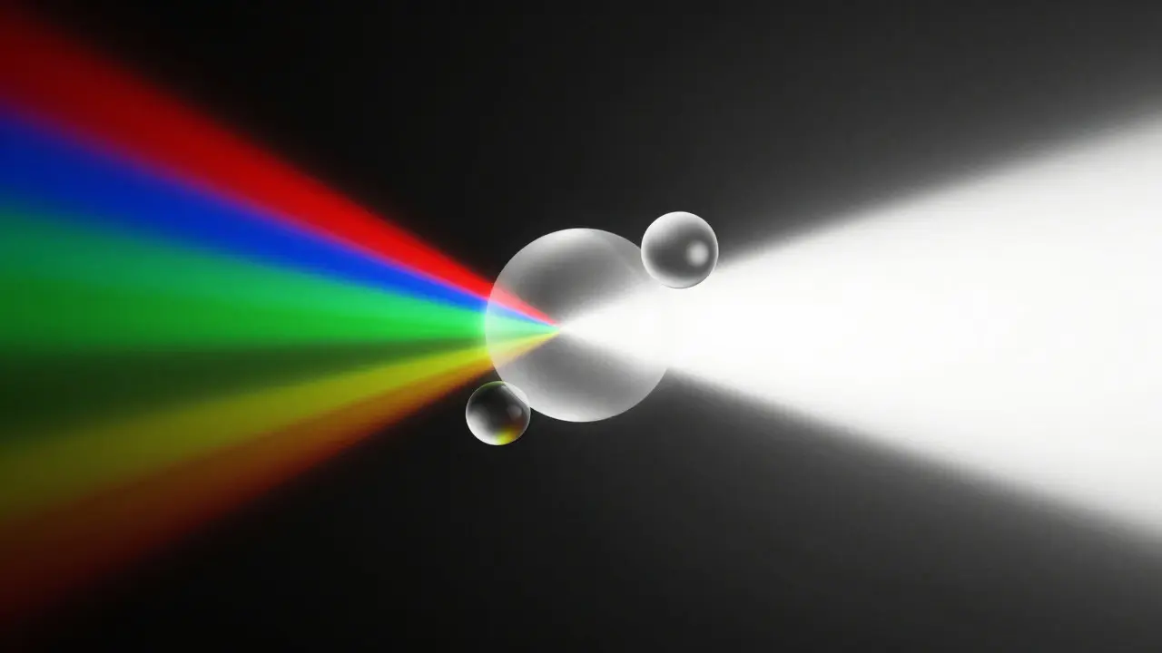
Color often hides the soul of a photograph. When you strip away the hues, you are left with light, texture, and form. This is why black and white conversion is not just about removing color; it is about reconstructing the image’s emotional core through tonal relationships. Many photographers treat monochrome as a fallback for "bad" color photos, but the best black-and-white images are deliberate choices made to emphasize contrast, mood, or graphic structure.
The difference between a flat, gray image and a striking monochrome piece lies in how you handle the channels. In digital photography, every pixel is composed of red, green, and blue data. When converting to grayscale, your software averages these values into a single luminance value. However, if you let the software do this automatically, you lose control over which colors become lighter or darker. By mastering manual adjustments, you can make skies deep charcoal, skin tones bright and clear, or foliage richly textured, all while maintaining a cohesive visual narrative.
Understanding the Mechanics of Grayscale Conversion
To edit effectively, you need to understand what happens under the hood. Digital cameras capture light through a Bayer filter, separating incoming light into red, green, and blue pixels. When you convert an image to black and white, the editing engine calculates a weighted average of these three channels. The standard weights are approximately 30% red, 59% green, and 11% blue. This weighting exists because human eyes are most sensitive to green light. If you simply desaturate an image using a basic slider, you rely on these default weights, which rarely produce the optimal result for specific scenes.
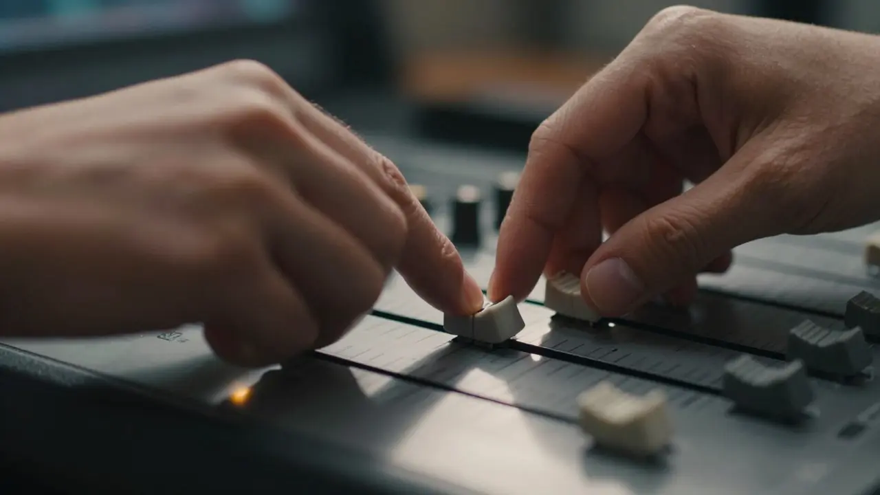
Manual conversion tools, such as the Channel Mixer or individual channel sliders found in professional editing software, allow you to override these defaults. For instance, if you want a dark, dramatic sky, you might lower the contribution of the blue channel. Conversely, if you want bright, airy clouds, you might raise the blue channel value. This process transforms the technical act of conversion into an artistic decision-making process where you dictate how each original color contributes to the final tonal range.
The Role of Tonal Contrast and Dynamic Range
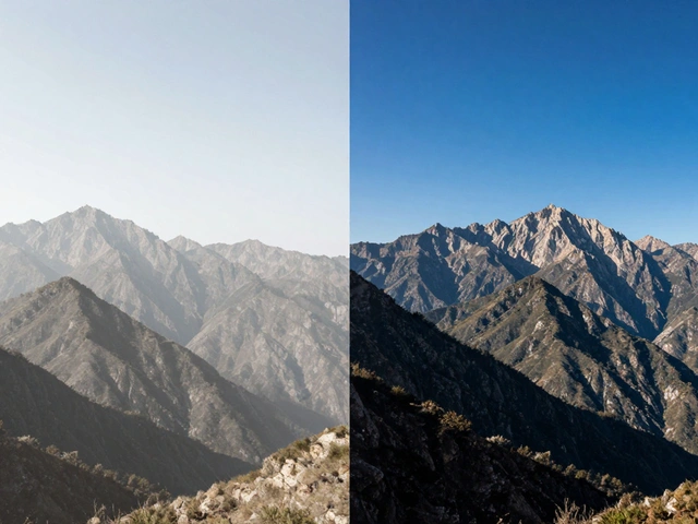
Contrast is the backbone of any successful monochrome image. Without strong contrast, black and white photos can look muddy or washed out. You need to define your highlights and shadows clearly. A common mistake is trying to preserve detail in both the brightest and darkest areas simultaneously without considering the overall impact. Sometimes, letting highlights clip slightly creates a more powerful graphic statement than preserving every nuance in a cloud formation.
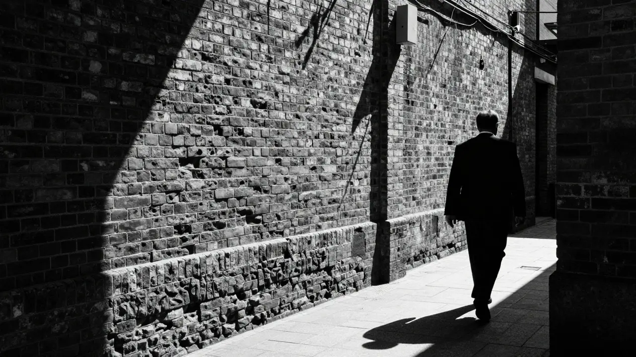
Dynamic range management is critical here. Unlike color photography, where a mid-tone orange jacket can stand out against a blue background, monochrome relies entirely on brightness differences. If two objects have similar luminance values, they will blend together regardless of their original colors. This is why pre-shooting matters. Look for subjects that have natural high-contrast elements: a dark suit against a white shirt, a shadowed alleyway against a sunlit street, or a bright face against a dark background. These natural contrasts give you a strong foundation to work with during the editing phase.
Channel Mixing Strategies for Specific Subjects
Different subjects require different channel adjustments. Here is how you can approach common photographic scenarios:
- Portraits: Skin tones are primarily composed of red and yellow (red + green) information. To make skin pop, increase the red channel and slightly decrease the blue channel. This keeps the face bright and clear while allowing the background to darken naturally. Avoid pushing the green channel too high, as it can introduce unwanted halos around hair edges.
- Landscape Photography: Blue skies and green foliage are the main components. To create a moody landscape, lower the blue channel to darken the sky and lower the green channel to deepen the trees. This creates a heavy, atmospheric feel. For a brighter, more ethereal look, raise the blue channel to lighten the sky and keep the greens moderate.
- Street Photography: Urban scenes are chaotic with many competing colors. Use the channel mixer to unify disparate elements. If a red car is distracting, lower the red channel to make it darker and less prominent. If a white building is too glaring, lower the blue and green channels to bring it down to a neutral gray. The goal is to guide the viewer’s eye to the main subject by controlling the tonal hierarchy of the surrounding environment.
Texture and Grain: Adding Depth to Flat Images
Monochrome images are particularly effective at showcasing texture. Because there is no color to distract the eye, the surface details of materials like brick, wood, skin, and fabric become the primary focus. Enhancing texture involves increasing local contrast. Tools like clarity or texture sliders in modern editing software are invaluable here. However, be careful not to overdo it, as excessive sharpening can create halos around edges, making the image look artificial.
Grain is another powerful tool in the monochrome arsenal. While digital noise is generally considered a flaw, simulated film grain adds a tactile quality that mimics analog photography. Fine grain works well for portraits and smooth subjects, adding subtle depth without distraction. Coarse grain suits gritty street scenes or abstract compositions, adding energy and movement. The key is consistency; apply grain uniformly across the image unless you are aiming for a specific stylistic effect like vignetting combined with edge grain.
Common Pitfalls and How to Avoid Them
Even experienced editors make mistakes when converting to black and white. One frequent error is relying solely on global contrast adjustments. Global changes affect the entire image equally, which can crush shadows in one area while blowing out highlights in another. Instead, use local adjustments like radial filters or gradient masks to target specific parts of the image. For example, you might want to brighten the subject’s face while keeping the background dark. This selective approach preserves dynamic range where it matters most.
Another pitfall is ignoring the histogram. In color photography, you can judge exposure based on multiple channels. In monochrome, you only have one luminance channel. Check your histogram regularly to ensure you are not clipping important details. A healthy histogram for a black and white image should show a good spread from left to right, with minimal spikes at the extreme ends unless intentional. If your histogram shows a large gap in the mid-tones, your image likely lacks contrast and needs adjustment.
Workflow Tips for Efficient Editing
An efficient workflow saves time and reduces frustration. Start by assessing the raw file. Ask yourself: does this image have enough contrast to work in black and white? If the answer is no, consider shooting in color and converting later, or discard the shot. Once you decide to proceed, duplicate your layer or create a new adjustment layer before making changes. This non-destructive approach allows you to revert to the original color version if needed.
Use presets wisely. Many editing platforms offer built-in black and white presets. These can serve as a starting point, but rarely as a final solution. Treat them as templates that you customize for each image. Save your own custom presets for recurring themes, such as "Moody Portrait" or "High-Key Landscape." Over time, you will build a library of settings that reflect your personal style, speeding up your editing process significantly.
| Feature | Automatic Desaturation | Manual Channel Mixing |
|---|---|---|
| Control Level | Low (uses default weights) | High (individual channel control) |
| Best For | Quick previews, low-stakes edits | Professional prints, fine art, client work |
| Tonal Accuracy | Average, often flat | Precise, tailored to subject |
| Time Required | Seconds | Minutes to hours depending on complexity |
| Creativity Potential | Limited | Unlimited |
Frequently Asked Questions
What is the best way to convert a photo to black and white?
The best method is using manual channel mixing tools rather than simple desaturation. This allows you to adjust how much each color channel contributes to the final grayscale image, giving you precise control over contrast and tone. For portraits, boost red; for landscapes, adjust blue and green based on desired mood.
Why do my black and white photos look gray and flat?
Flat appearance usually results from insufficient contrast. Check your histogram to see if the tonal range is compressed. Increase global contrast or use local adjustments to darken shadows and brighten highlights. Also, ensure your source image has sufficient dynamic range; low-contrast color photos often fail in monochrome.
Should I add grain to digital black and white photos?
Yes, if you want to mimic the aesthetic of film photography. Grain adds texture and depth, reducing the sterile look of clean digital files. Use fine grain for portraits and coarse grain for street or documentary styles. Apply grain consistently across the image to avoid distracting patterns.
How do I make skin tones look natural in black and white?
Increase the red channel value to brighten skin, as skin tones contain significant red information. Slightly reduce the blue channel to prevent a cool, unnatural cast. Avoid over-saturating the green channel, which can cause halos around hair. Test different combinations until the skin looks smooth and distinct from the background.
Is black and white better for certain types of photography?
Black and white excels in genres where emotion, texture, or graphic composition is paramount. Portraits, street photography, architecture, and abstract art often benefit from monochrome treatment. It removes distractions and focuses attention on form and light. However, vibrant landscapes or commercial product shots may lose essential information when converted, so choose based on the story you want to tell.