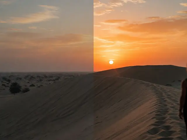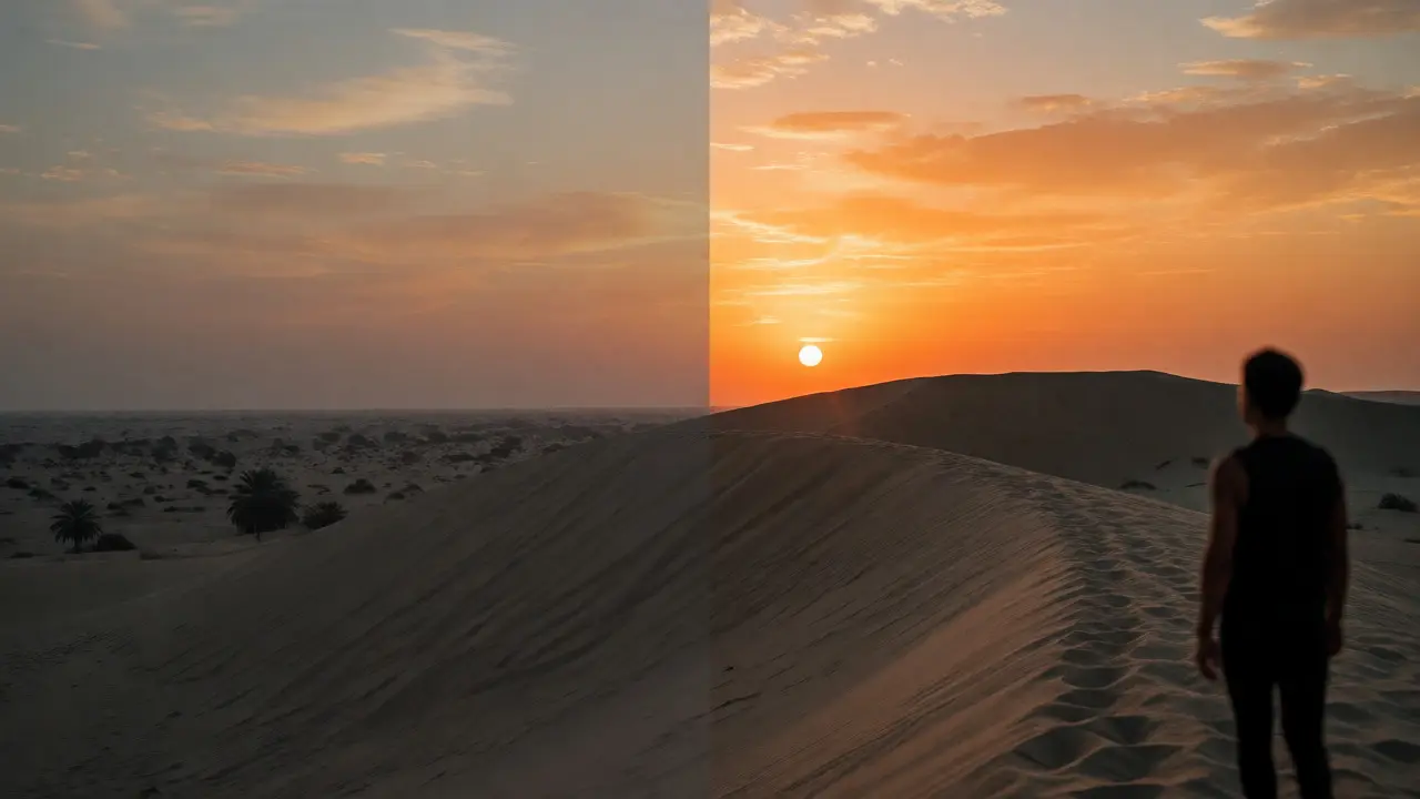
You’ve probably been there. You shoot a beautiful sunset, import it into Adobe Lightroom, and think, "This looks dull." So you crank up the Saturation slider until the sky turns neon orange and your subject’s skin looks like they just spent three days in a tanning bed. Sound familiar? The difference between a professional-looking edit and an amateur one often comes down to understanding two specific tools: vibrance and saturation.
Most beginners treat these sliders as interchangeable volume knobs for color. They aren’t. One is a blunt instrument; the other is a precision tool. If you want your photos to pop without looking artificial, you need to know exactly what each control does to your pixels and when to reach for which. Let’s break down the mechanics so you never have to apologize for oversaturated skies again.
The Core Difference: Uniformity vs. Intelligence
To fix your edits, you first need to understand how digital images store color data. Every pixel has three main components: hue (the actual color), saturation (the intensity or purity of that color), and luminance (brightness). When you adjust color in post-processing, you are manipulating these values.
Saturation is a global adjustment. It increases the intensity of all colors equally across the entire image. If you move the saturation slider from 0 to +50, every single color channel-reds, greens, blues, yellows-gets pushed toward its most intense state by the same amount. This is great if your image is completely gray or extremely muted, but it’s terrible for complex scenes. Why? Because it doesn’t care about context. It treats a vibrant red apple and a pale blue sky with the exact same level of aggression.
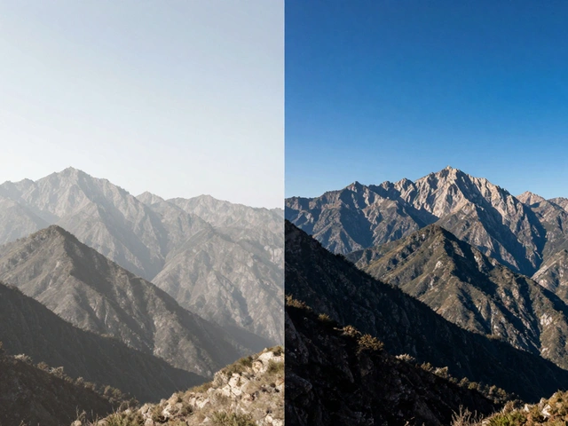
Vibrance, on the other hand, is a smarter, selective algorithm. It analyzes the current saturation levels of each pixel before applying changes. Its primary goal is to boost colors that are currently dull while leaving already saturated colors alone. Think of it as a limiter. If a color is already at 80% saturation, vibrance might only push it to 85%. But if another color is sitting at 10%, vibrance will aggressively push it up to 40%. This prevents the "clipping" effect where colors hit their maximum limit and lose detail, turning into flat blocks of neon.
Why Vibrance Protects Skin Tones
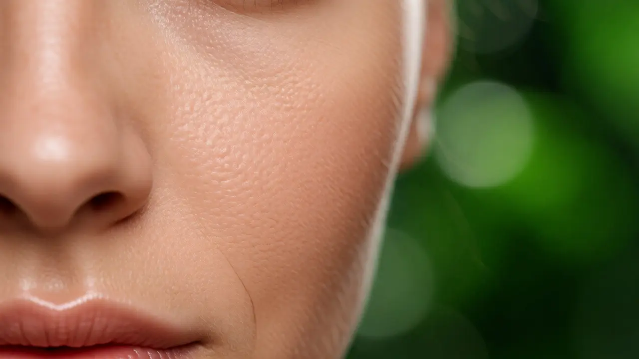
This is the number one reason photographers prefer vibrance over saturation for portraits. Human skin tones fall within a very narrow range of hues, primarily oranges and reds. Our eyes are incredibly sensitive to shifts in skin color. A slight increase in saturation can make a person look sunburned, sickly, or artificially tan.
Saturation boosts the orange/red channels indiscriminately. If your subject has naturally ruddy cheeks or a warm complexion, hitting the saturation slider amplifies those reds until they dominate the face. Vibrance includes a built-in protection mechanism specifically for skin tones. Most modern editing software, including Adobe Photoshop and Capture One, uses algorithms that detect skin-like hues and apply less aggressive boosting to them compared to other colors.
Try this experiment. Take a portrait with natural lighting. Push saturation to +30. Notice how the background pops, but the model’s nose and ears start glowing red. Now reset and push vibrance to +30. The background greens and blues become richer, but the skin remains relatively stable. You get the impact you want without losing realism.
When to Use Saturation Instead
Does this mean you should banish the saturation slider forever? Absolutely not. There are specific scenarios where saturation is the superior tool.
- Desaturated or Flat Images: If you shot in a foggy forest or under heavy overcast light, your entire image might lack punch. Since no colors are highly saturated yet, vibrance won’t have much to work with because it prioritizes low-saturation areas. Here, a moderate bump in saturation helps bring life back to the whole scene uniformly.
- Stylized Artistic Edits: Are you going for a hyper-realistic, surreal, or comic-book look? Sometimes you *want* that artificial intensity. High saturation creates bold, graphic contrasts that stand out in thumbnails. If you’re editing food photography for a magazine cover, you might want the burger patty to look intensely brown and the lettuce electric green, regardless of realism.
- Black and White Conversion Prep: Before converting a color image to black and white, adjusting saturation per channel can dramatically change the contrast. Boosting blue saturation darkens blue skies (making clouds pop), while boosting yellow saturation brightens skin tones. Vibrance’s selective nature makes it unpredictable for this specific technical task.
A Practical Workflow for Better Color
Don’t guess. Follow a structured approach to ensure your edits remain balanced. Here is a reliable workflow used by many professional retouchers.
- Start with Exposure and Contrast: Fix the brightness and dynamic range first. Color adjustments look different depending on whether the image is too dark or blown out. Get the tonal balance right before touching color.
- Apply Vibrance First: Move the vibrance slider slowly. Watch the histogram. For most landscape and lifestyle shots, you’ll find the sweet spot between +10 and +25. Stop when the colors feel rich but not garish.
- Check Skin Tones: Zoom in to 100% on any faces. If the skin looks unnatural, reduce vibrance slightly or use a local adjustment brush to mask the face and lower saturation there specifically.
- Add Saturation Only If Needed: If the image still feels flat after maxing out vibrance, add small increments of saturation (+5 to +10). This acts as a final polish. If you find yourself pushing saturation past +20, you’re likely compensating for poor white balance or bad lighting rather than fixing color depth.
- Use HSL Sliders for Precision: Both vibrance and saturation are global. For true control, use the Hue/Saturation/Luminance (HSL) panel. Want greener grass but less orange in the shirt? Lower the orange saturation and raise the green luminance. This targeted approach yields cleaner results than relying solely on the master sliders.
| Feature | Vibrance | Saturation |
|---|---|---|
| Behavior | Selective; boosts dull colors more than vivid ones. | Uniform; boosts all colors equally. |
| Skin Tone Protection | Yes; automatically reduces impact on orange/red hues. | No; affects skin tones just like any other color. |
| Risk of Clipping | Low; prevents colors from exceeding maximum limits. | High; easily causes loss of detail in highlights/shadows. |
| Best For | Portraits, landscapes, general enhancement. | Flat images, artistic styles, B&W prep. |
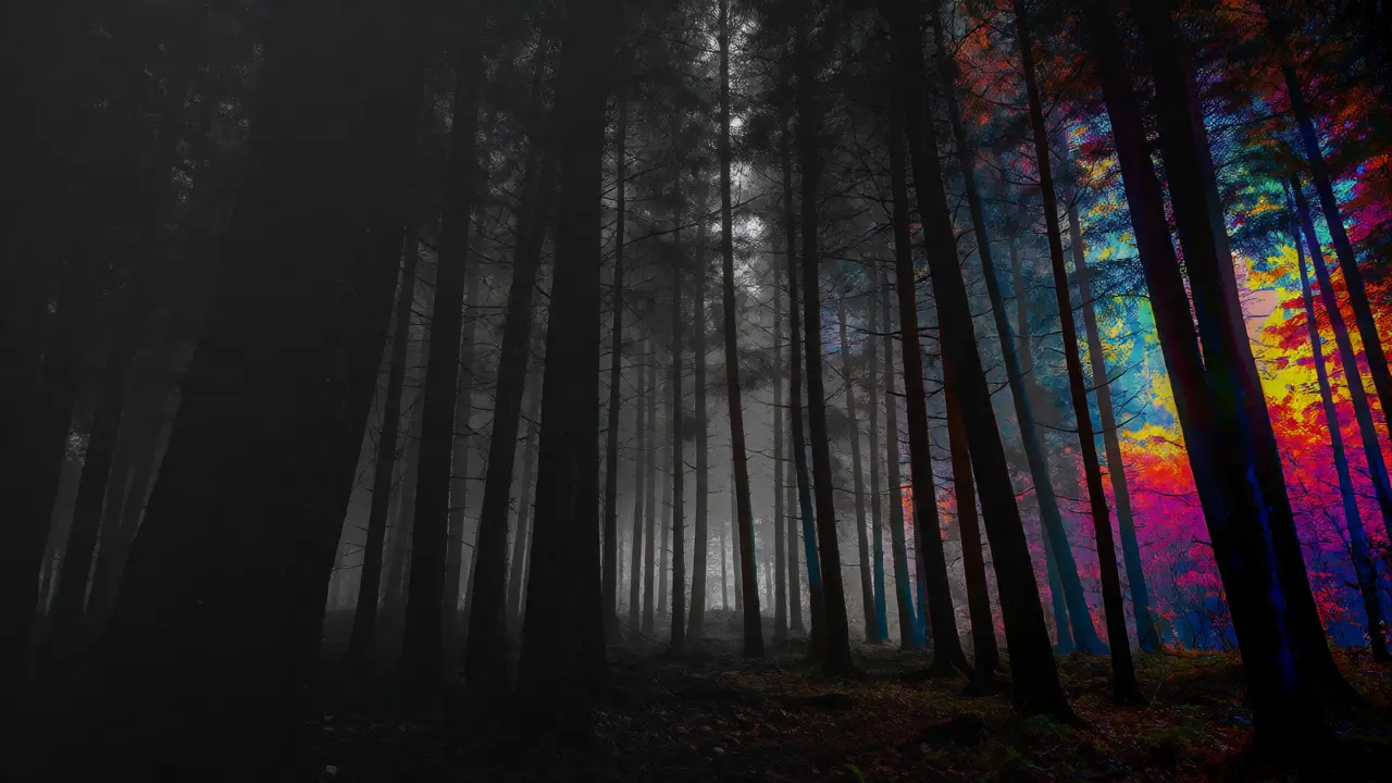
Common Pitfalls to Avoid
Even with the right tools, mistakes happen. The biggest issue isn’t using the wrong slider-it’s using either one too aggressively. Digital sensors capture more color information than our eyes perceive in the moment. What looks "boring" on screen might actually be accurate to reality. Pushing vibrance to +50 often reveals noise and banding in gradients, especially in skies.
Another trap is ignoring white balance. If your white balance is off (too cool or too warm), cranking saturation will exaggerate that cast. A blue-cast image with high saturation looks cold and unnatural. Always correct white balance first. Once the neutrals (whites, grays) look neutral, then enhance the chroma.
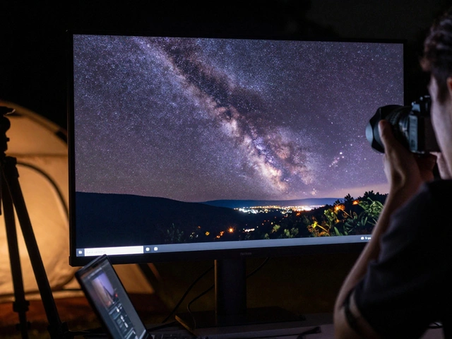
Finally, remember that screens lie. Editing on a calibrated monitor versus a phone screen yields different results. If you edit on a cheap laptop with washed-out colors, you’ll tend to over-saturate to compensate. Calibrate your display regularly, or check your edits on multiple devices before publishing.
Frequently Asked Questions
Can I use both vibrance and saturation together?
Yes, and often you should. Start with vibrance to bring out hidden details and protect skin tones. Then, add a small amount of saturation if the overall image still lacks punch. Just be careful not to double-boost certain areas excessively.
Which slider is better for landscape photography?
Vibrance is generally preferred for landscapes because it enhances foliage and water without making the sky look radioactive. However, if you are shooting in foggy conditions where everything is gray, a bit of saturation can help restore contrast and depth.
Does vibrance affect black and white photos?
No, vibrance and saturation controls typically disappear or become inactive once you convert an image to black and white, as there is no chroma to adjust. In some software, you can still use saturation sliders to influence the grayscale conversion before finalizing the B&W look.
Why do my photos look noisy after increasing saturation?
High saturation amplifies color noise, particularly in shadows and darker areas. If you see speckling after boosting color, try reducing the saturation slightly or applying noise reduction before color adjustments. Using vibrance instead can also help, as it applies less pressure to already noisy, saturated areas.
Is there a difference between vibrance in Lightroom and Photoshop?
The core algorithm is similar, but implementation varies. In Lightroom, vibrance is a raw adjustment applied early in the pipeline. In Photoshop, it’s often a layer adjustment or filter applied later. Photoshop’s version might interact differently with masks and blend modes, but the fundamental logic of protecting skin tones remains consistent.