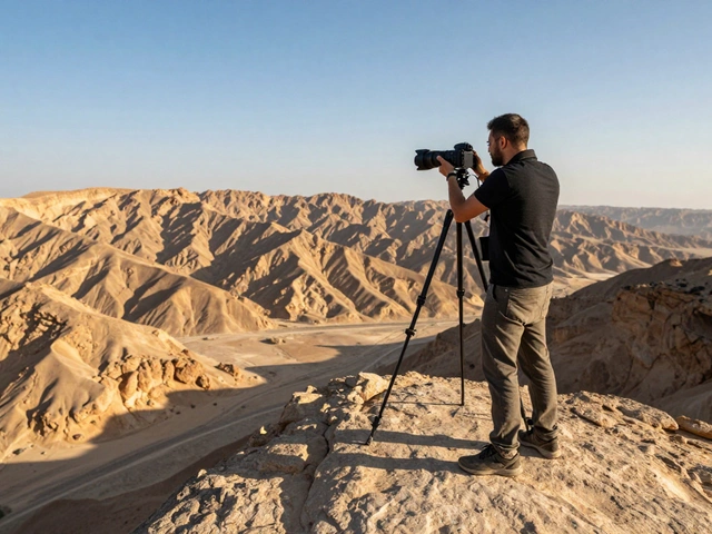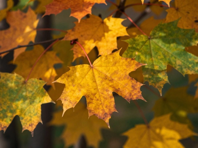
You've just taken a stunning shot, but when you get it onto your screen, it looks a bit "off." Maybe the sky is a blinding white void, or perhaps your subject is swallowed by shadows. This is where exposure and contrast adjustments is the process of manipulating the brightness and tonal range of a digital image to improve its visual clarity and emotional impact. It is the most fundamental part of post-processing, turning a flat snapshot into a professional-looking photograph.
The Quick Essentials
- Exposure handles the overall light-making the whole image brighter or darker.
- Contrast manages the gap between light and dark, adding "pop" or softening the mood.
- The Histogram is your map; it tells you exactly where your pixels are sitting.
- RAW files give you way more room to fix mistakes than JPEGs do.
Understanding Exposure: More Than Just Brightness
Think of exposure as a master volume knob for light. In the digital world, every pixel is made of red, green, and blue channels with values from 0 (pure black) to 255 (pure white). When you move the exposure slider, you're telling the software to shift these values across the entire image.
If you've ever shot a photo in a dim room and it looks muddy, increasing the exposure lifts those values. However, there's a catch. If you push the exposure too far on a photo that was already bright, you'll hit a wall called "clipping." This is when pixels hit the 255 mark and stay there, resulting in a flat white area where all detail-like the texture of a cloud or the skin on a forehead-is permanently gone. This is why capturing a decent exposure in-camera is still the golden rule, even with the best software.
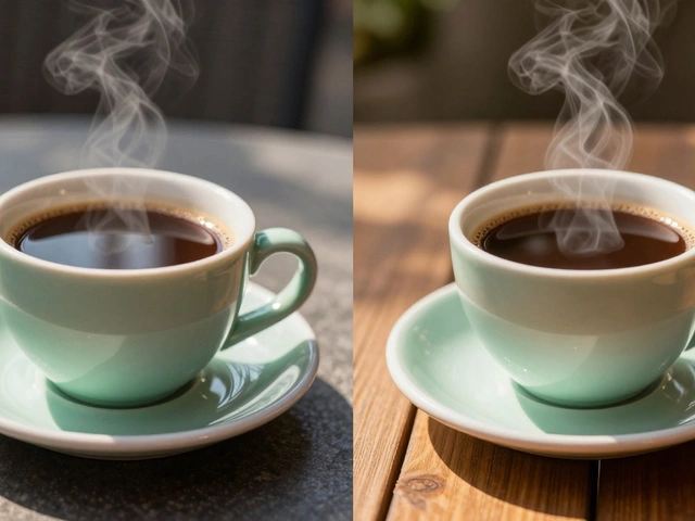
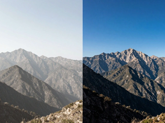
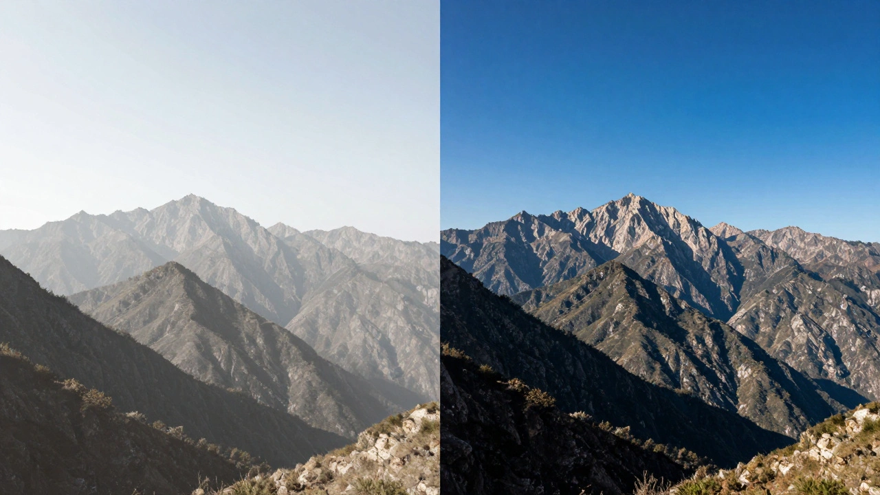
Cracking the Code of Contrast
If exposure is about the amount of light, contrast is about the difference between the lights and darks. When you crank up the contrast, the dark areas get darker and the bright areas get brighter. This pushes the pixels toward the edges of the spectrum, creating a punchy, dramatic look that often feels more "real" or high-energy.
But be careful. Too much contrast makes a photo look harsh and unnatural, often losing detail in the deepest shadows (crushing the blacks) or the brightest highlights (blowing out the whites). On the flip side, too little contrast leads to a "flat" or muddy image. It looks like there's a grey veil over everything. Finding the sweet spot is all about deciding whether you want a soft, ethereal vibe or a bold, gritty feel.
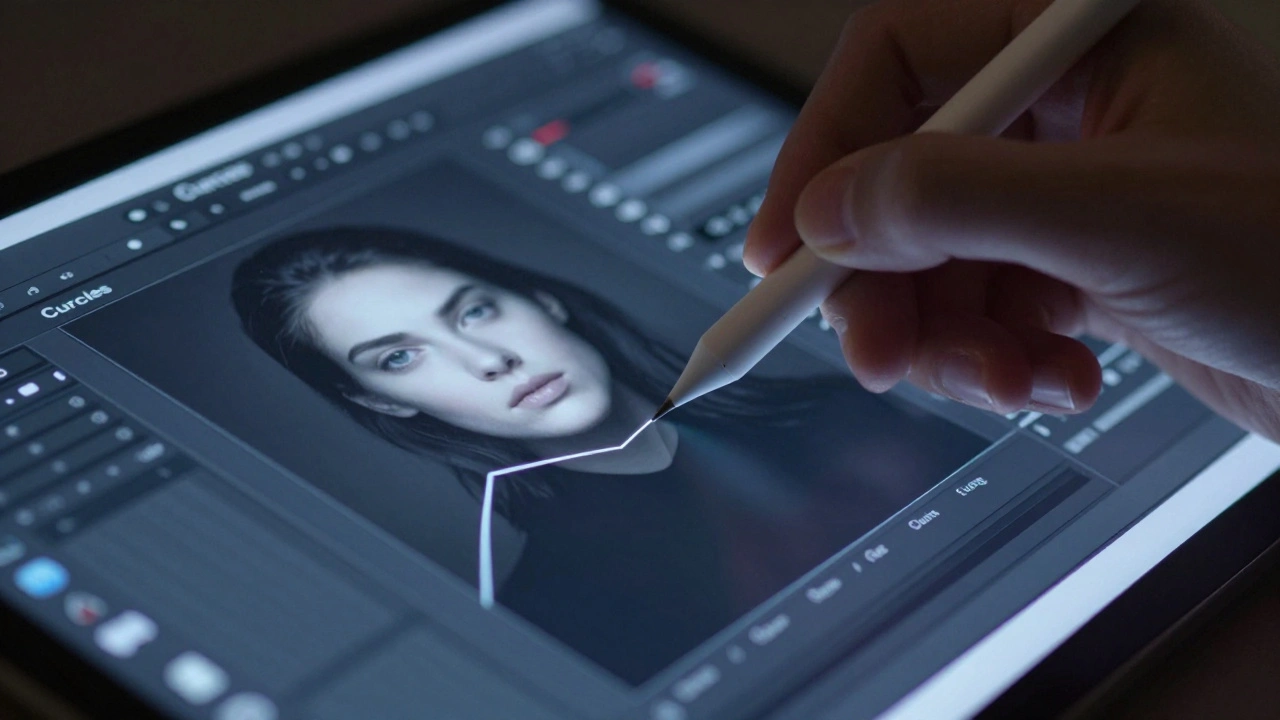
The Toolset: From Sliders to Curves
Different software offers different ways to handle these adjustments. While a simple brightness slider is fine for a quick Instagram post, professional work requires more precision. Most pro-level tools like Adobe Photoshop or Adobe Lightroom Classic use a variety of specialized controls.
| Tool | What it Does | Best Use Case |
|---|---|---|
| Exposure Slider | Shifts all tones uniformly | General brightness correction |
| Levels | Adjusts black, white, and mid-tone points | Fixing overall tonal distribution |
| Curves | Precise control via a graph line | Fine-tuning specific brightness ranges |
| Highlights/Shadows | Targets only the extremes | Recovering detail in clouds or dark corners |
The Curves Tool is the real power player here. Instead of a slider, you get a diagonal line representing your image's tones. By clicking and dragging the line, you can brighten the mid-tones without touching the deep blacks or the bright whites. It's a bit like sculpting with light.
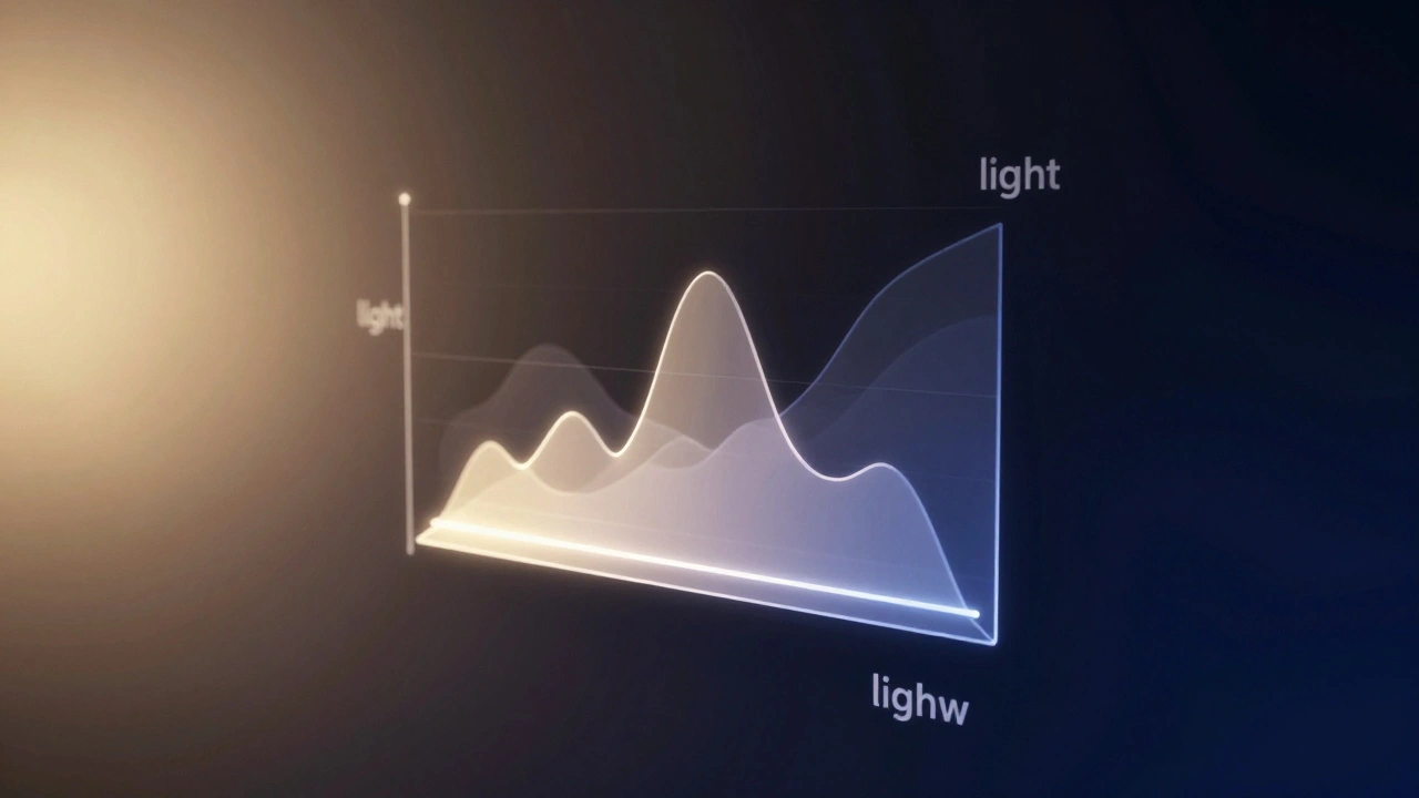
Reading the Histogram: Your Secret Weapon
Stop guessing and start looking at your Histogram. This little graph shows the distribution of pixels in your image. The left side represents the blacks, the middle is the mid-tones, and the right side is the whites.
If the "mountain" of the graph is all bunched up against the left wall, your photo is underexposed. If it's smashing against the right wall, it's overexposed. A balanced image usually has a mountain in the middle, though this depends on the scene-a photo of a dark cave *should* have a graph shifted to the left. The key is to watch for "clipping," where the graph literally touches the edge of the box, signaling that you've lost data.
A Pro Workflow for Natural Results
One of the biggest mistakes beginners make is over-relying on the Exposure slider. When you push it too hard, the image starts to look "digital" and processed. Instead, try a layered approach. Start by making a slight overall exposure adjustment, then use the Shadows slider to bring back detail in the dark areas, and the Highlights slider to tame the bright spots.
If you're working with RAW files, you have a massive advantage. RAW data preserves much more information than a JPEG, allowing you to recover highlights or lift shadows that would otherwise be a flat white or black mess. For the best results, duplicate your layers and test different combinations. Try adding a bit of contrast and then bringing back some of the shadow detail to keep the image looking organic.
Can I recover a photo that is completely white in some areas?
If the area is truly "clipped" (pure white with no data), you cannot recover it. The pixels are at 255, and there's no information left to reveal. This is why shooting in RAW is helpful, as it captures more highlight data, but once it's gone, it's gone.
What is the difference between Brightness and Exposure?
While they seem similar, the Exposure tool typically mimics how a camera lens works, affecting the highlights more significantly. Brightness tends to shift the mid-tones more, which can lead to a flatter look if overused.
Why does my photo look "muddy" after I lower the contrast?
Lowering contrast brings the light and dark tones closer together toward the grey mid-tones. Without a clear distinction between the darkest and lightest parts of the image, the photo loses depth and appears flat or muddy.
Should I always use the Curves tool?
Not always. For simple corrections, the basic sliders are faster and more intuitive. Save the Curves tool for when you need precise control over specific tonal ranges, such as brightening just the skin tones while keeping the background dark.
Does increasing exposure add noise to the image?
Yes, especially in the shadows. When you lift the exposure of a dark area, you are amplifying the signal-and the noise-stored in those pixels. This is why you'll often see grain appear in the dark parts of a photo after brightening it.
What to Do Next
If you're feeling confident with these basics, the next step is to explore Color Grading. Now that your light and contrast are balanced, you can start playing with the temperature and tint to evoke specific moods. You might also want to look into Local Adjustments-using brushes or gradients to apply exposure changes to only one part of the image, like brightening just the subject's face while keeping the rest of the scene moody.