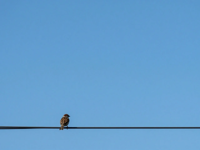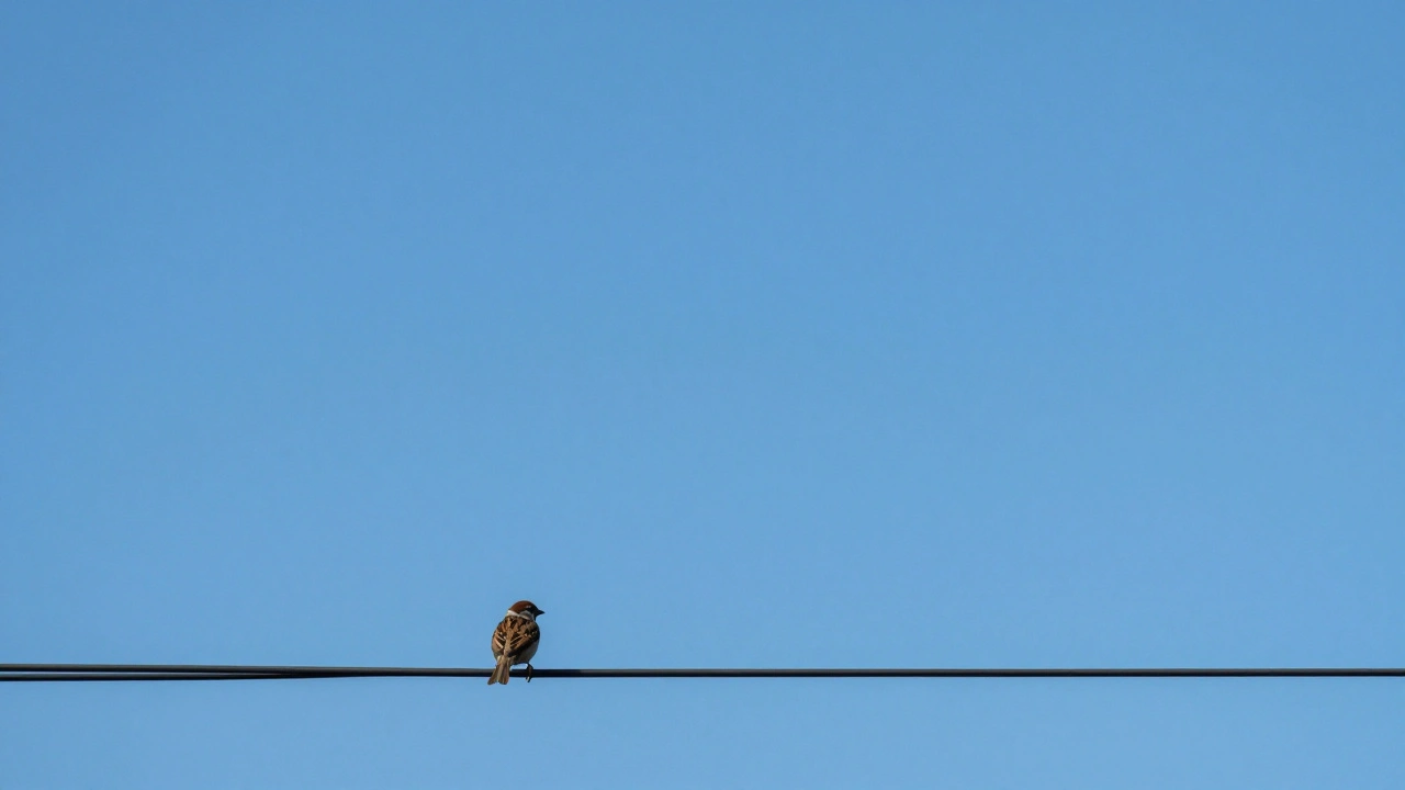
Imagine a photo of a tiny, solitary bird perched on a wire against a massive, cloudless blue sky. Your eyes don't wander; they go straight to the bird. Why? Because the sky isn't just 'empty'-it's doing the heavy lifting. This is the essence of negative space in photography is the unoccupied area surrounding and between the main subjects of an image, used to create balance and emphasis.
Most beginners make the mistake of trying to fill every inch of the frame. They think more detail equals a better photo. In reality, a crowded image often feels suffocating and chaotic. By intentionally leaving parts of your frame "empty," you give your subject room to breathe and your viewer room to think. It's the difference between a cluttered room where you can't find your keys and a clean gallery where one masterpiece hangs on a white wall.
The Balance Between Positive and Negative Space
To master this, you need to understand the tug-of-war between two elements: positive and negative space. Positive Space is the actual subject-the person, the building, or the flower-that attracts the viewer's attention. Everything else is the negative space.
When these two are in harmony, you get a balanced composition. If you have too much positive space, the image feels cramped. If you have too much negative space without a strong subject, the image feels accidental or void of meaning. The trick is to use the empty area as a tool to push the viewer's gaze exactly where you want it. Think of negative space as the silence between notes in a song; without the silence, the music is just noise.
How to Create Negative Space in Your Shots
You don't need a vast desert or a blank wall to use this technique. Negative space isn't always a white void; it's any area that doesn't compete with your subject for attention. Here are a few ways to pull it off:
- Natural Voids: Use a clear sky, a calm lake, or a sandy beach. These are the easiest forms of negative space because they have low visual complexity.
- Solid Colors and Textures: A flat-painted wall or a consistent grass texture can act as a backdrop that pushes the subject forward.
- Depth of Field: By using a wide aperture, you create Bokeh-those creamy, blurred-out backgrounds. The blur removes distracting details, effectively turning a busy background into negative space.
- Shadows and Silhouettes: In high-contrast photography, a deep black shadow can swallow the background, leaving only the brightly lit subject visible. This is a powerful way to create a dramatic, minimalist look.
| Attribute | Positive Space | Negative Space |
|---|---|---|
| Primary Role | The Focal Point | The Support / Frame |
| Visual Detail | High (textures, features) | Low (simplified, blurred) |
| Emotional Effect | Direct Action/Subject | Mood, Atmosphere, Scale |
| Typical Examples | A model, a tree, a car | Sky, water, shadows, walls |

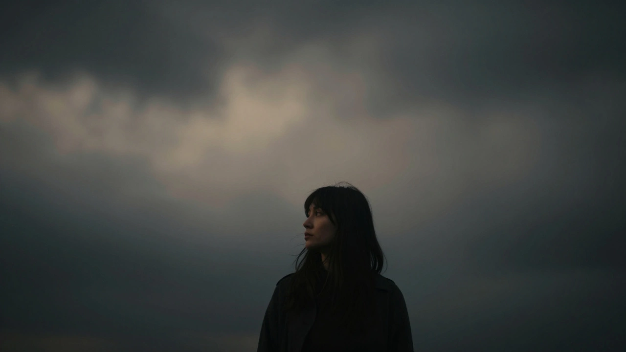
The Psychology of Emptiness: Setting the Mood
Negative space does more than just "look clean"; it communicates emotion. Depending on how you frame your shot, the empty space can tell a completely different story. If you place a small figure in the bottom corner of a massive landscape, the negative space creates a feeling of isolation, loneliness, or insignificance. It emphasizes the scale of nature versus the human.
On the flip side, generous space around a joyful subject can evoke a sense of freedom, lightness, and peace. This is why Minimalist Photography is so popular for wellness and architecture brands; it strips away the noise and forces the viewer to focus on the pure essence of the subject. When the space "steals the show," it creates a meditative quality that busy photos simply can't achieve.
Practical Tips for Better Composition
If you're struggling to implement this, start with the "50% Rule." Try to let the negative space occupy at least half of your frame. This ensures the effect is intentional and not just a result of poor framing.
Watch out for "distracting noise." Not all empty space is negative space. If there is a random trash can or a telephone pole sticking into the edge of your frame, that's a distraction, not negative space. True negative space should be clean and serve a purpose. If an element is on the same focal plane as your subject and competes for attention, it's just clutter.
Experiment with figure-ground reversal. This is where you make the surrounding space so interesting that it actually becomes the subject. For example, a shot of a white building against a deep blue sky where the shape of the sky (the negative space) forms a sharp, geometric pattern. In this case, the "emptiness" is actually the star of the show.
Common Pitfalls to Avoid
The biggest danger is creating a "dead" photo. There is a fine line between a minimalist composition and a boring one. If your subject is too small and the negative space has no texture or interesting color, the viewer might just see a blank image and keep scrolling. The negative space must still feel like it belongs to the story.
Another mistake is ignoring the edges of the frame. When using a lot of empty space, the boundaries of your photo become more important. A tiny speck of dust or a stray branch cutting into the corner of a minimalist shot will be incredibly obvious and will ruin the clean aesthetic. Double-check your corners before you click the shutter.
Is negative space the same as white space?
Essentially, yes. "White space" is the term used in graphic design and web layout. In photography, we call it negative space because it isn't always white-it can be black, blue, or any neutral color or texture that doesn't distract from the main subject.
How much negative space is too much?
There is no hard rule, but if the subject becomes so small that it loses its impact or the viewer can't tell what the photo is about, you've gone too far. A good starting point is the 50% rule, but you can go higher if the subject is visually powerful enough to hold the frame.
Can I use negative space in portraits?
Absolutely. Placing a model off-center with plenty of space around them can create a mood of contemplation or longing. Using a dark, empty background in a portrait can also make the subject's features pop more dramatically.
Does negative space always have to be empty?
Not necessarily. It just needs to be "uninteresting" compared to the subject. A blurred-out forest or a soft-focus wall is still negative space because it doesn't compete with the focal point for the viewer's attention.
How does a shallow depth of field help with negative space?
A shallow depth of field blurs the background and foreground. By turning detailed objects into soft shapes and colors, you effectively convert a busy environment into a simplified area of negative space, which makes your sharp subject stand out.