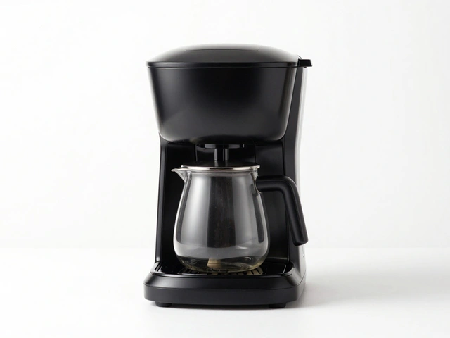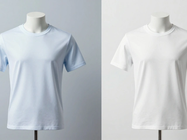
Imagine a customer scrolling through your store at midnight. They stop on your product page, look at the main image, and decide in under two seconds whether to click "Add to Cart" or bounce. That split-second decision is driven almost entirely by your product photography. If the images are blurry, poorly lit, or inconsistent, you lose the sale before the customer even reads your description. In ecommerce, your photos aren't just decoration; they are the primary interface between the shopper and the physical item.
This guide breaks down exactly how to optimize those visuals to drive revenue. We will move beyond basic tips like "use good lighting" and dive into the specific technical and strategic adjustments that turn browsers into buyers. Whether you are shooting with a smartphone or a professional studio setup, these principles apply directly to improving your conversion rates.
The Core Components of High-Converting Images
To understand why certain photos sell better, we need to look at the three pillars of effective visual presentation: clarity, context, and consistency. Clarity ensures the customer can see every detail without squinting. Context helps them visualize how the product fits into their life. Consistency builds trust by making your brand look professional and organized.
Clarity is the sharpness and resolution of the image, ensuring all product details are visible. This means avoiding compression artifacts that make edges look jagged. It also means using sufficient depth of field so that the entire product is in focus, not just one corner. If a customer has to zoom in to read a label or see the texture of fabric, you have failed the clarity test.
Context is where many brands go wrong. While white-background shots are essential for marketplace listings, lifestyle imagery provides the emotional hook. Showing a coffee mug being held in warm hands conveys comfort in a way a static shot against a wall never will. However, the background must remain uncluttered. The product should always be the hero, with the environment serving only to support the narrative.
Technical Settings That Matter Most
You don't need the most expensive camera in the world to produce high-quality ecommerce images. You do, however, need to control three specific camera settings: aperture, shutter speed, and ISO. Understanding how these interact allows you to maintain perfect exposure without relying on automatic modes that might misread your scene.
- Aperture (f-stop): For product photography, you generally want a smaller aperture (higher f-number, like f/8 or f/11). This increases the depth of field, keeping the front and back of the product sharp. Avoid wide apertures like f/1.8 unless you are intentionally blurring the background for an artistic effect.
- Shutter Speed: Since products are stationary, you can use slower shutter speeds without fear of motion blur. A speed of 1/60th of a second or slower is usually safe if you are using a tripod. This allows more light to hit the sensor, reducing the need for high ISO.
- ISO: Keep this as low as possible, ideally at 100 or 200. High ISO introduces digital noise, which looks grainy and cheap on close-up product shots. If your image is dark, add more light rather than raising the ISO.
Using RAW format instead of JPEG gives you significant leverage here. RAW files retain all the data captured by the sensor, allowing you to adjust highlights and shadows during post-processing without losing quality. This is crucial when dealing with reflective materials like glass or metal, where highlights often blow out easily.
Lighting Strategies for Different Materials
Lighting is the single biggest factor in perceived quality. Different materials react to light in distinct ways, requiring different setups to capture them accurately.
Diffused Lighting is light scattered through a softbox or umbrella to create soft shadows and even illumination. This is the default choice for most organic products, clothing, and food. Soft light minimizes harsh reflections and reveals true colors. If you shoot with direct flash or bare bulbs, you will get hard shadows that distract from the product.
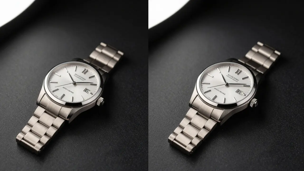
For shiny or reflective items, such as jewelry, watches, or cosmetics, you need controlled reflection. A common technique is using a light tent or a curved white sweep behind the subject. By placing translucent panels around the product, you create a seamless white background while controlling exactly where the highlights appear. This prevents unwanted reflections of the photographer or room clutter from appearing on the surface.
| Product Type | Lighting Style | Key Challenge | Solution |
|---|---|---|---|
| Clothing & Textiles | Soft, diffused side lighting | Revealing fabric texture | Use a large softbox at a 45-degree angle |
| Glass & Liquids | Backlighting with black cards | Managing transparency and refraction | Place black flags behind to define edges |
| Jewelry & Metal | Controlled point lights | Avoiding cluttered reflections | Use small LED panels or snoots |
| Food & Perishables | Natural window light or softboxes | Maintaining freshness appearance | Shoot early morning or use fresh props |

Composition and Framing Rules
How you frame the product tells the customer how much space it occupies and what its proportions are. Poor framing can make a small item look tiny or a large item look cramped. The goal is to balance negative space with the subject matter.
Start with the rule of thirds, but adapt it for commerce. Centering the product is often the best approach for catalog consistency, especially if you plan to use image carousels. Ensure there is equal padding on all sides. If you crop too tight, customers may feel the product is larger than it actually is, leading to returns. If you leave too much empty space, the product may appear insignificant.
Consider the aspect ratio carefully. Square images (1:1) work well for social media feeds and mobile shopping apps. Vertical images (4:5) perform exceptionally well on Instagram and Pinterest, driving traffic back to your site. Horizontal images (3:2) are standard for desktop web layouts. Always export multiple ratios to cover all platforms without needing to re-crop later.
Post-Processing Workflow for Consistency
Raw photos rarely look perfect straight out of the camera. Post-processing is where you unify your brand's look. The key here is consistency. If one product looks bright and airy while another looks moody and dark, your store feels disjointed. Create a preset or a step-by-step checklist to ensure every image follows the same path.
- Correct White Balance: Ensure colors match reality. Use a gray card during shooting to get an accurate reference, then adjust in editing software until the gray appears neutral.
- Adjust Exposure and Contrast: Lift the blacks slightly to avoid crushed shadows, but keep the whites pure. Add contrast to make the product pop against the background.
- Remove Dust and Flaws: Use the healing brush tool to remove dust particles, lint, or minor scratches. This is critical for luxury goods where perfection is expected.
- Sharpen Details: Apply moderate sharpening to bring out textures. Be careful not to over-sharpen, which creates halos around edges.
- Export Optimized Files: Save as JPEG with a quality setting of 80-90%. Compress further if needed for web speed, but never sacrifice clarity for file size alone.
Optimizing for Mobile and Page Speed
Over 70% of ecommerce traffic comes from mobile devices. This means your images must load quickly on varying connection speeds. Large, high-resolution files look great on a desktop monitor but can cause frustrating delays on a phone network.
Implement responsive image delivery. This involves serving different image sizes based on the user's device. A mobile user doesn't need a 4000-pixel wide image; a 800-pixel version is sufficient and loads significantly faster. Tools like WebP format offer better compression than JPEG with similar quality, reducing file size by up to 25-30%.
Also, consider lazy loading. This technique ensures that images below the fold (not immediately visible) only load when the user scrolls down to them. This improves the initial page load time, which is a critical metric for both user experience and search engine ranking.
Common Mistakes to Avoid
Even experienced photographers fall into traps that hurt sales. Being aware of these pitfalls can save you time and money.
- Inconsistent Backgrounds: Mixing pure white, off-white, and gray backgrounds across similar products confuses the eye. Stick to one standard for your main catalog images.
- Ignoring Scale References: Without a hand, a coin, or a familiar object nearby, it is hard for customers to gauge the actual size of the item. Include scale cues in at least one lifestyle shot per product.
- Over-Editing Colors: If the blue shirt in the photo is electric blue but arrives as navy blue, you get a return. Color accuracy is non-negotiable.
- Lack of Angles: One photo is rarely enough. Provide front, back, side, and detail shots. Customers want to inspect the item virtually.
Frequently Asked Questions
What is the best camera for product photography?
Any modern mirrorless or DSLR camera works well. The key is having a lens with macro capabilities or a prime lens with a fixed focal length (like 50mm or 90mm) that allows for close-up shots without distortion. Even a high-end smartphone can produce acceptable results if lighting is controlled properly.
Do I need a studio backdrop?
A seamless paper roll or a white sweep is ideal for creating clean, professional backgrounds. However, you can also use a white sheet taped to a wall or a piece of foam board. The important thing is that the background is uniform and free of wrinkles or shadows.
How many photos should I upload per product?
Aim for 5 to 10 images per product. This includes the main hero shot, alternate angles, detail close-ups, and at least one lifestyle image showing the product in use. More images generally lead to higher engagement and lower return rates because customers feel more confident in their purchase.
Is natural light better than artificial light?
Natural light is soft and flattering, but it is inconsistent and changes throughout the day. Artificial light, particularly continuous LED panels, offers consistency and control. For commercial consistency, artificial light is preferred. For casual or artisanal brands, natural light can add warmth and authenticity.
How do I handle reflective surfaces?
Use polarization filters on your lens to cut glare. Additionally, use large, diffuse light sources to create long, smooth highlights rather than small, sharp dots. Positioning the product on a matte surface can also help reduce unwanted reflections from below.