You’ve probably heard it a thousand times: "The best camera is the one you have with you." For most of us, that means a smartphone. But having a great lens doesn’t automatically mean great photos. The difference between a snapshot and a striking image usually comes down to composition. It’s not about fancy gear; it’s about how you arrange elements within the frame. If you’re tired of your phone shots looking flat or chaotic, you’re in the right place. We’re going to break down classic photographic rules and show you exactly how to apply them using just your thumbs and your screen.
The Grid Is Your Best Friend
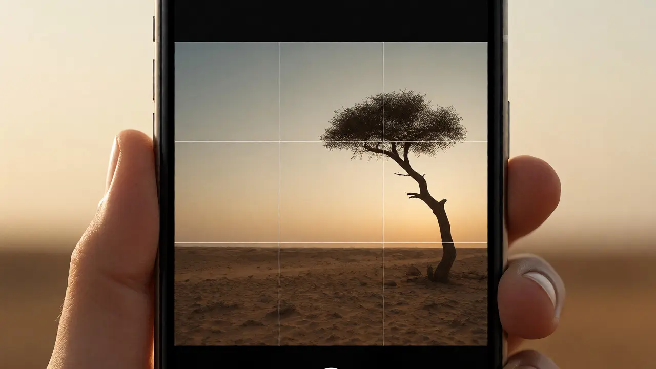
Let’s start with the big one. If you do nothing else after reading this, turn on your grid lines. In iOS Camera settings (under Composition) or Android Pro/Manual modes, enabling the 3x3 grid changes everything. This visual aid helps you apply the Rule of Thirds, which states that an image is more dynamic when subjects are placed along the grid lines or at their intersections, rather than dead center. Centered subjects can feel static, like a passport photo. Off-center placement creates tension and interest.
Think about shooting a sunset over a lake. Instead of putting the horizon line right through the middle of your screen, slide it down to the bottom third if you want to emphasize the sky, or up to the top third if the water reflections are the star. Your eyes naturally gravitate toward the intersection points. When you place a person’s eyes on the top-left or top-right intersection, the viewer connects with them instantly. Try this next time you’re walking down the street. Find a subject, move until their eye hits that crosshair, and snap. You’ll see the difference immediately.
Leading Lines That Pull the Viewer In
Once you’ve mastered the grid, look for natural guides. Leading lines are paths, roads, fences, rivers, or even shadows that direct the viewer’s eye toward your main subject. They create depth, turning a 2D screen into something that feels three-dimensional. Smartphones have wide-angle lenses by default, which exaggerates perspective, making these lines even more powerful.
Imagine standing at the end of a long pier. If you shoot straight down the middle, the planks form converging lines that draw attention to whatever is at the end-maybe a boat, maybe a friend waiting for you. Without those lines, the photo is just a pile of wood. To use this effectively, get low. Crouching down makes the lines appear longer and more dramatic. Also, don’t be afraid to break the symmetry slightly. A slight angle often looks more natural than a perfectly centered shot.
| Classic Rule | Smartphone Execution | Common Pitfall |
|---|---|---|
| Rule of Thirds | Use built-in grid overlays | Ignoring horizon tilt |
| Leading Lines | Get low to exaggerate perspective | Cutting off the line prematurely |
| Framing | Use doorways/windows as foreground | Distracting background clutter |
| Negative Space | Leave room around the subject | Zooming in too tight |
Framing Within the Frame
Human beings love frames. Whether it’s a window, an archway, or branches hanging overhead, framing adds context and depth. It tells the viewer, "Look here, but notice where we are." On a smartphone, this is easier than ever because you can physically move around your subject to find a natural border. Framing works by placing secondary elements in the foreground to surround the main subject. This technique isolates the subject from distractions and adds layers to the image. It transforms a simple portrait into a scene with story.
Try this: Next time you’re in a café, don’t just shoot your coffee cup. Shoot it through a window, with the glass reflecting the street outside. Or stand behind a railing and shoot your friend sitting on a bench, letting the bars cut across the bottom of the frame. The key is ensuring the frame doesn’t overpower the subject. If the foreground element is too dark or busy, it steals the show. Adjust your exposure by tapping the brightest part of the screen to keep the subject clear.

Embracing Negative Space
We live in a cluttered world. Our phones capture every stray cable, trash can, and passerby. Sometimes, the best thing you can do is remove things. This brings us to negative space-the empty area around your subject. Minimalism isn’t just an aesthetic choice; it’s a compositional tool that forces focus.
With smartphones, you can’t always blur out the background like a DSLR with a prime lens (though Portrait Mode helps). So, you need to compose carefully. If you’re photographing a lone tree in a field, give it plenty of sky. Don’t fill the edges with random bushes. Negative space gives the viewer’s eye a place to rest. It creates mood. A vast expanse of blue sky above a small figure conveys isolation or freedom. A blank wall behind a colorful object makes the color pop. Before you hit the shutter, ask yourself: What can I leave out?
Symmetry and Patterns
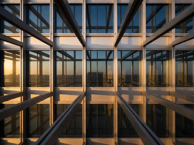
While the Rule of Thirds breaks symmetry, sometimes symmetry is exactly what you need. Humans are wired to find symmetrical images pleasing. Reflections in puddles, mirrored buildings, or repeating patterns in architecture all benefit from perfect balance. Modern phones make this easy with built-in level indicators or grid lines that help you align vertical and horizontal lines.
To nail symmetry, get parallel to your subject. If you’re shooting a building facade, stand directly in front of it, not at an angle. Use the grid lines to ensure the building’s edges are perfectly vertical. If there’s a reflection, try to split the frame exactly down the middle between the real object and its mirror image. Apps like VSCO or Lightroom Mobile have auto-straighten features, but getting it right in-camera saves editing time later.

Breaking the Rules Intentionally
Here’s the secret no one tells you: Rules are guidelines, not laws. Once you understand why they work, you can break them for effect. Centering a subject can work if you want to convey power or confrontation. Ignoring leading lines can create confusion or chaos, which might be exactly the mood you’re going for.
But you should only break them when you know what you’re doing. Start by mastering the basics. Spend a week shooting only using the Rule of Thirds. Then spend a week focusing on leading lines. After that, mix them up. Maybe you frame a subject with branches but place them dead center. Maybe you use negative space but tilt the horizon for dynamism. Experimentation is free. Delete the bad ones, keep the good ones, and analyze why they worked.
Practical Drills for Better Shots
Reading about composition is fine, but doing it is better. Here are three quick drills to sharpen your eye today:
- The One-Minute Walk: Set a timer for one minute. Walk slowly. Take five photos. Each must use a different composition rule (thirds, lines, framing, symmetry, negative space).
- The Crop Challenge: Take a wide shot. Later, crop it aggressively in your gallery app. See if you can find a stronger composition hidden inside the original frame.
- The Low Angle Hunt: Go outside and take ten photos from ground level. Notice how ordinary objects become interesting when viewed from below.
Remember, your smartphone has computational photography that handles exposure and white balance surprisingly well. Your job is purely creative arrangement. Stop worrying about settings. Start worrying about where you stand.
Do I need to edit my photos to fix composition?
Ideally, no. While cropping in post-processing can save a shot, fixing composition in-camera ensures higher resolution and detail retention. Editing should enhance lighting and color, not rescue poor framing. However, minor adjustments to straighten horizons or tweak aspect ratios are standard practice.
Which smartphone camera mode is best for learning composition?
Use the standard Photo mode with grid lines enabled. Avoid using Portrait mode initially, as it blurs the background artificially, hiding compositional errors. Shooting in standard mode forces you to consider the entire frame, including the background, which is crucial for learning spatial relationships.
How does the Rule of Thirds apply to video?
It applies similarly. Place moving subjects so they have "lead room"-space in front of them in the direction they are moving. If someone walks left to right, place them on the right third of the frame so they have space to walk into. This prevents the viewer from feeling cramped.
Is HDR necessary for good composition?
HDR (High Dynamic Range) helps preserve details in both bright highlights and dark shadows, which supports composition by ensuring no part of your frame is blown out or crushed black. However, it doesn't change the arrangement of elements. Turn it on for high-contrast scenes, but rely on it only as a safety net, not a compositional tool.
Can I use composition rules for macro shots?
Absolutely. Macro photography benefits greatly from negative space and diagonal lines. Since depth of field is shallow, keeping the background clean (negative space) ensures the tiny subject stands out. Diagonal compositions add energy to static close-ups like flowers or insects.