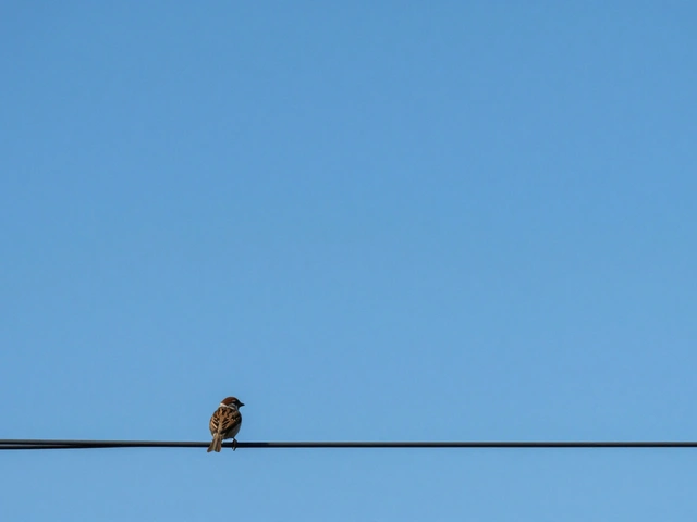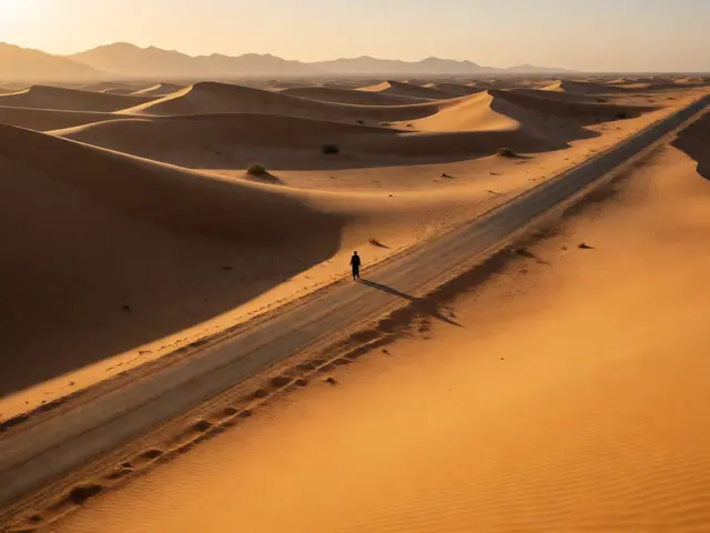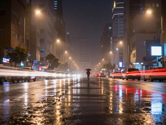
You know that feeling when you look at a photo and your eyes just... stop? They don't dart around looking for details. They rest. That’s the power of negative space in minimalist photography. It’s not about having less to say; it’s about saying more with what’s left unsaid. Most beginners think minimalism means shooting an empty wall or a blank sky. But if you’ve ever tried this and ended up with a boring snapshot instead of a striking image, you’re missing the core mechanic: tension.
Negative space is the area around and between the subjects of an image. In minimalist photography, this space becomes the primary compositional element, directing viewer attention through absence rather than presence. When done right, it creates breathing room for the eye and amplifies the emotional weight of your subject. If you want to master this style, you need to stop thinking about filling the frame and start thinking about clearing it.
The Psychology Behind Empty Frames
Why does our brain love negative space? It’s simple biology. Our visual system is wired to detect contrast and movement. When a frame is cluttered, the brain works hard to separate signal from noise. This cognitive load reduces the impact of the message. By stripping away distractions, you reduce processing time. The viewer instantly identifies the subject and feels a sense of calm or focus.
This isn’t just aesthetic preference; it’s functional design. Think of it like typography. A page packed with text is hard to read. A page with wide margins guides the eye effortlessly. In photography, visual balance is achieved by distributing weight across the frame. A small subject in a large empty space doesn’t feel lost; it feels isolated, important, and intentional. You are controlling the narrative flow. Without negative space, every detail competes for dominance. With it, you dictate exactly where the story begins and ends.
Identifying and Isolating Your Subject
The biggest mistake people make is choosing a complex subject and trying to force it into a minimalist box. Minimalism works best when the subject has strong geometry, clear lines, or distinct color separation. You aren’t hiding the subject; you’re highlighting its essence. Before you press the shutter, ask yourself: What is the one thing I want them to see?
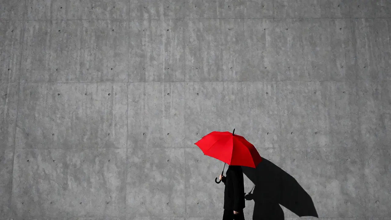
If you’re shooting a person, look for clean backgrounds. A plain concrete wall, a vast field of snow, or a solid-colored studio backdrop works wonders. If you’re shooting architecture, zoom in on a single window or a lone tree branch against the sky. The goal is subject isolation. You achieve this by eliminating context clues that explain where the subject is, so the viewer focuses entirely on what the subject is.
- Simplicity Check: Can you describe the image in three words or fewer? If not, remove elements until you can.
- Color Palette: Stick to monochromatic schemes or complementary colors. Clashing hues create visual noise.
- Texture Contrast: Pair a smooth background with a textured subject (or vice versa) to maintain interest without adding objects.
Mastering Composition Rules for Emptiness
Most photographers learn the Rule of Thirds early on. In standard photography, placing the subject on the intersection points creates dynamic balance. In minimalist work, you often break this rule intentionally. Placing the subject dead center can feel confrontational and stable. Placing it near the edge can create tension, making the viewer feel uneasy or curious about what lies outside the frame.
Consider the direction of gaze or movement. If your subject looks left, leave empty space on the left side of the frame. This gives them "room to look." If they look into the tight corner of the frame, the image feels claustrophobic, even if the background is empty. This subtle shift changes the entire mood from peaceful to trapped.
| Placement Strategy | Emotional Effect | Best For |
|---|---|---|
| Centered Subject | Stability, symmetry, directness | Portraits, architectural facades |
| Rule of Thirds | Balanced, natural, storytelling | Landscape, street photography |
| Edge Placement | Tension, mystery, dynamism | Action shots, abstract concepts |
| Small Scale | Isolation, scale, humility | Nature, solitary figures |
Lighting and Color as Compositional Tools
In busy scenes, lighting reveals texture and depth. In minimalist scenes, lighting defines shape. Because there are no distracting elements, shadows become part of the composition. Hard light creates sharp, graphic shadows that act as secondary subjects. Soft light flattens the scene, emphasizing color blocks over form.
Color plays a massive role here too. Since you have fewer pixels dedicated to the subject, their hue needs to pop against the negative space. High contrast works well-a red umbrella against a gray rainy street. But subtlety can be powerful too. A pale blue shirt against a white wall requires precise exposure control to avoid blending together. Always check your histogram. In high-key minimalist images (mostly white/light), ensure you aren’t clipping highlights so severely that texture disappears completely.
Use leading lines sparingly. A single road stretching into the horizon draws the eye directly to the subject. Multiple roads confuse the path. Let the emptiness guide the viewer, not a maze of details.
Common Pitfalls and How to Fix Them
Just because you have empty space doesn’t mean you have good composition. Here are the traps most people fall into:
The "Boring Blank" Syndrome: You removed everything, but now the image feels flat. Why? Lack of texture or tonal range. Add a subtle gradient in the sky, a slight shadow on the ground, or grain in post-processing to give the emptiness some tactile quality.
Unintended Distractions: A stray leaf, a power line, or a smudge on the lens ruins the illusion. Inspect corners closely. Use clone stamp tools in editing to remove tiny imperfections that break the silence of the frame.
Poor Cropping: Sometimes the best minimalist shot is hidden inside a messy original. Crop aggressively. Don’t be afraid to cut off parts of the subject if it improves the balance of positive to negative space. Often, tighter crops increase the emotional intensity.
Editing for Minimalist Impact
Your camera captures the scene, but your editor polishes the intent. In Lightroom or Capture One, start by desaturating competing colors. If there’s a random green bush in a black-and-white style shot, kill that saturation. Next, adjust contrast. Increasing clarity can help define edges, but be careful-too much sharpening can introduce noise in large smooth areas, which looks muddy.
Vignetting is your friend here. Darkening the corners subtly pushes the eye toward the center or the subject. It reinforces the idea that nothing else matters except what’s lit. Finally, consider converting to black and white. Removing color forces the viewer to engage with shapes, tones, and textures-the purest elements of minimalist design.
What is the difference between negative space and white space?
While often used interchangeably, white space specifically refers to unmarked or light-colored areas in design and photography. Negative space is a broader term referring to any area surrounding the main subject, regardless of color. A dark, moody forest canopy above a small bird is still using negative space effectively, even though it isn't white.
How much negative space should I include in my photos?
There is no fixed ratio, but a common starting point is allowing negative space to occupy 60-70% of the frame. However, the right amount depends on the subject's size and complexity. Smaller subjects require more space to emphasize isolation, while larger, detailed subjects might need less to remain recognizable.
Can I use negative space in portrait photography?
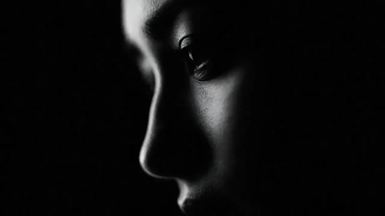
Absolutely. Portraits benefit greatly from negative space as it removes environmental distractions, forcing the viewer to connect with the subject's expression and posture. Ensure the background is clean and consistent in tone to prevent visual clutter from undermining the portrait's intimacy.
Does minimalist photography require expensive gear?
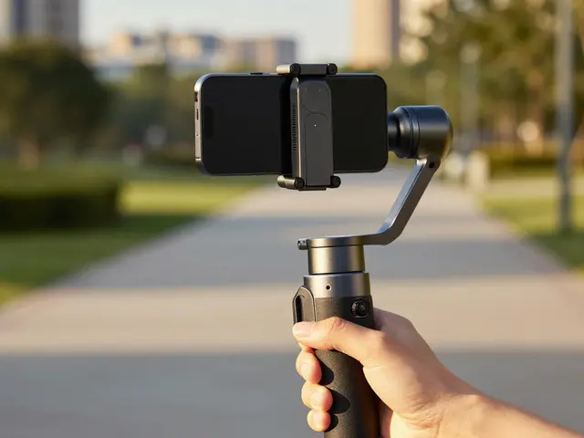
No. While fast lenses (like f/1.8 or f/1.4) help blur busy backgrounds, you can achieve similar results by moving closer to your subject or finding naturally clean environments. A smartphone camera can produce excellent minimalist shots if you focus on composition and lighting rather than technical specs.
How do I fix a background that is too busy?
If you cannot change the location, try changing your angle. Shoot upwards towards the sky or downwards towards the ground to replace a cluttered mid-ground with a uniform surface. Alternatively, use a wide aperture to blur the background into a soft wash of color, effectively turning detail into abstract negative space.