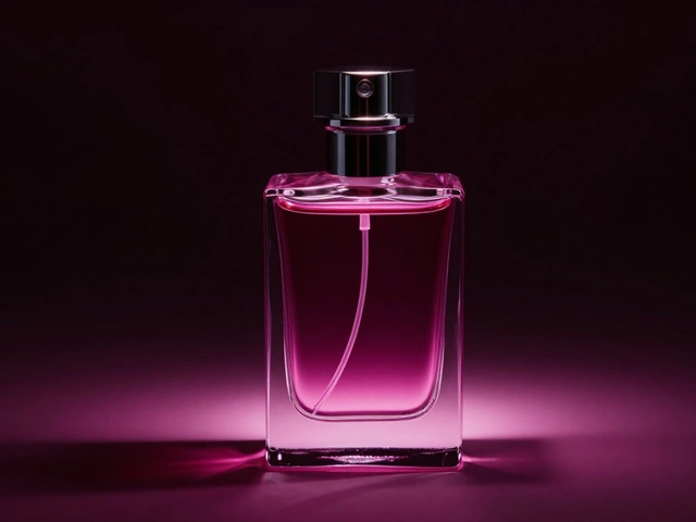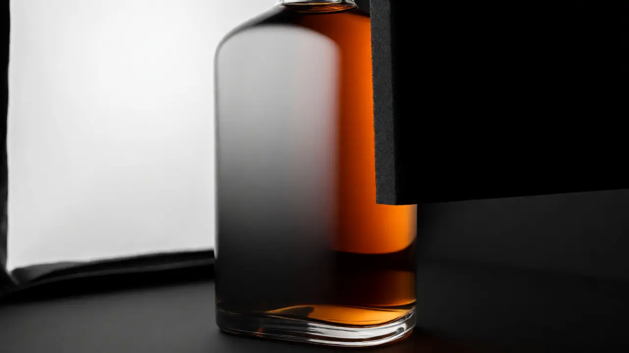
You know that moment when you set up a beautiful shot of a premium spirit or a crisp soda, but the glass looks like a disco ball? You get these harsh, scattered white spots instead of smooth, elegant reflections. It’s frustrating because your expensive camera and lens can’t fix bad light physics. The secret to those sleek, high-end commercial shots isn't magic-it's gradient lighting is a technique using large, continuous light sources to create smooth transitions from bright to dark across a reflective surface. This method turns chaotic reflections into controlled, artistic highlights that define the shape of the bottle and make the liquid inside look inviting.
If you’ve ever struggled with making glass look like glass rather than a collection of white blobs, this guide is for you. We’re going to break down exactly how to position your lights, modify them, and shoot so that every curve of your bottle catches the light just right. No more guessing games. Just clear steps to get that professional sheen.
Why Standard Lighting Fails on Glass
Glass is transparent and reflective. That means it doesn't have its own color; it reflects whatever is in front of it. If you point a small flash at a bottle, you get a tiny, intense reflection of the bulb. Move the bottle slightly, and that reflection jumps around. It looks cheap and distracting. To fix this, you need to change the size of the light source relative to the subject. A small light creates hard shadows and sharp highlights. A large light creates soft gradients.
Think about looking out a window on a cloudy day versus a sunny day. The cloudy sky acts as a massive softbox, giving you even, wrap-around light. In studio terms, we want to replicate that "cloudy sky" effect. When the light source is larger than the object (the bottle), the reflections become smooth and gradual. This is the core principle behind gradient lighting. You aren't illuminating the bottle directly; you're illuminating the environment that the bottle reflects.
The Essential Gear for Smooth Gradients
You don't need a million-dollar studio. You need control over the size and direction of light. Here is what actually matters:
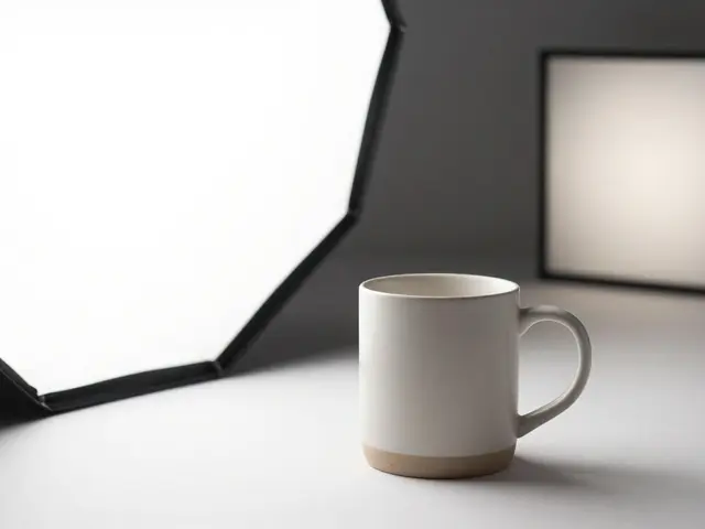
- Softboxes are light modifiers that diffuse light through a fabric layer to reduce harshness. For bottles, rectangular softboxes work best. They mimic windows and allow you to control the width of the highlight strip.
- Diffusion Panels are translucent sheets placed between the light source and the subject to scatter photons evenly. These are crucial for creating that seamless fade from white to gray.
- Black Cards (Flags) are opaque surfaces used to block light and create negative fill. Without black cards, your bottle will reflect the white walls of your room, washing out the contrast.
- Polarizing Filters are camera filters that cut glare from non-metallic surfaces like glass and water. While not strictly part of the lighting setup, they help manage reflections that remain after shaping the light.
A common mistake is buying a round softbox and expecting perfect bottle highlights. Round boxes create circular catchlights. For a cylindrical bottle, you want long, vertical strips of light. Rectangular modifiers give you that clean, linear definition along the sides of the glass.
Step-by-Step Setup: The Classic Two-Light Gradient
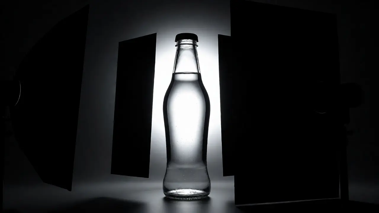
Let’s build the most reliable setup for beginners and pros alike. This uses two main lights and one black card. Follow these steps precisely.
- Position the Bottle: Place your bottle on a seamless background. White works for a clean look; black adds drama. Ensure the label faces forward.
- Place the Main Light (Key): Take your largest rectangular softbox. Position it to the left of the bottle, angled slightly toward the center. The edge of the softbox should be close to the bottle-about 6 to 12 inches away. Why so close? Because moving the light closer makes it effectively larger, which softens the gradient.
- Create the Highlight Strip: Look at the left side of the bottle. You should see a long, vertical band of light fading from bright white at the top to darker gray at the bottom. If the transition is abrupt, move the light closer or add another layer of diffusion.
- Add the Fill Light (Rim): Place a second, narrower softbox on the right side. This light shouldn't flood the front of the bottle. Instead, aim it at the back-right edge. Its job is to separate the bottle from the background by creating a thin, bright rim light on the right curve.
- Insert the Black Card: This is the game-changer. Hold a piece of black foam board vertically on the far right, outside the frame. This blocks ambient light from hitting the right side of the bottle. It deepens the shadow, making the rim light pop and enhancing the three-dimensional feel.
Check your viewfinder now. Do you see a smooth, continuous highlight on the left? Does the right side have a crisp edge against the background? If yes, you’ve nailed the basic gradient structure.
Controlling Liquid Appearance and Color
Glass is only half the battle. The liquid inside needs to look appetizing. Clear liquids like water or vodka can disappear if not lit correctly. Dark liquids like cola or whiskey need backlighting to show their color depth.
For Clear Liquids, use backlighting techniques where light passes through the bottle from behind to illuminate the fluid. Place a diffused light source directly behind the bottle. This causes the liquid to glow from within, revealing bubbles and clarity. Be careful not to blow out the highlights on the front; balance the key light intensity with the backlight.
For Dark Liquids, rely on side-lighting combined with strong rim lights to reveal viscosity and hue. Backlighting might turn a dark beer into an opaque black blob. Instead, let the side gradient do the work. Use a colored gel on your rim light if you want to enhance the amber tones of whiskey or the green of gin. The gradient on the glass surface will pick up these colors, adding richness without overpowering the natural look.
| Liquid Type | Primary Technique | Highlight Goal | Common Pitfall |
|---|---|---|---|
| Water/Clear Soda | Strong Backlight + Soft Key | Brightness and Clarity | Invisible liquid edges |
| Whiskey/Rum | Side Gradient + Amber Rim | Warmth and Depth | Loss of color saturation |
| Coffee/Syrup | Top Light + Front Reflection | Viscosity and Texture | Overly flat appearance |
| Oil/Vinegar | Narrow Side Strips | Sleek, Glossy Finish | Muddy reflections |
Advanced Tricks: Managing Curves and Labels
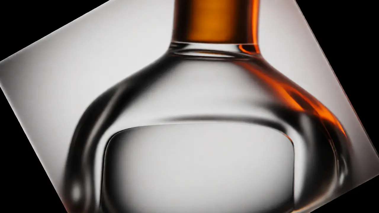
Not all bottles are straight cylinders. Some have shoulders, necks, or complex curves. A standard vertical gradient might break awkwardly on a curved shoulder. To handle this, adjust the angle of your softbox. Tilt the top of the softbox away from the bottle. This projects a wider highlight at the bottom and narrows it at the top, following the contour of the glass.
Labels are tricky because paper absorbs light differently than glass. If your gradient hits the label, it might look patchy. To fix this, ensure your main light is positioned so the highlight falls on the glass *around* the label, not directly on it. Alternatively, use a polarizer on your camera lens and rotate it until the glare on the glossy label disappears, while keeping the glass reflections intact. This requires trial and error, but it saves hours in post-production.
Another pro tip involves using Frosted Acrylic Sheets as secondary diffusion layers to create ultra-smooth, texture-free gradients. Place a sheet of frosted acrylic in front of your softbox. This scatters the light further, eliminating any hotspots caused by uneven LED arrays in modern strobes. It costs less than $20 and dramatically improves highlight quality.
Troubleshooting Common Gradient Issues
Even with the right gear, things go wrong. Here’s how to diagnose problems quickly.
- The highlight has a visible edge: Your light source is too small or too far away. Move the softbox closer to the bottle. Proximity increases the apparent size of the light, smoothing the transition.
- The bottle looks flat: You lack contrast. Add black flags on both sides of the bottle to absorb stray light. This forces the highlights to stand out against deeper shadows.
- Reflections of the photographer: Glass reflects everything. Wear black clothing and hold your camera carefully. Better yet, use a remote trigger or tethered shooting to keep yourself out of the reflection zone.
- Uneven brightness across the label: Check for mixed lighting sources. Turn off overhead room lights. Studio flashes should be the only light in the room unless you’re intentionally mixing ambient light.
Remember, gradient lighting is about subtraction as much as addition. Sometimes removing light creates the best definition. Keep experimenting with flag positions until the shape of the bottle feels solid and real.
Do I need a specific type of softbox for bottle photography?
Rectangular softboxes are preferred because they create long, vertical highlight strips that follow the cylindrical shape of most bottles. Square or octagonal softboxes can work but often produce circular catchlights that may look unnatural on straight-sided containers. Grids attached to softboxes also help control spill and maintain clean gradients.
How close should the light be to the bottle?
Generally, place the light as close to the bottle as possible without entering the frame. Closer lights appear larger relative to the subject, resulting in softer, smoother gradients. If the light is too far, the highlight becomes narrow and harsh. Start with the edge of the modifier 6-12 inches from the glass and adjust based on the desired falloff.
Why does my liquid look invisible?
Clear liquids often disappear because they reflect the dark surroundings or blend with the background. To fix this, use backlighting. Place a diffused light source directly behind the bottle to illuminate the liquid from within. This reveals the volume and clarity of the fluid. Combining this with a subtle front gradient ensures the glass itself remains defined.
Can I achieve gradient lighting with natural light?
Yes, but it requires control. Shoot near a large window on an overcast day. The window acts as a giant softbox. Use black boards on the opposite side to block light and create shadows. Direct sunlight is too harsh and small; you must diffuse it with sheer curtains or diffusion panels to create the smooth gradient effect needed for glass.
What is the role of black cards in gradient lighting?
Black cards, or flags, are essential for defining edges. Glass reflects everything nearby, including white walls or ceilings. By placing black cards strategically, you prevent unwanted reflections and deepen the shadows on the bottle. This contrast makes the illuminated gradient highlights appear brighter and more distinct, enhancing the three-dimensional look.