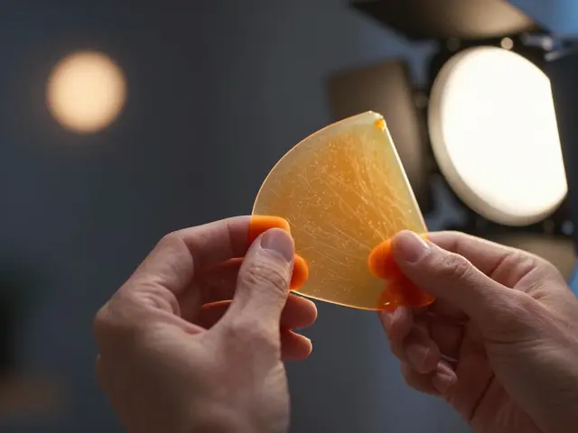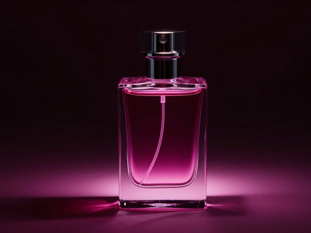
You know that feeling when you shoot a cold soda, but it looks flat? Or maybe your energy drink shot feels too sterile, missing the punchy vibe the brand wants. This is where color gels are translucent colored filters placed over light sources to alter the color temperature and hue of the illumination. They aren't just for stage shows or music videos anymore. In modern beverage photography is a specialized branch of commercial photography focused on capturing drinks in an appetizing and brand-consistent manner, they are essential tools for manipulating mood without touching a single pixel in post-production.
Think about the last time you saw a glowing cocktail ad. The neon blue background wasn't painted; it was lit. Using gels allows you to control the emotional response of the viewer before they even read the label. But using them wrong can make your drink look sickly or artificial. Here is how to use them correctly to nail both the creative mood and the strict requirements of brand alignment.
Why Physical Light Beats Digital Color Grading
You might ask, "Can't I just change the color in Photoshop?" Sure, you can. But digital color grading affects the entire image uniformly. It struggles with reflections. If you paint the background blue digitally, the reflection on the glass bottle stays white unless you manually mask every curve. That’s tedious and often looks fake.
Physical lighting modifiers are devices used to shape, soften, or color light from a source like gels interact with the physical properties of the liquid and the container. Glass refracts light. Water absorbs certain wavelengths while reflecting others. When you place a cyan gel over a strobe, the light hitting the water molecules actually changes. The refraction inside the ice cubes shifts naturally. The caustics (those dancing patterns of light at the bottom of a glass) take on the new color automatically. This realism is impossible to replicate perfectly in software without hours of masking.
Furthermore, gels allow for rapid iteration during the shoot. Want to try magenta instead of purple? Swap the sheet. Done. No waiting for render times or re-exporting files. For brands with tight deadlines, this speed is invaluable.
Understanding Gel Types and Transmission
Not all gels are created equal. You need to understand two main categories: CTB (Color Temperature Blue) gels that cool down warm light sources and CTO (Color Temperature Orange) gels that warm up cool light sources. These are correction gels. Then you have creative gels, which add specific hues like red, green, or blue regardless of temperature balance.
The key metric here is transmission rate the percentage of light that passes through a filter. A deep blue gel might only let 20% of the light through. A pale yellow might let 80% through. If you don't account for this loss, your exposure will be off. Always meter your light after placing the gel. Most professional photographers keep a logbook of transmission losses for their favorite colors. For example, Rosco #47 (Deep Blue) typically loses about 1.5 stops of light. Knowing this saves you from guessing.
| Gel Color | Psychological Association | Best Beverage Pairing | Light Loss (Approx.) |
|---|---|---|---|
| Cyan / Teal | Freshness, Coolness, Hydration | Water, Vodka Soda, Mint Mojitos | 1.0 - 1.5 Stops |
| Magenta / Pink | Energetic, Playful, Sweet | Energy Drinks, Cocktails, Fruit Juices | 1.5 - 2.0 Stops |
| Amber / Gold | Warmth, Comfort, Tradition | Coffee, Whiskey, Hot Chocolate | 0.5 - 1.0 Stop |
| Lime Green | Natural, Organic, Zesty | Lime Beer, Green Tea, Herbal Infusions | 1.0 - 1.5 Stops |
| Red | Passion, Urgency, Boldness | Ketchup, Spicy Sauces, Red Wine | 1.5 - 2.5 Stops |
Mastering Brand Alignment with Specific Hues
Brands live and die by their color palette. Coca-Cola owns red. Tiffany & Co. owns robin's egg blue. When shooting for these clients, your lighting must respect their identity. However, you rarely want to flood the entire scene in the brand color. That looks cheap. Instead, use gels to accentuate.
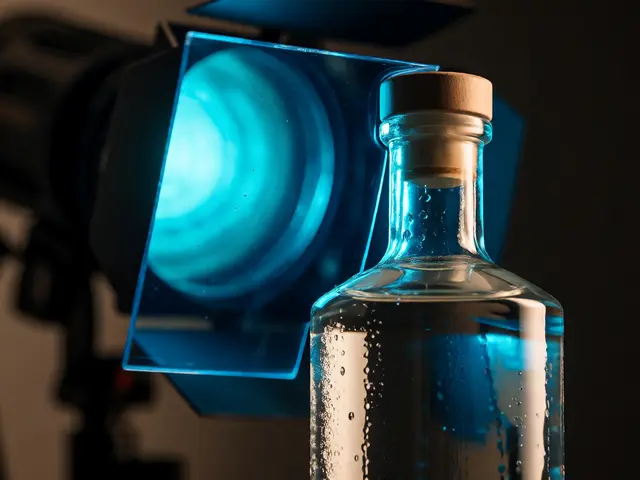
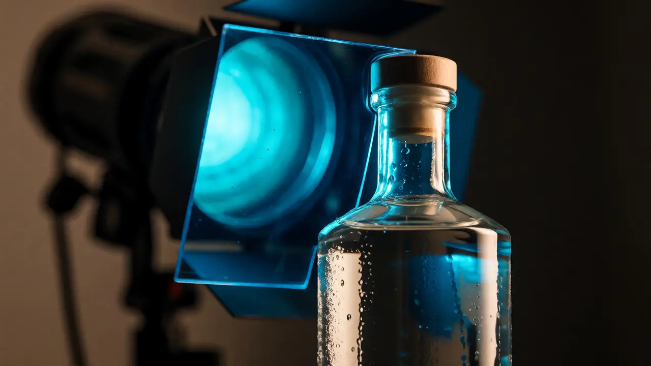
Consider a shoot for a premium gin brand whose logo is a sharp electric blue. You wouldn't light the whole room blue. Instead, use a strong blue gel on a rim light positioned behind the bottle. This creates a glowing edge that separates the product from the background. The front light remains neutral or slightly warm to keep the gin looking clear and inviting. This technique highlights the brand color without overwhelming the product's natural appearance.
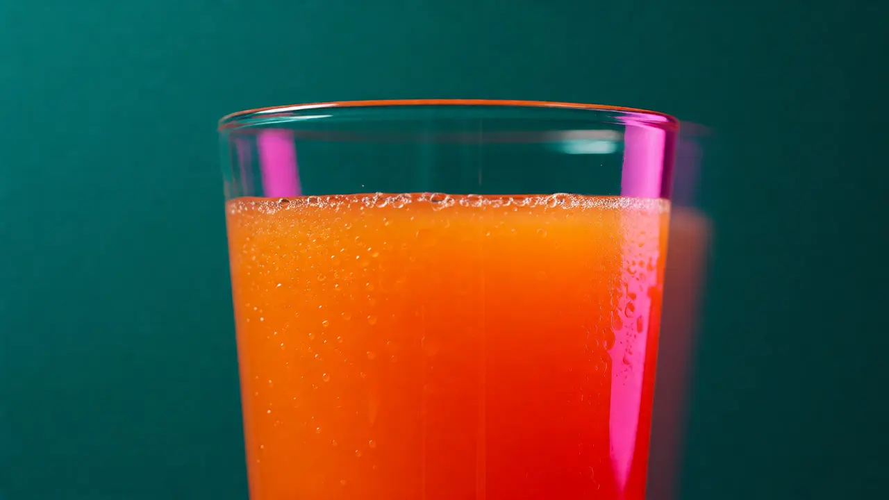
Another trick is complementary contrast. If the beverage is orange (like orange juice), use a blue or teal gel on the background. Blue and orange are opposites on the color wheel. This makes the orange pop visually. The viewer's eye is drawn directly to the product because of the color tension. It’s not just pretty; it’s strategic marketing physics.
Practical Setup: Rim Lighting vs. Background Washes
There are two primary ways to deploy gels in beverage shots. The first is the rim light a light source placed behind the subject to create a highlight along the edges. This is crucial for transparent liquids. Without a rim light, a clear drink on a clear glass against a light background disappears. A colored rim light solves visibility issues and adds drama simultaneously.
The second method is the background wash illuminating the backdrop separately from the subject. Here, you place a large diffusion panel behind the drink and shine a gelled strobe onto it. This creates a smooth, gradient color field. To avoid hotspots, ensure the light source is far enough back or use a scrim to soften the spread. If you want a vignette effect, use a snoot or grid on the background light to restrict the beam to the center.
For complex moods, combine both. Use a neutral key light from the side to illuminate the label and condensation details. Add a colored rim light for separation. Finally, blast a contrasting color onto the background. This three-point setup gives you depth, clarity, and mood all at once.
Material Matters: How Liquids React to Colored Light
Different liquids absorb and reflect light differently. Clear spirits like vodka or gin are highly reflective. They act almost like mirrors. If you shine a red gel on a vodka shot, the glass will reflect red intensely, potentially making the liquid itself look pinkish if the background is also red. To counteract this, use black flags or negative fill to block stray colored light from bouncing into the liquid.
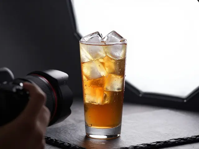
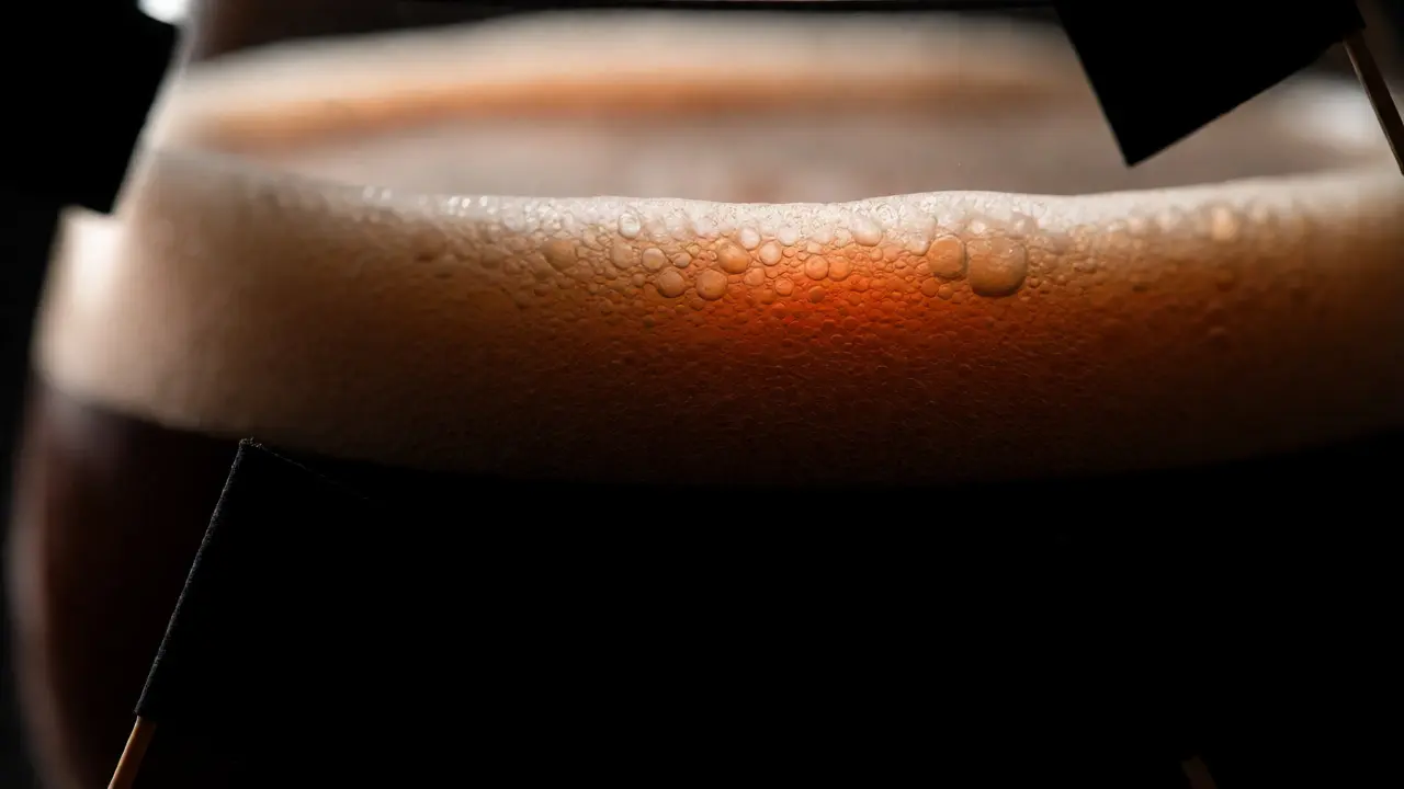
Darker beverages like cola or coffee behave differently. They absorb most light. Colored gels have less impact on the liquid body but significantly affect the surface highlights and bubbles. For a dark stout beer, a subtle amber gel on the backlight can make the foam head glow warmly, enhancing the perception of richness. Don't expect the black liquid to turn bright blue; it won't. Focus on the edges and the atmosphere.
Carbonation adds another layer. Bubbles scatter light. If you use a hard light source with a gel, the bubbles will sparkle brightly in that color. If you use soft light, the bubbles will appear softer and more diffuse. Decide early if you want a crisp, energetic look (hard light + gel) or a smooth, luxurious feel (soft light + gel).
Troubleshooting Common Gel Mistakes
The biggest mistake beginners make is oversaturation. A little gel goes a long way. Start with a lower density gel or move the light further away. You can always increase intensity in post, but you can't easily remove a cast that has baked into the highlights of a shiny bottle.
Another issue is color contamination. If your blue rim light spills onto the white label of the bottle, the text turns blue. Readability suffers. Use barn doors or flags to cut off the spill. Precision is key. Also, watch out for mixed lighting temperatures. If you have a tungsten bulb in the background and a daylight-balanced strobe with a CTO gel in the foreground, the math gets messy. Stick to consistent light sources where possible, or correct carefully in-camera.
Finally, check your white balance. Your camera tries to neutralize color casts. If you shoot RAW, you can fix this later. If you shoot JPEG, set a custom white balance with no gels on, then apply the gels. Otherwise, the camera might try to cancel out your artistic choice, turning your vibrant magenta into a muddy gray.
Next Steps and Workflow Tips
To get started, buy a starter kit of Rosco or Lee gels. Include primary colors (red, green, blue) and secondary colors (cyan, magenta, yellow). Test each one on a simple glass of water. Take notes on how much power adjustment you need for each. Build your own reference chart.
When planning a shoot, create a mood board that includes color swatches, not just images. Show the client exactly what hex code you aim to achieve with the lighting. This manages expectations. During the shoot, bracket your exposures. Take one shot with the gel, one without, and one with a different angle. Give yourself options.
Remember, color gels are a tool for storytelling. They help you translate the taste of a drink-sweet, bitter, fizzy, warm-into visual language. Master them, and your beverage photography will stop looking like documentation and start looking like art.
Do color gels affect the actual color of the beverage?
Yes, but indirectly. Transparent liquids transmit and refract light. If you shine a blue light through a clear liquid, the light exiting the other side will be blue. Opaque liquids reflect surface light. So, a dark coffee will show blue highlights if lit by a blue gel, but the body of the coffee remains brown. The perceived color depends on the combination of transmission, reflection, and absorption.
How many stops of light do gels typically lose?
It varies by density and color. Pale pastels may lose 0.5 stops. Deep saturated colors like dark red or blue can lose 2 to 3 stops. Always test your specific gel with your specific strobe using a light meter. Keep a notebook of these values to speed up future setups.
Can I use colored LED panels instead of gels?
Yes, RGB LED panels offer precise color control without light loss. However, they often lack the raw power of studio strobes needed for freezing motion in splashes. Gels on strobes provide higher peak output. LEDs are great for video or static compositions where power isn't critical. Many pros use a hybrid approach.
What is the best gel for making water look refreshing?
Cyan or light blue gels are standard for freshness. They mimic the color of clean water and sky. Avoid pure blue, which can look cold or clinical. A slight touch of green in the cyan mix often feels more organic and hydrating. Pair this with a neutral key light to keep the glass looking clear.
How do I prevent color spill on labels?
Use flags, barn doors, or grids to control the direction of the gelled light. Position the light so it hits the background or rim but doesn't bounce directly onto the label. Black cards placed strategically near the subject can also absorb stray light, preventing unwanted color contamination on white surfaces.