You’ve probably felt it before. You look at a photo, and something feels off. Maybe the subject is dead center but looks like it’s falling over. Or there’s a bright red car on the left that steals all attention from the person you actually wanted to photograph. That “off” feeling? It’s usually about visual weight. This isn’t about actual pounds or grams. It’s about how much your eye wants to stop on a specific part of an image. Think of visual weight as gravity for your viewer’s gaze. If you don’t balance it, your photo feels unstable. If you do, it feels calm, intentional, and powerful.
Most beginners learn the Rule of Thirds and think they’re done. But the Rule of Thirds is just a grid. Visual weight is what happens inside that grid. A small, sharp, high-contrast object can have more visual weight than a huge, blurry, low-contrast background. Understanding this hierarchy lets you break rules when you need to. You stop asking “where should I put this?” and start asking “what does this element demand from the viewer?” Let’s get into how to spot, measure, and balance these invisible forces.
What Actually Creates Visual Weight?
Before you can balance anything, you need to know what makes an element heavy. Visual weight isn’t subjective magic; it follows predictable patterns based on human perception. Your brain prioritizes certain things for survival and efficiency. Once you know the triggers, you can control them.
The biggest factor is size. Bigger objects generally carry more weight. A mountain dwarfs a tree. But size alone isn’t enough. Contrast often beats size. A tiny black dot on a pure white page screams louder than a large gray cloud on a blue sky. Sharpness matters too. Our eyes are drawn to clarity. If the foreground is crisp and the background is soft, the foreground pulls focus, even if it’s smaller.
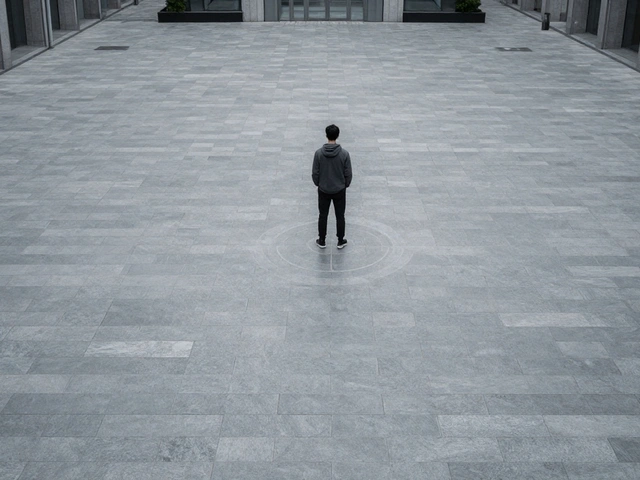
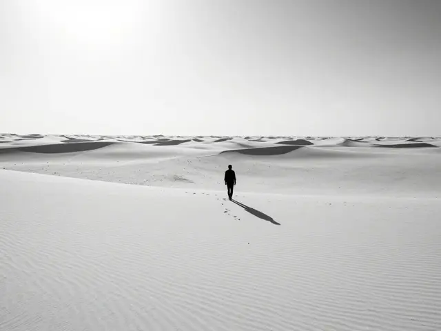
Color plays a massive role here. Warm colors (reds, oranges, yellows) feel heavier and closer than cool colors (blues, greens), which recede. A saturated red apple in a muted green field will dominate the frame every time. Texture adds friction to the eye. Smooth areas let the gaze slide past; rough or detailed areas make it linger. Finally, isolation works. A single bird in an empty sky has immense weight because there’s no competition. The less context around an object, the more it stands out.
Dominant vs. Supporting Elements
Every good composition has a hierarchy. You need one clear winner-the dominant element. This is the main subject, the story’s hero. Then you have supporting elements. These provide context, lead the eye, or add depth, but they never steal the show.
The mistake most people make is letting two elements fight for dominance. Imagine a landscape with a large rock formation on the left and a bright yellow flower patch on the right. Both have high contrast and distinct shapes. Your eye jumps back and forth, unable to settle. That’s imbalance. To fix it, you either reduce the weight of one or increase the weight of the other. Maybe you blur the rocks slightly. Maybe you crop tighter to exclude the flowers. Or maybe you wait for the light to hit the rocks harder, increasing their contrast relative to the flowers.
Supporting elements aren’t just filler. They guide the viewer to the dominant element. Leading lines, like roads or fences, act as arrows. Framing devices, like arches or branches, create windows that direct attention inward. Negative space-empty areas like sky or water-gives the dominant element room to breathe. Without negative space, even a strong subject can feel cluttered and weak.
How to Measure and Balance Weight
Balancing visual weight is like balancing a scale. If you have a heavy object on the left, you need counterweight on the right. But the counterweight doesn’t have to be identical. In fact, asymmetry is often more interesting than symmetry. Symmetrical balance feels static and formal. Asymmetrical balance feels dynamic and natural.
Here’s a practical test. Squint at your photo. Blurring the details helps you see shapes and tones without getting distracted by content. Where does your eye land first? If it lands on the wrong thing, adjust. Use the Rule of Odds alongside visual weight. Odd numbers of subjects (1, 3, 5) tend to feel more balanced and organic than even numbers, which can split attention evenly.
Consider position. Elements near the edges of the frame feel heavier than those in the center. Why? Because they threaten to fall out of the picture. Our brains want to keep everything contained. So, a small object in the bottom-right corner might need a larger, lighter object in the top-left to keep the frame stable. This is why photographers often leave "lead room" in front of moving subjects-it balances the implied motion.
| Factor | High Weight Trigger | Low Weight Trigger | Action to Reduce Weight |
|---|---|---|---|
| Size | Large area coverage | Small area coverage | Crop tighter or zoom out |
| Contrast | Sharp edges, high tonal difference | Soft edges, low tonal difference | Blur background or lower saturation |
| Color | Warm, saturated hues | Cool, desaturated hues | Shift white balance or convert to B&W |
| Position | Near edges or corners | Center of frame | Reposition subject or use negative space |

Practical Techniques for Better Balance
Let’s move from theory to shooting. When you’re behind the camera, you can actively manipulate visual weight using three main tools: framing, lighting, and post-processing.
Framing starts with lens choice. Wide-angle lenses exaggerate perspective, making foreground objects appear larger and heavier. Telephoto lenses compress distance, making background elements appear closer and potentially heavier. If your background is distracting and heavy, try a longer lens to isolate the subject, or a wider aperture to blur the background. Aperture controls depth of field, which directly impacts sharpness-and sharpness equals weight.
Lighting is your paintbrush for weight. Bright highlights attract the eye faster than shadows. If your subject is in shadow but the background is sunlit, the background wins. Move your subject into the light, or wait for clouds to diffuse the background brightness. Directional light creates texture, adding weight to surfaces. Flat light reduces texture, making elements feel smoother and lighter.
In post-production, you have precise control. Dodge and burn techniques allow you to lighten or darken specific areas. Lightening a subject increases its prominence; darkening distractions reduces their pull. Cropping is the ultimate tool for removing unwanted weight. If a branch in the corner is pulling attention away, cut it out. Saturation adjustments can tone down competing colors. Desaturating a distracting red shirt while keeping the subject’s skin tones natural shifts the balance instantly.
Common Mistakes That Break Balance
Even experienced shooters fall into traps. One common issue is "tipping." This happens when a vertical line (like a building or tree) leans toward the edge of the frame. It creates tension that feels accidental rather than artistic. Unless you’re going for dramatic unease, correct tilt in-camera or during editing.
Another trap is ignoring the horizon. A tilted horizon disrupts the entire sense of stability. No matter how well-balanced your subjects are, a crooked ground plane makes the viewer feel uneasy. Check your level. Digital levels in cameras and phones are helpful, but trust your eyes too.
Over-complication is also frequent. Adding too many supporting elements dilutes the message. If every corner of the frame has something interesting, nothing is interesting. Simplify. Ask yourself: does this element support the story, or is it just noise? If it doesn’t help the dominant element shine, remove it.

Real-World Application: Street and Portrait
Let’s apply this to street photography. You see a person walking down a busy sidewalk. There are cars, signs, and other pedestrians. To balance the shot, you might wait for the person to step into a patch of sunlight (increasing their weight via brightness). You might frame them against a plain wall (reducing background weight via simplicity). You might use a fast shutter speed to freeze motion, keeping them sharp while blurring the moving cars (increasing weight via sharpness).
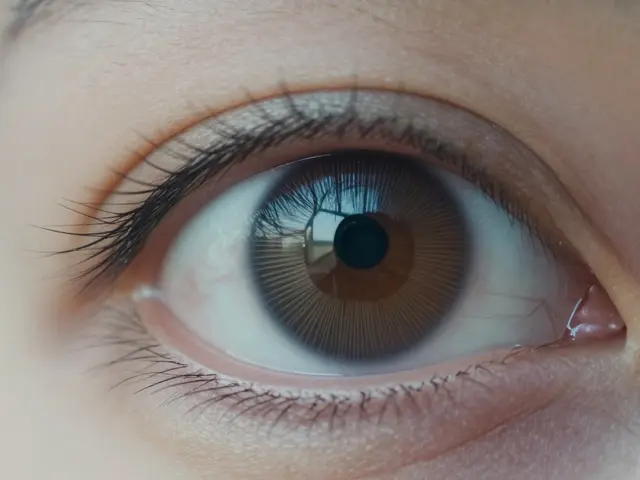
In portraits, the eyes are almost always the dominant element. Everything else must support them. If the background is busy, open up your aperture to blur it. If the subject’s clothing is brightly colored and competes with their face, consider changing outfits or desaturating the clothes in editing. Accessories like hats or glasses can add weight to the head, so ensure they don’t overshadow the eyes. Lighting ratio matters here-key light on the face, fill light softer, keeps the focus where it belongs.
Conclusion: Practice Seeing the Invisible
Visual weight isn’t something you calculate with a ruler. It’s a skill you develop by looking closely. Start analyzing photos you admire. Ask yourself: why did my eye go there first? What made that element stand out? Then try to replicate those conditions in your own work. Experiment with breaking the rules. Put the heavy object in the center. See if it works. Sometimes, imbalance is the point. But even then, you’re choosing it intentionally, not accidentally.
Mastering visual weight transforms your photography from random snapshots to composed statements. You gain control over the viewer’s experience. You decide what they see, when they see it, and how long they stay. That power comes from understanding the invisible forces at play in every frame.
Does color always override size in visual weight?
Not always, but frequently. A small, highly saturated red object can outweigh a large, pale blue object. However, if the size difference is extreme, the larger object may still dominate. Context matters: in a monochrome scene, size and contrast become the primary drivers.
How does negative space affect visual weight?
Negative space isolates the subject, effectively increasing its visual weight by removing competition. It also provides breathing room, allowing the dominant element to stand out more clearly. Too little negative space can make a subject feel cramped and less significant.
Can symmetry ever be boring?
Yes, perfect symmetry can feel static and predictable. While it offers balance, it lacks the dynamic tension of asymmetrical balance. Photographers often introduce slight asymmetries within symmetrical compositions to keep the image engaging.
Does black and white photography change visual weight rules?
It removes color as a factor, shifting emphasis entirely to tone, contrast, shape, and texture. Darker tones generally carry more weight than lighter ones in B&W images. This requires careful attention to exposure and dodging/burning to maintain balance.
How do leading lines influence visual weight?
Leading lines guide the viewer’s eye toward the dominant element, effectively transferring weight along the path. Strong, clear lines can enhance the perceived importance of the destination point. Weak or conflicting lines can scatter attention and reduce overall impact.