You press the shutter. The exposure is perfect. The colors pop. But when you look at the image five minutes later, something feels off. You can’t quite put your finger on it, but your eye wanders around the frame without landing anywhere. This isn’t a technical failure; it’s a communication breakdown. Visual hierarchy is the invisible architecture of your photo. It dictates where the viewer looks first, second, and third. Without it, even a technically flawless image becomes visual noise.
Think of your photograph as a stage play. If every actor shouts their lines at the same volume, the audience hears nothing. Visual hierarchy allows you to whisper the most important line so clearly that everyone leans in to hear it. It’s not about making things pretty; it’s about controlling attention. Whether you’re shooting street scenes, portraits, or landscapes, mastering this concept separates casual snapshots from compelling storytelling.
The Science Behind Where We Look
Why do we look where we look? Our brains are wired for efficiency. We scan images in predictable patterns, often starting with high-contrast areas, faces, or distinct shapes before moving to lower-priority details. Research in cognitive psychology suggests that viewers spend less than two seconds deciding whether an image holds their interest. In that blink-and-you-miss-it window, your composition either grabs them or loses them.
This biological imperative means you can’t rely on luck. You have to engineer the path your viewer’s eye takes. When you understand that human vision prioritizes certain stimuli-like bright spots over dark shadows, or sharp focus over blur-you gain a powerful toolset. You aren’t just capturing light; you’re directing traffic within the frame.
Contrast: The Loudest Voice in the Room
If one element in your photo screams while others whisper, that screaming element becomes the primary focal point. Contrast is the most direct way to establish dominance in a scene. It doesn’t just mean black versus white. It includes color contrast (red against green), tonal contrast (bright subject against dark background), and texture contrast (smooth skin against rough bark).
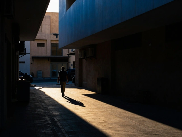
Consider a portrait shot in a dimly lit room. If your subject’s face is illuminated by a single window while the rest of the room falls into shadow, the eye goes straight to the face. There’s no debate. The brain identifies the area of highest luminance difference and locks onto it. If you want the viewer to notice a specific detail-a ring on a hand, a tear on a cheek-isolate it with light. Conversely, if everything is evenly lit, the eye has no reason to stop. Flat lighting creates flat hierarchies.
Scale and Size: Big Things Matter First
We naturally prioritize larger objects over smaller ones. A massive mountain dwarfs a tiny hiker, making the mountain the initial subject unless you manipulate the context. However, scale isn’t just about physical size; it’s about relative prominence within the frame. A small bird in flight against a vast, empty sky commands more attention than a large tree cluttered with leaves.
Use scale to create tension or harmony. If your main subject is small, give it space. Negative space acts as a spotlight, amplifying the importance of a small object. If your subject is large, ensure it doesn’t overwhelm the frame to the point of becoming monotonous. Break up large masses with negative space or contrasting elements to keep the eye engaged. Remember, a small dot of red in a sea of gray is instantly noticeable because its scale relative to the surrounding uniformity makes it stand out.
Leading Lines: The Roadmap for the Eye
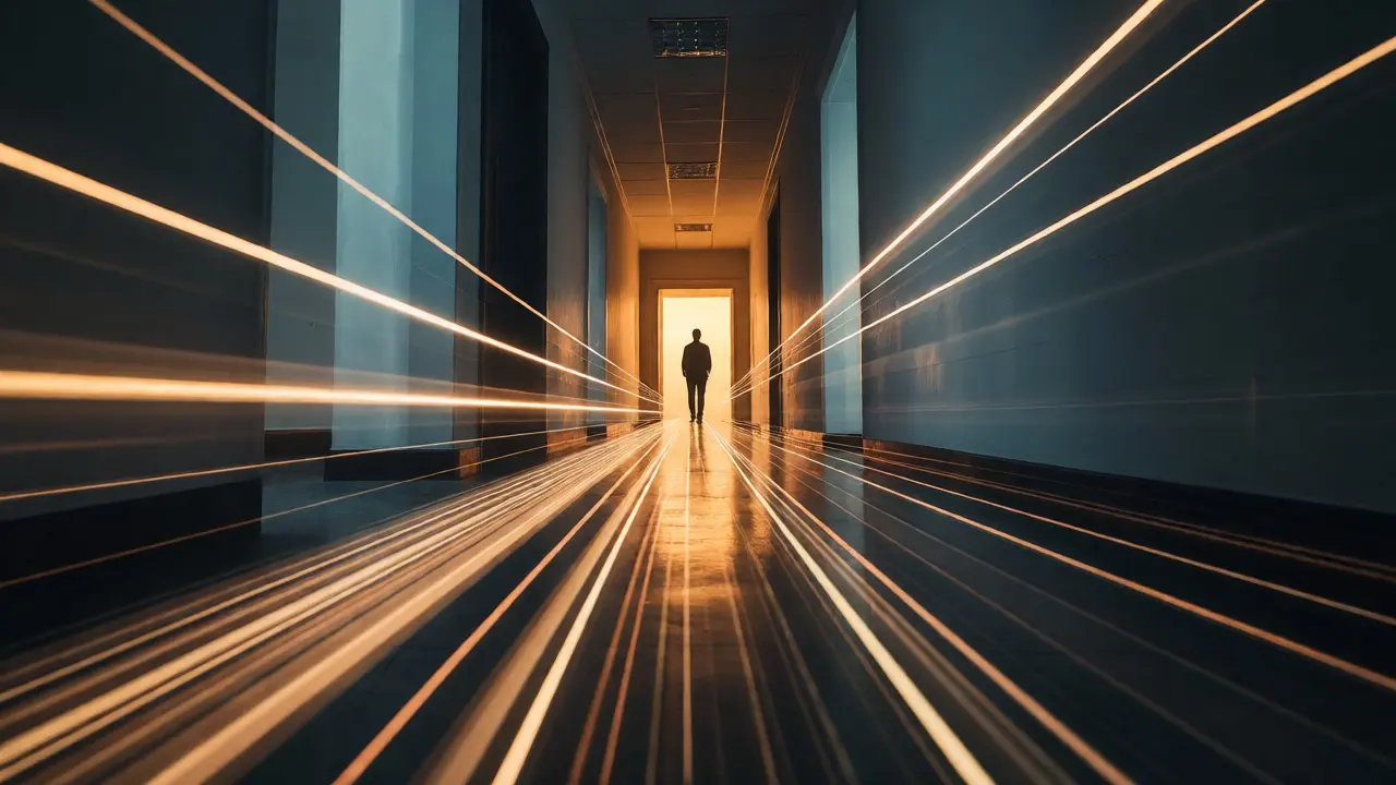
Your eyes love paths. Roads, rivers, fences, and even shadows act as vectors that pull the gaze toward a destination. Leading lines are compositional tools that guide the viewer’s attention along a specific trajectory. They don’t just lead to the subject; they control the speed at which the viewer arrives there.
Diagonal lines create dynamic movement, rushing the eye toward the focal point. Horizontal lines offer stability and calm, slowing the pace. Curved lines provide a gentle, winding journey. When you place your subject at the convergence of these lines, you reinforce its importance. Imagine a photograph of a long hallway. The parallel walls converge toward a door at the end. Your eye travels down the corridor and stops at the door. If you placed a person standing in the middle of the hall, away from the vanishing point, the effect would be weaker. Position matters as much as the line itself.
| Technique | Primary Effect | Best Use Case |
|---|---|---|
| Contrast | Immediate isolation of subject | Portraits, product shots, night photography |
| Scale | Emphasizes significance through size | Landscape, architectural, minimalist compositions |
| Leading Lines | Directs flow and movement | Street photography, interiors, roads |
| Focus Depth | Separates foreground/background | Macro, wildlife, busy environments |
Depth of Field: Blurring Out the Noise
Sharpness attracts the eye. Blur repels it. By using a wide aperture, you can isolate a subject from a chaotic background. This technique, known as shallow depth of field, creates a clear distinction between what matters and what doesn’t. The sharp area becomes the anchor; the blurred areas become context.
This is particularly useful in documentary or street photography where backgrounds are messy. A sharp face against a creamy bokeh background tells the viewer exactly who to look at. But use this power responsibly. If everything is sharp, you must rely on other hierarchy tools like contrast or placement. If everything is blurred except a tiny sliver, ensure that sliver contains the story. Don’t blur out critical context unless you intentionally want to abstract the scene.
Color Temperature and Saturation
Warm colors tend to advance, while cool colors recede. This optical illusion allows you to push subjects forward or pull backgrounds back simply by adjusting color balance. A warm orange sunset behind a cool blue silhouette pushes the silhouette forward. High saturation draws attention; desaturation pushes elements into the background.
In post-production, you can enhance hierarchy by selectively adjusting saturation. Desaturate distracting elements in the corners of the frame. Boost the saturation of the focal point slightly. This subtle manipulation guides the eye without looking artificial. Be careful not to overdo it-unnatural colors break immersion. The goal is to make the hierarchy feel intuitive, not manipulated.

Placement and The Rule of Thirds
While the Rule of Thirds is a basic guideline, it works because it aligns with natural scanning patterns. Placing key elements at the intersections of the grid creates dynamic tension. Centering a subject creates symmetry and stability, which can also establish hierarchy if the symmetry is strong enough. Off-center placement invites the eye to explore the rest of the frame, creating a secondary layer of interest.
Don’t treat the Rule of Thirds as a law. Treat it as a default setting. Sometimes, breaking it strengthens the message. A centered subject can feel confrontational or monumental. An off-center subject can feel fleeting or candid. The key is intent. Ask yourself: Do I want the viewer to feel settled or unsettled? Then place the subject accordingly.
Editing Your Hierarchy
Hierarchy isn’t just captured; it’s refined in editing. Lightroom and Photoshop offer precise controls to enhance visual flow. Use radial gradients to brighten the subject and darken the edges (vignetting). Dodge and burn to sculpt light around the focal point. These local adjustments reinforce the hierarchy established during the shoot.
A common mistake is editing globally. Increasing contrast across the entire image might blow out highlights in the background that compete with the subject. Instead, target specific areas. Darken distractions. Brighten the hero. This surgical approach ensures that your final image communicates clearly, regardless of how complex the original scene was.
Common Pitfalls to Avoid
One major pitfall is competing focal points. If two elements have equal weight-same brightness, same sharpness, same color intensity-the eye bounces between them, never settling. Resolve this by demoting one element. Reduce its contrast, blur it, or move it to the edge of the frame.
Another trap is ignoring negative space. Clutter kills hierarchy. Every element in the frame competes for attention. If it doesn’t support the story, remove it. Crop tighter. Move closer. Wait for the passerby to leave the frame. Simplicity amplifies impact.
What is visual hierarchy in photography?
Visual hierarchy is the arrangement of elements in a photograph to guide the viewer's eye in a specific order. It determines what the viewer sees first, second, and last, ensuring the intended subject receives the most attention.
How does contrast affect visual hierarchy?
High contrast areas attract the eye immediately. By placing your subject in a high-contrast zone relative to its surroundings, you make it the dominant focal point. Low contrast areas recede into the background.
Can I fix poor hierarchy in post-processing?
Yes, partially. While composition should ideally be set in-camera, you can enhance hierarchy in editing by dodging and burning, adjusting local contrast, desaturating distractions, and cropping to remove competing elements.
Do leading lines always need to point to the subject?
Not always, but they usually help. Leading lines guide the eye. If they point away from the subject, they might distract. Ideally, they should lead the viewer’s gaze toward the primary focal point or create a pleasing flow that ends there.
Is the rule of thirds necessary for visual hierarchy?
No, it’s a helpful guideline but not a requirement. Central placement can create strong hierarchy through symmetry. The key is intentional placement that supports the narrative, not rigid adherence to a grid.