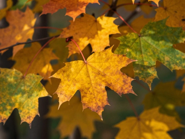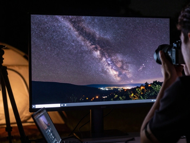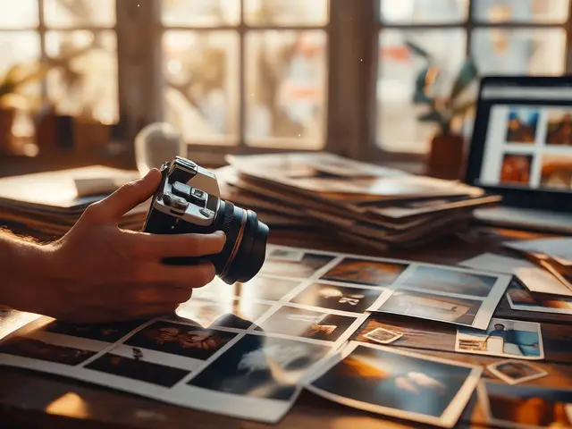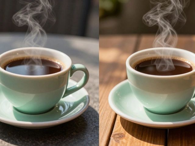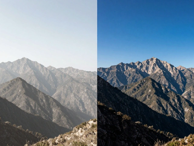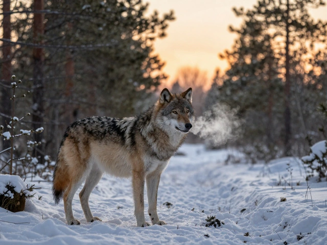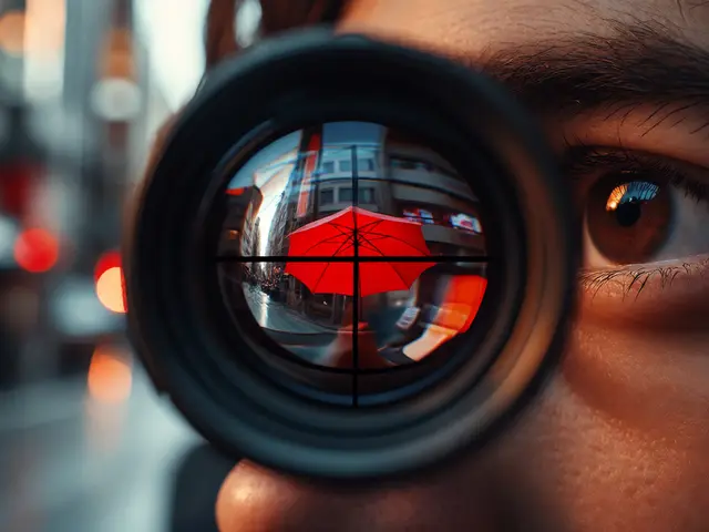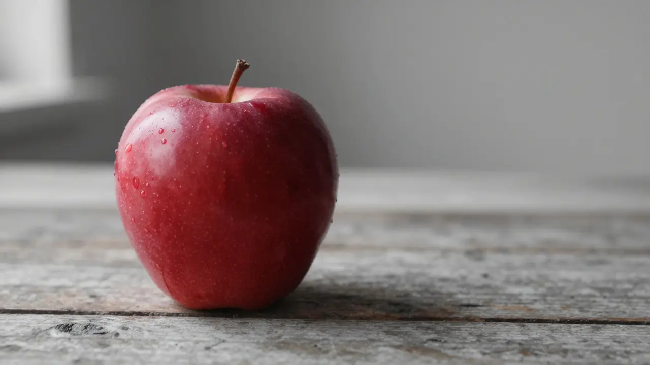
Ever looked at a photo where one red apple pops out of a sea of gray? That’s not magic. It’s selective color. This technique strips away the distraction of competing hues to force your viewer’s eye straight to what matters. If you’ve ever struggled with busy backgrounds or flat portraits, this is the tool that changes everything.
Most editors know how to adjust global saturation, but few master the art of controlling specific channels. Selective color isn’t just about making things pop; it’s about creating visual hierarchy. By manipulating how individual colors behave in relation to each other, you can guide attention, set mood, and tell a story without adding a single word. Whether you’re working in Lightroom, Photoshop, or even mobile apps, the logic remains the same: control the noise, highlight the signal.
What Exactly Is Selective Color?
Selective Color is a photo editing technique that allows users to adjust the saturation, hue, and lightness of specific color ranges independently from the rest of the image. Unlike global adjustments that affect every pixel equally, selective color targets particular tones-like skin tones, foliage, or skies-and modifies them while leaving others untouched. This precision is what separates a good edit from a great one.
The concept relies on the CMYK (Cyan, Magenta, Yellow, Black) model, even though we work in RGB screens. When you select 'Reds' in your editor, you aren’t just changing red pixels; you’re adjusting how much cyan, magenta, yellow, and black are added to or removed from those specific tones. This layered approach gives you granular control that simple sliders simply don’t offer.
Why Your Eye Ignores Everything Else
Human vision is wired to detect contrast. When a scene is full of saturated colors, the brain has to process too much information. It gets tired, and the focal point gets lost. Think of walking into a room painted in bright orange walls, green furniture, and blue curtains. Where do you look first? Now imagine the same room, but everything is muted except for a single red vase. The vase becomes impossible to ignore.
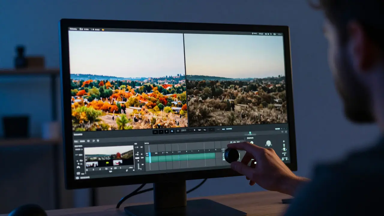
This principle applies directly to photography. By desaturating the background elements and preserving or enhancing the saturation of your subject, you create a natural path for the viewer’s gaze. It’s a psychological trick backed by decades of design theory. The less competition there is, the stronger the impact of the remaining color.
Step-by-Step: How to Apply Selective Color
You don’t need expensive software to start experimenting. Here’s a practical workflow that works across most major platforms:
- Identify your focal point. Before touching any slider, decide exactly what you want the viewer to see. Is it the person’s eyes? A product logo? A flower? Clarity here prevents over-editing.
- Isolate the target color range. In tools like Adobe Lightroom or Photoshop, use the HSL panel or the Selective Color adjustment layer. Click on the color swatch corresponding to your subject’s dominant hue.
- Desaturate the non-essential areas. Instead of lowering global saturation, lower the saturation of the *other* colors. For example, if your subject wears a blue shirt, reduce the saturation of Greens, Yellows, and Reds. Keep Blues vibrant.
- Fine-tune with Hue and Lightness. Sometimes, just desaturating isn’t enough. You might shift the hue of the background slightly to make it recede further, or increase the lightness of the subject to make it glow.
- Check the edges. Zoom in to 100% and look at the boundaries between your subject and the background. Harsh transitions can look unnatural. Use masking or brush tools to soften the transition if needed.
A pro tip: Don’t be afraid to push the desaturation further than you think is comfortable. In digital files, you have more latitude than in film. A background that looks almost monochrome often supports the subject better than one that’s merely “less colorful.”
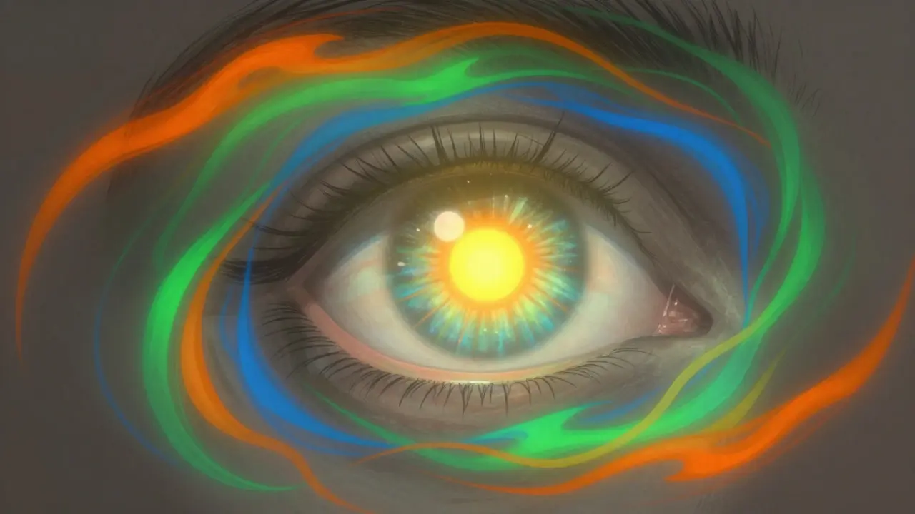
Common Pitfalls and How to Avoid Them
Even experienced editors fall into these traps. Recognizing them early saves hours of rework.
- The Halo Effect: If you desaturate too aggressively around high-contrast edges, you’ll see a faint colored outline around your subject. This happens because the algorithm picks up edge pixels from both the subject and background. Fix it by using a mask to refine the selection or by reducing the intensity of the effect near the edges.
- Skin Tone Disasters: Skin is a complex mix of oranges, yellows, and reds. If you’re targeting Reds to make lips pop, you might accidentally drain the life from cheeks. Always check skin tones after adjusting warm colors. Consider using a separate adjustment layer specifically for skin if necessary.
- Losing Detail in Shadows: Desaturated dark areas can turn muddy and lose texture. Ensure your shadows still have contrast. If the background goes flat black, bring up the blacks slightly to retain detail.
- Over-Saturating the Subject: Making the focal point neon-bright doesn’t always help. It can look artificial. Aim for a natural enhancement rather than an exaggerated one. The goal is emphasis, not distortion.
Tools and Workflows Compared
Different software handles selective color differently. Here’s how the major players stack up for this specific task:
| Software | Primary Tool | Granularity | Best For |
|---|---|---|---|
| Adobe Lightroom | HSL/Color Panel | Medium (8 color ranges) | Batch processing, quick edits |
| Adobe Photoshop | Selective Color Layer | High (CMYK-based per channel) | Precision retouching, complex scenes |
| Capture One | Color Editor | High (Point-based) | Commercial studio workflows |
| Snapseed (Mobile) | Adjust Image + Brush | Low-Medium | On-the-go social media posts |
If you’re working with a large volume of images, Lightroom’s speed is unbeatable. But for a hero shot where every pixel counts, Photoshop’s Selective Color layer offers the kind of nuance that no other tool matches. Capture One sits in between, offering powerful point-based color correction that many commercial photographers prefer for its consistency.
When to Use (and When Not To)
Selective color is a powerful tool, but it’s not a cure-all. Use it when you need to direct attention clearly. It shines in portrait photography, product shots, and landscape images with a distinct foreground element.
However, be cautious with documentary or journalistic work. Over-manipulating colors can alter the perceived reality of a scene. If authenticity is paramount, stick to subtle adjustments. Also, avoid using this technique on images with very low dynamic range. If your shadows are crushed and highlights blown out, selective color will only amplify those flaws.
Advanced Tips for Professional Results
Once you’re comfortable with the basics, try these advanced techniques to elevate your work:
- Split Toning Integration: Combine selective color with split toning. Add a cool tint to the shadows and a warm tint to the highlights. This adds depth and atmosphere that pure desaturation can’t achieve alone.
- Local Adjustments: Use radial filters or gradient masks to apply selective color only to specific parts of the image. For example, keep the sky vibrant but desaturate the ground, or vice versa.
- Texture Preservation: After desaturating, add a slight amount of clarity or vibrance to the subject area. This helps maintain the tactile feel of the material, whether it’s fabric, skin, or metal.
- Color Harmony Check: Ensure the remaining colors complement each other. If you’re keeping blues and yellows, make sure they’re balanced. A clash of complementary colors can be jarring if not handled carefully.
Frequently Asked Questions
Does selective color work on black and white photos?
Yes, but with a twist. Since B&W photos lack hue, you apply selective color to the grayscale values. You can lighten or darken specific luminance ranges to create emphasis. For example, lightening the mid-tones of a face while darkening the background creates a dramatic spotlight effect.
What is the difference between selective color and HSL sliders?
HSL sliders adjust Hue, Saturation, and Luminance for broad color ranges. Selective Color (in Photoshop terms) adjusts Cyan, Magenta, Yellow, and Black amounts for specific colors. Selective Color offers finer control over how colors interact with each other, while HSL is faster for general adjustments.
How do I prevent skin tones from looking unnatural?
Always preview your changes on a monitor calibrated for accurate color. If skin looks too orange or pink, adjust the Red and Yellow channels in the Selective Color tool. Reduce Yellow to cool down the tone, or reduce Red to lessen the warmth. Small increments make a big difference.
Can I use selective color in mobile apps?
Yes. Apps like Snapseed, VSCO, and Lightroom Mobile offer simplified versions of this feature. While they may not have the full CMYK control of desktop software, their HSL panels and brush tools allow you to achieve similar effects for social media content.
How much desaturation is too much?
There’s no hard rule, but a good guideline is to desaturate until the background feels secondary to the subject. If the background starts to distract or look muddy, you’ve gone too far. Aim for a balance where the background provides context without competing for attention.