You spend hours editing a photo on your laptop. The skin tones look perfect, the sunset is vibrant, and the shadows have just the right amount of detail. You hit export, send it to a friend, or worse, order a print from an online lab. Then comes the disappointment. The print looks muddy, the reds are too orange, and that beautiful blue sky turned purple. What went wrong? It wasn't your editing skills. It was a lack of Color Management. This is the systematic process of ensuring that colors appear consistent across different devices, from the moment you press the shutter button to the final printed page.
If you've ever wondered why your screen lies to you, this guide is for you. We're going to break down how color works in digital photography, why monitors and printers speak different languages, and exactly how to bridge that gap. By the end, you'll know how to set up a reliable workflow so that what you see is actually what you get.
The Core Problem: Different Devices, Different Languages
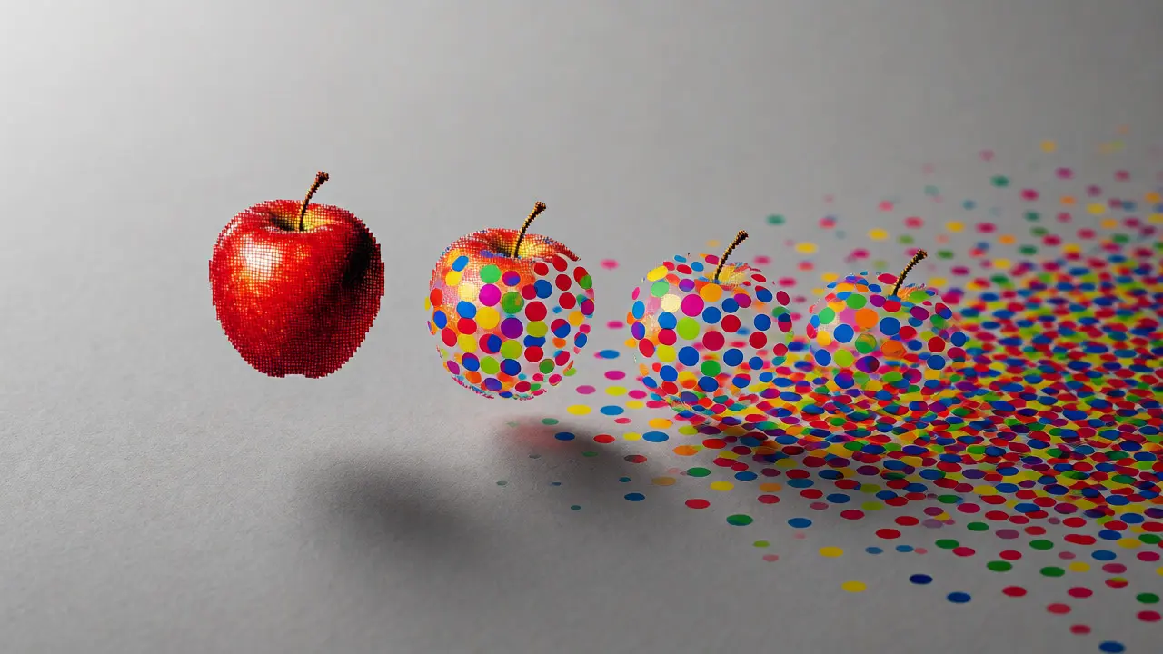
Here is the fundamental issue: every device captures, displays, or prints color differently. Your camera sensor records light using one specific method. Your computer monitor displays pixels using another. Your printer mixes ink dots using a third. Without a translator between them, chaos ensues.
Think of it like translating a novel. If you translate English to French directly without checking the context, nuances get lost. In photography, the "language" of color is defined by color spaces. The most common ones you'll encounter are sRGB, Adobe RGB, and ProPhoto RGB.
| Color Space | Gamut Size | Best Use Case | Risk Factor |
|---|---|---|---|
| sRGB | Small | Web sharing, social media, standard labs | Cuts off rich greens and cyans |
| Adobe RGB | Medium | Professional printing, high-end displays | May look dull on non-calibrated screens |
| ProPhoto RGB | Huge | Archival editing, maximum data retention | Requires 16-bit editing to avoid banding |
Choosing the right space matters, but it's only half the battle. The other half is making sure your hardware matches these definitions accurately.
Calibration: Making Your Monitor Honest
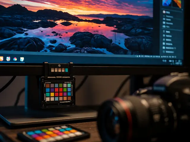
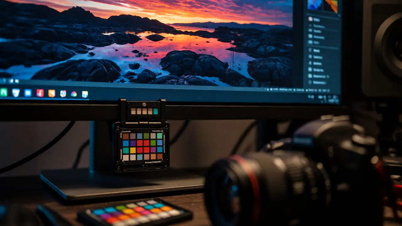
Your monitor is likely lying to you. Out of the box, most consumer screens are set to be bright and saturated to look good in a store. They aren't accurate. To fix this, you need Hardware Calibration, which involves using a colorimeter to measure your screen's output and create a custom profile.
Why bother? Because if your monitor thinks a certain gray is neutral when it's actually greenish, all your edits will compensate for that error. When you move that file to a calibrated screen or a print, those compensations become visible mistakes.
- Frequency: Calibrate your monitor every 2-4 weeks. LED backlights drift over time as they age.
- Environment: Do not calibrate in direct sunlight or under harsh overhead lights. Aim for consistent, dim ambient lighting similar to where you edit.
- Tools: Popular hardware includes the X-Rite i1Display Studio, Datacolor SpyderX, or the newer Calibrite models. Software like DisplayCAL (free) often offers better control than manufacturer bundles.
Once calibrated, your monitor has a unique ID and a description of how it renders color. This is called an ICC Profile. This profile tells your software, "When I ask for Red, this specific shade of red is what my screen shows." Without this, your software guesses.
Camera Profiles: Capturing Accurate Data
Most photographers shoot in RAW format because it retains the most data. But RAW files don't have built-in color information; they rely on metadata and processing algorithms. When you open a RAW file in Lightroom or Capture One, the software applies a default camera profile. These defaults are often generic and may not match your specific lens or sensor combination perfectly.
For critical work, consider creating custom camera profiles. Tools like X-Rite ColorChecker Passport allow you to photograph a reference chart under your specific lighting conditions. The software then generates a profile that corrects for color casts introduced by your camera and lens combo. This step is crucial for product photography or fashion shoots where brand colors must be exact.
Soft Proofing: Seeing the Print Before You Buy It
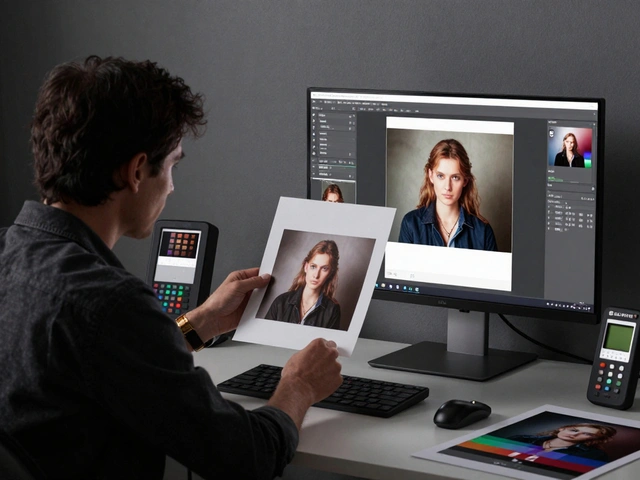
This is the game-changer for many photographers. Soft proofing allows you to simulate how your image will look when printed on a specific paper type using a specific printer profile. Instead of guessing, you can adjust your image specifically for the output medium.
To use soft proofing effectively in Photoshop or Lightroom:
- Load the ICC profile provided by your paper manufacturer (e.g., Hahnemühle Photo Rag) or your printer driver.
- Select the rendering intent. Usually, "Relative Colorimetric" preserves the most accurate colors within the printable gamut, while "Perceptual" compresses all colors to fit, maintaining visual relationships even if accuracy drops slightly.
- Check "Simulate Paper Color." This dims your screen to mimic the white point of the paper. Matte papers absorb more light, so images look flatter. Glossy papers reflect more, looking punchier.
You might notice areas turning gray or losing saturation. These are out-of-gamut warnings. You can manually adjust these areas-perhaps boosting contrast or shifting hues-to ensure they survive the translation to paper.
The Printer Profile: The Final Translator
Just like your monitor needs a profile, so does your printer. Every combination of printer model, ink set, and paper type produces different results. A glossy photo paper behaves completely differently than matte canvas.
Most reputable paper manufacturers provide free ICC profiles for their papers. Download them. Don't rely solely on the generic drivers installed by Windows or macOS. Those drivers are designed for office documents, not photographic fidelity.
If you print at home, you might eventually want to create custom printer profiles. This requires a spectrophotometer (like the i1Profiler) and a series of test charts. It’s a bit technical, but for pros who make a living selling prints, the investment pays off in consistency. You stop wasting expensive ink and paper on test batches that never quite match your screen.
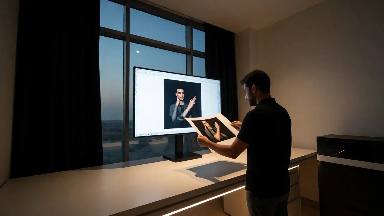
Common Pitfalls and Quick Fixes
Even with a solid system, things go wrong. Here are the most frequent culprits:
- Brightness Mismatch: Your screen is way brighter than a print. A print reflects light; a screen emits it. Lower your monitor brightness to around 80-100 cd/m² (candelas per square meter) during editing. If your screen is blindingly bright, you’ll under-edit contrast, leading to flat prints.
- Wrong Working Space: Editing in sRGB limits your ability to recover deep blues and greens later. Work in ProPhoto RGB or Adobe RGB, then convert to sRGB only for web exports.
- Ignoring Ambient Light: Editing next to a window changes how you perceive color temperature throughout the day. Keep your workspace controlled.
- Assuming Lab Defaults: Online print labs often strip metadata or apply their own sharpening. Check their guidelines. Some prefer sRGB JPEGs; others accept TIFFs in Adobe RGB.
Building a Reliable Workflow
Consistency isn't about perfection; it's about predictability. Here is a streamlined checklist to integrate into your routine:
- Capture: Shoot RAW. Use a grey card at the start of sessions for easy white balance correction.
- Edit: Work in 16-bit ProPhoto RGB. Keep your monitor calibrated monthly.
- Proof: Use soft proofing with the target paper profile before exporting.
- Export: Convert to the required space (usually sRGB for web, Adobe RGB for pro labs) with appropriate sharpening for the output size.
- Review: Always check a physical test print if you are starting a new paper or lab relationship.
Color management feels like extra overhead when you just want to share photos quickly. But once you set it up, it fades into the background. You stop second-guessing your edits. You trust your tools. And most importantly, your clients and viewers see the image you intended, not a distorted version of it.
Do I really need to calibrate my monitor?
If you care about color accuracy, yes. Consumer monitors vary wildly in color reproduction. Calibration ensures your screen displays colors according to a standard, making your editing decisions reliable across other devices and prints.
What is the difference between sRGB and Adobe RGB?
sRGB is a smaller color space designed for the web and standard displays. Adobe RGB is wider, capturing more greens and cyans. Use sRGB for web sharing to ensure compatibility. Use Adobe RGB for professional printing workflows where the wider gamut benefits the final output.
How often should I recalibrate my display?
Every 2 to 4 weeks is recommended. LED backlight technology drifts over time, changing its color temperature and luminance. Regular calibration keeps your profile accurate.
Can I use my phone for color-critical editing?
Modern high-end phones (like iPhones with P3 wide color gamut) are surprisingly accurate, but they lack the size and stability of desktop monitors. They are great for quick checks or social media posts, but for serious print preparation, a calibrated desktop monitor is still superior.
What is soft proofing?
Soft proofing is a feature in editing software that simulates how an image will look when printed on a specific paper and printer combination. It uses ICC profiles to show out-of-gamut colors and lets you adjust the image to optimize it for that specific output.