Have you ever printed a photo and been shocked at how different it looked from your screen? The colors are off. The shadows are too dark. The details are gone. You didn’t mess up the shot-you spent hours editing it. So why does the print look like a bad copy?
The problem isn’t your printer. It’s not your paper. It’s not even your monitor. It’s what you didn’t do before hitting print.
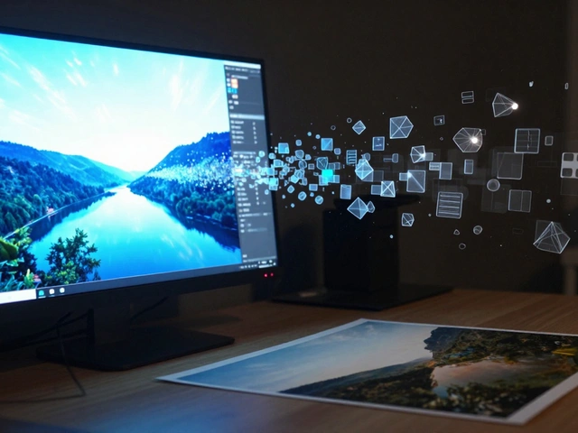
Print preparation isn’t an afterthought. It’s the final, critical step in your photography workflow. Skip it, and even the most carefully shot image can turn into a disappointment. Get it right, and your prints will look exactly how you imagined them-vibrant, sharp, and true to life.
Start with a Calibrated Monitor
Everything begins here. If your monitor doesn’t show colors accurately, nothing else matters. A screen that’s too bright makes you darken your images. A screen that’s too warm makes you cool them down. By the time you print, you’ve already built a mistake into the file.
Most photographers work with either sRGB or AdobeRGB color spaces. Printers mostly use sRGB. But if your monitor isn’t calibrated, you won’t know which one you’re actually seeing. External calibration tools like X-Rite i1Display or Datacolor Spyder are the gold standard. They measure your screen’s output and adjust it to match industry standards. Do this every 1-2 months. Even monitors with built-in calibration need a check-up.
Need a quick fix? Print five test photos with strong reds, blues, greens, and grays. Tape them next to your screen. Adjust your monitor’s brightness and color temperature until the on-screen and printed versions look as close as possible. Do this in a room with neutral lighting-no sunlight, no LED bulbs with a blue tint. A dim, gray-walled room works best.
Set the Right Resolution: PPI Matters
Resolution isn’t just about megapixels. It’s about pixels per inch (ppi). Your camera might shoot at 6000 pixels wide, but if you print it at 24 inches wide, that’s only 250 ppi. That’s fine. But if you stretch it to 40 inches? You’re down to 150 ppi. That’s blurry.
For professional photo books, magazines, and gallery prints, aim for 240-300 ppi. That’s the sweet spot where detail stays sharp without bloating your file size. Don’t just guess. Calculate it: take your image width in pixels and divide it by your print width in inches. If the result is below 200, you’re at risk.
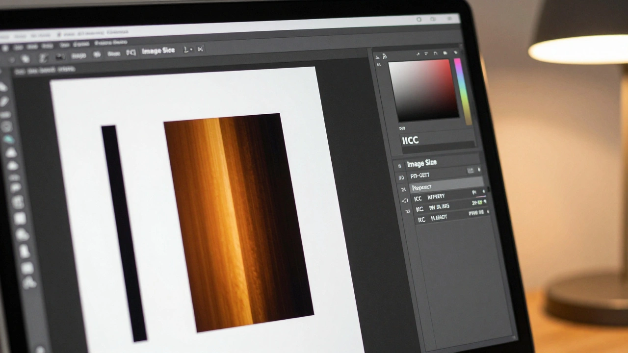
Never use automatic resizing tools that just stretch the image. Use Photoshop’s “Image Size” dialog with “Resample” turned on and set to “Preserve Details 2.0” or “Lanczos.” These algorithms retain edge clarity better than older methods. If you’re enlarging an image, do it in steps-never jump from 100% to 200% in one go.
Manage Color Correctly: RGB vs. CMYK
Here’s the big disconnect: your screen shows color using red, green, and blue light (RGB). Your printer uses cyan, magenta, yellow, and black ink (CMYK). They don’t speak the same language. If you export an image in AdobeRGB and send it to a lab that expects sRGB, the colors will shift-often dramatically.
Most labs work with sRGB. So unless you’re printing on a professional inkjet with custom profiles, stick to sRGB. Save your final file in this space. But here’s the trick: don’t just convert. Use soft proofing.
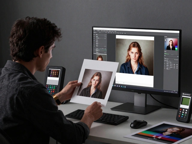
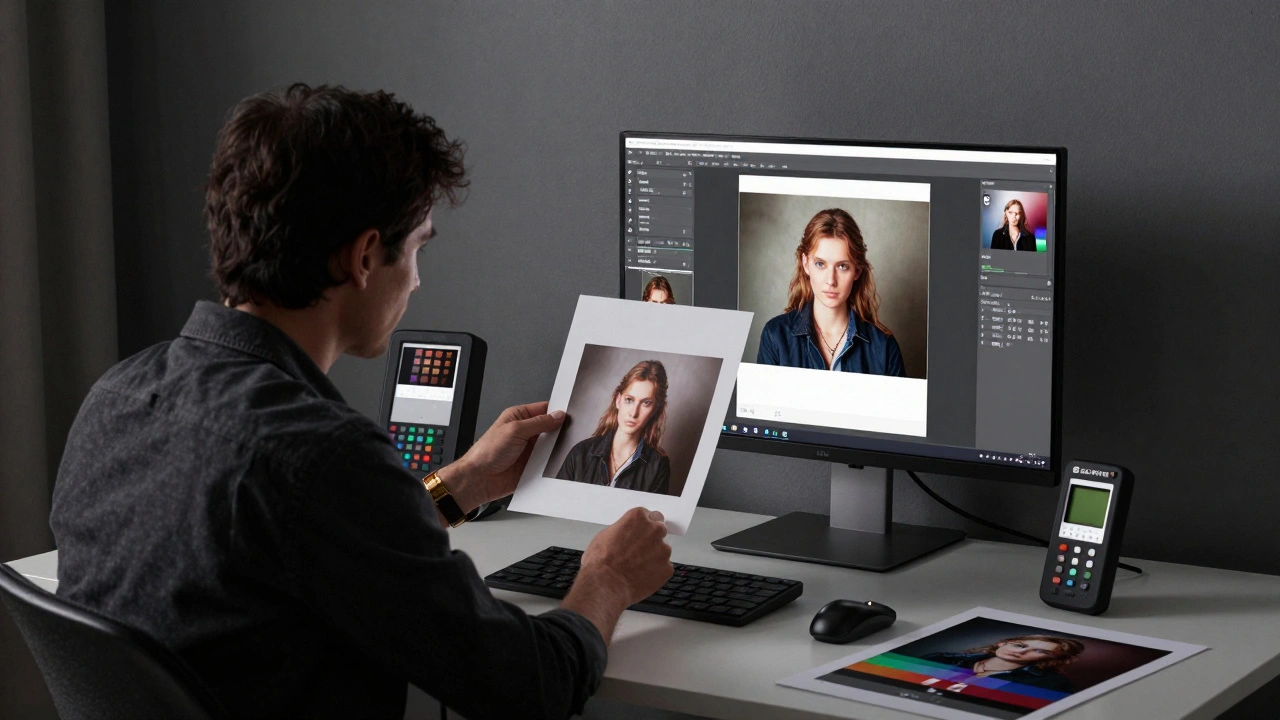
Soft proofing simulates how your image will look when printed. In Photoshop, go to View > Proof Setup > Custom. Choose the ICC profile your printer or lab provides. Toggle Proof Colors on (Ctrl+Y). Now you’re seeing what the print will look like-before you print. You’ll notice duller shadows, muted blues, or shifted greens. Adjust those areas now. Fix the contrast. Tweak the saturation. Soft proofing turns guesswork into control.
Crop for the Print Size
Your camera’s sensor has an aspect ratio-usually 3:2 for full-frame or 4:3 for Micro Four Thirds. But prints come in standard sizes: 4x6, 5x7, 8x10, 11x14, 16x20. They don’t match.
If you print a 3:2 image on an 8x10 canvas, you’ll lose parts of the top and bottom. That tree you framed perfectly? Gone. That person’s head? Cropped out. You didn’t realize it because you were looking at your screen at the original ratio.
Before exporting, crop your image to match the exact print size. Use the Crop tool in Lightroom or Photoshop and set the aspect ratio manually. Don’t rely on presets. Test it: drag your image into a mockup of the final print size. See what gets cut. Adjust your composition. Sometimes, you’ll need to reframe slightly to preserve the story. This isn’t cheating-it’s respecting the final format.
Apply Print-Specific Sharpening
You sharpened your image on screen. It looks crisp. But when you print, something changes. Paper absorbs ink. Ink spreads slightly. That sharpness you worked so hard for? It vanishes.
This is why you need a second round of sharpening-specifically for print. It’s not the same as creative sharpening. It’s a technical fix.
In Photoshop, go to Filter > Sharpen > Unsharp Mask. Set the radius to 0.3-0.5 pixels. Increase the amount until edges snap back. Keep the threshold at 1-2 to avoid noise. Or use Smart Sharpen with the “Lens Blur” setting. Do this after resizing, not before.
Some export tools (like those in Lightroom or WhiteWall’s online editor) have built-in print sharpening. Turn it on. Don’t skip it. The amount depends on the paper: glossy needs less, matte needs more. Test it. Print two versions-one with sharpening, one without. The difference is obvious.
Choose the Right Paper
Paper isn’t just paper. It’s part of the image. Glossy paper pops with color and contrast. Matte paper feels more artistic, subdued. Metallic paper adds a shimmer. Each changes how your photo behaves.
For beginners, start with resin-coated glossy paper like Ilford’s MULTIGRADE RC DELUXE. It’s durable, easy to handle, and forgiving if you over-sharpen or misjudge contrast. It’s also what most labs use for standard photo prints.
If you’re printing fine art pieces, try cotton rag paper. It’s thick, textured, and archival. It absorbs ink differently, so you’ll need to adjust your sharpening and contrast settings. Always ask your lab for their recommended paper profiles. They’ll give you ICC files to use in soft proofing.
Never assume all papers are equal. A 16x20 print on glossy looks totally different than the same size on canvas. Test small prints first. Keep notes. What worked for a landscape might ruin a portrait.
File Format: TIFF vs. JPEG
Save your final file as a TIFF if you’re printing at a professional lab. TIFFs are lossless. No compression. No quality loss. They’re larger, yes-but for prints, quality trumps file size.
If you’re using an online lab or a home printer, JPEG at 90-95% quality is fine. But never use 80% or lower. That’s where artifacts start showing up, especially in skies and skin tones.
Don’t save a JPEG, edit it, and save it again. Each time, you lose data. Always work from your original TIFF or PSD file. Export the final version only once, at the correct size and color space.
Common Mistakes and How to Fix Them
Prints look too dark? Your monitor was too bright. Calibrate it. Use soft proofing. Lower the brightness slider on your monitor by 10-15% next time.
Colors look muddy? You didn’t convert to the right color space. Check your lab’s requirements. Most want sRGB. If you sent AdobeRGB, that’s why.
Details are gone? You didn’t sharpen for print. Or you resized too much. Go back. Recalculate ppi. Apply sharpening again.
Parts of the image are missing? You didn’t crop to match the print size. Always crop before exporting. Never trust automatic fit options.
These aren’t hard fixes. They’re habits. Build them into your workflow, and you’ll stop getting bad prints. You’ll start getting prints that make people say, “How did you get it to look like that?”
Do I need to convert my photos to CMYK before printing?
Not usually. Most print labs work with sRGB. Converting to CMYK yourself can make colors look duller than they need to. Instead, use soft proofing with the lab’s ICC profile. That lets you see how the print will look without changing the color space. Only convert to CMYK if the lab specifically asks for it-and even then, get their profile first.
What resolution should I use for a 16x20 print?
For a 16x20 print, aim for at least 240 ppi. That means your image should be at least 3840 pixels wide (16 x 240) and 4800 pixels tall (20 x 240). If your image is smaller, don’t force it. You’ll get pixelation. If it’s larger, resize it down. Always calculate ppi before exporting.
Can I use the same sharpening for screen and print?
No. Screen sharpening enhances detail for viewing at 100% zoom on a bright display. Print sharpening compensates for ink spread and paper texture. It’s usually more subtle. Use a lower radius (0.3-0.5) and higher amount for print. Never skip the second pass-it’s what makes your print look professional.
Why do my prints look different from my monitor even after calibration?
Because calibration fixes your monitor, not your file. You still need to use the right color space (sRGB), soft proof with the correct ICC profile, and apply print sharpening. Also, ambient light matters. If you’re editing in bright sunlight but viewing the print under indoor lighting, the perception changes. Always compare under similar lighting.
Should I print at home or use a lab?
It depends. Home printing gives you control, but it’s expensive per print and requires maintenance. Labs offer better paper, ink, and calibration-often at lower cost for high-quality prints. If you’re printing for clients, galleries, or large formats, use a lab. For personal use or testing, home printing works. Either way, prepare your files the same way: calibrated monitor, correct ppi, soft proofed, sharpened for print.