Ever stared at a product photo that just felt... flat? You had the right light, the right camera settings, but something was missing. That "something" is almost always the styling. Product styling is the art of arranging objects, selecting props, and creating context to tell a story about a product before it even reaches the customer's hands. It’s not just about making things look pretty; it’s about visual persuasion. When you get the arrangement right, the viewer doesn't just see a bottle of soap; they smell the lavender and feel the smooth texture. When you pick the wrong prop, you distract from the hero. This guide breaks down how to move from generic shots to compelling images that sell.
The Core Principle: Context Before Aesthetics
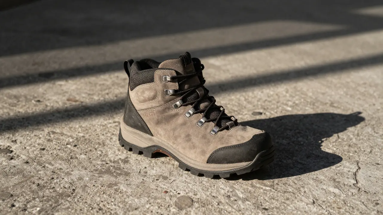
Before you grab a single prop, you need to define the narrative. What is this product for? Who uses it? Where does it live? If you are shooting a rugged hiking boot, placing it on a silk tablecloth with delicate flowers creates cognitive dissonance. The brain struggles to process the mismatch, and trust drops. Instead, place it on weathered wood or rough concrete. The environment must validate the product's purpose. This concept is known as visual context, which links the product to its intended use case through environmental cues. It requires you to think like a set designer, not just a photographer. Ask yourself: if this object were a character in a movie, what would their room look like?
Making the Right Arrangements
Arrangement is where composition meets psychology. Most beginners center everything, which feels static and boring. To create movement, try these specific layout strategies:
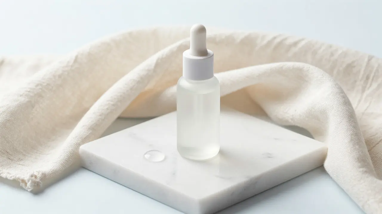
- The Rule of Thirds Offset: Place your main product off-center, aligning it with one of the grid intersections. Use negative space to let the eye rest. This works best for minimalist products like skincare or tech gadgets.
- The Triangular Composition: Arrange three elements (the product, a shadow-casting prop, and a background element) to form a triangle. This is inherently stable and pleasing to the human eye. It’s perfect for food styling or grouped lifestyle shots.
- The Diagonal Flow: Lead the viewer’s eye from the bottom corner to the top opposite corner using lines created by props or shadows. This adds energy and dynamism, ideal for sports gear or fashion accessories.
Remember, whitespace isn't empty space; it's breathing room. Crowding a frame with too many items forces the viewer to scan rather than focus. Give the hero product room to shine.
Choosing Props That Support, Not Steal
Props are supporting actors. Their job is to enhance the mood without demanding attention. A common mistake is using props that are louder than the product. If your product has intricate details, avoid busy patterned backgrounds. If your product is bold and colorful, keep the props neutral. Here is a quick framework for selecting props:
| Product Category | Recommended Prop Materials | Avoid |
|---|---|---|
| Skin & Beauty | Glass, marble, soft fabrics, water droplets | Rough textures, harsh industrial metals |
| Tech & Electronics | Matte surfaces, geometric shapes, clean lines | Cluttered backgrounds, organic chaos |
| Food & Beverage | Wood, linen, fresh herbs, rustic ceramics | Plastic, overly polished chrome |
| Fashion Accessories | Mannequins, structured fabrics, urban textures | Natural elements that clash with modern cuts |
Texture contrast is your best friend. Pair a smooth, glossy watch with a rough, textured stone. Pair a matte ceramic mug with a shiny metal spoon. This tactile variety keeps the image interesting without adding visual noise. Also, consider scale. A tiny prop next to a large product can make the product feel massive, while a huge prop can make a small item look delicate. Play with relative size to manipulate perception.
Complementary Items: Building the Ecosystem
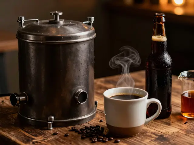
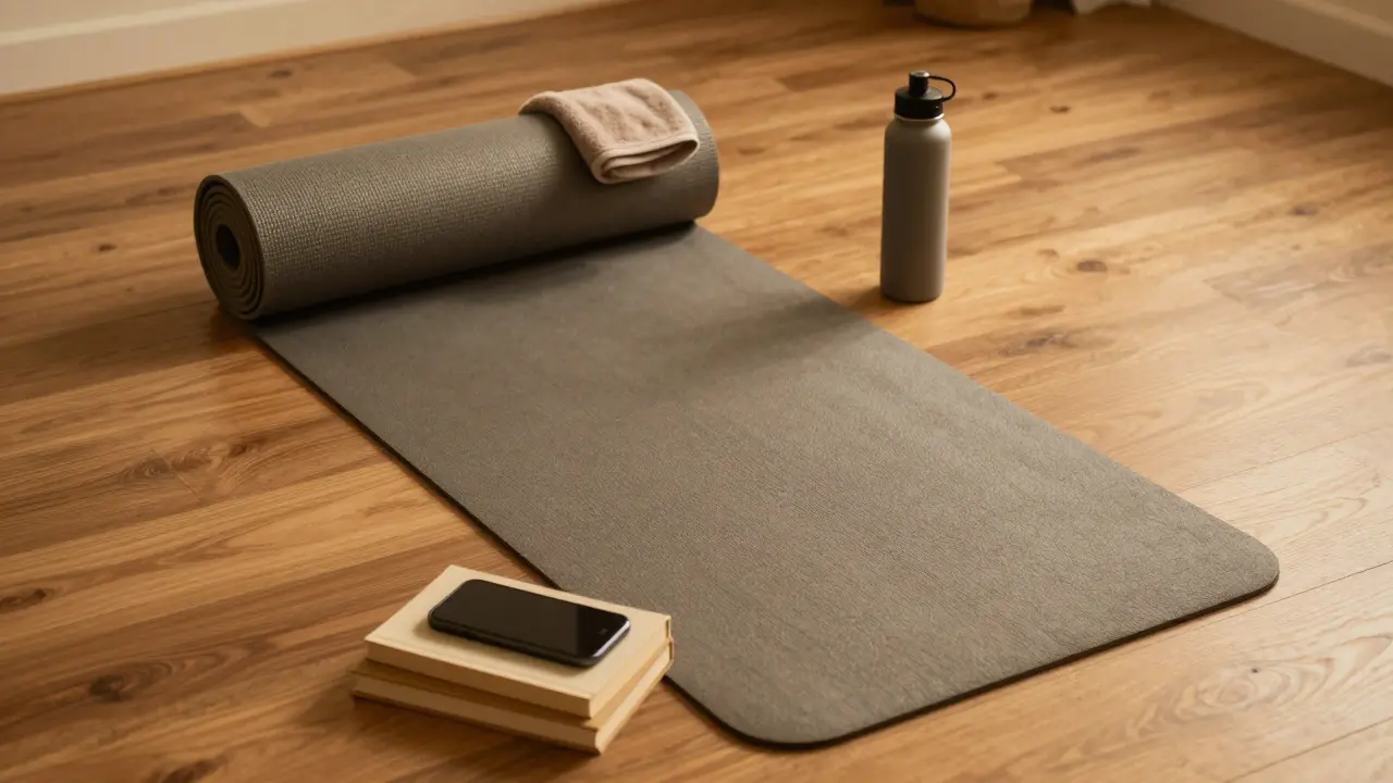
Complementary items differ from props because they suggest usage. While a prop might be a decorative rock, a complementary item is the coffee cup next to the espresso machine. These items answer the question: "How do I use this?" They build an ecosystem around the hero. For example, when photographing a yoga mat, don't just show the mat. Include rolled-up towels, a water bottle, and maybe a smartphone playing a meditation app. This tells the viewer that this mat is part of a routine, not just a piece of rubber. The key is relevance. Every item must have a logical reason to be there. If it doesn't serve the story, cut it. This approach leverages lifestyle association, which connects a product to specific daily activities to increase perceived value.
Lighting the Scene: Shadows as Design Tools
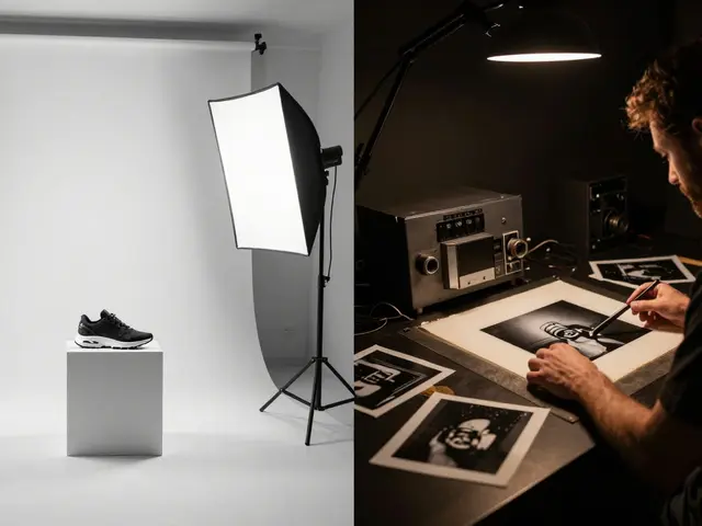
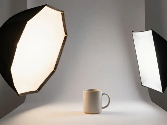
Styling isn't just about physical objects; it's about light. Hard light creates sharp, defined shadows that can act as graphic elements themselves. Soft light diffuses shadows, creating a dreamy, gentle atmosphere. Think about where your shadows fall. A long, dramatic shadow stretching across the frame can balance a heavy product on one side. Conversely, minimal shadows can make a product look floating and ethereal. Experiment with gels to change the color temperature of the light. Warm amber light suggests comfort and evening relaxation, while cool blue light implies cleanliness and technology. The light source should match the emotional tone established by your props and arrangement.
Common Pitfalls to Avoid
Even experienced stylists make mistakes. Here are the most frequent errors that ruin otherwise good shots:
- Over-styling: Adding one more item just because you have it. If it doesn't add meaning, remove it. Simplicity wins.
- Inconsistent Era: Mixing vintage props with ultra-modern products unless the contrast is intentional. A 1950s telephone next to a 2026 smartwatch looks like a mistake, not a style choice.
- Ignoring Scale: Using props that are too large or too small relative to the product, causing perspective distortion.
- Poor Color Harmony: Choosing props that clash with the product's color palette. Use the 60-30-10 rule: 60% dominant color (background), 30% secondary (props), 10% accent (product).
Always step back and look at the image from a distance. Can you identify the main subject within two seconds? If not, simplify the scene.
Practical Workflow for Your Next Shoot
To put this into practice, follow this streamlined workflow:
- Brief the Story: Write one sentence describing the feeling or scenario. Example: "A calm morning routine for someone who values sustainability."
- Curate, Don't Collect: Gather only items that fit the brief. Limit yourself to five props max.
- Block the Shot: Arrange items physically before turning on the lights. Check sightlines and balance.
- Test Lighting: Adjust light direction to highlight textures and create desired shadows.
- Refine Details: Wipe fingerprints, straighten labels, adjust fabric wrinkles. Small details signal professionalism.
This method ensures efficiency and consistency, especially when working with tight deadlines or multiple SKUs.
Frequently Asked Questions
What is the difference between props and complementary items?
Props are decorative elements that set the mood or texture (like a wooden board or a piece of cloth). Complementary items are functional objects that suggest how the product is used (like a toothbrush next to toothpaste). Props support aesthetics; complements support utility.
How many props should I use in a single shot?
Generally, less is more. Aim for no more than three to five distinct elements including the product. Each additional item competes for attention. If you find yourself needing more than five, consider splitting the scene into two separate shots.
Do I need expensive props for professional-looking photos?
No. Thrift stores, nature, and household items often provide better textures than store-bought props. A rough river stone or a piece of burlap can look high-end if lit correctly. Focus on texture and condition rather than cost.
How do I choose colors for my background and props?
Use the color wheel. Complementary colors (opposite each other) create high contrast and energy. Analogous colors (next to each other) create harmony and calm. Neutral backgrounds (white, gray, beige) are safe choices that allow any product color to pop.
Is natural light better for product styling?
Natural light is great for soft, organic looks, but it can be unpredictable. Studio lighting gives you control over intensity and direction, which is crucial for consistent branding. Many professionals mix both, using window light for fill and artificial lights for highlights.