You know that feeling when you click on a product online, the image looks crisp, but you still hesitate to buy? It’s rarely about the lighting or the background. It’s usually because the camera angle didn’t answer your most basic question: "What does this actually look like in my hands?"
Choosing the right Product Photography Angle is not just an aesthetic choice; it’s a communication tool. A bad angle hides flaws or creates confusion. A great angle builds trust before the customer even reads the description. Whether you’re shooting jewelry, sneakers, or kitchen gadgets, there are four core angles that dominate e-commerce and marketing: Front, Side, 45-Degree, and Top-Down. Let’s break down exactly when to use each one, why they work, and how to shoot them without looking like a beginner.
The Front View: The Digital Shelf Staple
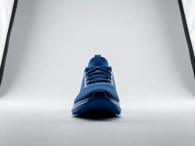
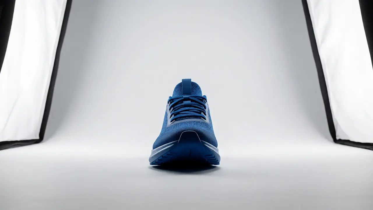
The Front View is what most people picture when they hear "product photo." It’s the straight-on shot where the camera sits at eye level with the product, perpendicular to its main face. This angle is non-negotiable for any e-commerce catalog because it mimics how you’d see an item standing on a store shelf.
Why do we start here? Because clarity trumps creativity in the first impression. When a shopper searches for "blue running shoes," they want to see the side profile of the shoe, not a weird abstract shot. The front view provides the primary silhouette. It allows customers to instantly recognize the brand logo, the shape, and the colorway.
However, the front view has a major weakness: it flattens depth. If you only shoot from the front, a rectangular box looks like a square, and a curved vase loses its volume. To fix this, ensure your lens is perfectly parallel to the product’s face. Use a tripod with a geared head to lock the position. If you’re shooting something with texture, like a knitted sweater, light it from the side (raking light) so the front view doesn’t look like a flat graphic. This preserves the tactile feel while maintaining the familiar perspective.
The Side View: Revealing Profile and Depth
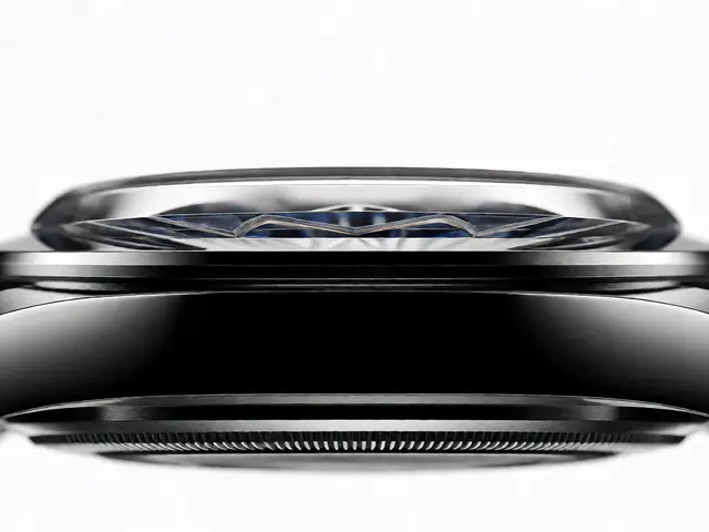
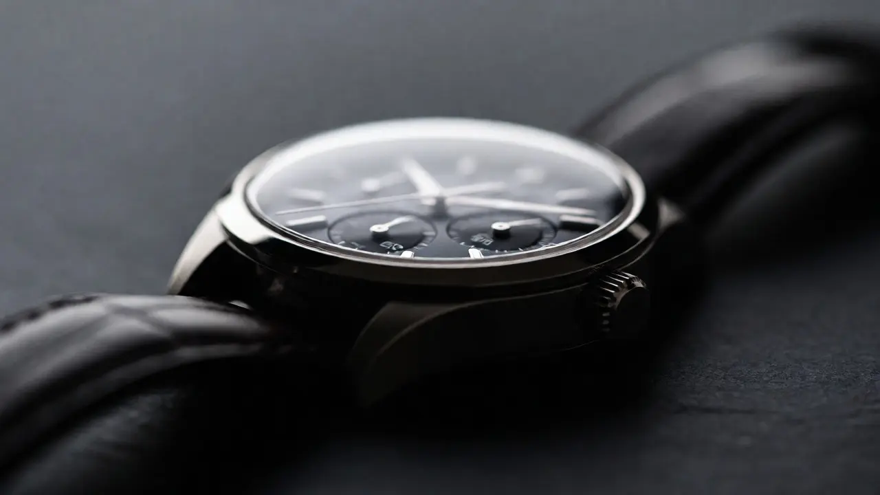
If the front view tells you *what* the product is, the Side View tells you *how much space* it takes up. This angle is critical for items where thickness or profile matters-think laptops, books, watches, or bottles.
Imagine buying a phone case. You need to see the edge to understand if it’s slim or bulky. You need to see the button placement. The side view delivers this context. It’s also the best angle to show layering. For example, if you’re selling a stack of notebooks, the side view shows the paper thickness and binding style, which the front view completely misses.
A common mistake here is ignoring the horizon line. In a side view, the table surface often cuts through the middle of the product, creating a distracting line. To avoid this, shoot slightly above the table height, or use a seamless background that curves behind the product (a cyclorama). This isolates the product and lets the viewer focus on the profile. Also, pay attention to symmetry. If your product has a distinct left and right side (like a controller or a mug handle), make sure the side view highlights the functional aspect, not just the blank wall of the object.
The 45-Degree Angle: The Human Perspective
This is the money shot. The 45-Degree Angle (also known as the three-quarter view) is arguably the most versatile angle in commercial photography. Why? Because it matches how humans naturally hold and interact with objects.
When you pick up a coffee cup, you don’t stare at it from directly above or directly from the side. You tilt it. The 45-degree angle captures the top, the side, and the front simultaneously. It creates a sense of dimensionality that makes the product feel tangible. For apps like Amazon or Shopify, this is often the hero image because it feels dynamic yet informative.
To nail this angle, visualize a triangle between the camera, the product, and the light source. Position your camera so it’s elevated enough to see the top surface but low enough to keep the vertical lines strong. If you go too high, it starts looking like a top-down shot. Too low, and it becomes a side view. The sweet spot is usually around 30 to 45 degrees from the horizontal plane.
| Angle | Best For | Key Benefit | Common Pitfall |
|---|---|---|---|
| Front View | Logos, packaging, flat items | Instant recognition | Lacks depth/volume |
| Side View | Thickness, profiles, edges | Shows scale and structure | Distracting horizon lines |
| 45-Degree View | General products, lifestyle | Natural human perspective | Distortion if lens is wide |
| Top-Down View | Flat lays, ingredients, tech | Shows layout and contents | Hard to gauge height |
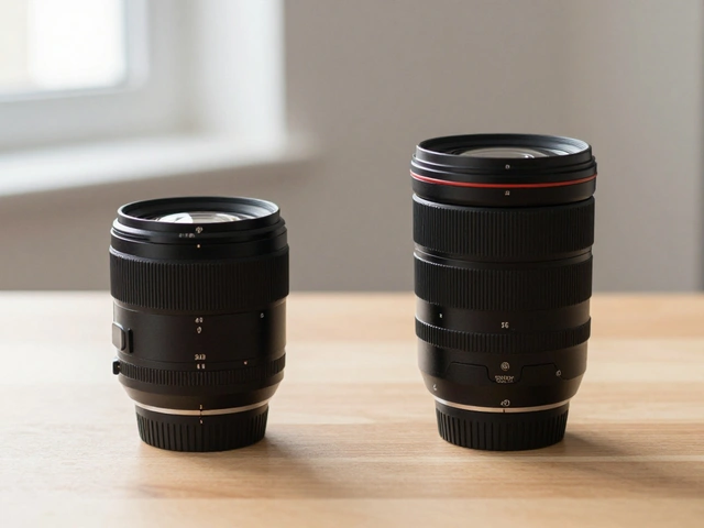
One technical tip: use a longer focal length (85mm or 100mm macro) for this angle. Wide-angle lenses (like 24mm or 35mm) exaggerate perspective at close range, making the front of the product look unnaturally large compared to the back. A telephoto lens compresses the scene, keeping proportions accurate and professional.
The Top-Down View: The Flat Lay Favorite
The Top-Down View, or overhead shot, is essential for anything that lives on a surface. Jewelry, food, cosmetics, electronics accessories, and stationery all benefit from this perspective. It removes the clutter of the background and focuses entirely on the arrangement and design.
This angle is particularly powerful for showing "what’s in the box." If you’re selling a skincare kit, a top-down shot can display every bottle, tube, and brush in a single frame, organized neatly. It gives the customer a complete inventory check without scrolling through ten different images.
Shooting top-down requires precision. Any slight tilt will make the product look skewed. Use a copy stand or a tripod with a center column that flips horizontally. Ensure your camera sensor is perfectly parallel to the table. Lighting is tricky here because your body and gear can cast shadows. Use large, soft light sources placed to the sides rather than directly above. Or, better yet, use a light tent to diffuse light evenly across the entire surface.
Composition is king in top-down shots. Since there’s no horizon line to anchor the eye, you must use negative space and geometric alignment. Align items with the grid lines in your viewfinder. Keep the spacing consistent. If you’re shooting multiple items, group them by size or color to create visual harmony. A messy top-down shot looks chaotic and cheap; a clean one looks curated and expensive.
How to Choose the Right Angle for Your Product
You shouldn’t guess which angle to use. Let the product dictate the approach. Here’s a quick decision framework:
- Is it tall and thin? (e.g., water bottle, perfume) Start with the Front View to show branding, then add a Side View to show capacity and cap detail.
- Is it flat? (e.g., t-shirt, tablet, plate) Go straight to the Top-Down View. Add a slight angle (15-20 degrees) if you need to show thickness.
- Is it complex or multi-faceted? (e.g., sneaker, backpack, blender) The 45-Degree View is your primary hero shot. Follow up with specific close-ups of features.
- Does it have a lid or opening? (e.g., jar, laptop) Shoot the Top-Down with the lid off to show contents, then a 45-Degree with the lid on to show closure mechanism.
Remember, consistency matters more than perfection. If you’re shooting a batch of 50 mugs, ensure every single one is shot from the exact same 45-degree angle and distance. Mixed angles confuse the algorithm and frustrate the user. Standardize your setup once, then execute repeatedly.

Lighting Considerations for Each Angle
Changing your angle changes how light hits the product. What works for a front view might create harsh glare in a top-down shot.
For Front Views, use symmetrical lighting. Two softboxes on either side at 45 degrees to the subject create even illumination and minimize shadows. This is ideal for glossy products like glass or plastic, as reflections remain controlled.
For Side Views, directional light is your friend. Place a single light source higher and to the side to accentuate texture and depth. This creates gradients that define the curve of the object. If the product is matte, you can get away with softer, broader light.
For 45-Degree Views, you need a balance. A key light from the upper-left and a fill card from the lower-right usually works well. This maintains dimensionality without crushing the shadows on the visible side.
For Top-Down Views, avoid direct overhead lights unless they are heavily diffused. Direct light kills texture. Instead, use two large panels at opposite corners (e.g., top-left and bottom-right) to create soft, wrap-around light. This ensures the entire flat lay is evenly lit without hotspots.
Common Mistakes to Avoid
Even experienced shooters fall into traps with angles. Here are the big ones:
- Ignoring Lens Distortion: Shooting too close with a wide lens makes products look bulgy. Step back and crop in post-production instead.
- Inconsistent Height: If your camera is 5mm higher in one shot than another, the perspective shifts subtly. Mark your tripod legs with tape to replicate setups exactly.
- Cluttered Backgrounds in Top-Down: Don’t let crumbs, dust, or stray props distract from the product. Clean the surface thoroughly between shots.
- Cropping Too Tight: Leave some breathing room around the product. E-commerce platforms often require white space for zoom functionality. Cutting too close limits usability.
By mastering these four angles, you transform your product images from simple snapshots into persuasive sales tools. The right angle answers questions before they’re asked, reduces return rates, and elevates your brand’s perceived value. Grab your camera, set up your tripod, and start experimenting. Your customers will thank you with their clicks.
Which angle is best for selling clothing?
For clothing, a combination of Front and Side views is standard. However, mannequin shots often benefit from a slight 45-degree turn to show the fit and drape of the fabric. For folded clothes, a top-down view works best to show patterns and colors clearly.
Do I need a special lens for top-down photography?
You don't necessarily need a special lens, but a prime lens (like a 50mm or 85mm) helps reduce distortion. Avoid ultra-wide lenses as they warp the edges of flat objects. A macro lens is useful if you need to capture fine details like jewelry textures from above.
How many angles should I include per product?
Most e-commerce guidelines recommend 3-5 images per product. A typical set includes a main hero shot (often 45-degree or front), a back/side view, a detail shot, and a scale/lifestyle shot. Always prioritize angles that highlight unique selling points.
Why does my product look distorted in 45-degree shots?
This is usually due to using a wide-angle lens too close to the subject. The perspective exaggeration makes the nearest part of the product look larger than the rest. Switch to a longer focal length (85mm+) and move further away to correct this.
Can I use AI to generate missing angles?
Yes, generative AI tools can now extrapolate missing angles from existing photos. While promising, they sometimes struggle with complex geometry or logos. It's best to use AI for background removal or minor adjustments, but rely on real photography for primary angles to ensure accuracy and trust.