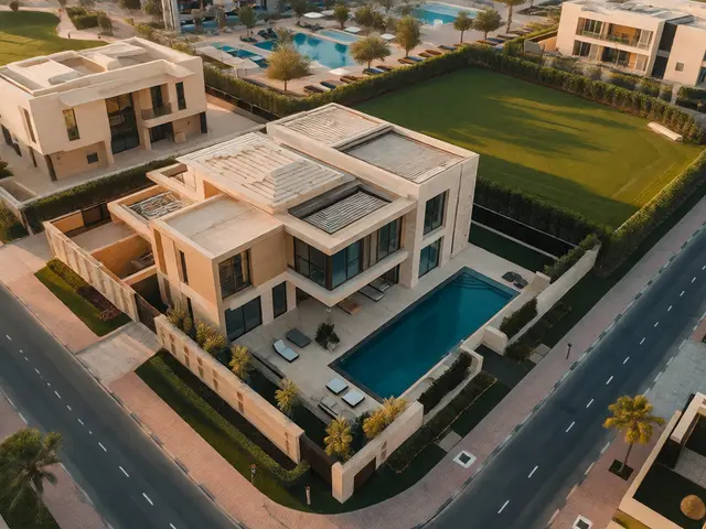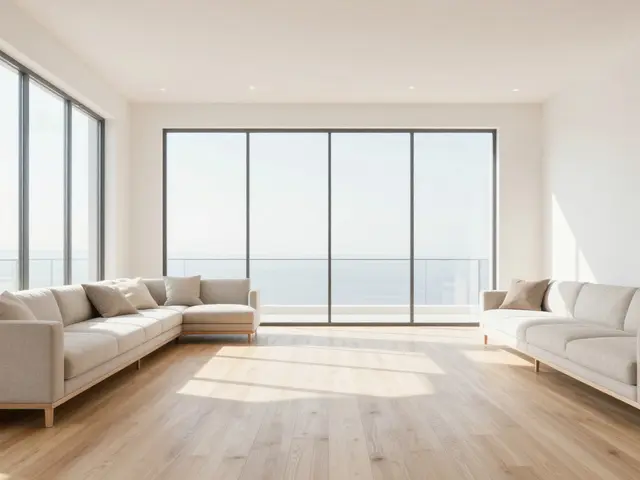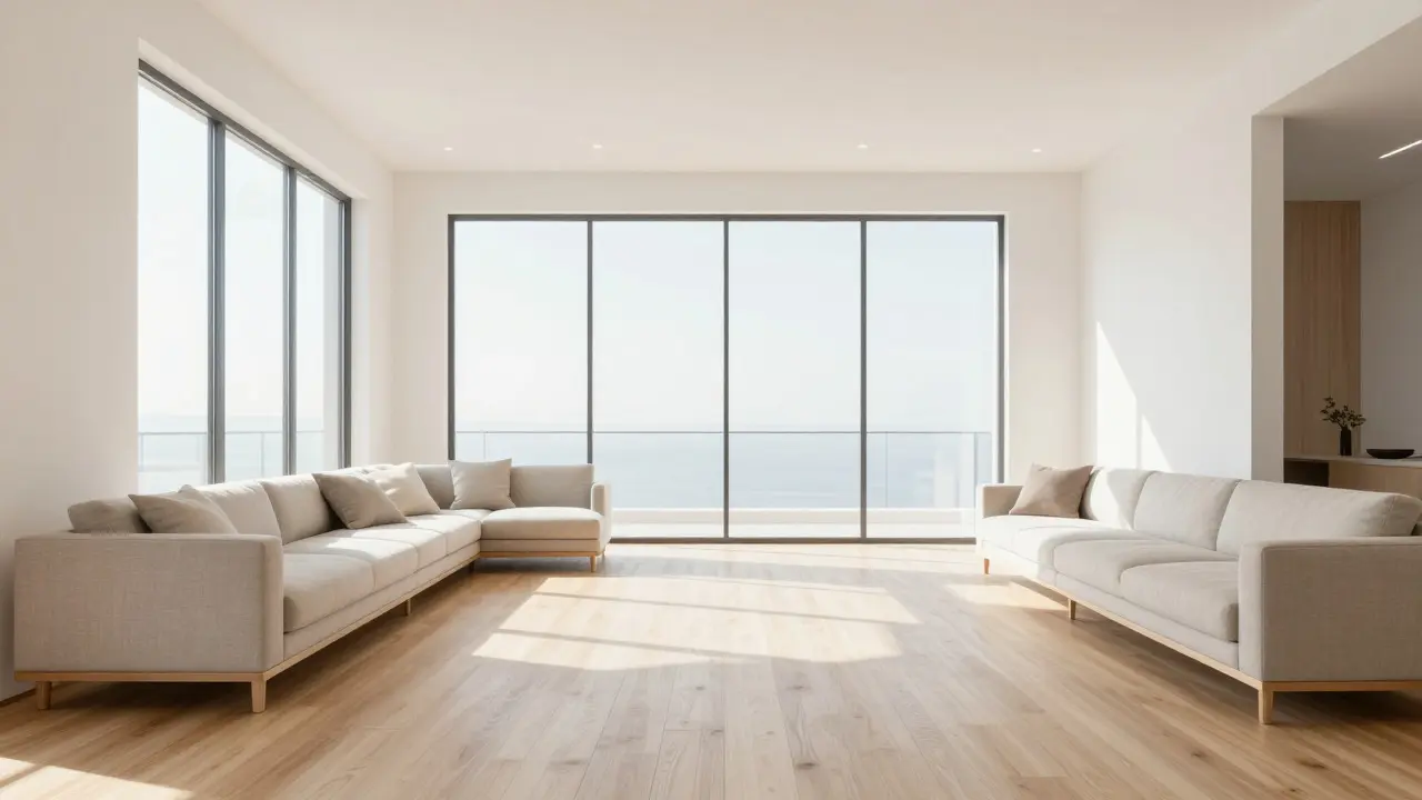
Imagine scrolling through Instagram. You see a bright, airy living room with warm wood tones. The next post shows the same style of home, but the colors are cool and blue-heavy. The third is overexposed and washed out. What do you feel? Confusion. And in real estate, confusion kills clicks.
Real estate branding isn't just about a logo or a catchy slogan. It’s about the immediate emotional response your visuals trigger. For agencies managing multiple listings, maintaining visual consistency is the single hardest part of the job. One agent might prefer high contrast; another loves soft, pastel filters. Without a unified system, your brand looks fragmented, unprofessional, and forgettable.
The Cost of Inconsistent Visuals
Inconsistency doesn’t just look messy; it actively hurts conversion rates. When potential buyers browse your social media or website, they are subconsciously evaluating your competence. If every photo looks different, they assume your process is chaotic. If the lighting shifts wildly between posts, they question whether the homes are actually as good as they appear.
Consider the data. Studies on consumer behavior suggest that consistent brand presentation can increase revenue by up to 23%. In the real estate sector, where trust is the currency, this metric is critical. A buyer who trusts the aesthetic is more likely to trust the transaction. Conversely, a jarring visual experience creates friction. They hesitate. They scroll past. They choose an agency whose feed feels like a curated magazine rather than a random dump of files.
Building Your Visual Identity System
To fix this, you need a system, not just a preference. Start by defining your core visual attributes. These are the non-negotiables that every image must follow before it goes live.
- Color Palette: Choose 3-5 primary colors that reflect your brand personality. For luxury properties, think deep blues, charcoal grays, and gold accents. For family-friendly suburbs, opt for warm whites, soft greens, and natural wood tones.
- Luminance Levels: Decide if your brand is "bright and airy" (high key) or "moody and dramatic" (low key). Most residential real estate benefits from high-key lighting-clean, open, and inviting.
- Saturation Balance: Avoid oversaturating skies or grass. Naturalism builds trust. Keep saturation at 100% or slightly below unless you have a specific artistic reason to push it.
- White Balance: Standardize your white balance. Neutral white (around 5500K-6500K) works for most interiors. Outdoors, match the ambient light but avoid extreme yellow casts that make photos look dated.
Document these rules in a simple one-page PDF. Share it with every photographer, editor, and agent on your team. This document becomes your source of truth.

Streamlining the Editing Workflow
Knowing the rules is step one. Applying them consistently across hundreds of images is step two. This is where technology saves your sanity. Manual editing for every single shot is unsustainable. You need automation.
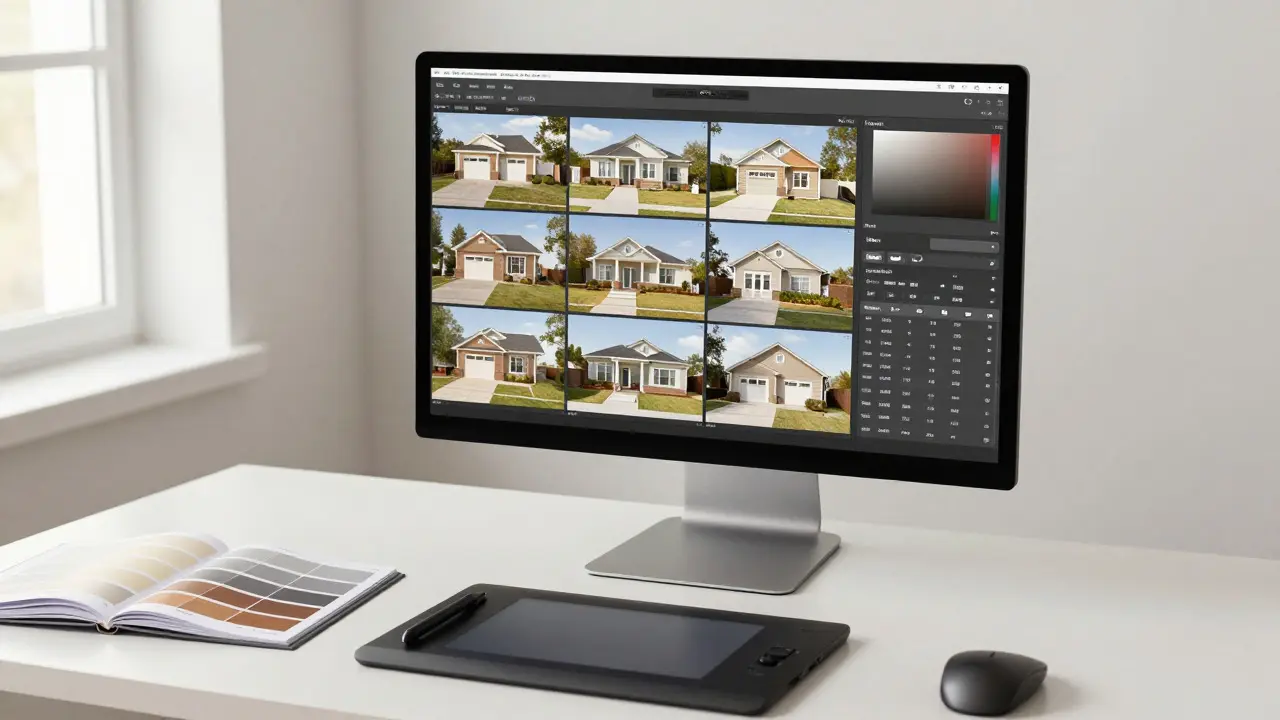
Use preset-based workflows. Create a master preset in software like Adobe Lightroom or Capture One that applies your base color grade, exposure adjustments, and white balance settings. Then, create variations for specific scenarios: "Interior Daylight," "Exterior Golden Hour," and "Night Exterior."
Here is a practical workflow structure:
- Ingest & Cull: Import raw files. Quickly cull duplicates and blurry shots. Do not edit what you won’t use.
- Batch Apply Base Preset: Select all remaining images. Apply your master brand preset. This handles 80% of the work instantly.
- Individual Tweaks: Go through the batch. Adjust exposure for dark corners or blown-out windows. Fix horizon lines. Crop for composition.
- Quality Check: Zoom in to 100%. Check for noise, dust spots, and color banding. Ensure skin tones (if people are present) look natural, not orange or green.
- Export & Organize: Export in high-quality JPEG for web and print. Name files systematically (e.g., ListingID_Room_PhotoNumber).
This approach reduces editing time per image from 10-15 minutes to under 2 minutes, while ensuring 95% visual uniformity.
Managing Multiple Agents and Styles
The biggest challenge for agencies is that agents often have their own ideas. "I love my photos darker," one might say. "My clients prefer brighter kitchens," says another. How do you handle this without breaking the brand?
You don’t let them break it. Instead, you offer controlled flexibility. Allow minor variations within a strict framework. For example, you might allow agents to adjust brightness by +/- 10% based on client preference, but lock the color temperature and saturation curves. This way, the photos still feel like they belong to the same family, even if one is slightly brighter than the other.
Communicate this clearly. Show agents side-by-side comparisons of "Brand Compliant" vs. "Off-Brand" edits. Explain that consistency drives leads, not personal taste. When agents see that their branded photos perform better in engagement metrics, resistance drops significantly.
Common Pitfalls to Avoid
Even with a system, mistakes happen. Watch out for these frequent errors:
- Over-editing Skies: Blue skies should be vibrant but not electric. If the sky looks like a digital painting, it undermines realism.
- Ignoring Interior Reflections: Windows often show the photographer or bright outdoor light. Use lens correction tools or manual cloning to remove distracting reflections.
- Inconsistent Cropping Ratios: Stick to standard ratios (4:5 for Instagram, 16:9 for websites). Mixing aspect ratios makes feeds look disorganized.
- Neglecting Mobile Viewing: Always check how photos look on a small screen. Fine details get lost, and poor contrast becomes glaringly obvious.
Measuring Success
How do you know if your consistent editing strategy is working? Track engagement metrics before and after implementing the new workflow. Look at average time spent on listing pages, social media save rates, and click-through rates from ads. You will likely see a gradual improvement as your brand becomes more recognizable. Ask your top-performing agents for feedback. Do they feel the photos represent their listings accurately? Do clients comment on the quality of the imagery?
Consistency is a marathon, not a sprint. It takes time to train editors, update presets, and shift mindsets. But once the system is in place, the payoff is significant. Your agency stops looking like a collection of individual efforts and starts looking like a cohesive, professional force. In a market flooded with options, that clarity is your competitive edge.
What is the best software for consistent real estate photo editing?
Adobe Lightroom Classic is widely considered the industry standard due to its powerful preset management and batch processing capabilities. Capture One is also excellent for color accuracy and tethered shooting. Both allow you to create and sync presets across devices, ensuring every editor uses the exact same settings.
How many presets does a real estate agency really need?
You typically need three to five core presets: one for interior daylight, one for interior artificial light, one for exterior daytime, one for exterior twilight/golden hour, and one for night exteriors. Having too many presets creates decision fatigue and inconsistency. Keep it simple and refine those few presets until they are perfect.
Should we edit photos on-site or in the office?
For maximum consistency, edit in the office using a calibrated monitor. On-site editing is tempting for speed, but lighting conditions and device screens vary wildly. Calibrating your office monitors ensures that the colors you see are the colors your clients will see, which is crucial for maintaining brand integrity across different viewing environments.
How do we handle unique architectural features that don't fit our standard preset?
Allow for local adjustments. While the global preset sets the tone, use Lightroom's adjustment brushes or radial filters to tweak specific areas. For example, if a room has a very dark corner, brighten just that spot. The goal is to maintain the overall mood while ensuring no part of the image is lost in shadow or blown out.
Is it worth hiring a dedicated photo editor for a small agency?
If you list more than 10-15 properties a month, yes. The time saved by offloading editing allows agents and photographers to focus on sales and shooting. Even a part-time freelancer can provide significant value by enforcing your preset standards and handling the bulk of the volume, ensuring no photo leaves the office without passing a quality check.