When you walk into a photo session, what you wear matters more than you think. It’s not about looking fancy-it’s about making sure your face is the center of attention. Too many people show up in busy patterns, neon shirts, or ill-fitting clothes, and suddenly the photo isn’t about them anymore. It’s about their shirt, their belt, or the stripe on their pants. The truth? Portrait styling isn’t about fashion. It’s about control. Control over how the camera sees you, how the light hits you, and how viewers feel when they look at your image.
Fit First: The Foundation of Everything
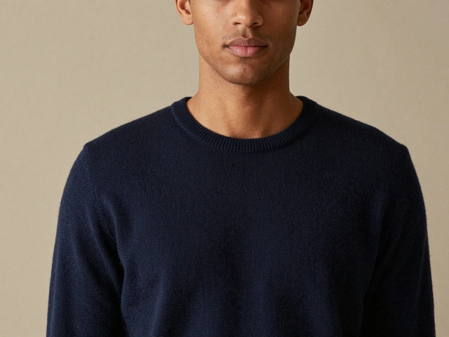
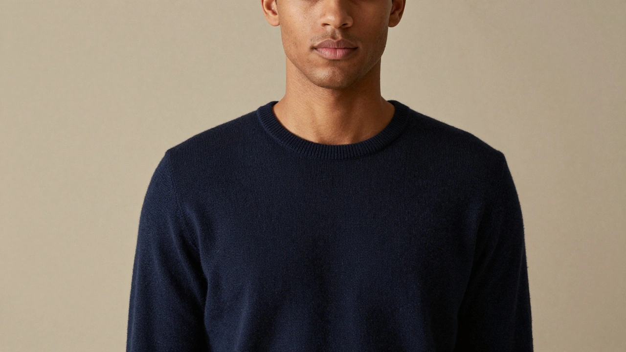
Before you pick a color, before you think about texture, you need to get the fit right. Clothes that are too tight pull across your shoulders or dig into your neck. Clothes that are too loose look sloppy, like you grabbed the first thing off the floor. Professional portrait photographers agree: tailored is the goal. Not necessarily formal. Just clean. A well-fitted sweater, a shirt that doesn’t bunch when you sit, pants that don’t sag or gap at the waist-that’s what creates structure. Structure gives your body a quiet confidence in front of the camera. When you feel put together, you stand taller. Your shoulders roll back. Your eyes look clearer. That’s the difference between a snapshot and a portrait.Color: What Works, What Doesn’t
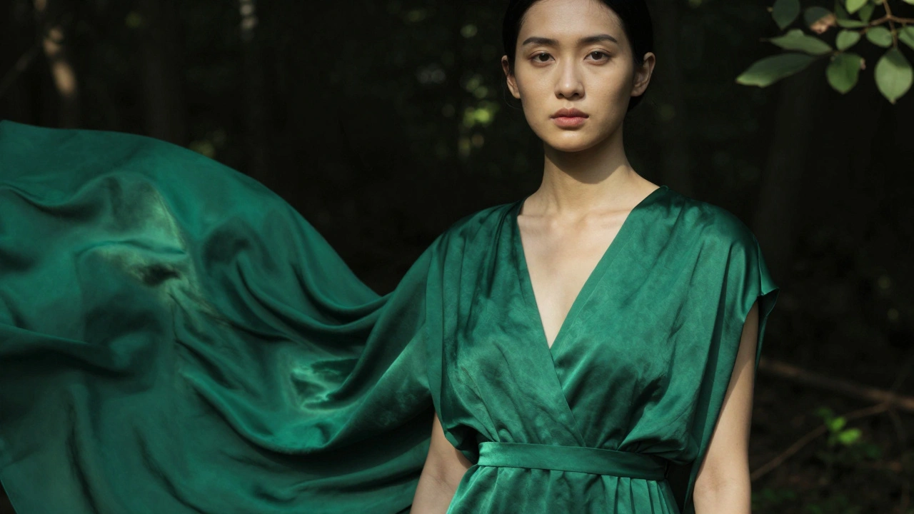
Colors don’t just look different on camera-they behave differently. Bright colors like electric blue, hot pink, or neon green don’t just stand out-they reflect. They bounce light back onto your skin, creating strange tints you didn’t ask for. That’s why photographers avoid them. Instead, they lean into solid, saturated tones. Navy, charcoal, olive, deep burgundy, emerald. These colors hold their depth under studio lights and natural sunlight alike. They don’t fight with your skin tone. They support it. If you have warm undertones (think golden skin, greenish veins, gold jewelry looks better), earth tones like mustard, rust, and olive work best. Cool undertones (pinkish skin, blue veins, silver jewelry) pop with jewel tones: sapphire, plum, and forest green. Neutral undertones? You’re lucky. You can wear both. But avoid pure white. It’s too harsh. Ivory, light gray, or soft blush photograph more naturally. And if you’re doing a black-and-white portrait? Dark solids like black, navy, or charcoal create strong contrast. Pastels like lavender or light pink give you soft, gentle tones. Avoid white shirts in black-and-white shots-they turn into blobs.Texture: Depth Without Distraction
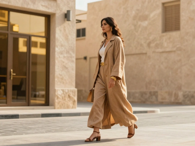
Texture adds dimension. A plain black t-shirt looks flat. A wool sweater? It catches light differently. Linen has a natural ripple. Silk glides. Cotton breathes. These subtle differences make your clothing feel real, not staged. But texture doesn’t mean chaos. Stick to simple fabrics. Wool, cotton, linen, tweed, corduroy. They add richness without shouting. Avoid anything shiny-polyester, satin, or metallic threads reflect too much light. They create hot spots on your skin or make your collar look like a mirror. Patterns? Keep them quiet. A thin pinstripe? Fine. A small floral? Acceptable. A loud plaid, polka dots, or a logo? No. Your face is the story. The shirt shouldn’t be the headline. If you love patterns, layer them under a solid jacket. That way, the pattern is there-but it’s not in charge.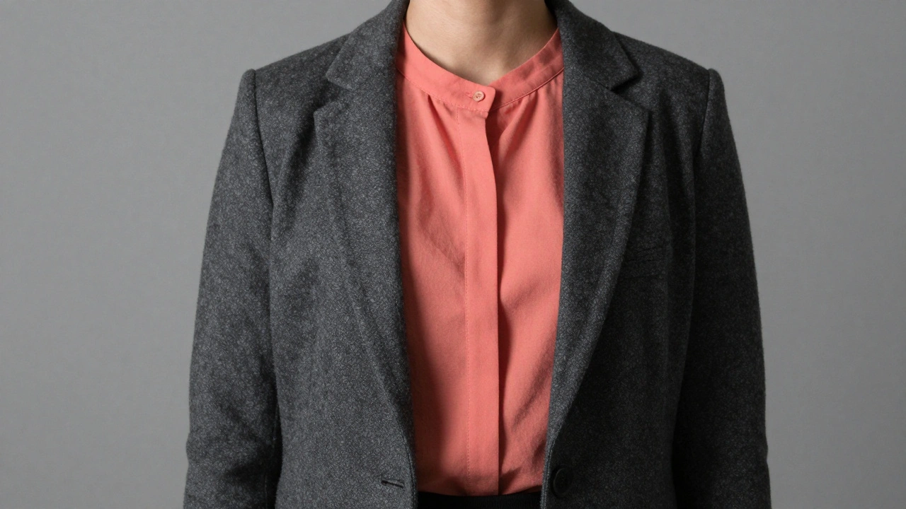
Layering: The Secret Weapon
Layering isn’t just for cold weather. It’s a tool. A cardigan over a bright top? Instant balance. A blazer on top of a patterned shirt? Now the shirt is a detail, not the focus. Layering creates separation. It adds depth. It lets the photographer play with light and shadow. A simple rule: if you’re wearing something bold, put something neutral over it. Navy jacket over a coral top? Perfect. Gray cardigan over a striped tee? Clean. Don’t pile on three layers unless you’re going for a very specific look. Too much bulk makes you look bigger than you are. And remember-jackets should fit your shoulders, not hang off them. Shoulder seams should sit right where your bone ends. That’s the sweet spot.Backgrounds Don’t Lie
Your clothes need to talk to the background. If you’re shooting in a dark studio, wear something that pops. Jewel tones, pastels, even a rich red. They’ll stand out beautifully. But if you’re outside under bright trees or a colorful wall? Tone it down. Stick to neutrals. Beige, gray, soft blue. Let the environment be the star. The same goes for outdoor shoots. Wear earth tones in the woods. Dark greens, browns, muted blues. Don’t show up in a bright yellow dress if you’re standing next to mossy rocks. It doesn’t blend-it clashes. And if you’re in a studio with a white or gray backdrop? You have freedom. But still, avoid white shirts. They vanish. And avoid black if you have light skin. The contrast can be too harsh, washing out your features.What to Avoid
There are some universal no-gos:- **Athletic wear**-sweatpants, hoodies, sports bras. They scream casual, not portrait.
- **Closed-toe shoes**-unless you’re in a full-body shot, no one sees them. Wear open-toed sandals or barefoot if it fits the vibe. Feet shouldn’t be an afterthought.
- **Loose pants**-baggy jeans, harem pants, flowy trousers. They create messy lines and hide your shape.
- **Big jewelry**-chunky necklaces, oversized earrings. They compete with your face. Stick to small studs, delicate chains, or a classic watch.
- **Patterns on patterns**-striped shirt under a plaid jacket? Don’t. It’s visual noise.
- **Undershirts that show**-if you’re buttoning a shirt, make sure there’s no peeking. It’s distracting.
Style by Purpose
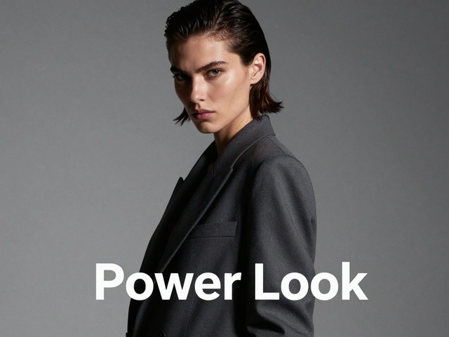
Not every portrait is the same. Your clothes should match the reason you’re being photographed.- Corporate headshots: Tailored blazers, button-down shirts, slim trousers. Navy, charcoal, gray. No patterns. No colors. Just clean, professional lines.
- Casual lifestyle: A fitted tee, jeans, a light sweater. Barefoot or simple loafers. This is about being you-not performing. Wear what you’d wear on a Sunday morning.
- Family portraits: Mix textures. One person in linen, another in knit, someone else in cotton. Avoid matching outfits. Instead, match tones. All neutrals, or all warm tones. Add a scarf or a hat for personality.
- Artistic portraits: Go wild. Silk dresses, asymmetrical cuts, bold colors, lace, ruffles. This is where texture and color become the story. But even here, keep the face clear. Don’t let a hat shadow your eyes.
Confidence Is the Best Accessory
No matter what you wear, if you feel awkward in it, the camera will notice. Your posture will slump. Your smile will feel forced. Your eyes will look away. Portrait photographers know this better than anyone. That’s why they ask you to bring 2-3 outfits. To find the one that doesn’t just look good-but feels right. If you’re fidgeting with your collar, you’re not relaxed. If you’re pulling at your sleeves, you’re not confident. The goal isn’t to look perfect. It’s to look like yourself. And the best way to do that? Wear something you’d choose on a day you feel proud.Wardrobe isn’t about trends. It’s about intention. Every thread you choose should pull attention toward your face-not away from it. When you get that right, the photo stops being a picture. It becomes a moment.
What colors work best for dark skin tones in portraits?
Dark skin tones photograph beautifully with rich, saturated colors like emerald, ruby, sapphire, and deep plum. These tones create contrast without competing. Avoid pastels-they can wash out your skin. Neutrals like charcoal, navy, and chocolate brown also work well. The key is depth. Colors with intensity make your skin glow, not fade.
Should I wear makeup for a portrait session?
Yes, but keep it natural. Heavy foundation can look flat under studio lights. A light tinted moisturizer, a touch of blush, and neutral lip color help your features pop without looking painted. Avoid glitter, shimmer, or glossy lips-they reflect too much light and distract from your eyes.
Can I wear jeans in a professional portrait?
Yes-if they’re well-fitted, dark, and free of rips or fading. Pair them with a tailored blazer or a crisp button-down. This combo works for modern corporate portraits, especially in creative industries. Avoid light-wash or baggy jeans-they read as too casual.
Why do photographers recommend avoiding white shirts?
White reflects too much light, especially under studio lamps or bright sun. It can create harsh highlights on your skin or make your face look washed out. It also blends into white backgrounds, making your upper body disappear. Ivory or light gray are softer alternatives that still feel clean.
Is it okay to wear accessories in portraits?
Yes, but less is more. A simple watch, small stud earrings, or a delicate necklace are fine. Avoid chunky bracelets, dangling earrings, or multiple rings. They draw the eye away from your face. If you’re wearing a necklace, make sure it sits above your collarbone-not down your chest.
Next Steps
Before your next shoot:- Choose 3 outfits: one neutral, one bold, one textured.
- Try them on in natural light. Look in the mirror. Do you feel like yourself?
- Check fit. Are sleeves too long? Are pants pulling? Adjust now.
- Remove any logos, stains, or wrinkles. A quick steam goes a long way.
- Bring a neutral jacket or cardigan to layer if needed.
Portrait styling isn’t about following rules. It’s about making smart choices that let your face speak. When you do that, the photo doesn’t just capture you-it honors you.