Ever wonder why almost every fast-food joint on the planet uses red and yellow? It isn't a coincidence or a lack of imagination. It's a calculated move based on food color theory is the study of how colors influence human appetite, purchasing behavior, and consumption patterns through psychological and physiological triggers . By tweaking the palette of a plate or a dining room, you can literally tell a customer's brain whether to dig in or stop eating.
The biological spark of warm palettes
When we talk about warm colors, we're focusing on Red, Orange, and Yellow. These aren't just "cheerful" colors; they act as physiological stimulants. Research from Frontiers in Psychology shows that red is the most aggressive appetite stimulant because it can actually increase your heart rate and blood pressure. This creates a state of metabolic readiness-your body is essentially being primed to eat.
Yellow plays a different game. Because it's the most visible color in daylight and is naturally linked to sunlight, it triggers feelings of happiness and energy. When people are in a high-energy, happy mood, they tend to focus less on the nutritional value of their meal and more on the pleasure of eating, which often leads to overindulgence.
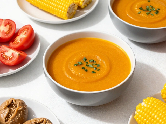
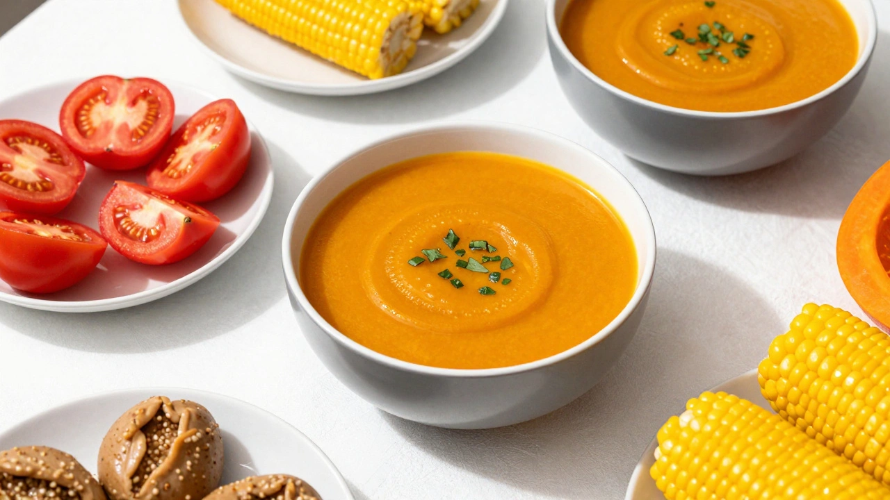
Orange sits right in the middle, offering a sense of heartiness and wholesomeness. Think of the deep orange in a roasted sweet potato or a thick pumpkin soup; the color itself signals a filling, comforting meal before you even take a bite.
Why cool colors act as appetite suppressants
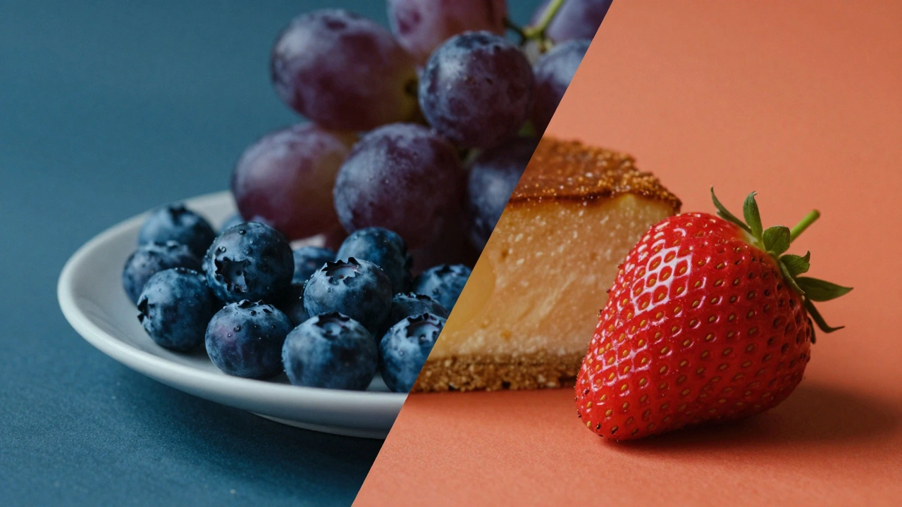
On the flip side, Cool Colors like Blue and Purple generally do the opposite of red. They calm the system down, evoke trust, and-most importantly-they kill the urge to eat. If you look at nature, very few foods are naturally blue. Because of this, humans have an instinctive caution around blue-tinted foods, associating them with spoilage or toxicity.
While a blue-themed restaurant might feel calming and trustworthy, it's a risky move if your goal is to increase the average check size. People simply don't feel the same "hunger urgency" when surrounded by cool tones. However, there are a few natural outliers, like blueberries or blue cheese, that bypass this mental block because we've learned they are safe and tasty.
| Color Group | Key Colors | Physiological Effect | Psychological Trigger | Common Use Case |
|---|---|---|---|---|
| Warm | Red, Yellow, Orange | Increased heart rate, metabolism boost | Urgency, hunger, happiness | Fast food, brunch cafes |
| Cool | Blue, Purple, Teal | Slower heart rate, calming effect | Trust, serenity, caution | Health clinics, luxury spas |
| Earth | Green, Brown, Beige | Balanced sensory response | Naturalness, organic quality | Farm-to-table, coffee shops |
The danger of artificial coloring
Here is where things get tricky. You might think, "I'll just dye my food red to make people crave it more." Stop right there. A landmark study published through the National Institutes of Health (NIH) found that artificial coloring can actually backfire. When 448 women viewed images of sweets, those that were artificially colored red or blue were rated as *less* appetizing than foods in their original, natural colors.
Why does this happen? It comes down to expectation and authenticity. When the brain perceives a color as "fake," it triggers a skepticism response. The appetite-reducing effect was even stronger when participants were told that certain colors suppress appetite, proving that our mental expectations can override the physiological stimulation of a color. To get the most appeal, stick to enhancing natural tones rather than introducing synthetic dyes.
Using earth tones for organic appeal
Not every food brand wants the "urgent" vibe of a fast-food joint. This is where Earth Tones come in. Browns, deep greens, and beiges signal that a product is organic, healthy, and grounded. These colors don't stimulate hunger with the same intensity as red, but they build a different kind of desire: the desire for quality and authenticity.
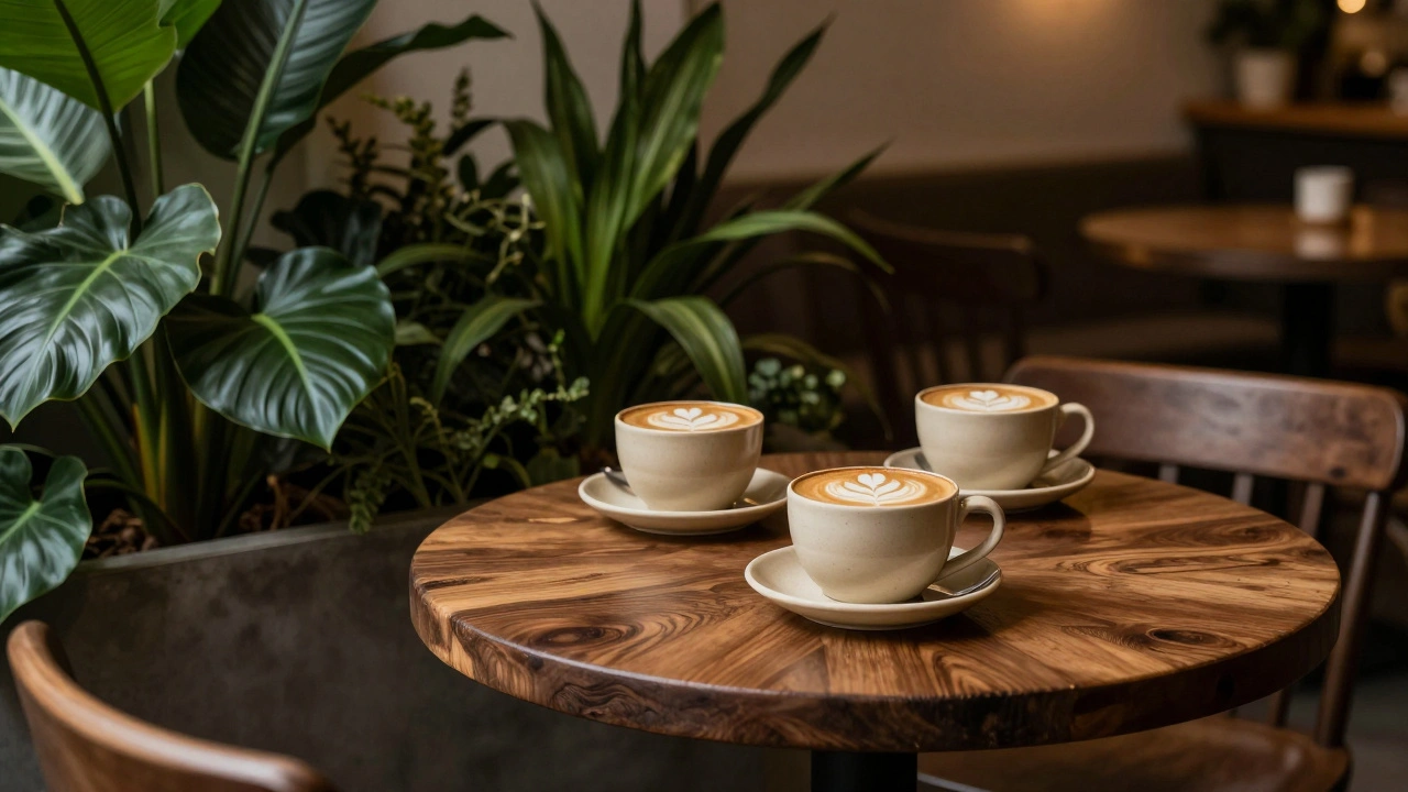
Think about high-end coffee brands or artisanal chocolate shops. They rely heavily on deep browns and creams. These colors communicate richness and luxury without making the customer feel rushed. Similarly, green is the gold standard for health-focused brands because it immediately connects the food to nature and wellness.
Practical application in food styling and design
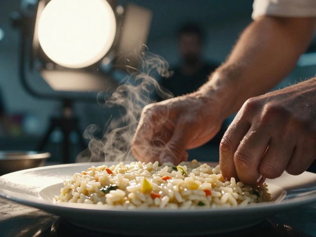
If you're styling a shoot or designing a menu, you can use these triggers to guide the customer's experience. For a casual dining environment, a mix of red and yellow creates energy without causing anxiety. It makes the space feel alive and exciting, which is perfect for high-turnover bistros.
In digital food presentation, such as delivery apps, the stakes are even higher because there's no smell or taste to guide the user. High-saturation warm filters can make a photo feel "cozier" and more welcoming, increasing the likelihood of an impulsive order. If you're designing a plate, consider the contrast: a bright red strawberry on a neutral white plate pops more and looks more enticing than a strawberry on a blue plate.
For those dealing with picky eaters, especially children, sprinkling red vegetables into a dish can make the healthy option look more appealing. It leverages the brain's natural attraction to warm tones to encourage better dietary habits.
Does red always increase appetite?
Generally, yes, because it stimulates the heart rate and metabolism. However, this only applies to natural-looking colors. If the red looks artificial or synthetic, it can actually make food look less appetizing and trigger a rejection response.
Why is blue so rare in food branding?
Blue is a natural appetite suppressant. Because very few foods are naturally blue, our brains often associate the color with things that are not edible or are spoiled, making it a poor choice for encouraging people to eat.
What is the best color combination for a cafe?
A combination of red and yellow is highly effective for creating energy and urgency. If you want a more relaxed, high-end feel, combining earth tones like deep green and brown with neutral creams suggests quality and organic origins.
Can color be used to manage obesity or overeating?
Yes. Since cool colors like blue and purple suppress appetite signals in the brain, using these colors in plating or dining environments can potentially discourage overeating by reducing the visual urge to consume more.
How do earth tones differ from warm tones in appeal?
Warm tones (red/yellow) trigger a fast, physiological response of hunger and urgency. Earth tones (green/brown) trigger a psychological response of trust, health, and natural quality, making the food feel more authentic rather than just "tasty."
What to do next
If you're a restaurant owner, start by auditing your lighting and wall colors. If your customers are staying too long and not ordering enough, a shift toward warmer accents might spark that missing urgency. For photographers, experiment with warm-toned filters in post-production to see if it increases engagement on social media.
If you're focused on a health-conscious brand, avoid the "fast-food red" and lean into the greens and beiges. The goal is to move from "I'm hungry now" to "This is a high-quality choice I can trust."