When you look at a photograph that just feels right-like the colors belong together, like they’re whispering to your eyes-you’re seeing color harmony at work. It’s not magic. It’s math, psychology, and instinct all rolled into one. And in photography, it’s one of the quietest tools that turns a good shot into a great one.
What Is Color Harmony?
Color harmony is simply the art of combining colors so they feel balanced, intentional, and emotionally clear. It’s why a sunset over the ocean looks more dramatic than a gray sky. It’s why a red jacket pops against a green wall. It’s why a black-and-white photo of misty trees can still feel alive.
This isn’t about following rules. It’s about understanding relationships. The color wheel is your guide-not a prison. It’s divided into primary colors (red, blue, yellow), secondary colors (orange, green, violet), and tertiary colors (like yellow-orange or blue-violet). These aren’t just labels. They’re roadmaps.
Complementary Colors: High Contrast, High Impact
Complementary colors sit directly across from each other on the color wheel. Red and green. Orange and blue. Yellow and purple. These pairs are visual opposites. And that’s exactly why they work.
In portrait photography, placing a subject in an orange sweater against a blue wall doesn’t just make them stand out-it makes them command attention. The contrast is so strong, your eye locks onto the person instantly. That’s why product photographers use it: a bright red coffee mug on a cool blue towel? Instant focus. No filters needed.
But here’s the catch: complementary colors can feel jarring if you’re not careful. A pure, saturated red next to pure green? It can shout. To soften it, use tints (lighter versions), shades (darker versions), or tones (grayed-down versions). Think of a sunset: the orange sky isn’t pure orange-it’s layered with pink, gold, and deep amber. The ocean below isn’t just blue-it’s navy, teal, and streaks of reflected light. That’s harmony with depth.
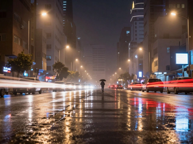
Use complementary schemes when you want energy, urgency, or drama. A wedding dress against a brick wall? A neon sign in a rainy alley? That’s the power of opposites.
Analogous Colors: Smooth, Natural, Calm
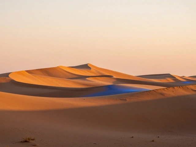
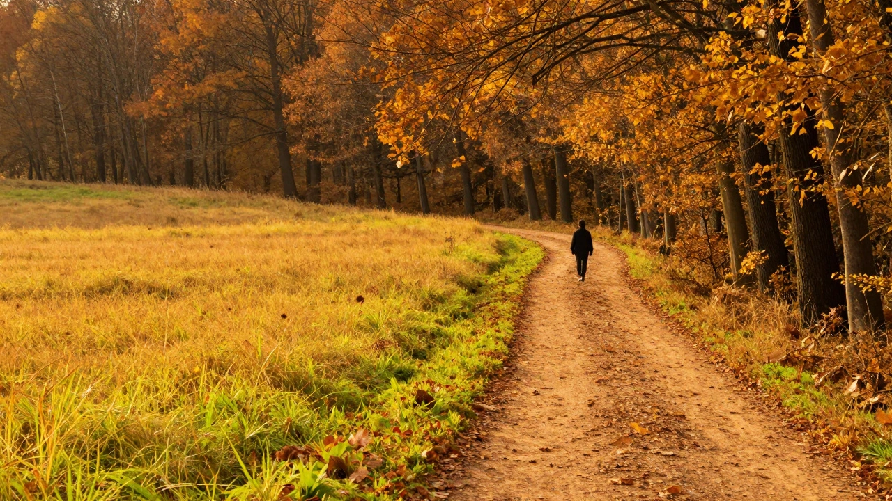
Analogous colors live side by side on the wheel. Think yellow, yellow-green, and green. Or red, red-orange, and orange. These are the colors of nature-sunrise, autumn leaves, forest canopies. They flow into each other. No sharp edges. No tension.
This is the go-to for landscape and nature photography. A field of goldenrod, with hints of lime-green grass and soft ochre dirt? That’s analogous harmony. It feels peaceful. It feels real. It doesn’t demand attention-it invites you in.
It’s also perfect for lifestyle and wellness imagery. A spa photo with soft lavender walls, pale mauve towels, and cream linens? No clash. Just calm. You can use two or three colors here. More than five? You risk losing the harmony. The goal isn’t variety-it’s unity.
Try this: shoot a bouquet of flowers with petals that shift from deep coral to pale peach. Or capture a person in a mustard-yellow coat walking down a sidewalk with warm brown bricks and golden leaves. The colors don’t compete. They whisper to each other.
Monochromatic: One Color, Infinite Mood
Monochromatic doesn’t mean black and white. It means one hue, in every shade, tint, and tone you can find.
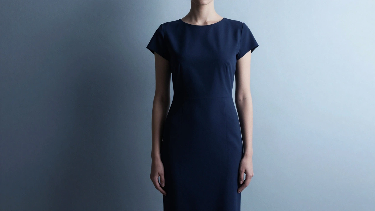
A mountain range at dawn: deep indigo shadows, mid-tone slate, and pale lavender peaks. A forest in winter: charcoal branches, frost-gray snow, and misty silver air. A model in a navy dress, lit with soft highlights that lift the fabric into pale sky-blue and deepen into midnight.
This scheme is all about texture and tone. Without competing colors, your eye reads light, shadow, and form. It’s why monochrome works so well in editorial and minimalist photography. It feels sophisticated. Quiet. Controlled.
Want to add emotion? Play with saturation. High saturation in a monochromatic shot-like vivid emerald foliage-feels lush, alive. Lower saturation? That’s moody. Mysterious. Perfect for foggy mornings or rainy cityscapes.
Portrait photographers love this. A subject with cool-toned skin, dressed in a gray-blue sweater, standing in front of a wall with the same hue, but slightly darker? The face becomes the story. The color just holds the space.
How Color Models Help You Edit
When you’re editing in Lightroom or Capture One, you’re not just adjusting RGB sliders. You’re working in HSL: Hue, Saturation, Lightness.
Hue is the color itself-what you’d name it on the wheel. Saturation is how intense it is. Lightness? How bright or dark it appears.
Want to make a green tree pop without changing the sky? Adjust the green hue slightly toward yellow, then boost saturation. Want to mute a distracting red in the background? Lower its saturation. That’s how you control harmony after the shot.
And don’t forget value-the lightness or darkness of a color. A high-contrast monochrome image can be more powerful than a rainbow. A dark silhouette against a bright sky? That’s value doing the work. It’s why black-and-white photography still matters: because light and shadow are the truest forms of contrast.
When to Use Which Scheme
There’s no one-size-fits-all. But here’s a quick cheat sheet based on what you’re trying to say:
- Complementary: Use when you want drama, energy, or to highlight a subject. Great for portraits, product shots, and action scenes.
- Analogous: Use when you want calm, flow, or natural beauty. Perfect for landscapes, lifestyle, and branding that feels warm and inviting.
- Monochromatic: Use when you want elegance, depth, or emotional subtlety. Ideal for editorial, fashion, and moody environments.
Don’t force it. Look around. Notice how the light hits a wall at 4 p.m. Notice how the shadows under a tree blend into the grass. That’s color harmony already happening. Your job is to see it-and then frame it.
Common Mistakes to Avoid
Not every colorful scene needs a harmony scheme. Sometimes, a chaotic mix of colors is the point. But if you’re aiming for impact, avoid these:
- Using three saturated complementary colors at once. It’s overwhelming. Stick to one dominant, one accent.
- Forgetting value. A bright red and bright green can still clash if they’re both too light or too dark.
- Ignoring your subject. Color should support the story, not steal it. A red dress in a green field? Beautiful. A red dress in a red field? You’ve lost the subject.
- Over-editing. Pushing saturation too far turns a natural scene into a cartoon. Less is often more.
Test this: shoot the same scene three ways-complementary, analogous, monochromatic. Compare them. You’ll see how each changes the mood. That’s how you learn.
What’s the easiest way to find complementary colors in the field?
Use your phone’s camera in grayscale mode. Turn on black-and-white preview. Now look for strong contrasts between light and dark areas. The areas that pop the most are likely complementary. You don’t need to see the color-you just need to see the contrast.
Can I use more than three colors in an analogous scheme?
Technically, yes. But the more colors you add, the harder it is to maintain harmony. Stick to two or three for clarity. If you’re using five, you’re probably just shooting a busy scene-not applying a harmony. Let the scene guide you, not the rulebook.
Do I need to edit my photos to achieve color harmony?
Not always. Many of the best color harmonies happen naturally-in golden hour light, in autumn forests, or under neon signs. But editing helps you refine it. You can mute a distracting color, boost a subtle tone, or deepen shadows to add depth. It’s not about fixing-it’s about enhancing what’s already there.
Is monochromatic photography only for black and white?
No. Monochromatic means one hue, not one tone. A photo with only shades of blue-navy, teal, sky, and ice-is monochromatic. So is a shot with only warm grays and golds. Black and white is just one type of monochrome. The real power is in using color, but staying within one family.
How do I train my eye to see color harmony?
Start by studying paintings. Look at Monet’s water lilies-how he uses analogous greens and blues. Or Van Gogh’s starry nights-complementary yellows and purples. Then go outside. Walk through your neighborhood. Look at buildings, cars, street signs. Ask yourself: what colors are working together? Why? That’s how you build intuition.
