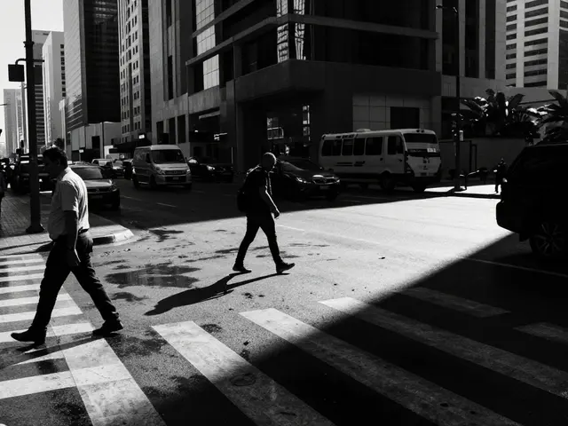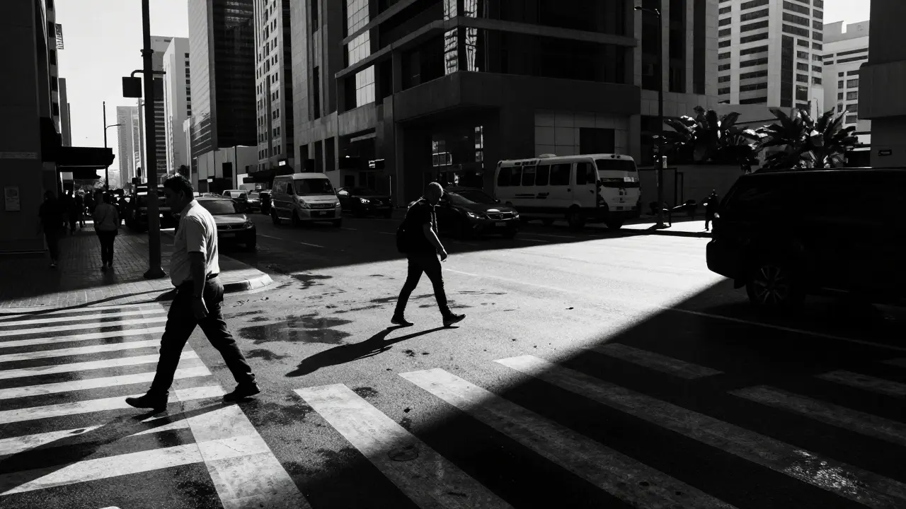
Color is a distraction. That’s the first thing you learn when you strip it away from a street scene. In Black and White Street Photography is a genre that relies on tonal contrast, texture, and geometry to convey emotion rather than relying on hue. When you shoot in monochrome, the viewer’s eye goes straight to the light, the shadow, and the human element. If you’ve ever looked at a color photo of a rainy city street and thought, “It looks muddy,” but then saw a black-and-white version of the same moment and felt a chill go down your spine, you know exactly what I mean.
The magic isn’t just in the camera settings; it’s in how you process the file. Many photographers convert to B&W in-camera and stop there. But if you want impact, you need to understand how luminance channels work. You need to know why a blue sky turns into a deep charcoal while a yellow taxi cab becomes a bright highlight. This guide breaks down the technical side of converting and processing street images so they hit hard, not just technically correct, but emotionally resonant.
Why Monochrome Works Better on the Street
Street photography is chaotic. People are moving, lights are flickering, and colors can clash in ways that distract from the story. By removing color, you simplify the visual noise. The brain stops trying to categorize objects by their hue and starts looking at shapes and relationships. This is why Tonal Contrast is the primary driver of visual interest in monochrome imagery, defined by the difference between the brightest highlights and darkest shadows.
Consider a busy intersection in Tokyo or New York. In color, the reds of signs and the blues of jackets compete for attention. In black and white, those elements become mid-tones. The focus shifts to the stark white of a cloud against a dark building, or the sharp line of a pedestrian’s silhouette. It forces the viewer to engage with the composition rather than the palette. For street photographers, this is a superpower. It allows you to capture moments that might feel visually cluttered in color but become powerful graphic statements in grayscale.
The Science of Luminance Channels
Here is where most people get stuck. They think converting to black and white is just desaturating the image. It isn’t. Desaturation averages out all color information equally, which often results in flat, lifeless images. True conversion uses Luminance Masks are tools that allow independent control over the brightness of specific color channels during conversion. Every color in your image has a specific luminance value. Yellow is very bright (high luminance). Blue is very dark (low luminance). Green sits somewhere in the middle.
When you convert an image, the software calculates these values. If you have a bright yellow wall behind a subject, that wall will appear as a light gray or white in your final image. If you have a deep blue sky, it will turn into a dark gray or black. Understanding this relationship is crucial. You don’t just “convert” the image; you sculpt the tones based on the original colors. This is why shooting in RAW is non-negotiable for serious B&W street work. JPEG files lock in these conversions early, giving you far less flexibility later.
| Color Channel | Relative Brightness (0-100) | Visual Effect in B&W |
|---|---|---|
| Yellow | 95% | Becomes near-white; great for backgrounds |
| Green | 60% | Mid-tone; can look muddy if unadjusted |
| Blue | 30% | Becomes dark gray/black; ideal for skies |
| Purple | 40% | Darker mid-tone; subtle depth |
Pre-Shoot Strategy: Seeing in Grayscale
You can’t fix a bad exposure in post if you didn’t capture the dynamic range. On the street, you need to anticipate how colors will translate. A pro tip: keep your camera’s histogram in mind, but also train your eyes. Look for scenes with strong natural contrast. Think about the time of day. Mid-day sun creates harsh shadows that can be dramatic in B&W, but they can also crush detail. Overcast days provide soft, even lighting that is perfect for capturing texture in faces and wet pavement without blowing out highlights.
Pay attention to clothing. A person wearing a bright yellow raincoat will stand out dramatically against a gray background. Conversely, someone in a navy suit might disappear into a dark alley unless you adjust the blue channel slider up in post-processing. This pre-shoot awareness separates the pros from the amateurs. You aren’t just clicking the shutter; you’re mentally previewing the final black-and-white image before you even press the button.
Processing Workflow for Maximum Impact
Once you’re back at your desk, the real work begins. Most modern editing software, like Adobe Lightroom or Capture One, offers robust B&W controls. Here is a streamlined workflow that works for high-impact street photos:
- Convert to Grayscale: Use the dedicated B&W module, not just a saturation slider. This activates the individual channel sliders.
- Adjust Blue and Yellow Sliders: These two usually have the biggest impact. Lower the Blue slider to darken skies and denim. Raise the Yellow slider to lighten skin tones and concrete.
- Check Skin Tones: Skin is tricky. It’s a mix of orange, red, and yellow. Adjust the Orange and Red sliders carefully to ensure subjects don’t look too dark or washed out.
- Add Local Contrast: Use the Clarity and Dehaze tools sparingly. Too much makes the image look artificial. A slight boost helps separate foreground subjects from busy backgrounds.
- Crop Tight: Street photography benefits from tight crops. Remove distracting edges. Focus on the emotional core of the frame.
Don’t forget about grain. Digital sensors are clean, sometimes too clean. Adding a subtle layer of digital grain can mimic the texture of film stocks like Kodak Tri-X or Ilford HP5+. This adds a tactile quality that feels more authentic to the street photography tradition. Keep it subtle; you want texture, not noise.
Common Pitfalls to Avoid
Even experienced photographers make mistakes in B&W processing. The most common one is over-processing. Because you have so many sliders, it’s easy to push them to extremes until the image looks unnatural. Aim for a balance. If the blacks aren’t pure black, that’s okay. Sometimes a slightly lifted black gives the image a softer, more nostalgic feel. Another mistake is ignoring the mid-tones. While highlights and shadows draw the eye, the mid-tones carry the detail. If your mid-tones are flat, the image lacks depth. Use the tone curve to add a gentle S-curve to bring life back to the mids.
Also, beware of the “HDR look.” Heavy use of local adjustments can create a plastic, hyper-realistic appearance that clashes with the candid nature of street photography. Keep your edits organic. The goal is to enhance the reality, not replace it.
Frequently Asked Questions
Should I shoot in RAW or JPEG for black and white street photography?
Always shoot in RAW. RAW files retain all the color information, allowing you to manipulate individual color channels during conversion. JPEG files compress this data, limiting your ability to fine-tune the luminance of specific colors later.
Which color channel has the most impact on the final image?
The Blue and Yellow channels typically have the most significant impact. Blue affects skies and denim, while Yellow affects skin tones and concrete. Adjusting these two sliders first usually gets you 80% of the way to a good result.
Is it better to convert to black and white in-camera or in post-production?
In-camera conversion is useful for quick previews and ensuring you have a usable backup. However, post-production offers far greater control over tonal separation and detail recovery. For maximum impact, always convert in post using RAW files.
How do I prevent skin tones from looking too dark in B&W?
Skin tones are composed of red, orange, and yellow hues. If they appear too dark, raise the Orange and Red channel sliders slightly. Be careful not to overdo it, or the skin may look washed out. Test on a small crop to see the effect clearly.
Do I need to add grain to digital black and white photos?
Grain is optional but recommended for many styles. It adds texture and reduces the sterile look of digital sensors. Use a subtle amount that mimics medium-format film. It helps blend the image together and gives it a classic aesthetic.