When you see a fashion photo that feels perfect - like the model is floating in a world made just for her dress - it’s not luck. It’s background. Too often, beginners treat the background as something to fill the space behind the model. But in fashion photography, the background isn’t just behind the subject. It’s part of the story. It tells the viewer where this outfit belongs, what mood it carries, and whether it’s meant to be seen on a city street, in a silent studio, or under the glow of a neon sign at midnight.
Why Backgrounds Don’t Just Frame - They Speak
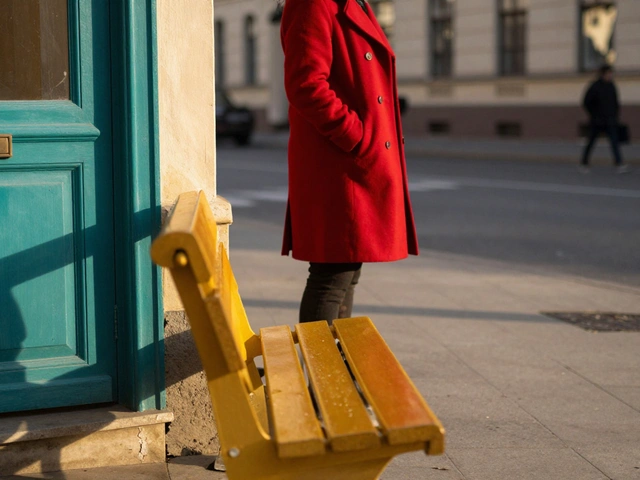
Think about the last time you saw a luxury gown on a model standing in front of a busy street. The outfit was stunning. But the background? A cluttered alley with trash cans and a flickering sign. Suddenly, the dress didn’t look expensive. It looked confused. That’s because a background doesn’t just hold the subject. It talks to it. A silk gown needs silence. A leather jacket needs grit. If the background doesn’t match the clothing’s voice, the whole image falls apart.
Professional photographers don’t pick backgrounds after choosing the clothes. They pick them at the same time. The outfit and the setting are designed together - like a pair of shoes and a dress. You wouldn’t wear stilettos to hike a mountain. And you shouldn’t put streetwear in front of a white studio wall unless you’re going for irony.
Studio Backdrops: More Than Just Color
Most shoots start in a studio. And in a studio, you have control. That’s why the choice of backdrop matters even more. Here’s what works - and what doesn’t.
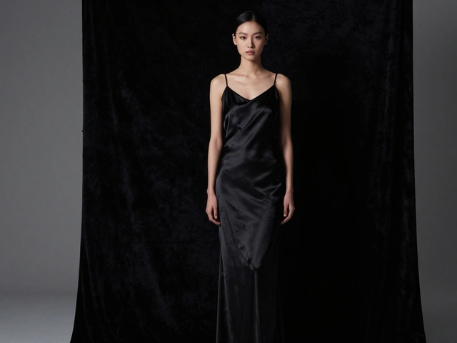
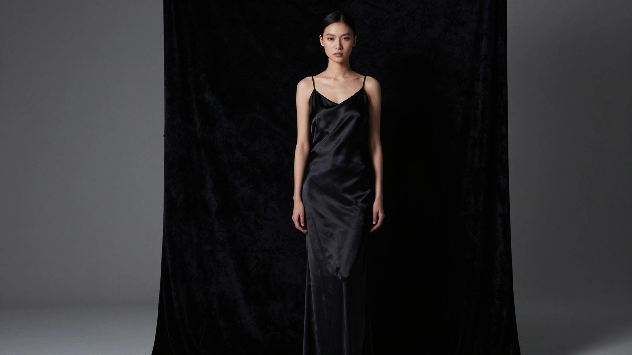
- Black backdrops aren’t just dark. They’re deep. Used right, they make skin glow and fabric pop. The key? Keep the light off the wall. If any light hits it, you lose the drama. Position the model at least 3 feet away. Use flags or grids to block spill. A black backdrop should feel like a void - not a painted wall.
- White backdrops are the opposite. They’re bright, clean, and demanding. To make them work, you need to overexpose the background by at least 3 stops. That means your subject’s lighting is dimmer than the wall. It creates that crisp, editorial look you see in high-end catalogs. But if you underexpose it? You get a gray, muddy mess.
- Textured or painted backdrops add character. Think cracked plaster, brushed metal, or a soft watercolor wash. These aren’t for every shoot. But when you’re doing a vintage collection or a high-fashion editorial with artistic intent, they add soul. Lindsay Adler uses hand-painted Savage Seamless backdrops - like "Tangelo #82" - to match the exact hue of a dress. The result? The outfit and the background breathe the same color.
- Green screens aren’t just for movies. They’re for flexibility. Need your model to stand on a rooftop in Tokyo, but you’re in Portland? Shoot on green, then drop in the skyline. But don’t overuse it. If the lighting doesn’t match the digital background, the model looks like a cutout. Always match your key light direction to the virtual scene.
Outdoor Locations: Let the City Do the Work
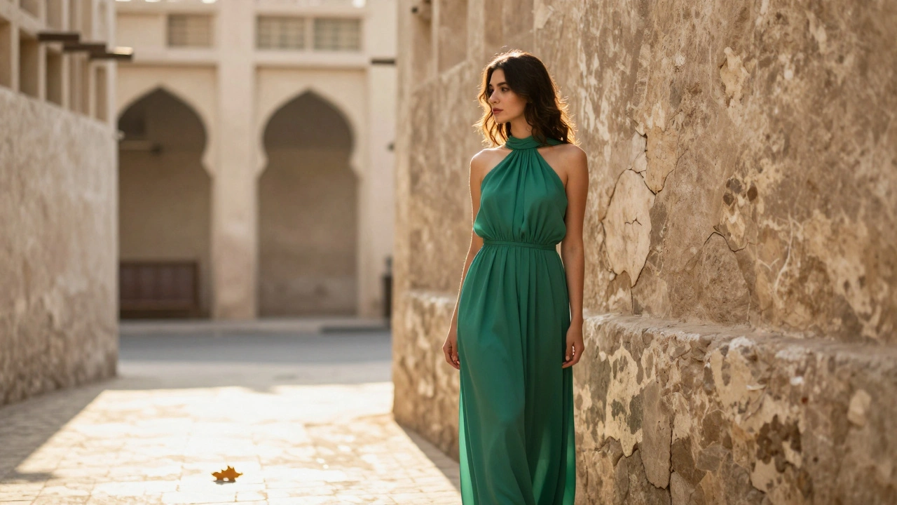
Urban settings aren’t just convenient. They’re powerful. A tailored blazer looks sharper against a brick wall. A flowing gown gains movement when shot near a fountain or rustling trees. But outdoor shooting isn’t just "find a pretty spot." It’s about reading the environment.
Here’s how to pick the right one:
- Color clash kills. If your model is wearing a bright red coat, avoid a red brick wall. Your eye won’t know where to land. Instead, find a wall with neutral tones - gray, weathered wood, or concrete. Let the coat stand alone.
- Light direction matters more than you think. A sunny alley with a narrow opening can create natural rim lighting. Use it. Position the model so the sun hits the edge of their shoulder, not their face. That creates depth. If the sun is behind them? You’re not shooting a portrait - you’re shooting a silhouette. Both work. Just know which one you want.
- Movement is your friend. A busy street can be distracting. But a single leaf blowing across pavement? That’s poetry. Let motion happen naturally. Don’t stage it. Capture it.
- Architecture tells stories. A curved staircase suggests elegance. A rusted fire escape suggests rebellion. Choose the shape of the space to match the vibe of the clothes. A structured suit? Go for clean lines. A flowy, bohemian dress? Look for curves, arches, vines.
Color Theory: The Silent Director
You don’t need to be an artist to use color. But you do need to understand contrast.
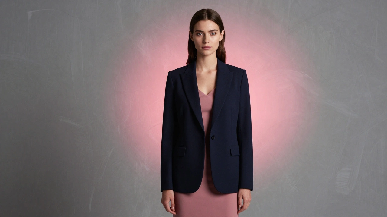
Here’s the rule most pros follow: Make the clothing darker than the skin, and lighter than the background. That creates a visual hierarchy. Your eye goes: face → clothing → background. Done right, it’s effortless.
Let’s say you’re shooting a model in a navy blue dress. The skin tone is medium. The background? A soft gray. That’s safe. But if you put the dress against a dark gray wall? The dress disappears. If you put it against a bright white wall? The dress looks flat. The solution? A background that’s slightly darker than the dress. Not much. Just enough to let the dress float.
And don’t forget lighting gels. Lindsay Adler doesn’t just match the backdrop color. She matches the light. She puts a pink gel on a light behind the model - not to make it look weird, but to echo the pink in the dress. Suddenly, the whole image feels connected. Like it was painted in one breath.
Blurred Backgrounds: Soft Focus, Sharp Impact
Shooting wide open - f/2.8 or lower - isn’t just for portraits. It’s a secret weapon in fashion. A blurred background doesn’t mean you’re avoiding the setting. It means you’re curating it.
Take a model in a floral dress. Shoot her in front of a garden. If you’re at f/16, every petal is sharp. The dress competes with the flowers. But at f/2.8? The flowers melt into a soft haze. The dress becomes the focus. The garden becomes a mood, not a distraction.
This technique works best with textured backdrops - brick, trees, glass buildings. The blur turns chaos into art.
Lighting the Background: It’s Not an Afterthought
Most photographers light the model. Then they forget the background. Big mistake.
For a black backdrop, you want zero light. But for a colored or textured one? You need to control it. Here’s how:
- Use a separate light - not the same one on the model.
- Place it behind the model, aimed only at the backdrop.
- Use a grid or snoot to keep the light from spilling onto the subject.
- Adjust the power so the background is either 1 stop darker (for depth) or 1 stop brighter (for lift).
Adler’s 3-light setup isn’t magic. It’s logic. Two lights with pink gels on either side, high and behind, create a rim that matches the dress. The third light? On the model, clean and soft. The result? A photo where the background doesn’t compete - it sings.
Common Mistakes (And How to Fix Them)
- "I just used what was there." That’s not a location. That’s an accident. Always scout. Walk around. Shoot test frames. Look for shadows, reflections, trash cans, power lines.
- "The background looks cool." Cool doesn’t mean good. If it doesn’t serve the outfit, it’s noise.
- "I’ll fix it in post." You can’t fix bad composition. You can’t make a dull background interesting in Photoshop. You can only make it less bad.
- "I used a white backdrop because it’s easy." Easy isn’t powerful. If you’re always using white, you’re not growing. Try textured. Try color. Try shadows.
Final Rule: The Background Is a Character
It’s not scenery. It’s not a prop. It’s a character in the story. And like any good character, it should have personality, purpose, and restraint.
A fashion photo isn’t just about what’s on the model. It’s about where she stands. What she’s reacting to. What the world around her whispers. The background doesn’t need to be loud. It just needs to be right.
What’s the best background color for fashion photography?
There’s no single "best" color - it depends on the clothing and mood. Black works for drama, white for clean editorial, and muted tones like gray or beige for versatility. The key is contrast: the clothing should be darker than the skin tone and lighter than the background to guide the eye naturally.
Can I use a green screen for outdoor fashion shoots?
Yes, but only if lighting matches. A green screen lets you replace the background later, but if the light on the model doesn’t match the digital background (e.g., sunlight direction vs. studio lighting), the model will look fake. Use it for flexibility, not convenience.
How far should the model stand from the backdrop?
Start with 3 feet. This creates enough space to avoid shadows on the backdrop and gives room for background lighting. For a soft blur effect, move closer. For sharp separation and control, move farther - especially with dark backdrops.
Do I need to match the backdrop color to the clothing?
Not exactly. But you should harmonize them. Using complementary colors (like orange dress with a muted blue backdrop) creates contrast. Using similar tones (like a red dress with a deep crimson backdrop) creates unity. The goal is to make the outfit and background feel like they belong together - not compete.
Why do some fashion photos have blurry backgrounds?
A blurred background (using wide apertures like f/2.8) removes visual noise and directs attention to the model and clothing. It’s especially useful in busy environments like streets or gardens. The blur turns distractions into mood, not clutter.