You spend hours perfecting that sauce, arranging the garnish, and waiting for the light to hit just right. Then you snap the photo, and it looks… flat. The colors clash. The background screams for attention instead of letting the dish shine. This isn’t a lighting problem. It’s likely your props and backgrounds.
In food photography, these elements are not just decoration. They are the stage. They tell the story before the viewer even tastes the meal visually. Whether you are shooting a rustic loaf of sourdough or a sleek modern dessert, the surfaces and objects around your food dictate the mood. Get them wrong, and you distract the eye. Get them right, and you create an image that feels authentic, appetizing, and professional.
The Golden Rule: Food Is Always the Hero
Before buying a single board or bowl, understand this core principle: the food must always be the most interesting thing in the frame. Every expert in the field, from educators at Food Photography Academy led by Lauren Caris Short to seasoned bloggers at Photofocus, agrees on this hierarchy. If someone looks at your photo and comments on how cool your plate is before they notice the burger, you have failed.
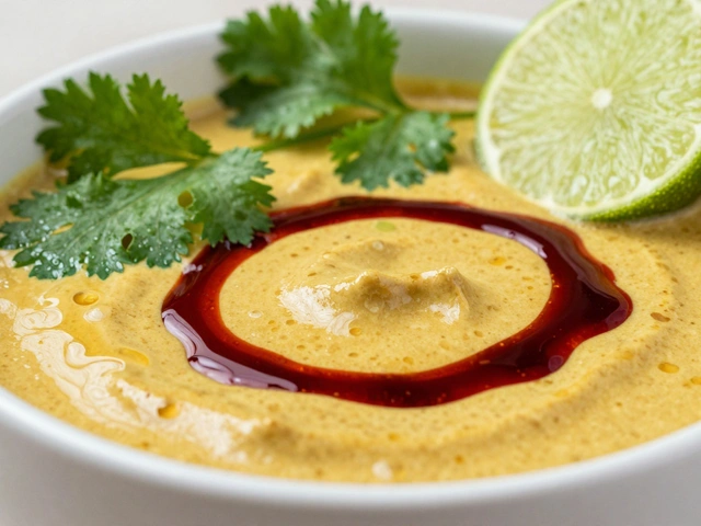
Props and backgrounds are supporting actors. Their job is to add context, depth, and texture without competing with the subject. A bold, bright red background might look great in isolation, but it will overpower subtle greens and browns in a salad. Instead, aim for neutrality. Think of your background as a canvas that enhances the natural colors of the ingredients rather than fighting them.
Choosing the Right Backgrounds
Your background sets the tone. It is the foundation upon which everything else sits. When selecting surfaces, consider color, size, finish, and texture.
Color and Tone
Neutral tones are your best friend. Greys, off-whites, and muted earth tones allow almost any food to pop. Lauren Caris Short often recommends grey-toned backgrounds because they provide a versatile base where nearly every ingredient looks good. Avoid bold, saturated colors unless you have a very specific stylistic reason for them. Bright blues or hot pinks tend to draw the eye away from the food immediately.
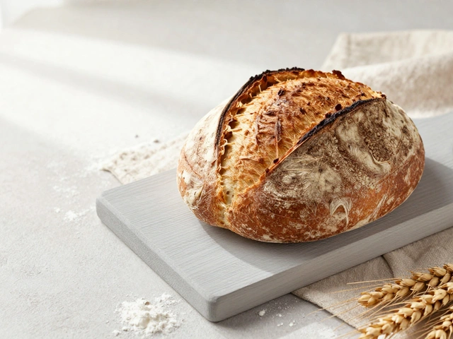
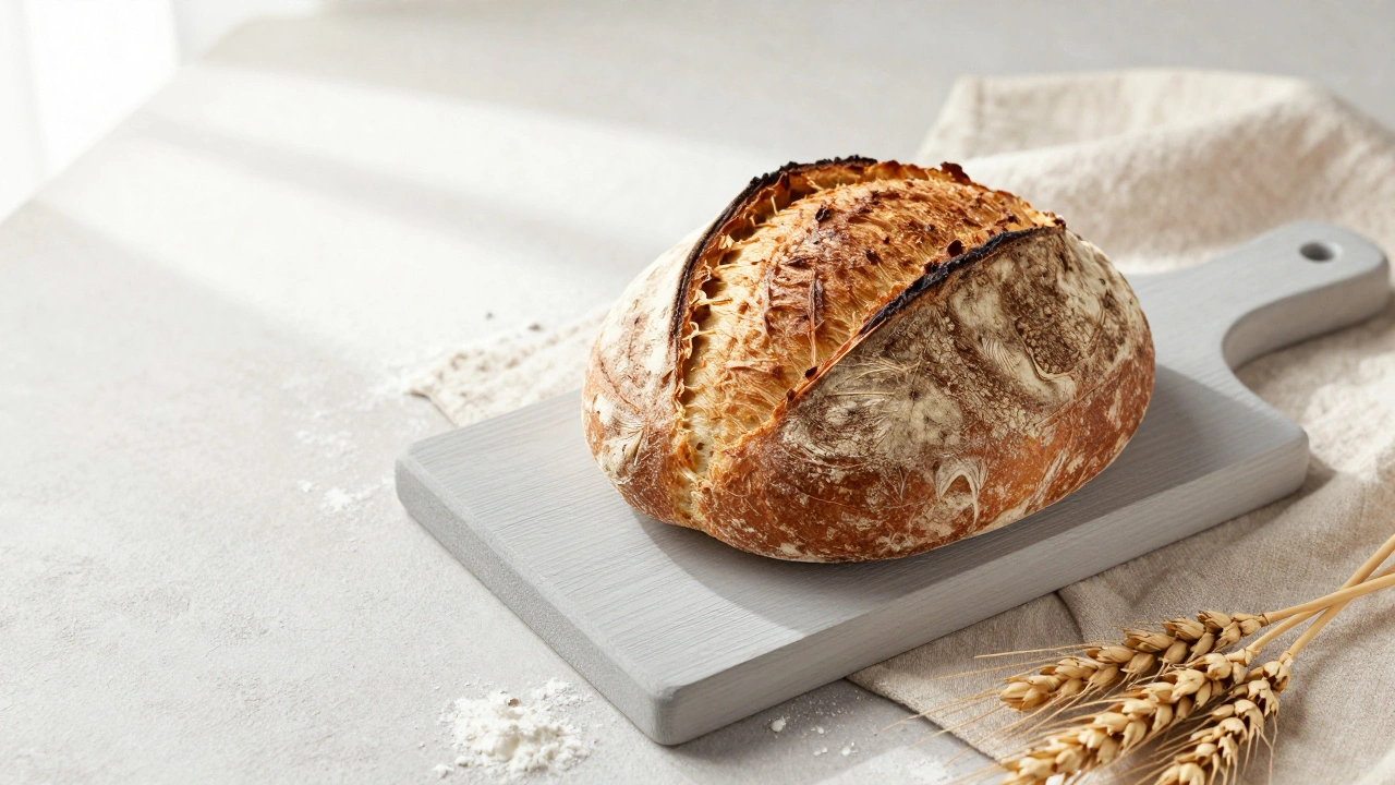
Cool-toned backgrounds (greys, soft blues, purples) work exceptionally well with warm-toned foods like breads, stews, and roasted meats. The contrast makes the warm colors appear richer and more inviting. Warm woods can also work, but they require careful pairing to ensure they don’t blend too seamlessly with browned crusts or sauces.
Size Matters
A common mistake beginners make is using backgrounds that are too small. You need enough surface area to compose your shot, especially if you are shooting overhead tablescapes. A minimum size of 2 ft × 3 ft (approximately 60 cm × 90 cm) is recommended by industry standards. This ensures you can place your dish with negative space around it without the edge of the backdrop creeping into the frame. If your background is smaller, you risk awkward cut-offs that break the illusion of a continuous surface.
| Material | Pros | Cons | Best For |
|---|---|---|---|
| Matte Vinyl | Waterproof, rollable, affordable | Can glare under hard light, less texture | Messy shoots, travel |
| Rigid Wood Boards | Realistic texture, durable, matte finish | Heavy, expensive, hard to store | Rustic, artisanal styles |
| Hand-Painted Surfaces | Unique, artistic, high-end look | Very expensive, fragile | Editorial, high-budget commercial |
| DIY Tyvek/Vinyl Prints | Customizable, water-resistant | Requires printing setup, can wrinkle | Specific pattern needs |
Finish: Matte vs. Shiny
Always choose matte over glossy. Shiny surfaces reflect light, creating distracting hotspots and reflections that are difficult to remove in post-processing. Two Loves Studio emphasizes that matte surfaces handle directional light gracefully and preserve the texture of the food. Even vinyl backdrops from brands like Club Backdrops advertise low-sheen finishes specifically to avoid this issue. If your background reflects the window or your camera lens, it’s the wrong choice.
Texture and Visual Complexity
Flat, solid colors can look sterile. Look for surfaces with "oodles" of texture-subtle grain, specks, cracks, or imperfections. Real-to-the-touch textures read as authentic in photos. A lightly distressed wooden board tells a story of use and history, while a smooth, perfect slab might feel artificial. Variety is key; having one concrete-style board, one weathered wood, and one dark slate gives you options for different moods.
Building Your Prop Collection
Props include everything in the frame except the food itself. Plates, linens, utensils, and decorative items all fall into this category. The goal is to build a collection that supports various narratives without cluttering the scene.
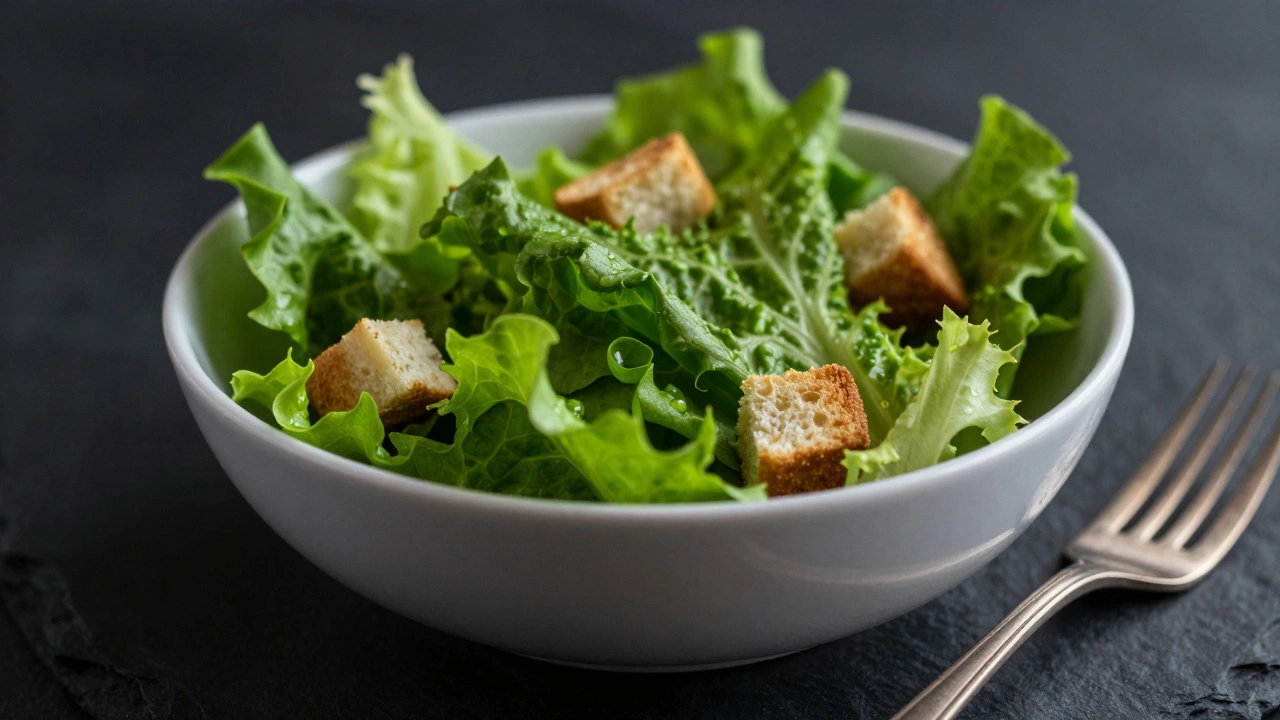
Dinnerware: Simple and Neutral
Start with white or off-white plates and bowls. They are versatile and clean-looking. Keep a variety of sizes and shapes-one shallow bowl for soups, one deeper bowl for salads, and plates of different diameters. Add a few darker, textured ceramics (like stoneware or speckled clay) for moody, rustic shots. Limit colorful or patterned dishes to a small number; use them sparingly as accents, not as the main event.
Linen and Textiles
Fabric adds softness and guides the eye. White or neutral linen napkins, dish towels, and tablecloths are essential. They introduce folds and lines that lead the viewer toward the food. Darker linens can create a dramatic, moody atmosphere. Start with two or three neutrals (white, beige, grey) and perhaps one with a subtle stripe or texture for character. Avoid busy patterns that compete with the food’s details.
Utensils and Cookware
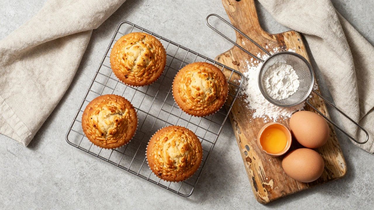
Choose utensils that match your style. Tarnished silverware, wooden spoons, and patina-rich serving pieces suggest a home-cooked, lived-in feel. Vintage baking trays, muffin tins, and cooling racks are excellent for storytelling, especially for baked goods. Broma Bakery highlights sifters and measuring cups as great props for baking narratives. Make sure they are clean but show signs of gentle use; pristine, shiny new cookware can look out of place in rustic scenes.
Structural Props
Baskets, crates, and risers help create depth. A wire basket for eggs or fruit adds a farmhouse vibe. Wooden crates can elevate a dish slightly, allowing you to layer elements in the foreground and background. These structural props help you move beyond a flat, top-down view and add dimension to your composition.
Styling Techniques for Authenticity
Having the right tools is only half the battle. How you arrange them matters just as much.
Layering and Depth
Don’t just place items side-by-side. Layer them. Place a linen under a cutting board, then put the dish on the board. Use risers to vary heights. This creates visual interest and prevents the image from looking flat. Ensure you have elements in both the foreground and background to frame the hero dish, but keep them blurred or secondary so they don’t steal focus.
The Power of "Mess"
A perfectly clean scene can feel sterile. Add intentional mess to suggest activity. Sprinkle a little flour, salt, or pepper around the edges. Leave some crumbs near a sandwich. Spray fresh fruits and vegetables with water to create droplets that imply freshness. The key is subtlety. Too much mess looks dirty; just enough looks authentic. As Photofocus advises, surround the dish with relevant ingredients-herbs, spices, or raw components-that hint at how the dish was made.
Odds and Evens
When grouping items, use odd numbers. Three apples, five eggs, or seven herbs look more natural and visually pleasing than even numbers. This is a classic design principle known as the "rule of odds." It creates a sense of balance without symmetry, which can feel rigid.
Incremental Staging
Start with just the food. Take a photo. Then add one prop. Take another photo. Continue adding elements one by one. This allows you to see exactly how each prop affects the composition. It’s easy to get carried away and clutter the scene. By building slowly, you can identify what works and what distracts. Digital photography allows you to shoot extensively and edit down later, so take advantage of that flexibility.
Starting Kit Recommendations
You don’t need to spend thousands to start. Experts recommend building a small, versatile kit first. Here is a practical list based on advice from Rachel Korinek of Two Loves Studio and other industry leaders:
- Backgrounds: 2-3 matte boards (one light grey, one mid-tone wood/concrete, one dark charcoal/wood). Each at least 2 ft × 3 ft.
- Dinnerware: 2-4 white/off-white plates in varying sizes, 2-3 bowls (shallow and deep), 1-2 dark textured ceramics.
- Cutlery: A small set of plain silverware and 1-2 vintage/tarnished pieces.
- Linen: 2-3 neutral napkins/dish towels (white, beige, grey) and one with subtle texture.
- Boards: One medium-sized wooden cutting board.
- Functional Props: One baking tray or cooling rack, a few small ramekins.
Invest in quality where it counts-especially in backgrounds and primary dinnerware. You can always add more specialized props later as your style evolves.
Maintenance and Cleanliness
A clean set is a happy set. Spills happen. Sauce splatters. Crumbs scatter. Before every shoot, meticulously clean your plates, bowls, and backgrounds. A small stain in reality becomes a giant distraction in a high-resolution photo. Choose materials that are easy to wipe down. Vinyl backdrops are waterproof and ideal for messy shoots. Rigid wood boards may need occasional sealing or wiping. Hand-painted surfaces require gentler care. Regular maintenance ensures your props remain versatile and ready for any dish.
What is the best color for food photography backgrounds?
Neutral tones like grey, off-white, and muted earth tones are generally the best. Grey is particularly versatile because it complements almost all food colors without competing. Cool-toned backgrounds (soft greys, blues) work well with warm foods like bread and meat, creating contrast that makes the dish pop.
Should I use matte or glossy backgrounds?
Always choose matte backgrounds. Glossy surfaces reflect light, creating distracting hotspots and reflections that are difficult to edit out. Matte finishes handle light more naturally and preserve the texture of the food and surrounding props.
How large should my food photography background be?
A minimum size of 2 ft × 3 ft (approximately 60 cm × 90 cm) is recommended. This provides enough space for overhead compositions and negative space without the edges of the backdrop appearing in the frame.
What are some essential props for a beginner food photographer?
Start with neutral dinnerware (white/off-white plates and bowls), simple linen napkins, a wooden cutting board, basic cutlery, and a few textured backgrounds. Focus on versatility and simplicity rather than buying many specialized items initially.
How do I avoid cluttering my food photos with props?
Build your scene incrementally. Start with just the food, then add one prop at a time, taking photos after each addition. Remove anything that doesn’t directly support the story or enhance the food. Limit the number of distinct props to three or four layers to maintain focus on the hero dish.
Is it better to buy commercial backdrops or make DIY ones?
It depends on your budget and needs. Commercial boards from brands like V-Flat World or Poppy Bee offer realistic texture and durability but cost more. DIY wooden boards or printed vinyl/Tyvek are cost-effective and customizable but may lack the refined finish of premium products. Many photographers use a mix of both.
Why are odd numbers recommended for grouping food items?
Odd numbers (three, five, seven) are visually more pleasing and natural to the human eye. This design principle, known as the "rule of odds," creates a sense of balance without the rigidity of symmetry, making the arrangement feel more organic and engaging.