Have you ever taken a photo of a delicious-looking meal that just didn’t look as good on your screen? The lighting was fine, the focus was sharp, but something felt... off. Chances are, the issue wasn’t your camera-it was your color coordination. In food photography is the art of photographing food in an appealing way, often using specific techniques like lighting and composition to make dishes look more appetizing, color is your most powerful tool. It dictates how the viewer feels before they even taste the dish.
You don’t need to be a designer to get this right. You just need to understand one simple concept: complementary colors are pairs of colors that sit directly opposite each other on the color wheel, creating high contrast and visual pop when placed together. When you use these pairs intentionally, your food doesn’t just look good-it looks irresistible. Here is how to master this technique without overcomplicating your next shoot.
The Magic of Opposites: Why Complementary Colors Work
To understand why certain colors work together, you have to look at the color wheel is a circular diagram that shows the relationships between primary, secondary, and tertiary colors, serving as a foundational tool for artists and photographers. This isn’t just abstract art theory; it’s based on how our eyes process light. When two colors sit directly across from each other on this wheel, they create maximum contrast. This contrast creates visual tension, which draws the eye immediately to the subject-in this case, your food.
Think about it this way: if everything in your frame is the same color, your eye has nowhere to rest. It gets bored. But when you introduce a complementary color, you create a "pop." According to professionals at Poppy Bee Surfaces is a creative studio known for sharing design principles and aesthetic tips for lifestyle and food photography, complementary colors are "eye-catching and impactful" because they feel balanced yet dynamic. They make things stand out. This is crucial in food photography, where the goal is to make the dish the undisputed hero of the image.
The psychological effect is real. High-contrast color schemes signal energy and freshness. A bright orange carrot on a deep blue plate doesn’t just look colorful; it looks vibrant and alive. This is why professional stylists rely on these pairings-they leverage human perception to make ordinary ingredients look extraordinary.
The Power Pair: Orange and Blue
If you only remember one thing from this guide, let it be this: orange and blue are the dream team of food photography. This pairing is favored by pros because it combines warm tones (orange) with cool tones (blue), creating a sense of movement and depth.
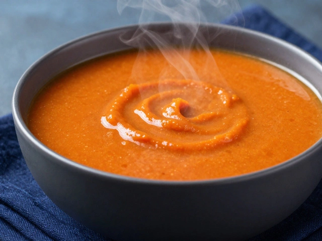
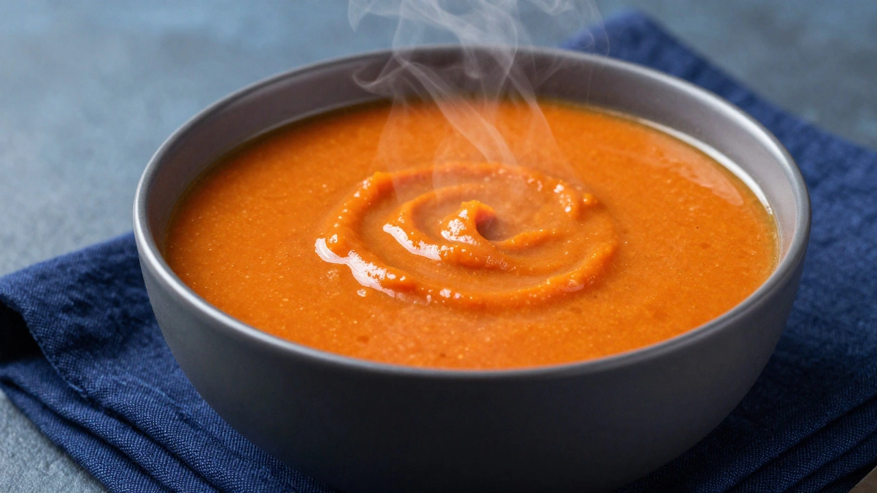
Why does this work so well? Most cooked foods-roasted vegetables, baked breads, soups, pastries-naturally fall into the orange, brown, or yellow spectrum. By placing these warm subjects against a cool blue background, you instantly separate the food from its environment. The blue pushes back, allowing the orange to come forward.
Francesco Sapienza is a professional photographer and educator who specializes in teaching practical food photography techniques and styling tips notes that an orange carrot on a blue plate can be significantly more appealing than on a neutral one. It’s not just about brightness; it’s about separation. Try shooting a bowl of tomato soup. If you place it on a white table, it might blend in. Place it on a dark navy blue fabric, and that orange-red soup suddenly glows. The contrast makes the steam look hotter and the texture richer.
You don’t need pure primary colors to make this work. Tints and shades matter. A soft pastel blue napkin works beautifully with a vibrant orange citrus slice. Conversely, a deep indigo ceramic bowl complements a lightly toasted golden-brown pastry. The key is maintaining that warm-versus-cool dynamic.
Classic Contrast: Red and Green
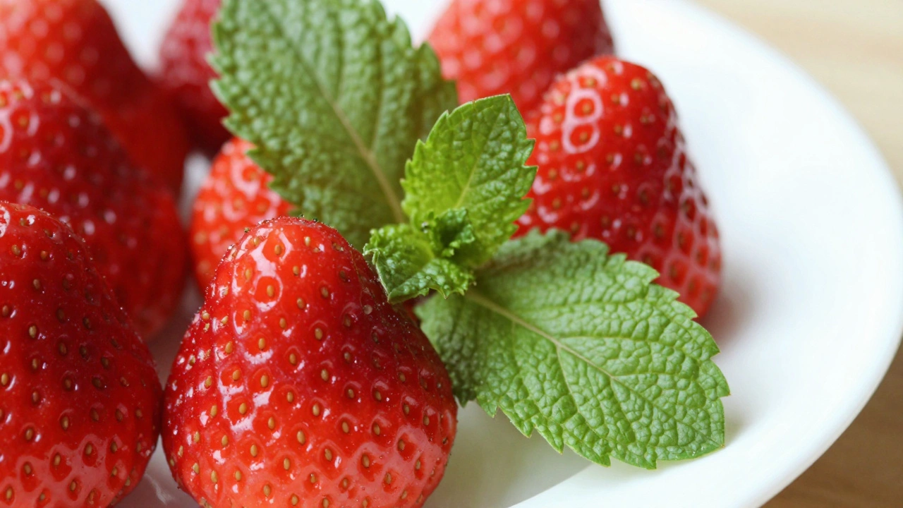
Red and green is another classic complementary pair, perhaps most famous for its association with Christmas. But in food styling, it’s all year round. This combination is particularly effective for fresh produce, salads, and desserts that feature berries or herbs.
Gastrostoria is an online resource providing detailed guides on food styling, photography techniques, and culinary aesthetics recommends using red and green to make fresh fruits and vegetables visually enticing. Think about a strawberry shortcake. The red of the strawberries pops against the green mint leaves or the green rim of a glass. Or consider a watermelon radish noodle bowl. The pinkish-red hue of the radish contrasts sharply with the green cilantro or scallions.
A pro tip here: avoid using equal amounts of red and green. That can look chaotic or seasonal in a distracting way. Instead, let one color dominate and use the other as an accent. If your dish is mostly green (like a pesto pasta), add small bursts of red (cherry tomatoes, red pepper flakes) to draw the eye. If your dish is red (like a beet salad), use green herbs as a garnish to frame the plate.
Remember, variations count. Pink is a tint of red, and lime green is a shade of green. So, a pink raspberry paired with a lime green sorbet still utilizes the complementary principle, just with a softer, more sophisticated palette. This flexibility allows you to adapt the theory to almost any ingredient.
Beyond Complementary: When to Use Analogous and Monochromatic Schemes
While complementary colors create drama and pop, they aren’t always the right choice. Sometimes you want calm, harmony, or elegance. That’s where analogous and monochromatic schemes come in.
Analogous colors are colors that sit next to each other on the color wheel, such as red, orange, and yellow, creating a harmonious and serene visual effect. These combinations feel natural because they mimic gradients found in nature. A dish featuring various greens-spinach, avocado, cucumber, and basil-uses an analogous scheme. It conveys freshness and cohesion without jarring contrasts. Similarly, a sunset-inspired dessert with purple grapes, red berries, and orange segments creates a warm, inviting mood.
Monochromatic schemes are color palettes that use tints, shades, and tones of a single hue, offering a minimalist and elegant aesthetic. This approach is great for highlighting texture. Imagine a chocolate mousse cake. Using different shades of brown-from the dark drizzle to the lighter sponge-creates depth without introducing competing colors. It feels refined and focused.
Know your goal. Do you want the viewer to jump at the image (complementary)? Or do you want them to linger and appreciate the mood (analogous/monochromatic)? For most commercial food photography, especially for restaurants or cookbooks, complementary colors are safer bets because they grab attention quickly in social media feeds.
Practical Application: Plating, Props, and Garnishes
Color theory isn’t just about the food itself. It extends to every element in your frame: the plate, the background, the napkins, and even the cutlery. Every prop is a color decision.
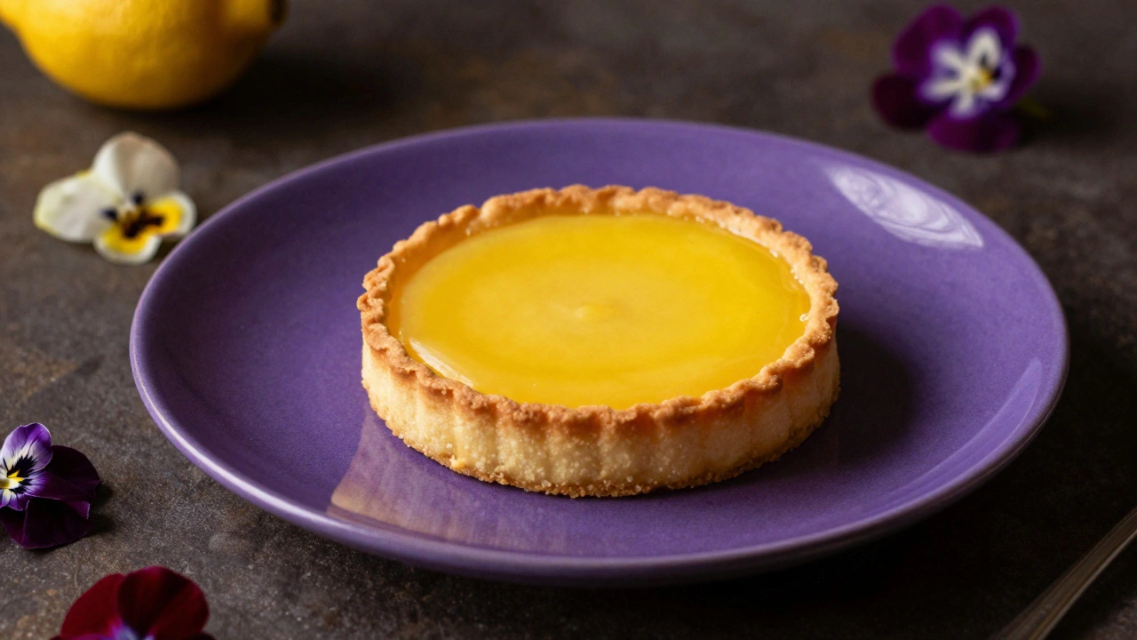
Start with the plate. White plates are versatile because they act as a neutral canvas, but they can also wash out subtle colors. If you’re shooting a colorful dish, try a colored plate that complements the main ingredient. For example, serve a yellow curry on a deep purple plate. The contrast will make the yellow look brighter and more appetizing.
Consider your background carefully. A wooden surface adds warmth (brown/orange tones). If you’re shooting a warm-toned dish like grilled cheese, a wood background might blend too much. Add a blue linen napkin or a turquoise placemat to introduce that complementary cool tone. This creates layers of interest. As noted by experts, being "very careful with the napkin" ensures it doesn’t distract but rather supports the main subject.
Garnishes are your final touch of color control. A sprig of green basil on a red tomato soup isn’t just traditional; it’s strategic. It provides a tiny point of high contrast that anchors the viewer’s eye. Similarly, a dusting of green matcha powder on a pink macaron uses complementary accents to enhance the perceived flavor profile.
| Primary Pair | Best Used For | Visual Effect | Example Dish |
|---|---|---|---|
| Orange & Blue | Cooked meals, soups, baked goods | High energy, warmth vs. coolness | Tomato soup on navy cloth |
| Red & Green | Fresh produce, salads, desserts | Vibrancy, freshness, appetite appeal | Strawberries with mint |
| Purple & Yellow | Desserts, exotic fruits, breakfast | Luxury, richness, bold contrast | Blueberry pancakes with lemon zest |
| Pink & Lime Green | Light snacks, beverages, sweets | Playful, modern, soft contrast | Raspberry smoothie with kiwi slices |
Troubleshooting Common Color Mistakes
Even with the best intentions, color coordination can go wrong. Here are three common pitfalls and how to fix them:
- Muddy Colors: If your image looks dull, check your white balance. Incorrect lighting can shift colors toward gray or brown, killing the contrast. Shoot in natural daylight whenever possible to preserve true hues.
- Too Much Competition: If both the plate and the background are brightly colored and complementary, the food might get lost. Keep one element neutral. If the plate is blue, keep the background white or light wood. Let the food be the star.
- Ignoring Texture: Color works best when paired with texture. A smooth orange mousse on a rough blue stone slab creates more visual interest than smooth-on-smooth. Use props that add tactile contrast to support your color story.
Finally, trust your eyes. While the color wheel is a guide, real-world ingredients vary. A ripe banana is yellower than a green one. Adjust your props accordingly. Experimentation is part of the process. Take test shots, review them on your phone, and tweak your palette until the food truly pops.
What are the best complementary colors for food photography?
The most effective complementary pairs are orange and blue, red and green, and purple and yellow. Orange and blue is particularly popular because many cooked foods are orange-toned, making blue backgrounds ideal for creating contrast. Red and green works well for fresh produce and desserts, while purple and yellow adds a luxurious feel to breakfast items or exotic fruits.
How do I choose the right plate color for my food?
Look at the dominant color of your dish and find its opposite on the color wheel. For example, if your dish is yellow (like a lemon tart), choose a purple or deep violet plate. If it’s green (like a pesto pasta), use a red or terracotta plate. If you’re unsure, white plates are safe, but colored plates can make the food stand out more dramatically.
Can I use complementary colors if my food is neutral-colored?
Yes! Neutral foods like rice, potatoes, or plain bread benefit greatly from colorful surroundings. Add a complementary garnish or prop. For instance, serve plain mashed potatoes on a deep blue plate with a sprinkle of green chives. The green and blue create a subtle analogous harmony, while the white potato stands out clearly against the dark background.
What is the difference between analogous and complementary colors?
Complementary colors are opposites on the color wheel (e.g., red and green) and create high contrast and visual excitement. Analogous colors are neighbors on the wheel (e.g., green and blue) and create harmony, calm, and a cohesive look. Use complementary for impact and analogous for mood.
Does lighting affect how complementary colors appear?
Absolutely. Warm artificial light can make blues look muddy and oranges look overly saturated. Natural daylight is the best source for accurate color representation. If you must use indoor lighting, adjust your white balance to ensure the complementary colors remain distinct and vibrant rather than blending into a dull mix.