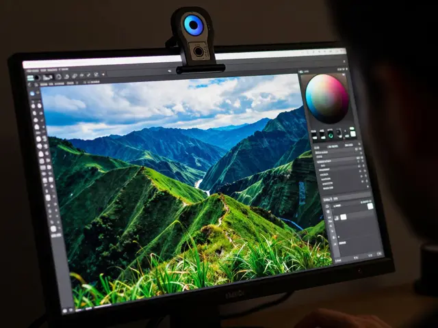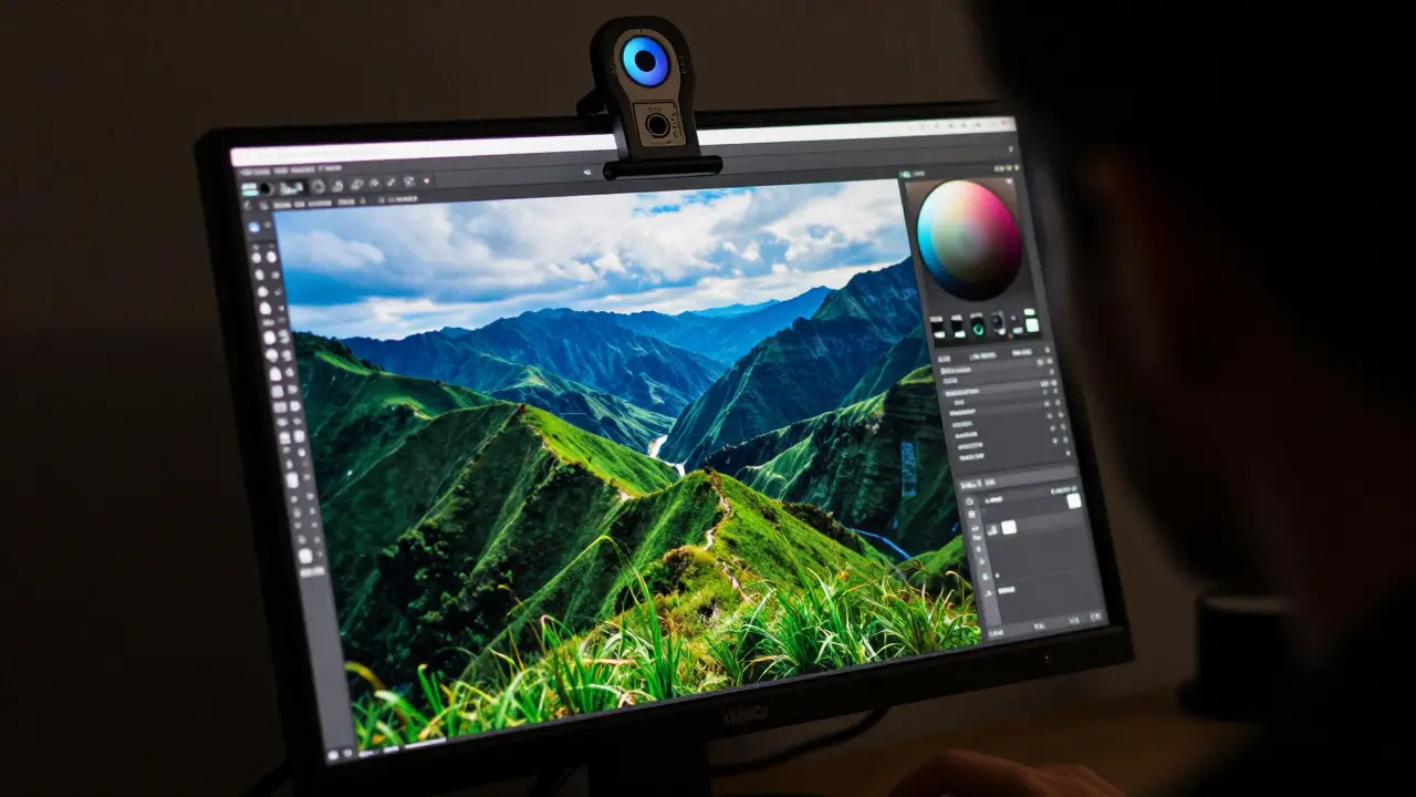
You just spent hours editing a landscape shot in Lightroom. The greens are lush, the blues are deep, and the skin tones look perfect on your calibrated monitor. You hit "Export," select the default sRGB setting, and upload it to Instagram. Suddenly, the colors look washed out and dull. What happened? You didn't break anything; you just picked the wrong color profile for the destination.
Understanding the difference between sRGB, Adobe RGB, and ProPhoto RGB is one of those technical skills that separates casual shooters from professionals who control their image quality end-to-end. These three standards define how digital files store color information, and choosing the right one depends entirely on where your photo is going next: the web, a high-end print lab, or an archival master file.
The Quick Summary: Which One Do I Need?
- sRGB: Use this for the web, social media, and most client deliverables. It is the universal standard for screens.
- Adobe RGB (1998): Use this for professional printing, especially if you shoot in RAW and plan to print large formats. It covers more green and cyan than sRGB.
- ProPhoto RGB: Use this only for working files in advanced editing software. Never export final images in this space unless you have a very specific reason.
If you are unsure, start with sRGB. It is safe, compatible, and expected by almost every digital platform. But if you want to maximize print quality or work with wide-gamut monitors, you need to understand the nuances below.
What Are Color Profiles Really?
A color profile is essentially a translation dictionary for your computer. Digital cameras capture light as raw data, but screens and printers interpret that data differently. A profile tells the device exactly how to display the colors you captured.
Think of it like language. If you speak French (your camera's sensor) and try to talk to someone who only understands English (your monitor), you need a translator. The color profile is that translator. Without it, colors can shift, become muted, or look completely wrong.
The three main profiles we discuss today are based on different standards for what colors a human eye can perceive and what devices can reproduce. Each has a specific "gamut"-the range of colors it can hold.
sRGB: The Web Standard
sRGB is a color space defined by Microsoft and HP in 1996 that serves as the standard for most consumer displays and web content. It was designed specifically for the limitations of typical LCD and LED monitors at the time. Today, it remains the baseline for digital color management.
Why is it so dominant? Because everyone uses it. When you browse the web, watch YouTube, or post to social media, the platform assumes your images are in sRGB. If you send them a file in Adobe RGB without embedding the profile, the colors will likely look oversaturated and weird. If you embed the profile, some older platforms might ignore it, leading to dull colors.
Key Attributes of sRGB:
- Gamut Size: Smallest of the three. Covers about 35% of visible human vision.
- Best For: Web galleries, social media, email attachments, and standard office documents.
- Limitations: Struggles with highly saturated greens and cyans found in nature photography.
If you are shooting for Instagram, Facebook, or a personal portfolio website, sRGB is your best friend. It ensures consistency across billions of devices. You don't need to overthink it. Convert to sRGB before export, and you are set.
Adobe RGB (1998): The Print Powerhouse
Adobe RGB (1998) is a wide-gamut color space developed by Adobe Systems in 1998 that extends beyond sRGB to cover more colors in the green and cyan regions. It was created to bridge the gap between digital capture and high-quality printing.
Unlike sRGB, which is limited by screen technology, Adobe RGB is designed to hold more color information. This is crucial for photographers who take their work to professional labs. Many fine art papers and pigment inks can reproduce colors that simply don't exist in the sRGB space.
Key Attributes of Adobe RGB:
- Gamut Size: Medium. Covers about 50% of visible human vision.
- Best For: Professional printing, magazine layouts, and clients who expect high-fidelity output.
- Limitations: Not universally supported by all web browsers or older software. Requires careful handling during export.
Here is the catch: Adobe RGB files are larger because they contain more data. Also, if you view an Adobe RGB image on a standard sRGB monitor without proper color management, the colors will look overly vibrant and "neon." This is why many beginners avoid it. But if you calibrate your monitor and use software like Photoshop or Lightroom correctly, Adobe RGB gives you a significant advantage in print work.
ProPhoto RGB: The Working Space Giant
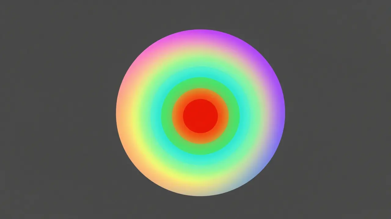
ProPhoto RGB is an extremely wide-gamut color space introduced by Kodak in 1999 that encompasses nearly all colors visible to the human eye. It is not meant for final output but for intermediate editing stages.
ProPhoto RGB is massive. It includes colors that even the best printers cannot reproduce. Why use it then? Because when you edit an image, you often push sliders, adjust curves, and apply effects. If you do this in a smaller space like sRGB, you risk clipping highlights or losing subtle color gradations. ProPhoto RGB gives you headroom. It acts as a safety net, preserving detail that would otherwise be lost during aggressive edits.
Key Attributes of ProPhoto RGB:
- Gamut Size: Largest. Covers over 90% of visible human vision.
- Best For: Internal editing workflows in 16-bit mode within professional software.
- Limitations: Too large for most screens and printers. Causes banding issues in 8-bit files. Not suitable for web export.
Most users never need to touch ProPhoto RGB directly. However, if you are using Photoshop and doing heavy retouching, setting your workspace to ProPhoto RGB can help maintain smooth gradients in skies and skin tones. Just remember: convert back to sRGB or Adobe RGB before you save the final file.
Comparison Table: At a Glance
| Feature | sRGB | Adobe RGB (1998) | ProPhoto RGB |
|---|---|---|---|
| Primary Use Case | Web & Social Media | Professional Printing | Advanced Editing Workspace |
| Gamut Coverage | ~35% | ~50% | >90% |
| File Size Impact | Smallest | Medium | Largest (if saved as TIFF/PNG) |
| Browser Support | Universal | Inconsistent | Poor |
| Recommended Bit Depth | 8-bit | 16-bit | 16-bit |
How to Choose Your Export Settings
Your choice should always be driven by the final destination of the image. Here is a simple decision tree to follow:
- Is the image for the internet? If yes, use sRGB. No exceptions. Even if you edited in ProPhoto, convert to sRGB before exporting JPEG or PNG.
- Is the image for a professional print lab? Check with the lab. Most high-end labs prefer Adobe RGB or CMYK. If they accept RGB, ask if they want Adobe RGB. If they don't specify, Adobe RGB is usually safer than sRGB for large prints.
- Are you sending a file to a designer or another photographer? Ask them. If they work in print, send Adobe RGB. If they work in web/digital ads, send sRGB. Always embed the profile.
- Are you archiving the file? Save your master files as TIFF or DNG in ProPhoto RGB or Adobe RGB at 16-bit depth. This preserves maximum data for future re-edits.
A common mistake is forgetting to embed the color profile. In Lightroom or Photoshop, make sure the option "Embed Color Profile" is checked. If you don't, the receiving program will guess what profile to use, and it will almost always guess wrong.

Common Pitfalls and How to Avoid Them
Even experienced photographers make mistakes with color spaces. Here are the top three errors to watch out for:
1. Viewing Adobe RGB on an Uncalibrated Monitor If your monitor isn't calibrated, you can't trust what you see. An uncalibrated screen might show sRGB colors as too blue, making you think your Adobe RGB file looks dull. Calibrate your monitor regularly using a hardware calibrator like a X-Rite i1Display or Datacolor Spyder. This ensures your eyes match the data.
2. Converting Multiple Times Every time you convert from one color space to another, you lose a tiny bit of data. Try to minimize conversions. Edit in your preferred wide space (like ProPhoto or Adobe RGB), then convert once to your final output space (sRGB). Don't bounce back and forth.
3. Ignoring Bit Depth Color space and bit depth are linked. sRGB works fine at 8-bit. But Adobe RGB and ProPhoto RGB really shine at 16-bit. If you save a 16-bit ProPhoto file as an 8-bit JPEG, you will get banding in gradients. Always keep your working files at 16-bit until the final export.
Practical Workflow Example
Let's walk through a real scenario. You shoot a wedding in RAW. You import into Lightroom and develop the images. Your monitor is calibrated and set to Adobe RGB.
- Edit in ProPhoto RGB: Set your Lightroom working space to ProPhoto RGB (or Adobe RGB if you prefer simplicity). This gives you maximum flexibility for color corrections.
- Prepare for Web: Select the photos for your online gallery. In the Export module, choose sRGB as the color space. Set quality to 80-90%. Embed the profile. Export as JPEG.
- Prepare for Print: Select the photos for the album. In the Export module, choose Adobe RGB. Keep the bit depth at 16-bit if possible (Lightroom exports 8-bit JPEGs, so consider exporting TIFFs for print labs if high fidelity is needed). Embed the profile.
- Archive: Back up the original RAW files and the edited XMP sidecar files. These are your masters. They don't have a fixed color space in the same way, but they contain all the data.
This workflow ensures you get crisp, accurate colors on the web and rich, detailed colors in print, without compromising your original data.
Frequently Asked Questions
Should I always convert to sRGB before uploading to Instagram?
Yes. Instagram converts all images to sRGB internally. If you upload an Adobe RGB file, Instagram may strip the profile and display the colors incorrectly, often looking oversaturated. Converting to sRGB yourself gives you control over how the conversion happens.
What is the difference between 8-bit and 16-bit color depth?
8-bit color stores 256 levels per channel (red, green, blue), while 16-bit stores 65,536 levels. 16-bit allows for smoother gradients and less banding, especially in wide-gamut spaces like ProPhoto RGB. Use 16-bit for editing and large prints; 8-bit is sufficient for web JPEGs.
Can I use ProPhoto RGB for my final printed photos?
Generally, no. Most printers and RIP software expect sRGB or Adobe RGB. ProPhoto RGB contains colors that printers cannot reproduce, leading to unpredictable results. Convert to Adobe RGB or CMYK before sending to a printer.
Why do my colors look different on my phone versus my desktop?
This is usually due to inconsistent color management. Desktops often have better-calibrated monitors and software support for embedded profiles. Phones rely on OS-level color management, which can vary. Always test critical images on multiple devices.
Do I need a calibrated monitor to use Adobe RGB?
Yes, strongly recommended. Without calibration, you cannot accurately judge whether colors are correct. A calibrated monitor ensures that what you see matches the actual color data in the file, preventing costly print surprises.